Update New post here. maintained location here.
That plot is based on reanalysis data, and covers just one region. Since I am now regularly integrating current NCEP/NCAR reanalysis data (here), I thought I could do the same for that region, and the comparison would be a check. However, in some ways that high Arctic is not where melting is currently concentrated, so I thought I could also give a better spread of areas. Naturally, that means a gadget, below the fold.
The DMI plot shows an average from 1958-2002. That isn't without cost - it requires melding a number of different reanalyses to cover the range. It could be argued too that it misses recent Arctic warming, and so may show modern data as unusually warm, when by modern standards it isn't.
Anyway, I decided to stick with NCEP/NCAR data from 1994 to present, over which time it seems fairly reliable. And of course I use NCEP for current. There are some discrepancies. DMI aims to show the true surface temp 2m above the ground. I show what is basically the bottom grid level.
Here are the comparative plots for 2015. I've tried to stick to the DMI style here:
| DMI | NCEP/NCAR vai Moyhu |
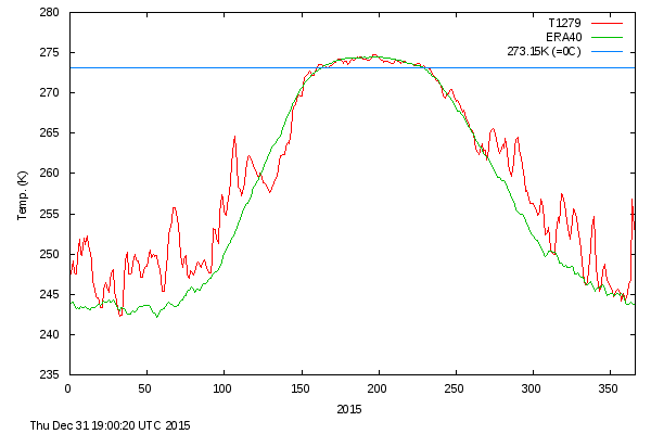 |  |
I have however used Celsius - I can't see the point of Kelvin here, especially with freezing being prominent. The plots are broadly similar. The DMI average has a longer period above zero, but to a smaller extent. This may reflect the slight difference in levels. DMI shows a warmer looking winter - reflecting I think the more ancient reference average.
So below the fold is the gadget. It lets you choose arbitrary rectangles on a 5×15° grid in the region above 60°N. I'll place it just below, with further description below that.
The "rectangle" shows with colored sides. Below is a box of controls. The colored triangles move the sides in the indicated directions by one step. Outward pointing triangles expand the area. The black triangles translate the rectangle by longitude. The initial rectangle has overlapping sides and doesn't show all the colors.
When you have selected the area, press "Plot new" to show the plot of daily average temperatures for 2015 to date. Day of year is marked on the x axis.
I'll add the plot to the maintained latest data page.


Why can't previous years be plotted (e.g. 2012)?
ReplyDeleteMainly a matter of data download. There are 24*6*365 datapoints for a full year. That's about 300 KB. I could set up a request data download for specific years.
DeleteNick, in many years there is a 'shoulder' at approximately -14C; both in spring and fall. Any idea what this might represent?
ReplyDeleteKevin,
DeleteI can't think of a reason. Actually, there aren't pronounced shoulders in the 80N averages, either mine or DMI. A small one in fall in mine.
This gadget let's you try to localise effects. This year there was a big peak in to 0-90E quarter at about 100 days, which then fell away. That would be a big part of the apparent shoulder in >80N.
Nick, the timing isn't consistent - so they average out over any period of years - but if you view the individual years you will find that more often than not there is a spring shoulder between 260 and 265K. The fall shoulder is less pronounced or gets lost in noise more often, but it's still there in many years.
DeleteNick Stokes: I have however used Celsius - I can't see the point of Kelvin here, especially with freezing being prominent.
ReplyDelete0°C isn't really the right threshold either. A better value is -1.8°C, which is the freezing point of sea water.
Kevin---I think the apparent "shoulder" is a visual illusion.
Here's an animation of the Arctic temperature for the year, averaged in 5° bands (annular rings), using Nick's widget:
animation
As the radius of the annular ring decreases, you get more or less the same warming trend, just with progressively larger amplitude shorter period fluctuations.
Our brains try and combine the phenomena of the warming trend and e.g. the peak around 70 days, so we see what looks like a shoulder.
(This is easier to see if you download the m4v file and view it in a player that allows you to use the left & right arrows to rock the image back and forth.)
Carrick,
DeleteMore important I think is the melting point of the upper surface, which is likely much closer to 0°C.
As I understand it, bottom melting is the primary thermodynamic mechanism for sea ice loss. (The primary mechanical one is transport of ice from colder regions to warmer regions.)
DeleteWhen sea air temperatures go above -1.8°C, it's no longer possible for sea ice to form on the surface of the ocean. Open ocean surface implies an increased rate of solar radiation absorption by the ocean, and in turn an increase in the rate of bottom melting.
Carrick,
DeleteYes, but the question is, what influences air temperature? What gives the average temperature series such a marked flat top in summer at about 0°C?
I think it is the temperature of melting ice on the upper surface which is in contact with air, not with sea water. Not so much salt there.
Nick: What gives the average temperature series such a marked flat top in summer at about 0°C?
DeleteI think you're trying to get the tail to wag the dog here. This is just due to the much larger transfer of heat energy from the open ocean and the air above it than there is between the ice and the air.
In wintertime conditions, the surface boundary layer looks pretty much the same over the (frozen) Arctic Ocean, but in summer, once the big melt gets under way, the open water moderates the temperature of the air.
Put another way, the reason why the surface air temperature is relatively flat in summer is unrelated to why the sea ice melts.
The main thing that having the surface air temperature above 0°C does is the snow on the top melts, forming melt pools. And there's some pretty interesting things that happen because of that. But it's my understanding this is a pretty minor source of sea ice loss.
The heat conduction between the ocean and the ice is much, much larger than that of the air and the snow layer on top of the (still briny) sea ice. As far as I can see, adding more heat energy into the surface layers of the ocean is still going to be the primary way you're going to accelerate the rate of ice loss.
How are you doing the averaging? Are you adjusting for grid box area? DMI doesn't, it simply uses a 0.5 degree grid and averages together all the points with equal weighting. That means it's not a true measurement of the average temperature for the area above 80N, but is very heavily weighted towards the Pole. Maybe also helps explain the shape difference?
ReplyDeletePeter,
DeleteYes, I certainly use trig area averaging both for Arctic and globe. It's essential near the poles - I'm pretty amazed DMI doesn't.
Nick, your Arctic temperature graphs at this link are still labeled "2016" although the graphs currently show data for 2017. Also, as some other commenters have suggested, I think it would be very interesting to be able to make comparisons with other years, for example years like 2016, 2015, 2012 and 2007.
ReplyDeleteThanks, Steven, I'll fix the 2016. I said earlier that the main issue with allowing past year comparisons is the amount of data entailed, to allow for arbitrary choice of cell. But I'll see if I can do it for some popular choices.
Delete