Update: GISS has published an update
May 15, 2015: Due to an oversight several Antarctic stations were excluded from the analysis on May 13, 2015. The analysis was repeated today after including those stations.This actually made a big difference. The April temperature anomaly comes back from 0.75°C to 0.71°C, and March from 0.85°C to 0.84, making a drop of 0.13°C. GISS uses an extra Antarctic data set from GHCN, which I presume is the one involved. So this won't affect the TempLs calc.
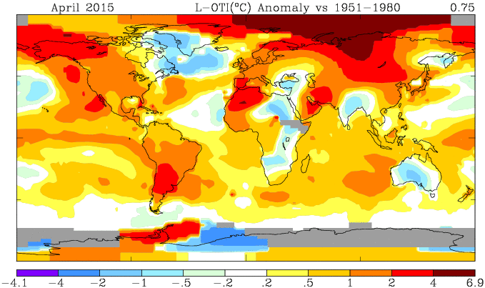
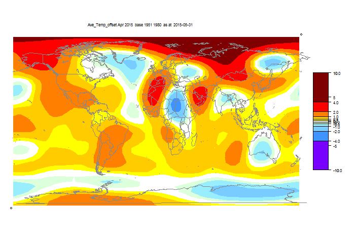
Below the fold, as usual, I'll show the GISS plot, and the TempLS spherical harmonics smoothed map.
Here is the GISS map

And here is the TempLS spherical harmonics smoothed map:

And here is a listing of many corresponding TempLS monthly reports in recent years.


So, Jan-April for GISS are now just barely cooler than 2010... no longer the hottest start to a year on record. http://data.giss.nasa.gov/gistemp/tabledata_v3/GLB.Ts.txt
ReplyDelete-MMM
That's the land-stations-only version. More commonly, what people use is the land + ocean version of GISTEMP. In that version, 2015 year-to-date is warmer than any previous year.
ReplyDeleteSou has a good plot of the running YTD averages.
DeleteWhy just GISTEMP?
DeleteFor one, it's the first thermometer series to announce their number each month. Two, it's the only thermometer series that is updating on WfT. RSS and UAH are here, but... WfT is down to RSS and GISTEMP.
Delete"Why just GISTEMP"?
DeleteI'd use BEST, but they don't seem to provide monthly data until the end of the year. At least, there's nothing yet for 2015.
HADCRUT isn't sufficiently global. I do use C&W's modified HADCRUT but the updates seem to run a few weeks behind GISTEMP. They don't have April up yet.
I do routinely look at NCDC's data, though I have some vague recollection that like HADCRUT it doesn't provide very complete coverage, and like C&W it runs a little behind GISTEMP.
My recollection is that JMA's data were a bit of a pain to work with (they only distribute the gridded data, not a global mean?) I could be wrong about this.
If you have suggestions for others that are worth following, let me know.
This comment has been removed by the author.
DeleteScrewed up the comment so I deleted it and reposted.
DeleteNed W, in my opinion C&W is probably the best alternative.
I think BEST is still a beta product (speed issues prevent monthly updates and there are problems with spatial smearing), and I agree that both NCDC and HadCRUT have coverage issues at high latitudes.
I was commenting (cryptically it turns out) on why Sou is only doing a running plot of GISTEMP. She seems to be falling into the same trap that Monckton is of cherry picking the series that gives the result she is most comfortable with (namely the one with the largest trend).
As has been commented on here before, you shouldn't pay a whole lot of attention to the monthly variation in running averages. A running average is just a poor quality low-pass filter, and you end up with loss of fidelity in the month-to-month variation (you end up with a sign inversion in some of the higher frequency content, plus the roll-off in frequency is very slow).
Not only does this case some of the high-frequency wiggles to reverse their phase, it also tends to flatten the extrema in the smoothed curve, which I would say is “a bad thing”.
Here’s a figure showing GISTEMP showing rectangular (equal weighting) versus Hann windowed data, to illustrate what I’m talking about:
https://www.dropbox.com/s/wt47dy051nysomh/giss.smoothing_effect.png
I would argue that the Hann-weighting aka Hann-windowed data have better high-frequency fidelity than the equal-weigthed 13-month average.
"If you have suggestions for others that are worth following, let me know."
DeleteTempLS :)
"As has been commented on here before, you shouldn't pay a whole lot of attention to the monthly variation in running averages."
Indeed. But annual averages, for better or worse, get talked about a lot - Hann-windowed values not. And Sou's running average is quite a good indicator of the prospects for annual average.
As others have said, the main reason why GISS is shown is that it comes out first. At the moment running averages are a little higher, mainly because of a jump in March.
ps Carrick, when you delete a comment, there's an option for complete vanishing.
My point didn’t have anything to do with annual averages. What I prefaced my remarks on Hann-window filters was “you shouldn't pay a whole lot of attention to the monthly variation in running averages.”
DeleteThis could be a historic year. Another 1998. Nobody talks about 2001. If 2015 comes out at .90C, people will talk about it for a long time. So it's exciting. I've been excited about this warming trend since it started in 2011. Because it was unusual. As JNG suggested, a record warmest in an ENSO neutral year was possible, and it essentially happened. It's set the stage for a big El Nino induced warmest year, so the months-to-month scoring is major. It will either happen or unravel. The climate is complex and chaotic, so you have to watch it in as many places and and as often as possible, and Nick has a ton of gadgets here that allow one to do that. Does it have a point? I don't know. Once GISS announces, I check once a day for NOAA. Still not out.
DeleteThe "the months-to-month scoring is major" ... for what?
DeleteI don't know anybody doubts this will be a warm year, at least if you use the GISTEMP index.
In that vein, it would be very interesting to compare that to C&W for example.
Reminding you that we're in this for "the long term", so what you're mostly getting excited about is short term SST variability. As long as you don't lose site of that, there is no issue. (I'm mostly interested in 30-year well-characterized trends, so this stuff is fun, but not very insightful.)
Otherwise, this warmest year records excitement just becomes the flip side of Monckton's garbage about the xxx year "pause".
Give it a rest Carrick. Mild filtering isn't going to obscure the fluctuations caused by a strong ENSO modulation of the temperature signal. It is comical for you to suggest that it will cause "some of the high-frequency wiggles to reverse their phase".
DeletePerhaps it just goes to show that you actually don't work with the data.
I agree with Nick, I like TempLSmesh more and more. It updates every day, it has a kriging-like infill, it avoids the seemingly unfair down-adjustments of Arctic data by using unadjusted GHCN, it behaves smoothly with small changes month by month, etc.
DeleteThe year to date average that Sue is doing with GISS is not a new thing. NOAA did it last year, e.g http://www.ncdc.noaa.gov/sotc/global/2014/11/supplemental/page-1
NOAA reports later than GISS, but the preliminary MLOST can be followed here:
http://www1.ncdc.noaa.gov/pub/data/cmb/ersst/v3b/png/mlost.13mon.bar.png
from the third each month.
Right now MLOST is about 0.46, down 0.10 compared to March, just like GISS and Temp LS.
Sudan has not reported yet, and that country has a key position in the otherwise empty Eastern Sahara. Sudan data can make the global indices jump by 0.010, I have seen it before..
Thanks, Olof. That's a useful pointer on early MLOST.
DeleteCarrick, I agree that one shouldn't overrate the climate significance of monthly data. But it is news, and it's all the news we have. A blog devoted to watching the change in a Hanned decadal signal would get boring.
Nick writes: TempLS :)
DeleteWell, yes, but given that we're having this discussion *here*, I thought that went without saying!
Carrick writes: As has been commented on here before, you shouldn't pay a whole lot of attention to the monthly variation in running averages.
I agree, esp. in cases like (Greg Laden's blog?) where people are highlighting the fact that multiple successive months set a new record for the 12-month rolling average. Obviously, 11/12ths of April's "record" comes from March's "record" and so on.
But I think Sou is just plotting the year-to-date averages as a way of showing the current state of the "horse race" for the end-of-year annual record. That seems OK to me.
In fact, Sou's graph bothers me less than the one Tamino posted a few days ago, in which he plots GISTEMP annual with the current JFMA average added on at the end. The problem is that the seasonal cycle used to derive anomalies has changed over time, so anomalies in NH winter are not really comparable to anomalies in NH summer, or to annual averages.
ISTM that the right way to show the 2015 data point would be to model the annual mean as a function of JFMA mean, using only data from recent years, and then show that predicted value plus/minus its uncertainty. I did so, casually, and IIRC the expected annual mean is somewhat lower than the JFMA mean.
Oh, yeah, my bad. I blame the antihistamines.
ReplyDeletehttp://data.giss.nasa.gov/gistemp/tabledata_v3/GLB.Ts+dSST.txt
-MMM
Am I missing something?
ReplyDeleteFrom http://data.giss.nasa.gov/gistemp/tabledata_v3/GLB.Ts+dSST.txt :
Year Jan Feb Mar Apr
2010 65 75 87 83
2015 76 80 85 75
I calculate an average of 79 for 2015 and 77.5 for 2010.
Oh - you are looking at land temperatures only. The data I am looking at is for land and sea (70% of the earth's surface).
Sorry - I see you guys worked this out while I was reviewing the numbers.
ReplyDeleteGISS has posted new values, and April's mean is down from 0.75°C to 0.71. March is back to 0.84°C, so that makes a total drop of 0.13°C.
ReplyDeleteThere doesn't seem to be any corresponding change to GHCN unadjusted or ERSST.
See update above. GISS says they omitted some Antarctic stations.
DeleteYou can see the issue in the maps above (before change). GISS has a grey area in E Antarctica, below Australia. TempLS shows it as cold (we could feel it here last week).
DeleteOK, that was really an errata. I've have actually wondered why GISS omitted the shores of East Antarctica, there are plenty of stations there, but not in the interior...
ReplyDeleteI was a little bit mean yesterday and posted something like this at Steven Goddards:
"This is truly scandalous! GHCN is tampering with the Amundsen-Scott base, probably the best maintained scientific station in the world:
ftp://ftp.ncdc.noaa.gov/pub/data/ghcn/v3/products/stnplots/7/70089009000.gif
Warming the past and cooling the present. With the GISS 1200 km extrapolation they cool 4.5 million km2 of interior Antarctica by 1 degree Celsius!"
It has not passed moderation though :-)
Also, it is not completely true. I believe that Vostok and other station may take chunks out of the 1200 km radius, and 1 degree C down-adjustment is only fully applied in the center, as I understand.
But some stations are really important by representing a large area.
BTW Nick, thanks for your new tools that makes it easier to detect and compare effects of adjustment, etc.