Saturday, February 21, 2015

Regression as derivative

Regression as derivative


In two recent posts here and here, I looked at a moving OLS trend calculation as a numerical derivative for a time series. I was mainly interested in improving the noise performance, leading to an acceleration operator.

Along the way I claimed that you could get essentially the same results by either smoothing and differentiating the smooth, or differencing and smoothing the differences. In this post, I'd like to develop that, because I think it is a good way of seeing the derivative functionality.

This has some relevance in the light of a recent paper of Marotske et al, discussed here. M used "sliding" regressions in this way, and Carrick linked to my earlier posts.

Integrating by parts


My earlier derivation was for continuous functions. If we define an operator:
R=t/X, t from -N to N, zero outside
and X is a normalising constant, then the OLS moving trend is
β(t) = ∫R(τ)y(τ+t) dτ
where ∫ is over all reals ( OK since R has compact support). X is chosen so that t has unit trend: ∫R(τ)*(τ+t) dτ = 1.

I'll define W(t)=-∫∞tR(τ) dτ, (modified following suggestion from HaroldW, thanks) and use D=d/dτ, so DW = -R, and W=-D-1R. Then
∫D(W(τ)y(τ+t)) dτ = 0 = -∫R(τ)y(τ+t) dτ + ∫W(τ)Dy(τ+t) dτ,
or, β(t) = ∫R(τ)y(τ+t) dτ = ∫W(τ)Dy(τ+t) dτ

Now W is a standard Welch taper.

It is the cumulative integral of R, and since that has mean subtracted, so integral over the whole range is zero, then it is a quadratic that starts from zero at -N and returns to zero at N, and is zero outside that range. So that establishes our first proposition:
β(t) = ∫W(τ)Dy(τ+t) dτ
ie a Welch-smoothed derivative of y.

Now D is wrt τ, but would give the same result if it were wrt t. In that case, it can be taken outside the integration:
β(t) = D∫W(τ)y(τ+t) dτ

That is or second result - the sliding trend β(t) is just the derivative of the Welch-smoothed y.

Application to time series


I introduced D because it has a nice difference analogue
Δy = yi - yi-1

It's inverse Δ-1 is a cumulative sum (from -∞). So the same summation by parts works:
β(i) = Σj R(j)y(i+j)
Again W = -Δ-1R is a symmetric parabola coming to zero at each end of the range - ie Welch. Then
Σj Δ(W(j)y(i+j) = 0 = -Σj R(j)y(i+j) + Σj W(j)Δy(i+j)
or β(i) = Σj W(j)Δy(i+j)

Again that's the first result - the sliding trend is exactly the Welch smooth of the differences of y. Smoothed differentiation.

Again, Δ can be regarded as applying to i rather than j.
β(i) = Σj W(j)y(i+j)+Σj W(j)y(i+j-1) = ΔΣj W(j)y(i+j)

The sliding trend is exactly the differences of the Welch smooth of y.


Wednesday, February 18, 2015

Google Maps and GHCN adjustments

Google Maps and GHCN adjustments

A fortnight ago I posted a Google Maps gadget for viewing GHCN stations colored according to the effect on them of GHCN adjustments. I've been doing some improvements, and rewriting the code in the process. This simplifies the logic, and I'm hoping to produce a generic application to operate on any supplied data.

For the moment, the main improvement is that it displays a count of whatever is colored on the screen. So you can quickly show how many have been adjusted up, or down, with selection criteria specified. The other improvement is that the popup data includes a link to the GHCN display page, giving extensive history and graphs of observations and adjustments.

I have also updated the data to Jan 2015.

The plot is below. And below that, some details about the usage logic. The field Trend_Adj is the trend difference over whole of life made by adjustment, in °C/cen. It is set to NaN for stations with less than 360 months of adjusted data in total (maybe with gaps).


The green box on the right has a collection of selection criteria. Some are comparisons, some are logical. The second small button toggles between the relation options (>,==,T/F etc), and for comparison, the third is a text box in which you enter the reference value. Only one selection can be live at a time, determined by the left radio button.

When you have a live selection, you can click a radio button in the top orange section (Pink,Cyan etc). Any stations that fulfill your requirement will change to that color. In the middle column, the numbers in each color are shown, and updated with each choice. Invisibles are still in the totals.

The right column shows the most recent logical operation that was implemented for that color. It does not show the status of all markers in that color. If the color is eg pink, then the expression will not include markers that were pink before the latest selection, and the other logicals don't change. I could make a logical expression for the state, but it would quickly get very complicated.

The All button, when F does nothing, but when T and live changes everything to one color. You may want to start with everything invisible. I'd make this the default, except that it is a bit discouraging when you are first trying to make something happen.

You can enter NaN into the text fields, which will have the effect of changing any NaN to that color. Usually used to make them invisible. For Trend_Adj, there is the option of equality ("=="), mainly used to test for zero. I should warn that it tests to rounding level, which is 0.01. Very few stations totally escape adjustment (eg MMTS), but it is often very small.

I've included Lat and Lon; it doesn't mean much when you have a map. but is useful for counting, eg Arctic. I have given Urban and Rural as separate options, because there is also Mixed. So if you color Urban T, that is what you see, but Rural F gives Urban and Mixed.

You'll find negative logic useful. The advice on how to sculpt an elephant is, take a very big rock and chip away anything that doesn't look like an elephant. Same here. If you want pink to show urban stations that have trend increased on adjustment, then pink all uptrended, then go to Urban F, and make that invisible. That will affect other colors too (if any).


Monday, February 16, 2015

January GISS up from 0.72 to 0.75°C

GISS showed a small rise. TempLS mesh dropped slightly from 0.66C to 0.64C. TempLS grid also dropped, from 0.65C to 0.63C. Based on this, I would expect a small drop in NOAA and HADCRUT. But maybe not. Both satellite indices rose - RSS significantly, from 0.28C to 0.37C. Since the recent warming seems to be SST driven, this lag makes sense. Maps are below. TempLS is continually reported here.

Slightly O/T, but there has been a recent spike in February, according to the NCEP/NCAR index. It has now pulled back a bit.


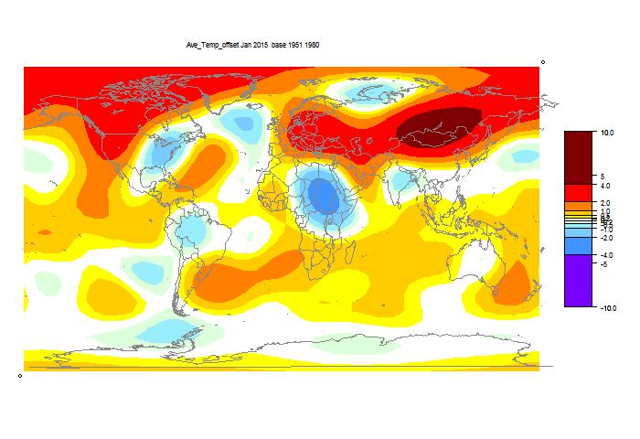
Here is the GISS map:


Warm in Western N America, esp NW, cold in East (a common pattern lately). Warm in NE Europe and Siberia.

Here is the TempLS grid map:


It shows similar features, with more warmth in Mongolia, and a cooler spot in Africa.

And here is the similar TempLS mesh plot:


Thursday, February 12, 2015

Adjusting in the finance world

There has been much talk recently about homogeneity adjustments. Some in the mainstream madia, and none that made much sense. It's one of the most extraordinary scandals of our time. Maybe even criminal:

"Is history malleable? Can temperature data of the past be molded to fit a purpose? It certainly seems to be the case here, where the temperature for July 1936 reported ... changes with the moment," Watts told FoxNews.com.

"In the business and trading world, people go to jail for such manipulations of data."


So I thought I'd see what does go on in the trading world. I originally commented on this at Paul Homewood's site. I looked up the chart for BHP's share price on our national exchange, ASX. Scrolling down, I read:

"Adjustments - The charts are adjusted to smooth out the effect of bonus issues, rights issues, special dividends, share splits, consolidations, capital reductions, or to link historical values that represent the company's primary equity security. The chart also assumes that all company issued options and convertible securities are converted into ordinary shares."

In other words, not the historic prices at all. And ASX won't show you a chart of the "raw data". One complaint about GHCN adjustments is that they are constantly changing the past. But see what happens here. As with climate, present adjusted values are held equal to present market price. So what happens when BHP issues such a dividend? Its price drops by about the amount of the dividend. ASX adjusts all past prices down, to "smooth" the drop.


So are they changing the trend? Yes, definitely. Dividends, share splits etc almost always lower the share price. So past adjustments are almost always down. BHP's actual share price did not rise nearly as much as shown (well, OK, declined by more, lately).

You may say, well, a dividend is a known amount (though since BHP dividends are fully franked, the drop may be modified by the tax benefits). So let's look at another case - Bluescope Steel. They say:

"To enhance comparability, and consistent with market practice, actual share prices have been adjusted to reflect the 1 for 6 consolidation of December 2012 and the deemed 'bonus component' of the BlueScope Steel Entitlement Offers of 2009 and 2011. (An adjustment factor of 0.8470 has been applied to share prices prior to 22 November 2011 in respect of the 2011 Entitlement Offer, and a further adjustment factor of 0.8016 has been applied to share prices prior to 7 May 2009 in respect of the 2009 Entitlement Offer)."

That is rather more specific, and the numbers quoted are estimates, with no explained basis.

I haven't heard anyone threatened with jail for this very public malleability of history. Of course, they are done for the same reasons as temperature adjustments. If you want to know how the company (or the market) is faring, then you do not want to know about the predictable response to dividends, share splits etc. It is absolutely right to take them out. As it is with the inhomogeneities in the temperature record.


Wednesday, February 11, 2015

Surface temperature global average is robust to noise

There has been a lot of argument about GHCN adjustments. Fiddly stuff like whether a certain step introduced in Reykjavik in 1963 was justified. None of this has any significance for a global average. Steve Mosher of BEST is constantly reminding that there is actually a huge amount of data in the average, and there is no point in focussing on the very local scale.

That is a point I was emphasising in this post on homogenisation. The average is little affected by unbiased noise (cancellation), but sensitive to bias. So it makes sense to identify and eliminate bias, even if it increases noise. Homogenise.

There is another common naysayer claim, that averages are not more accurate than the original readings, as in this WUWT thread. I don't know what they think drug companies etc go to great expense to get a large set of responses to average.

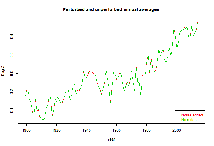
Anyway, in this post I'll give a dramatic demonstration of the noise suppression of averaging. I'll take the usual post-1900 monthly GHCN and ERSST data and let TempLS calculate an annual average. Then I'll add Gaussian noise to every single monthly average. Big noise - amplitude (sd) 1 °C. That's a world in which thermometers can barely be read to the nearest degree. In fact much worse, since monthly averaging already reduces noise. Then I'll recompute and show the differences in various ways. I'll do 10 instances.

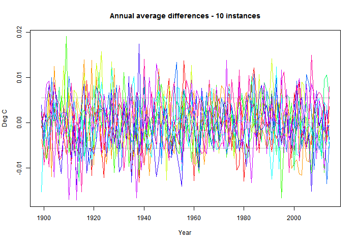
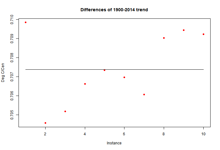
As you'll guess, the difference is small. The standard deviation of fluctuations about the unperturbed is about 0.006 °C. The effect on trend is even smaller. The unperturbed trend 1900-2014 is 0.7073 °C/Century and the range is about 0.705 to 0.710.

I should emphasise that this perturbation operates on what might be taken to be measurement error, and does not emulate that quoted by NASA, NOAA etc, which is dominated by spatial sampling error. It also assumes white (ie independent) noise; dependence will increase the effect. But from a very low base.

So here is the plot of time series of a single perturbation (red) against unperturbed. The change is barely visible. 1°C unbiased noise added to the individual monthly averages makes scarcely any difference.


So I'll plot the differences over time. This time I'll show the 10 instances - the signal is effectively random. The horizontal lines show the mean and 1 sd range. Note the y-axis scale.


Finally I'll show a plot of 1900-2014 trends. As mentioned, the unperturbed is 0.7073 and the range about +-0.0025; about 0.4%.


Monday, February 9, 2015

Breakdown of effects of GHCN adjustments.

In a previous post, I showed how running TempLS with unadjusted or adjusted GHCN station data made a small difference to the final global average. That is useful to know, because some say that AGW is a creature of GHCN adjustments. This is certainly not true.

That analysis can be extended. I can trace the contribution to this small adjustment effect from various categories of stations - by continent, rural status, or airport status. And as before, it shows the difference by year, or effect on trend (to present time) by year.

A useful addition to the present post will be some trends calculated for land only in a NOAA paper by Lawrimore et al, 2011, Table 4 (h/t Victor Venema):

v3 Uncorr v3 Corr
1880–20100.61°C/Century0.79°C/Century
1901–20100.70°C/Century0.91°C/Century
1951–20100.16°C/Decade0.18°C/Decade
1981–20100.27°C/Decade0.27°C/Decade

Note the change of units (in the original). I got an approx land only difference of 0.17°C/Cen for 1900-2014 by dividing the global value by the land area fraction. That was pretty rough; the value in this post is more accurate, and agrees well.

In this post, I'll start with the usual active plot - see here for guidance. I've added a new "Norm" button. This allows you to toggle to a mode where the average adjustment for each category is calculated. The initial mode gives the contribution of that category to the global average. I think that is most useful, as it is area weighted. The category average can show high average adjustments for relatively rare stations. I'm using TempLS mesh exclusively; the grid style allows too much mixing between categories.

As usual with the active graph, you can select the set to show, move and zoom the graph, and show the numerical data. Then I'll show some ordinary graphs comparing the categories.

Here is the active plot. You can click on Trendback to togle a mode that shows trends to present, and on Data to pop up the numbers you see on screen.

Global with urban/rural breakdown

Here is the plot. All have a slight smoothing over 3 years. Note that all these plots can be generated on the zoomable active plotter, along with the associated trend graphs.


So you can see that the total global contribution is negative to about 1970, then positive. This has the effect that the contribution to trends from about 1960 onward is actually cooling. These are the trends that are vigorously debated as possible evidence of AGW. They are not enhanced by adjustment - on the contrary.

Before 1970 the adjustments "cool the past", by up to 0.05°C. However, on a land basis, that is up to 0.2°C. That is representative of the maximum average adjustment.

A virtue of the left style is that it is additive. So urban adjustments make up the larger part, but not by all that much.

There is an interesting sharp rise to about 1975, and then a decade plateau. We'll see more of it. It seems here associated with rural. My theory is that it is an airport effect, and may be associated with the move of some rural classified stations to airports.

There is also a WW2 effect, principally associated with Mixed (between rural and urban). Again I think it may have been connected with the moving of civilian stations to military airports, and maybe back again.

Breakdown by airport status


Here both of those features are markedly associated with airport status (hence my theory). Despite what you sometimes hear, adjustments to airports are a relatively minor net contributor. Note that the GHCN inventory ratings that I use refer to current conditions. Many "airports" have century plus records; they obviously weren't always airports. Some adjustments probably relate to the time when the station was originally transferred to the airport.

Breakdown by continent


Well, as you might expect from recent fusses, South America has the most negative adjustments. Africa is mostly positive. Less adjusted are Europe and Oceania (BoM and NIWA take a bow!).

Special cases


Finally, I'll show CONUS (continental US) and the Arctic. There has been a lot of fuss in recent times. The Arctic adjustments have been passionately excoriated by Booker of the Telegraph.


Well, as you'll see, the Arctic has made very little contribution to the global average, and it is quite flat. On the right, the average adjustment is also quite low (and again flat in trend).

CONUS, on the other hand, has the highest average adjustments (also noted here). That is mainly TOBS. Because CONUS is a smallish fraction of total land, the effect overall is modest, and also not so strong in trend. As previously noted, the adjustments reach a minimum in the 1930's.


Sunday, February 8, 2015

Hadley Cells and Carnot Heat Engine

I've been commenting on a thread at ATTP called "Atmospheric Heat Engines". It's about a paper by Laliberte et al which appeared recently in Science. There is an article about it in the Smithsonian.

The eye-catching thesis is that in a warming climate, the heat engine that drives the poleward circulation, typified by the Hadley Cell, will work with decreased efficiency, because water vapor will not work as well as a working fluid. Their abstract says:
Incoming and outgoing solar radiation couple with heat exchange at Earth’s surface to drive weather patterns that redistribute heat and moisture around the globe, creating an atmospheric heat engine. Here, we investigate the engine’s work output using thermodynamic diagrams computed from reanalyzed observations and from a climate model simulation with anthropogenic forcing.We show that the work output is always less than that of an equivalent Carnot cycle and that it is constrained by the power necessary to maintain the hydrological cycle. In the climate simulation, the hydrological cycle increases more rapidly than the equivalent Carnot cycle. We conclude that the intensification of the hydrological cycle in warmer climates might limit the heat engine’s ability to generate work.


I think there are some global constraints here, as I said in a comment at ATTP. It's something I've written about here over the years, here, here, and here. Overall, I'm uncertain. I've read the paper, and will continue to try to understand it. But meanwhile, I will give my understanding of Carnot cycles, how Hadley cells emulate one, and what role water vapor plays.

The Carnot Cycle

Wiki shows this schematic. You could think of a piston like a coffee plunger, with two plates - source hot, sink cold. With the air initially hot, you place it on the hot plate which is at the same temp. It expands and does work, which staying at the constant temperature of the source. After a while, you take it off the plate. It continues expanding and doing work but now cooling. When it cools to the temp of the sink, you put it on that plate, and now start compressing. During this stage, the entropy that was admitted at the source stage is emitted. When it has gone you withdraw, but keep compressing adiabatically until it warms to the temperature of the source. Repeat...


More formal is this P-V (pressure-volume) diagram from Wiki. The description is here. I'd like to pick up some points.

We need the concepts of:
  • Internal energy U. For an ideal gas thus is just cv N T, where N is mass according to the units of cv
  • Enthalpy H = U + PV
You can see how the engine does work from the P-V graph. Work is PdV, and while the volume change is the same in expansion and compression, expansion happens at higher pressure. Note that a reserve of mechanical energy is needed. You have to do work to get work.


The heat gained from the source adds directly to the enthalpy. In the first step (1->2), U is constant, so the enthalpy change goes entirely into PV work. In the second, enthalpy doesn't change (adiabatic), so the work done just comes from the change in U. That is the same change in the fourth adiabatic compression stage, so they do no net work. The net work is done by the excess of the first stage over the third.

Hadley Cell

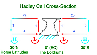
The Hadley cell is an eddy where warm air rises in the tropics (ITCZ), travels at high altitude supplying heat to support TOA IR emission, then descends in mid-latitudes (subtropical ridge) and returns via the surface trade winds. There are Coriolis effects, but the main heat engine effects can be considered without them.

The subtropical ridge is a region of high pressure, so the mass of air there is high. Where the cell rises, (ITCZ), the surface pressure is lower, so the mass of air is less. However, it is warmer, so the center of mass is actually higher.

To think of it as a Carnot cycle, the first thing needed is the reservoir of mechanical energy. Kinetic energy plays some role, but the main one is hydrostatics. The bouyant rise in the tropics carries the air to a high altitude, whence it travels gradually downhill to the descent phase. The potential energy gained carries it through the cooling phase. It is bouyancy that keeps the low pressure at the equaqtor, and negative bouyancy that pushes air into the pressure maximum at the subtropical ridge. The resulting pressure gradient drives the trade wind stage.

So next to the Carnot analogy, thinking first of a dry circulation. I've identified four stages. The heat source is the surface, so the step 1, where the working fluid picks up heat, is far from isothermal. The fluid gains internal energy, while still expanding. The expansion contributes by facilitating the gravitational gradient at high altitude.

The (adiabatic, approx) rise stage is enhanced by the internal energy thus gained. The expansion does work to maintain a slightly reduced hydrostatic pressure gradient, in turn maintaining the surface low pressure and the pressure gradient that drives the trades.

In the third, high altitude stage, heat is lost to the sink (space) by radiation. In the Carnot cycle, mechanical compression maintained the temperature. Here the gradual loss of altitude has the same effect. Potential energy is the reservoir.

In the final stage, the cold air compresses and warms. But it was dense air with relatively less far to descend, so the negative bouyancy allows to to recharge the high pressure zone at the subtropical ridge, keeping up the other end of the surface pressure gradient that drives the trade winds.
   Diagrams from Wikipedia


Effect of water vapor

That was a dry Hadley Cell. It's generally reckoned that evaporation and latent heat (LH) are powerful extra drivers. This is partly because wv is bouyant, but also because LH increases the heat carrying capacity of the air.

LH, if you count it as internal energy, is transferred to the air in addition to sensible heat at the trade wind stage, more especially at the later, warmer stage. But the necessary evaporation takes heat from something. Partly sea water, partly air. The cooled air may be further heated by the air-sea temp differential thus created, but still, there is probably less sensible heat taken up than in the dry case.

As I understand it, Lalibertie et al are saying that in fact you can't count the latent heat until it does actually condense. And as global warming proceeds, LH is a greater proportion of internal energy, and this is a limitation.

But obviously water vapor does condense somewhere along the cycle. And most of it will have done so before the end of the bouyant rise. In doing so, it warms (or slows cooling) of the rising air, and allows it to rise to a greater height than it otherwise would have. Or put another way, it helps maintain the surface low pressure, and thus the surface pressure gradient that drives the trade winds. So the fact that the condensation occurs later does not diminish the work available to the cycle.

Conclusions

Well, none. This is a blog, and these are tentative thoughts. What do you all think? Me, I'll read the paper again.