This post is about the basics of
TempLS. But I want to present it in terms of first principles of averaging, with reference to other methods that people try that just don't work. I'll mention the least squares approach described
here.
I once described a
very simple version of TempLS. In a way, what I am talking about here is even simpler. It incorporates an iterative approach which not only gives context to the more naive approaches, which are in fact the first steps, but is a highly efficient solution process.
Preliminaries - averaging methods
The first thing done in TempLS is to take a collection of monthly station readings, not gridded, and arrange them in a big array by station, month and year. I denote this x
smy. Missing values are marked with NA entries. Time slots are consecutive. "Station" can mean a grid cell for SST, assigned to the central location.
I'm going to average this over time and space. It will be a weighted average, with a weight array w
smy exactly like x. The first thing about w is that it has a zero entry wherever data is missing. Then the result is not affected by the value of x, which I usually set to 0 there for easier linear algebra in R.
The weighting will generally be equal over time. The idea is that averaging for a continuum (time or space) generally means integration. Time steps are equally spaced.
Spatial integration is more complicated. The basic idea is to divide the space into small pieces, and estimate each piece by local data. In effect, major indices do this by gridding. The estimate for each cell is the average of datapoints within, for a particular time. The grid is usually lat/lon, so the trig formula for area is needed. The big problem is cells with no data. Major indices use something equivalent to this.
Recently I've been using a finite element style method - based on
triangular meshing. The surface is completely covered with triangles with a datapoint at each corner (picture
here). The integral is that of the linear interpolation within each triangle. This is actually higher order accuracy - the 2D version of the trapezoidal method. The nett result is that the weighting of each datapoint is proportional to the area of the triangles of which it is a vertex (picture
here).
Averaging principles
I've described the mechanics of averaging (integrating) over a continuum. Now it's time to think about when it will work. We are actually estimating by sampling, and the samples can be sparse.
The key issue is missing values. There is one type of familiar missing value - where a station does not report in some month. As an extension, you can think of the times before it started or after it closed as missing values.
But in fact all points on Earth except the sample points can be considered missing. I've described how the averaging deals with them. It interpolates and then integrates that. So the issue with averaging is whether that interpolation is good.
The answer for absolute temperatures is,
no it isn't. They vary locally within any length scale that you can possibly sample. And anyway, we get little choice about sampling.
I've
written a lot about where averaging goes wrong, as it often does. The key thing to remember is that if you don't prescribe infilling yourself, something else will happen by default. Usually it is equivalent to assigning to missing points the average value of the remainder. This may be very wrong.
A neat way of avoiding most difficulties is the use of anomalies. Here you subtract your best estimate of the data, based on prior knowledge. The difference, anomaly, then has zero expected value. You can average anomalies freely because the default, the average of the remainder, will also be zero. But it should be your best estimate - if not, then there will be a systematic deviation which can bias the average when missing data is defaulted. I'll come back to that.
What TempLS does
I'll take up the story where we have a data array x and weights w. As described
here, TempLS represents the data by a linear model
x
smy=L
sm+G
my+ε
smy
Here L is a local offset for station month (like a climate normal), G is a global temperature function and ε an error term. Suffices show what they depend on.
TempLS minimises the weighted sum of squares of residuals:
Σw
smyd
smy² where d
smy=x
smy-L
sm-G
my
It is shown
here that leads to two equations in L and G which TempLS solves simultaneously. But here I want to give them an intuitive explanation. The local offsets don't vary with year. So you can get an estimate by averaging the model over years. That gives an equation for each L.
And the G parameters don't involve the station s. So you can estimate those by averaging over stations. That would be a weighted average with w.
Of course it isn't as simple as that. Averaging over time to get L involves the unknown G. But it does mean, at least, that we have one equation for each unknown. And it does allow iteration, where we successively work out L and G, at each step using the latest information available. This is a well-known iterative method - Gauss-Seidel.
That's the approach I'll be describing here. It works well, but also is instructive. TempLS currently uses either block Gaussian elimination with a final direct solve of a ny×ny matrix (ny=number years), or conjugate gradients, which is an accelerated version of the iterative method.
Naive methods
A naive method that I have
inveighed against is to simply average the absolute temperatures. That is so naive that it is, of course, never done with proper weighting. But weighting isn't the problem.
But one that is common, and sometimes not too bad, is where a normal is first calculated for each station/month over the period of data available, and used to create anomalies that are averaged. I gave a detailed example of how that goes wrong
here. Hu McCulloch gave one
here.
The basic problem is this. In setting T=L+G as a model, there is an ambiguity. L is fixed over years, G over space. But you could add any number to the L's as long as you subtract it from G. If you want L to be the mean over an interval, you'll want G to have zero mean. But If stations have a variety of intervals, G can't be zero-mean over all of them.
The normal remedy is to adopt a fixed interval, say 1961-90, on which G is constrained to have zero mean. Then the L's will indeed be the mean for each station for that interval, if they have one. The problem of what to do if not has been much studied. There's a discussion
here.
Iterating
I'll introduce a notation Σw_s, Σw_y, meaning that a w-weighted sum is formed over the suffix variable (station, year) holding the others fixed. I'd call it an average, but the weights might not add to 1. So Σw_y yields an array with values for each station and month. Our equations are then
Σw_y(d_smy) = 0
or Σw_y(L_sm) = Σw_y(T_smy - G_my)......
Eq(1)
But Σw_y(L_sm) = L_sm Σw_y(1). Eq(1) is solvable for L_sm
and
Σw_s(d_smy) = 0
or Σw_s(G_my) = Σw_y(T_smy - L_sm)......
Eq(2)
But Σw_s(G_my) = G_my Σw_s(1). Eq(2) is solvable for G_my
The naive model is in fact a first step. Start with G=0. Solve (1) gives the normals, and solve (2) gives the resulting anomaly average.
It's not right, because as said, with non-zero G, (1) is not satisfied. But you can solve again, with the new G. Then solve (2) again with the new L. Repeat. When (and if) it has converged, both equations are satisfied.
Code
Here is some R code that I use. It starts with x and w arrays (dimensioned ns×nm×ny×, nm=12,nsm=ns*nm) as defined above:
G=0; wx=w*x; wr=rowSums(w)+1e-9; wc=colSums(w);
for(i in 1:8){
 L=rowSums(wx-w*rep(G,each=nsm))/wr
 G=colSums(wx-w*rep(L,ny))/wc
}
That's it. The rowSums etc do the averaging. I add 1e-9 to wr in case stations have no data for a given month. That would produce 0/0, which I want to be 0. I should mention that I have set all the NAs in x to 0. That's OK, because they have zero weight. Of course, in practice I monitor convergence and end the loop when achieved. We'll see that later.
In words
- Initially, the offsets L are the long term station monthly averages
- Anomalies are formed by subtracting L, and the global G by spatially averaging (carefully) the anomalies. Thus far, the naive method.
- Form new offsets by subtracting the global anomaly from measured T, and averaging that over years.
- Use the new offsets to make a spatially averaged global anomaly
- Repeat 3 and 4 till converged.
A simple example
Here's another simple example showing that just taking anomalies over station data isn't enough. We'll forget months; the climate is warming 1C/year (change the units if you like), and there are two stations which measure this exactly over five years. But they have missing readings. So the x array looks like this:
| Station A | 1 | 2 | 3 | - | -
|
| Station B | - | - | 3 | 4 | 5
|
and w looks like
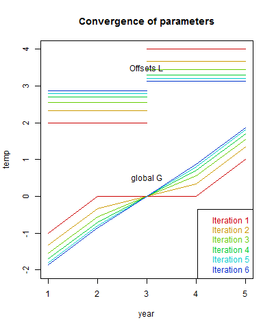
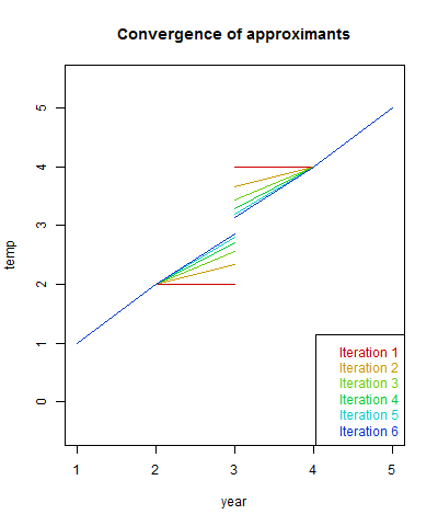
Here are the first four iterations. I've calculated the trend of G, which should be 1, and the weighted sum of squares of residuals.
| j | |
| Iter | Trend | Sum squares
|
| 1 | 0.4 | 2
|
| 2 | 0.6 | 0.8889
|
| 3 | 0.7333 | 0.3951
|
| 4 | 0.8222 | 0.1756
|
The first row is the naive recon. The trend is way too low, and the sum squares is far from zero. Iteration shows gradual improvement. The columns do converge to 1 and 0 respectively.
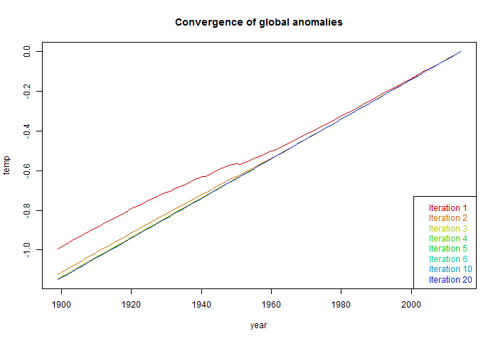
The convergence speed depends on the overlap between stations. If there had not been overlap in the middle, the algorithm would have happily reported a zig-zag with the anomaly of each station as the global value. If I had extended the range of each station by 1 year, convergence is rapid. A real example would have lots of overlap. Here are plots of the comvergence:
A real example
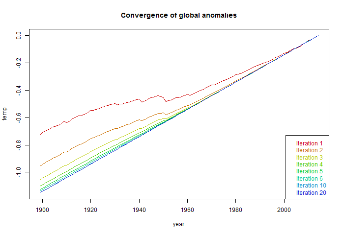
Now I'll take x and w from a real TempLS run, from 1899 to April 2015. They are 9875×12×117 arrays, and returns 12*117 monthly global anomalies G. I'll give the complete code below. It takes four seconds on my PC to do six iterations:
| Iter | Trend | Sum squares
|
| 1 | 0.5921 | 1
|
| 2 | 0.6836 | 0.994423
|
| 3 | 0.6996 | 0.994266
|
| 4 | 0.7026 | 0.99426
|
| 5 | 0.7032 | 0.99426
|
| 6 | 0.7033 | 0.99426
|
Again, the first row, corresponding to the naive method, significantly understates the whole-period trend. The sum of squares does not change much, because most of the monthly deviation is not explained by global change. The weights I used were mesh-based, and as a quick check with the
regular results
| Nov | Dec | Jan | Feb | Mar | Apr
|
| Regular run 18 May | 0.578 | 0.661 | 0.662 | 0.697 | 0.721 | 0.63
|
| This post | 0.578 | 0.661 | 0.662 | 0.697 | 0.721 | 0.630
|
To 3 figures, it is the same.
More code
So here is the R code including preprocessing, calculation and diagnostics. I've used color to show these various parts:
for(i in 1:8){
load("TempLSxw.sav") # x are raw temperatures, w wts from TempLS
x[is.na(x)]=0
d=dim(x); # 9875   12  117
L=v=0;
wr=rowSums(w,dims=2)+1e-9; # right hand side
wc=colSums(w)+1e-9; # right hand side
for(i in 1:6){
 L=rowSums(w*x-w*rep(G,each=d[1]),dims=2)/wr  # Solve for L
 G=colSums(w*x-w*rep(L,d[3]))/wc # then G

 r=x-rep(L,ny)-rep(G,each=ns)  # the residuals
 v=rbind(v,round(c(i,
 lm(c(G)~I(1:length(G)))$coef[2]*1200,sum(r*w*r)),4))
}

colnames(v)=c("Iter","Trend","Sum sq re w")
v[,3]=round(v[,3]/v[2,3],6)  # normalising SS
G=G-rowMeans(G[,62:91+1]) # to 1961-90 anomaly base
write(html.table(v),file="tmp.txt")




 Posts
Posts

