Thursday, May 14, 2015

GISS down by 0.1°C in April

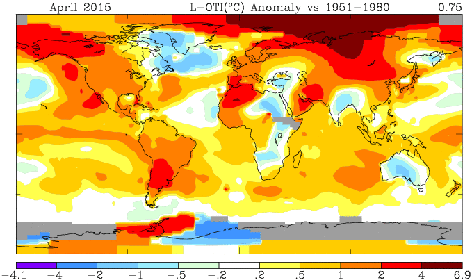
GISS has reported an average anomaly of 0.75°C (h/t JCH). They raised their March estimate to 0.85°C (from 0.84), so that makes a difference of 0.1, which is what I also reported for TempLS. In fact, TempLS has since crept up with extra data, so the difference is 0.09°C. Metzomagic comments on recent GISS changes here.

Update: GISS has published an update
May 15, 2015: Due to an oversight several Antarctic stations were excluded from the analysis on May 13, 2015. The analysis was repeated today after including those stations.
This actually made a big difference. The April temperature anomaly comes back from 0.75°C to 0.71°C, and March from 0.85°C to 0.84, making a drop of 0.13°C. GISS uses an extra Antarctic data set from GHCN, which I presume is the one involved. So this won't affect the TempLs calc.

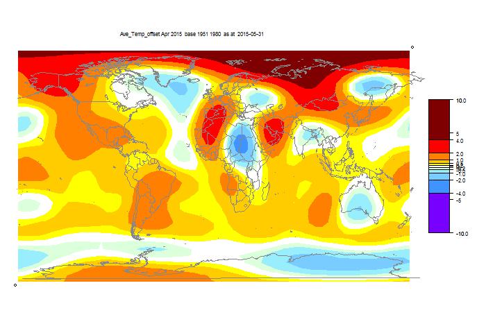
Below the fold, as usual, I'll show the GISS plot, and the TempLS spherical harmonics smoothed map.

Here is the GISS map


And here is the TempLS spherical harmonics smoothed map:


And here is a listing of many corresponding TempLS monthly reports in recent years.


Tuesday, May 12, 2015

BoM declares El Niño status

Australia's Bureau of Meteorology has upgraded its ENSO Tracker to El Niño status, saying
"El Niño–Southern Oscillation (ENSO) indicators have shown a steady trend towards El Niño levels since the start of the year. Sea surface temperatures in the tropical Pacific Ocean have exceeded El Niño thresholds for the past month, supported by warmer-than-average waters below the surface. Trade winds have remained consistently weaker than average since the start of the year, cloudiness at the Date Line has increased and the Southern Oscillation Index (SOI) has remained negative for several months. These indicators suggest the tropical Pacific Ocean and atmosphere have started to couple and reinforce each other, indicating El Niño is likely to persist in the coming months.

International climate models surveyed by the Bureau indicate that tropical Pacific Ocean temperatures are likely to remain above El Niño thresholds through the coming southern winter and at least into spring."
You can see an animation of the last 50 days of ENSO-responsive SST here.

Sou has more on the story here.

ps In terms of Arctic sea ice, 2015 has been lately well ahead in melting of most recent years. It has just passed 2006 (which is fading after an early spurt) to have the least ice for this day (12 May).


Monday, May 11, 2015

Station temperature trends - new page


Friday, May 8, 2015

TempLS April cooler by 0.1°C

As foreshadowed from the daily NCEP reanalysis, April surface temperatures were down, according to TempLS, from 0.721°C to 0.623°C (as at 8/5). Data came in early, though I don't think we have all of Canada. Warm in central Russia, West N America, an odd pattern in Africa, which may change with more data. I'll just paste the report below.

Update. I notice Roy Spencer's map has the same major features as the one below.


Wednesday, May 6, 2015

New Page - Google Maps and GHCN

I've created a new page which combines some of the Google maps capability that I have been developing. I'll include the full text below, but the post is showing on the right; also it is here.

This page shows in a Google maps framework the 7280 stations of the GHCN Monthly network. To the side is a panel where you can choose which stations will be shown, and with what colors. You can select by metadata like altitude or urban status, or by ranges of data. here the data is a variety of trend options over the last 30, 50 or 60 years. The options are trends from the GHCN unadjusted data file, or adjusted, or the difference if you want to see what effect adjustment had.

I'll explain methods below the gadget.


The initial display shows an arbitrary selection. It has available all the usual Google Maps facilities, with controls at top left. But particularly you can click on any marker to bring up a balloon of information. This includes name, a link to the NOAA data sheet attached to the GHCN number, some metadata, and a trend number.

At the bottom of the box on the right, there is a selection box which determines that trend type. It has combinations of Unadj, Adj and A-U, meaning GHCN trend of unadjusted, adjusted and the trend difference. Choosing there determines what is meant by "Trend" elsewhere.

The green box on the right has a collection of selection criteria. Some are comparisons, some are logical. The second small button toggles between the relation options (>,==,T/F etc), and for comparison, the third is a text box in which you enter the reference value. Only one selection can be live at a time, determined by the left radio button. If nothing is live, nothing happens.

When you have a live selection, you can click a radio button in the top orange section (Pink,Cyan etc). Any stations that fulfill your requirement will change to that color. In the middle column, the numbers in each color are shown, and updated with each choice. Invisibles are still in the totals. This is a very handy way of displaying a count of a subset.

The right column shows the most recent logical operation that was implemented for that color. It's just a reminder and does not show the status of all markers in that color. If the color is eg pink, then the expression will not include markers that were pink before the latest selection, and the other logicals don't change.

The All button, when F does nothing, but when T and live changes everything to one color. You may want to start with everything invisible. I'd make this the default, except that it is a bit discouraging when the screen first comes up.

You can enter NaN into the text fields, which will have the effect of changing any NaN to that color. Usually used to make them invisible. For Trend_Adj, there is the option of equality ("=="), mainly used to test for zero. I should warn that it tests to rounding level, which is 0.01. Very few stations totally escape adjustment (eg MMTS), but it is often very small.

I've included Lat and Lon; it doesn't mean much when you have a map. but is useful for counting, eg Arctic. I have given Urban and Rural as separate options, because there is also Mixed. So if you color Urban T, that is what you see, but Rural F gives Urban and Mixed.

You'll find negative logic useful. The advice on how to sculpt an elephant is, take a very big rock and chip away anything that doesn't look like an elephant. Same here. If you want pink to show urban stations that have trend increased on adjustment, then pink all uptrended, then go to Urban F, and make that invisible. That will affect other colors too (if any).

Earlier Google maps posts include:


Saturday, May 2, 2015

An early GHCN V1 found - hardly different from latest V3 unadjusted


Clive Best has come up with an early version of GHCN V1, which he says is from around 1990; GHCN V1 was released in 1992, and I think this must be from a late stage of preparation. Anyway, he has kindly made it available. I have been contending that GHCN unadjusted is essentially unchanged , except by addition, since the inception, despite constant loud claims that NOAA is constantly altering history.

I thought I would compare with the latest GHCN V3 unadjusted, which has data up to March 2015. This turns out to be not so simple, as the numbering schemes for stations have changed slightly, as have the recorded station names. Stations have a WMO number, but several can share the same number in both sets. They have a modification number, but these don't match.

So for this post, I settled on just one country, Iceland. GHCN is supposed to have done terrible things to this record. A few weeks ago, we had Chris Booker in the Telegraph:
"When future generations look back on the global-warming scare of the past 30 years, nothing will shock them more than the extent to which the official temperature records - on which the entire panic ultimately rested - were systematically "adjusted" to show the Earth as having warmed much more than the actual data justified.
...
Again, in nearly every case, the same one-way adjustments have been made, to show warming up to 1 degree C or more higher than was indicated by the data that was actually recorded. This has surprised no one more than Traust Jonsson, who was long in charge of climate research for the Iceland met office (and with whom Homewood has been in touch). Jonsson was amazed to see how the new version completely "disappears" Iceland's "sea ice years" around 1970, when a period of extreme cooling almost devastated his country's economy."


This was reported by NewsMax under the headline:
"Temperature Data Being Faked to Show Global Warming"

The source, of course, was Paul Homewood. Euan Mearns chimed in with:
"In this post I examine the records of eight climate stations on Iceland and find the following:
There is wholesale over writing and adjustment of raw temperature records, especially pre-1970 with an overwhelming tendency to cool the past that makes the present appear to be anomalously warm."


So what did I find? Nothing that could be considered 'systematically "adjusted"'. There were differences, mainly with a clear reason. I'll list the eight stations below the jump.

Clive's V1 is accessible here. V3 in CSV format is here (10Mb zipfile). I have put the extracts relevant to Iceland on a small zipfile here.

A point of comparison is with the IMO records here. These, however, are not entirely unadjusted. They can be useful for resolving differences.
  • GRIMSEY,TEIGARHORN
    These two of the eight are very simple. Exactly the same in V1 and V3.
  • STYKKISHOLMUR
    This is a long record, 1620 months to 1990. Of these nine have been changed. Eight are sign changes, one is a minor change. In all cases, V3 and the IMO record agree. Clearly V3 corrects errors in the V1 draft.
  • REYKJAVIK
    This is also a long record. There are a lot of apparent changes. However, the real situation is revealed by a table of their magnitudes, in the top row, vs number of occurrences in the bottom:

    Size00.1>0.1
    Number8642113

    Almost all changes (211) are by ±0.1. That is, a rounding difference, presumably from monthly averaging.
  • HOFN I HORNAFIRDI and AKUREYRI
    Again, a fair number of rounding differences, but at most four larger (>0.1) month changes in a long record
  • KEFLAVIKURFLU...
    This actually had quite a lot of small changes - 159 in a 461 month record. But I found what is happening by looking in ver 2, which records duplicates. These are different records for the same location, but may be different equipment or measuring points. The V3 version and V1 version are both recorded as duplicates in V2. In V3, they chose whichever seemed best.
  • VESTMANNAEYJAR
    At this stage, I have run out of investigative zeal. Here's the frequency table

    0 0.10.2 0.3 0.4 >0.4
    1050 37 28 20 11 4

    There are 100 discrepancies in 1150 months, small, but several bigger than rounding. No obvious reason.

It is clear that there is no "wholesale over writing and adjustment" in the GHCN V3 unadjusted file for Iceland.


Early note on April 2015 global

Most of the NCEP data for April global surface temperature is in. It was the coolest month so far in this warm year. As is common lately, it started cool, and only really warmed up to average (relative to current warmth). It was however, a bit warmer than last November, when GISS reported 0.63°C. March was &0.84°C. My guess for GISS in April is a bit over 0.7°C.