Thursday, March 5, 2015

Klotzbach revisited

Not a perfect title; it's actually my first comment on the 2009 GRL paper by Klotzbach, Pielke's, Christy et al. It was controversial at the time, but that was pre-Moyhu, or at least in very early days. And I hadn't paid it much attention. But it surfaced again today at Climate Etc, so I thought I should read it.

The paper is very lightweight (as contrarian papers can be). It argues that observed surface trends since 1979 actually exceed troposphere trends, as measured by the UAH and RSS indices, which CMIP etc modelling suggests that the troposphere should warm faster.

Now for global you can simply get those trends, and many more, with CIs from the Moyhu trend viewer. You might say, well, figuring out what the models said should be rated substantial. But they way oversimplified, were corrected at Real Climate (Gavin) and had to publish a corrigendum. There has been more discussion then and over the years. Here, for example, is a post at Climate Audit, with Gavin participating. But the audit didn't seem to pick up the CI issue, though other methods were discussed. Later a Klotzbach revisited WUWT post (my title echoes) two years ago; more on that from SKS here. And now another update.

But what no-one, AFAICS, has noticed is that the claims of statistical significance are just nuts. And significance is essential, because they have only one observation period. The claim originally, from the abstract, was:
"The differences between trends observed in the surface and lower-tropospheric satellite data sets are statistically significant in most comparisons, with much greater differences over land areas than over ocean areas."
I've noticed that the authors are quieter on this recently, and it may be that someone has noticed. But without statistical significance, the claims are meaningless.

Update: I think that the CI's they are quoting may relate to a different calculation. They computed the trends in Table 1, with CI's, and in Table 2 the differences. They say in the abstract that these are differences of trends, but the heading of Table 2, which is not very clear, could mean that they are computing the trends of the differences (a new regression) and giving CI's for that. That is actually a reasonable thing to do, but they should make it clear. I have got reasonably close to their numbers for comparisons with UAH, but not with RSS; it may be that the RSS data has changed significantly since 2009.


I'll describe this in more detail below the jump.

Here is their Table 1 of trends in C/decade with 95% CI's
Table 1. Global, Land, and Ocean Per Decade Temperature Trends and Ratios Over the Period From 1979 to 2008
Data Set         Global Tren         Land              Ocean Trend
NCDC Surface     0.16 [0.12-0.20] 0.31 [0.23-0.39] 0.11 [0.07-0.15]
Hadley Surface   0.16 [0.12-0.21] 0.22 [0.17-0.28] 0.14 [0.08-0.19]
UAH Lower Trop   0.13 [0.06-0.19] 0.16 [0.08-0.25] 0.11 [0.04-0.17]
RSS Lower Trop   0.17 [0.10-0.23] 0.20 [0.12-0.29] 0.13 [0.08-0.19]

My own calcs (to 2014) gave CI's comparable to these.

I've been commenting at CE here and here, and I extracted σ values here
NCDC Surface   0.16 [0.12-0.20]  0.04
Hadley Surface 0.16 [0.12-0.21]  0.04
UAH Lower Trop 0.13 [0.06-0.19]  0.06
RSS Lower Trop 0.17 [0.10-0.23]  0.06

 But you don't need them to see that the results in Table 1 are very unlikely to be significant. Virtually all the trends lie within the CIs of the sat indices. Consider a comparison of NCDC 0.16 and UAH 0.13 [0.06-0.19]. There is no way NCDC is inconsistent with the range of UAH, even if it did not have error of its own.

Anyway, what Klotzbach et al did was to show a table of differences with CIs:

Table 2. Global, Land, and Ocean Per Decade Temperature Trends Over the Period From 1979 to 2008 for the NCDC Surface Analysis
Minus UAH Lower Troposphere Analysis and the Hadley Centre Surface Analysis Minus RSS Lower Troposphere Analysis
Data Set               Global Trend (C)    Land Trend (C)     Ocean Trend (C)
NCDC minus UAH           0.04 [0.00- 0.08]  0.15 [0.08- 0.21]    0.00 [-0.04-0.05]
NCDC minus RSS           0.00 [-0.04- 0.04] 0.11 [0.07- 0.15]   -0.02 [-0.07- 0.02]
Hadley Center minus UAH  0.03 [0.00- 0.07]  0.06 [0.02- 0.10]   0.03 [-0.01-0.07]
Hadley Center minus RSS  -0.01 [-0.04- 0.03] 0.02 [-0.02- 0.06] 0.00 [-0.04-0.04]
Trends that are statistically significant at the 95% level are bold; 95% confidence intervals are given in brackets.

So compare, say, Had-UAH global: 0.03 [0.00- 0.07]
But Had was:
Hadley Surface 0.16 [0.12-0.21]
and UAH
UAH Lower Trop 0.13 [0.06-0.19]  0.06

The CI for the difference has about half the range as for RSS alone. This is reflected throughout the table.  But the normal method requires that Ïƒ's  be added in quadrature. The range for the difference must be larger than for each of the operands.

Now it might be possible to construct an argument that dependence would make a lower CI for the difference. But there isn't much data to resolve dependence as well. And this is basically a test for dependence. You can't start off by assuming it. In any case, the paper doesn't say anything about how the difference CI's were calculated. And I have no idea.

Table 3 shows the differences between amplified (x 1.2) surface vs troposphere. It is little different, and again the CI's are far too narrow. Yet that is where the main claim of significance is based. I won't reproduce here; it is muddied by the changes made in the corrigendum. But they do nothing to repair the situation.

I do not believe any of these trend differences are significant.
Update - see above. I think that interpreted as the CI's of a regression on the differences, the original significance claims may be justified.

Update. A commenter at Climate Etc challenged me to calculate a corrected Table 2. He also wanted Table 3, but it's a bit late for that. Here is Table 2. I've shown under each original line, my variance-added numbers. I've worked with rounded data, so there are rounding discrepancies.


Data Set               Global Trend (C)    Land Trend (C)     Ocean Trend (C)
NCDC minus UAH           0.04 [0.00- 0.08]  0.15 [0.08- 0.21]    0.00 [-0.04-0.05]
                          0.03 -0.05 0.11   0.15  0.03 0.27     0.00 -0.08 0.08
NCDC minus RSS           0.00 [-0.04- 0.04] 0.11 [0.07- 0.15]   -0.02 [-0.07- 0.02]
                         -0.01 -0.09 0.07   0.11 -0.01 0.23    -0.02 -0.09 0.05
Hadley Center minus UAH  0.03 [0.00- 0.07]  0.06 [0.02- 0.10]   0.03 [-0.01-0.07]
                         0.03 -0.05 0.11    0.06 -0.04 0.16     0.03 -0.06 0.12
Hadley Center minus RSS  -0.01 [-0.04- 0.03] 0.02 [-0.02- 0.06] 0.00 [-0.04-0.04]
                         -0.01 -0.09 0.07    0.02 -0.08 0.12    0.01 -0.07 0.09
As you can see, there is now only one case that is barely significant - NCDC-UAH on land. But that is at 95% - we could expect it 1 in 20 times. And here are 12 tests.

Tuesday, March 3, 2015

Early comment on global February

According to my NCEP/NCAR based index, February was globally pretty warm. Very warm indeed around the 12th, but a cool start and finish. The hotspot was Central Asia/Mongolia (daily eyeballing estimate). It ended up just a little cooler than October, which after May was warmest in 2014.

 I'll have a TempLS surface report in a few days.
Update. Preliminary TempLS (7 mar) is very warm indeed. In fact, warmest month ever (since 1900). But Canada, Australia, China, India still to come. Very warm in Russia and N and E Europe. Cold in E US/Can.
Update 8 Mar. Canada, Australia, India are in. Canada was cold.  TempLS has come back to 0.7,  below warmest ever  (March 2010 at 0.737°C). Still, since 2010 only Nov 2013 has been warmer, and only slightly. There is a little more data to come.


Monday, March 2, 2015

Derivatives, filters, odds and ends

I've been writing about how a "sliding" trend may function as a estimate of derivative (and what might be better) here, here and here. There has been discussion, particularly commenter Greg. This post just catches up on some things that arose.

Welch smoothing and spherical Bessel functions.

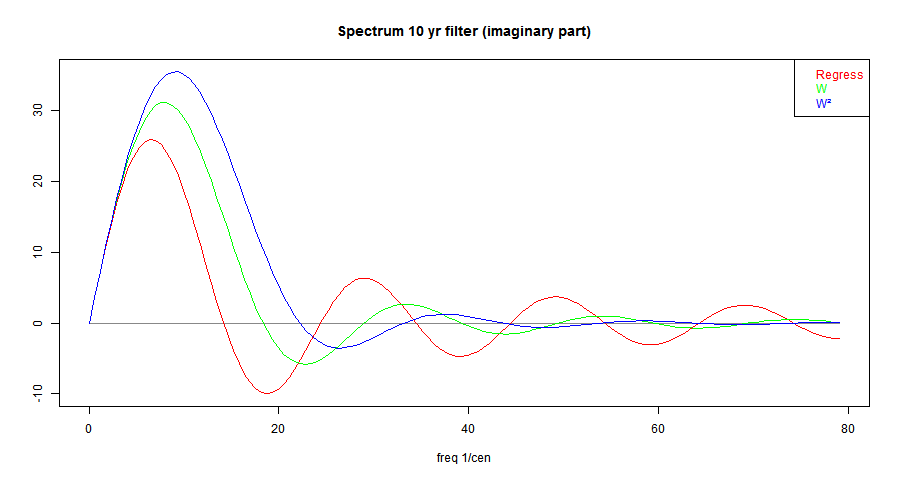
In the first post, I gave this plot of the spectra of the 10-year OLS trend operator, and what results if multiplied by a Welch taper W, and then multiply again. I'll explain why those operations below. T the spectra are actually spherical Bessel functions. Or, more exactly,
(π²/3)*(w/2)^(.5-n)*Γ(n+1.5)*Jn+.5(x)
where x=f*π*T, f=freq in 1/Cen, T=trend period,n=1,2,3...

I've given a detailed derivation here. You might think that Bessel functions is overkill. But in fact, j0(x)= sqrt(π/2x)J1/2(x) is just the sinc function sin(x)/x, and as jn increase in order, they are just trig functions multiplied by polynomials in 1/x, in such a was that they are O(xn) near 0, and decay as 1/x for large x. So x1-njn has the appropriate asymptotics here, and for the order of the polynomials, uniquely so.

General remarks on filters

Greg has been commenting on the merits of other filters, including Gaussian and Lanczos. They are of course not strictly differentiating filters, but could be converted to one. In fact, any of the usual symmetric windows/filters can be converted by differentiating to a differentiating filter (the reason is not quite as obvious as it sounds).

Properties that you are likely to want in a lowish pass convolution filter are:
  1. In the time domain, a bounded domain (compact support). In fact, the domain should about match the period corresponding to the upper limit of frequencies that you want to start attenuating.
  2. In the frequency domain, eventual rapid attenuation with high frequency, which often means controlling side lobes
  3. Sometimes overlooked, a contrary wish for some specific behaviour in the pass band. Possibly a flat response for low pass, or in our case, an accurate derivative representation.
I say contrary, because whatever is wanted for low frequencies is unlikely to include attentuation. So there is an uncomfortable intermediate region which is neither accurate nor attenuated. This is worse for differentiation filters which want to increase amplitude with frequency right up to the transition to attenuation.

The ideal filter with compact support and bounded domain is that gate or boxcar filter H(t). But in the frequency domain is a sinc function sin(ω)/ω, which attenuates very slowly. There is a rule about rates of attenuation. The power |ω|-n of attenuation is determined by n, the order of the first derivative that fails to exist. This is usually determined by the cut-off at the ends of the compact support of the filter. H(t) is discontinuous, to the first derivative fails.

There are filters, like Welch, or the triangle filters (see Wiki for a list) which terminate with a discontinuous derivative. These attenuate O(|ω|-2). It is fairly easy to extend to a zero derivative at the end, as with Hann, Blackman, and so increase n to 3 or beyond. These satisfy 1 and 2. For Welch W, raising it to the nth power improves the termination by a power of n, and the corresponding HF attenuation.

The ultimate in this direction is the Gaussian. It gives best roll-off in the freq domain (FD). It does not strictly have bounded support, but approaches zero so fast that it can be truncated, with only a small amplitude HF tail (though slowly fading). This can be ameliorated. But again, it does not have a flat top.

The Lanczos window tries more to honor requirement 3 by reintroducing aspects of the sinc function in the time domain. It is a product of a narrow and a wider sinc, generally arranged so that the zeroes coincide at the cut-off. It gives a flatter top in the FD, at the cost of being non-positive in the TD.

I find that Welch functions are flexible. You can raise them to any power to give faster attenuation, at the expense of a broader footprint in the FD relative to the support in the TD (so attenuation is eventually faster, but starts later).

Plots

That was all a longish preamble to fulfilling a request from Greg to plot spectra of the Gaussian (truncated at 3 σ), and Lanczos, along with the Welch functions I have been using.

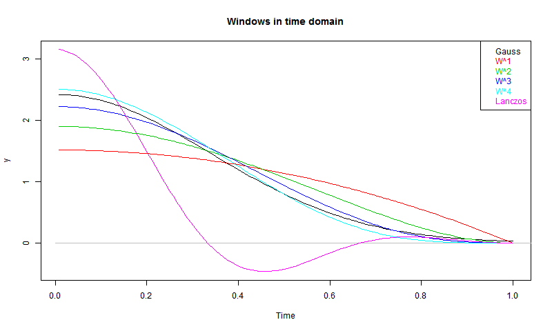
So here are the plots of the windows. I've normalised to area=1, except for Lanczos, shown with area=0.5 (for the sake of the y-axis). But it is restored for the spectrum.


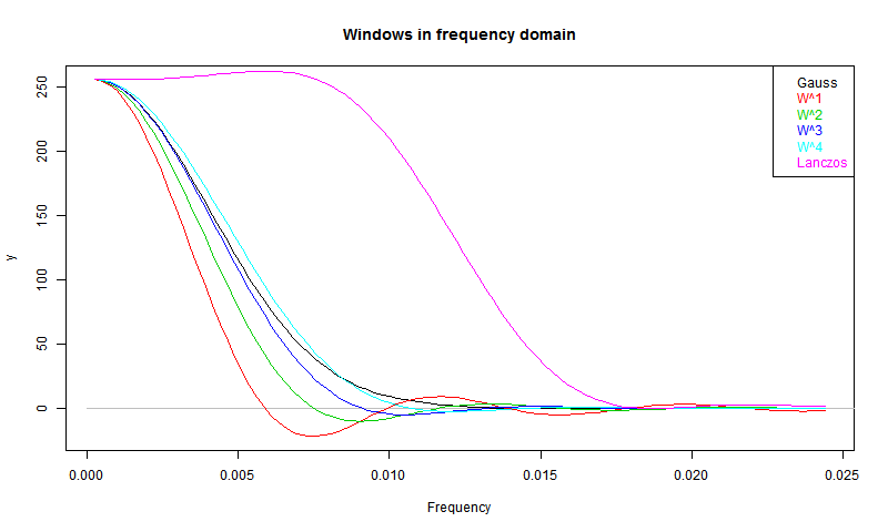
W stands for Welch. You can see that the higher powers are looking quite like the Gaussian. So here are the spectra:


You can see the trade-offs. W decays relatively slowly, but is narrowest in the FD - for its TD footprint, it has a narrower low-pass. Higher powers approach the Gaussian. The Lanczos does indeed have a flatter top, as intended, and also a good attenuation. But it is broadest of all - it lets through relatively high frequencies before the cut-off.


Saturday, February 21, 2015

Regression as derivative

Regression as derivative


In two recent posts here and here, I looked at a moving OLS trend calculation as a numerical derivative for a time series. I was mainly interested in improving the noise performance, leading to an acceleration operator.

Along the way I claimed that you could get essentially the same results by either smoothing and differentiating the smooth, or differencing and smoothing the differences. In this post, I'd like to develop that, because I think it is a good way of seeing the derivative functionality.

This has some relevance in the light of a recent paper of Marotske et al, discussed here. M used "sliding" regressions in this way, and Carrick linked to my earlier posts.

Integrating by parts


My earlier derivation was for continuous functions. If we define an operator:
R=t/X, t from -N to N, zero outside
and X is a normalising constant, then the OLS moving trend is
β(t) = ∫R(τ)y(τ+t) dτ
where ∫ is over all reals ( OK since R has compact support). X is chosen so that t has unit trend: ∫R(τ)*(τ+t) dτ = 1.

I'll define W(t)=-∫tR(τ) dτ, (modified following suggestion from HaroldW, thanks) and use D=d/dτ, so DW = -R, and W=-D-1R. Then
∫D(W(τ)y(τ+t)) dτ = 0 = -∫R(τ)y(τ+t) dτ + ∫W(τ)Dy(τ+t) dτ,
or, β(t) = ∫R(τ)y(τ+t) dτ = ∫W(τ)Dy(τ+t) dτ

Now W is a standard Welch taper.

It is the cumulative integral of R, and since that has mean subtracted, so integral over the whole range is zero, then it is a quadratic that starts from zero at -N and returns to zero at N, and is zero outside that range. So that establishes our first proposition:
β(t) = ∫W(τ)Dy(τ+t) dτ
ie a Welch-smoothed derivative of y.

Now D is wrt τ, but would give the same result if it were wrt t. In that case, it can be taken outside the integration:
β(t) = D∫W(τ)y(τ+t) dτ

That is or second result - the sliding trend β(t) is just the derivative of the Welch-smoothed y.

Application to time series


I introduced D because it has a nice difference analogue
Δy = yi - yi-1

It's inverse Δ-1 is a cumulative sum (from -∞). So the same summation by parts works:
β(i) = Σj R(j)y(i+j)
Again W = -Δ-1R is a symmetric parabola coming to zero at each end of the range - ie Welch. Then
Σj Δ(W(j)y(i+j) = 0 = -Σj R(j)y(i+j) + Σj W(j)Δy(i+j)
or β(i) = Σj W(j)Δy(i+j)

Again that's the first result - the sliding trend is exactly the Welch smooth of the differences of y. Smoothed differentiation.

Again, Δ can be regarded as applying to i rather than j.
β(i) = Σj W(j)y(i+j)+Σj W(j)y(i+j-1) = ΔΣj W(j)y(i+j)

The sliding trend is exactly the differences of the Welch smooth of y.


Wednesday, February 18, 2015

Google Maps and GHCN adjustments

Google Maps and GHCN adjustments

A fortnight ago I posted a Google Maps gadget for viewing GHCN stations colored according to the effect on them of GHCN adjustments. I've been doing some improvements, and rewriting the code in the process. This simplifies the logic, and I'm hoping to produce a generic application to operate on any supplied data.

For the moment, the main improvement is that it displays a count of whatever is colored on the screen. So you can quickly show how many have been adjusted up, or down, with selection criteria specified. The other improvement is that the popup data includes a link to the GHCN display page, giving extensive history and graphs of observations and adjustments.

I have also updated the data to Jan 2015.

The plot is below. And below that, some details about the usage logic. The field Trend_Adj is the trend difference over whole of life made by adjustment, in °C/cen. It is set to NaN for stations with less than 360 months of adjusted data in total (maybe with gaps).


The green box on the right has a collection of selection criteria. Some are comparisons, some are logical. The second small button toggles between the relation options (>,==,T/F etc), and for comparison, the third is a text box in which you enter the reference value. Only one selection can be live at a time, determined by the left radio button.

When you have a live selection, you can click a radio button in the top orange section (Pink,Cyan etc). Any stations that fulfill your requirement will change to that color. In the middle column, the numbers in each color are shown, and updated with each choice. Invisibles are still in the totals.

The right column shows the most recent logical operation that was implemented for that color. It does not show the status of all markers in that color. If the color is eg pink, then the expression will not include markers that were pink before the latest selection, and the other logicals don't change. I could make a logical expression for the state, but it would quickly get very complicated.

The All button, when F does nothing, but when T and live changes everything to one color. You may want to start with everything invisible. I'd make this the default, except that it is a bit discouraging when you are first trying to make something happen.

You can enter NaN into the text fields, which will have the effect of changing any NaN to that color. Usually used to make them invisible. For Trend_Adj, there is the option of equality ("=="), mainly used to test for zero. I should warn that it tests to rounding level, which is 0.01. Very few stations totally escape adjustment (eg MMTS), but it is often very small.

I've included Lat and Lon; it doesn't mean much when you have a map. but is useful for counting, eg Arctic. I have given Urban and Rural as separate options, because there is also Mixed. So if you color Urban T, that is what you see, but Rural F gives Urban and Mixed.

You'll find negative logic useful. The advice on how to sculpt an elephant is, take a very big rock and chip away anything that doesn't look like an elephant. Same here. If you want pink to show urban stations that have trend increased on adjustment, then pink all uptrended, then go to Urban F, and make that invisible. That will affect other colors too (if any).


Monday, February 16, 2015

January GISS up from 0.72 to 0.75°C

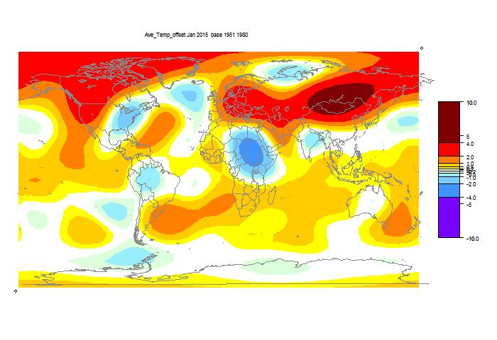
GISS showed a small rise. TempLS mesh dropped slightly from 0.66C to 0.64C. TempLS grid also dropped, from 0.65C to 0.63C. Based on this, I would expect a small drop in NOAA and HADCRUT. But maybe not. Both satellite indices rose - RSS significantly, from 0.28C to 0.37C. Since the recent warming seems to be SST driven, this lag makes sense. Maps are below. TempLS is continually reported here.

Slightly O/T, but there has been a recent spike in February, according to the NCEP/NCAR index. It has now pulled back a bit.


Here is the GISS map:


Warm in Western N America, esp NW, cold in East (a common pattern lately). Warm in NE Europe and Siberia.

Here is the TempLS grid map:


It shows similar features, with more warmth in Mongolia, and a cooler spot in Africa.

And here is the similar TempLS mesh plot:


Thursday, February 12, 2015

Adjusting in the finance world

There has been much talk recently about homogeneity adjustments. Some in the mainstream madia, and none that made much sense. It's one of the most extraordinary scandals of our time. Maybe even criminal:

"Is history malleable? Can temperature data of the past be molded to fit a purpose? It certainly seems to be the case here, where the temperature for July 1936 reported ... changes with the moment," Watts told FoxNews.com.

"In the business and trading world, people go to jail for such manipulations of data."


So I thought I'd see what does go on in the trading world. I originally commented on this at Paul Homewood's site. I looked up the chart for BHP's share price on our national exchange, ASX. Scrolling down, I read:

"Adjustments - The charts are adjusted to smooth out the effect of bonus issues, rights issues, special dividends, share splits, consolidations, capital reductions, or to link historical values that represent the company's primary equity security. The chart also assumes that all company issued options and convertible securities are converted into ordinary shares."

In other words, not the historic prices at all. And ASX won't show you a chart of the "raw data". One complaint about GHCN adjustments is that they are constantly changing the past. But see what happens here. As with climate, present adjusted values are held equal to present market price. So what happens when BHP issues such a dividend? Its price drops by about the amount of the dividend. ASX adjusts all past prices down, to "smooth" the drop.


So are they changing the trend? Yes, definitely. Dividends, share splits etc almost always lower the share price. So past adjustments are almost always down. BHP's actual share price did not rise nearly as much as shown (well, OK, declined by more, lately).

You may say, well, a dividend is a known amount (though since BHP dividends are fully franked, the drop may be modified by the tax benefits). So let's look at another case - Bluescope Steel. They say:

"To enhance comparability, and consistent with market practice, actual share prices have been adjusted to reflect the 1 for 6 consolidation of December 2012 and the deemed 'bonus component' of the BlueScope Steel Entitlement Offers of 2009 and 2011. (An adjustment factor of 0.8470 has been applied to share prices prior to 22 November 2011 in respect of the 2011 Entitlement Offer, and a further adjustment factor of 0.8016 has been applied to share prices prior to 7 May 2009 in respect of the 2009 Entitlement Offer)."

That is rather more specific, and the numbers quoted are estimates, with no explained basis.

I haven't heard anyone threatened with jail for this very public malleability of history. Of course, they are done for the same reasons as temperature adjustments. If you want to know how the company (or the market) is faring, then you do not want to know about the predictable response to dividends, share splits etc. It is absolutely right to take them out. As it is with the inhomogeneities in the temperature record.