Wednesday, February 11, 2015

Surface temperature global average is robust to noise

There has been a lot of argument about GHCN adjustments. Fiddly stuff like whether a certain step introduced in Reykjavik in 1963 was justified. None of this has any significance for a global average. Steve Mosher of BEST is constantly reminding that there is actually a huge amount of data in the average, and there is no point in focussing on the very local scale.

That is a point I was emphasising in this post on homogenisation. The average is little affected by unbiased noise (cancellation), but sensitive to bias. So it makes sense to identify and eliminate bias, even if it increases noise. Homogenise.

There is another common naysayer claim, that averages are not more accurate than the original readings, as in this WUWT thread. I don't know what they think drug companies etc go to great expense to get a large set of responses to average.

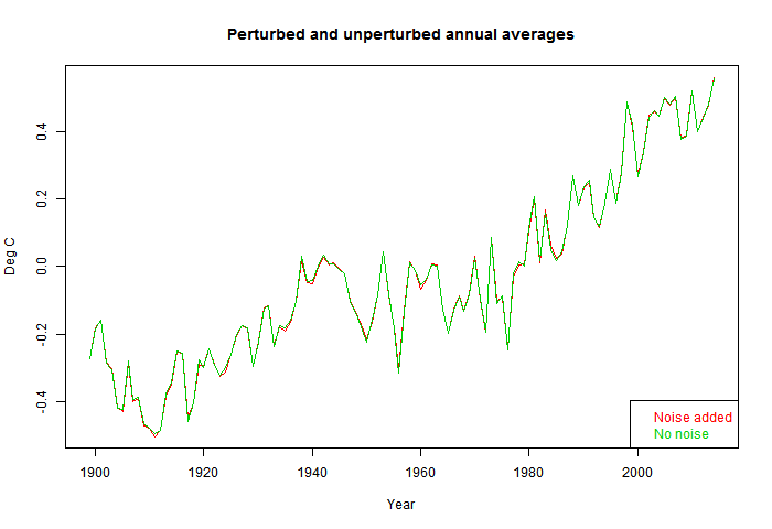
Anyway, in this post I'll give a dramatic demonstration of the noise suppression of averaging. I'll take the usual post-1900 monthly GHCN and ERSST data and let TempLS calculate an annual average. Then I'll add Gaussian noise to every single monthly average. Big noise - amplitude (sd) 1 °C. That's a world in which thermometers can barely be read to the nearest degree. In fact much worse, since monthly averaging already reduces noise. Then I'll recompute and show the differences in various ways. I'll do 10 instances.

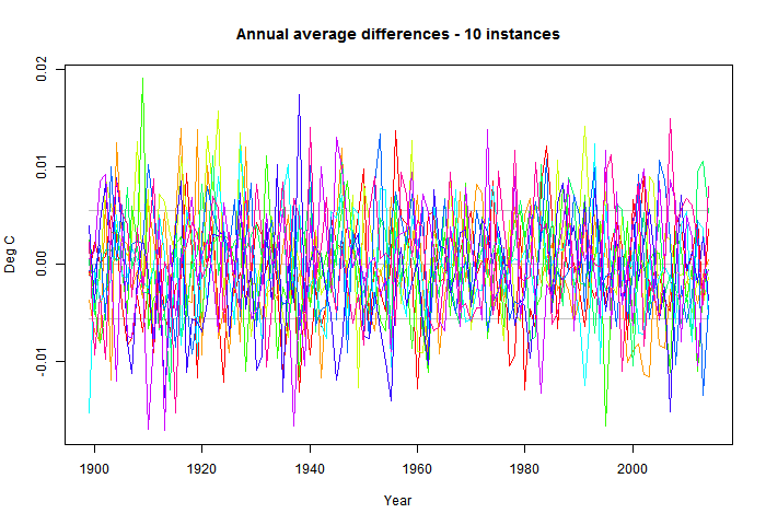
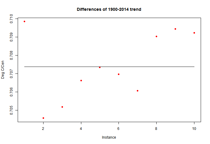
As you'll guess, the difference is small. The standard deviation of fluctuations about the unperturbed is about 0.006 °C. The effect on trend is even smaller. The unperturbed trend 1900-2014 is 0.7073 °C/Century and the range is about 0.705 to 0.710.

I should emphasise that this perturbation operates on what might be taken to be measurement error, and does not emulate that quoted by NASA, NOAA etc, which is dominated by spatial sampling error. It also assumes white (ie independent) noise; dependence will increase the effect. But from a very low base.

So here is the plot of time series of a single perturbation (red) against unperturbed. The change is barely visible. 1°C unbiased noise added to the individual monthly averages makes scarcely any difference.


So I'll plot the differences over time. This time I'll show the 10 instances - the signal is effectively random. The horizontal lines show the mean and 1 sd range. Note the y-axis scale.


Finally I'll show a plot of 1900-2014 trends. As mentioned, the unperturbed is 0.7073 and the range about +-0.0025; about 0.4%.


Monday, February 9, 2015

Breakdown of effects of GHCN adjustments.

In a previous post, I showed how running TempLS with unadjusted or adjusted GHCN station data made a small difference to the final global average. That is useful to know, because some say that AGW is a creature of GHCN adjustments. This is certainly not true.

That analysis can be extended. I can trace the contribution to this small adjustment effect from various categories of stations - by continent, rural status, or airport status. And as before, it shows the difference by year, or effect on trend (to present time) by year.

A useful addition to the present post will be some trends calculated for land only in a NOAA paper by Lawrimore et al, 2011, Table 4 (h/t Victor Venema):

v3 Uncorr v3 Corr
1880–20100.61°C/Century0.79°C/Century
1901–20100.70°C/Century0.91°C/Century
1951–20100.16°C/Decade0.18°C/Decade
1981–20100.27°C/Decade0.27°C/Decade

Note the change of units (in the original). I got an approx land only difference of 0.17°C/Cen for 1900-2014 by dividing the global value by the land area fraction. That was pretty rough; the value in this post is more accurate, and agrees well.

In this post, I'll start with the usual active plot - see here for guidance. I've added a new "Norm" button. This allows you to toggle to a mode where the average adjustment for each category is calculated. The initial mode gives the contribution of that category to the global average. I think that is most useful, as it is area weighted. The category average can show high average adjustments for relatively rare stations. I'm using TempLS mesh exclusively; the grid style allows too much mixing between categories.

As usual with the active graph, you can select the set to show, move and zoom the graph, and show the numerical data. Then I'll show some ordinary graphs comparing the categories.

Here is the active plot. You can click on Trendback to togle a mode that shows trends to present, and on Data to pop up the numbers you see on screen.

Global with urban/rural breakdown

Here is the plot. All have a slight smoothing over 3 years. Note that all these plots can be generated on the zoomable active plotter, along with the associated trend graphs.


So you can see that the total global contribution is negative to about 1970, then positive. This has the effect that the contribution to trends from about 1960 onward is actually cooling. These are the trends that are vigorously debated as possible evidence of AGW. They are not enhanced by adjustment - on the contrary.

Before 1970 the adjustments "cool the past", by up to 0.05°C. However, on a land basis, that is up to 0.2°C. That is representative of the maximum average adjustment.

A virtue of the left style is that it is additive. So urban adjustments make up the larger part, but not by all that much.

There is an interesting sharp rise to about 1975, and then a decade plateau. We'll see more of it. It seems here associated with rural. My theory is that it is an airport effect, and may be associated with the move of some rural classified stations to airports.

There is also a WW2 effect, principally associated with Mixed (between rural and urban). Again I think it may have been connected with the moving of civilian stations to military airports, and maybe back again.

Breakdown by airport status


Here both of those features are markedly associated with airport status (hence my theory). Despite what you sometimes hear, adjustments to airports are a relatively minor net contributor. Note that the GHCN inventory ratings that I use refer to current conditions. Many "airports" have century plus records; they obviously weren't always airports. Some adjustments probably relate to the time when the station was originally transferred to the airport.

Breakdown by continent


Well, as you might expect from recent fusses, South America has the most negative adjustments. Africa is mostly positive. Less adjusted are Europe and Oceania (BoM and NIWA take a bow!).

Special cases


Finally, I'll show CONUS (continental US) and the Arctic. There has been a lot of fuss in recent times. The Arctic adjustments have been passionately excoriated by Booker of the Telegraph.


Well, as you'll see, the Arctic has made very little contribution to the global average, and it is quite flat. On the right, the average adjustment is also quite low (and again flat in trend).

CONUS, on the other hand, has the highest average adjustments (also noted here). That is mainly TOBS. Because CONUS is a smallish fraction of total land, the effect overall is modest, and also not so strong in trend. As previously noted, the adjustments reach a minimum in the 1930's.


Sunday, February 8, 2015

Hadley Cells and Carnot Heat Engine

I've been commenting on a thread at ATTP called "Atmospheric Heat Engines". It's about a paper by Laliberte et al which appeared recently in Science. There is an article about it in the Smithsonian.

The eye-catching thesis is that in a warming climate, the heat engine that drives the poleward circulation, typified by the Hadley Cell, will work with decreased efficiency, because water vapor will not work as well as a working fluid. Their abstract says:
Incoming and outgoing solar radiation couple with heat exchange at Earth’s surface to drive weather patterns that redistribute heat and moisture around the globe, creating an atmospheric heat engine. Here, we investigate the engine’s work output using thermodynamic diagrams computed from reanalyzed observations and from a climate model simulation with anthropogenic forcing.We show that the work output is always less than that of an equivalent Carnot cycle and that it is constrained by the power necessary to maintain the hydrological cycle. In the climate simulation, the hydrological cycle increases more rapidly than the equivalent Carnot cycle. We conclude that the intensification of the hydrological cycle in warmer climates might limit the heat engine’s ability to generate work.


I think there are some global constraints here, as I said in a comment at ATTP. It's something I've written about here over the years, here, here, and here. Overall, I'm uncertain. I've read the paper, and will continue to try to understand it. But meanwhile, I will give my understanding of Carnot cycles, how Hadley cells emulate one, and what role water vapor plays.

The Carnot Cycle

Wiki shows this schematic. You could think of a piston like a coffee plunger, with two plates - source hot, sink cold. With the air initially hot, you place it on the hot plate which is at the same temp. It expands and does work, which staying at the constant temperature of the source. After a while, you take it off the plate. It continues expanding and doing work but now cooling. When it cools to the temp of the sink, you put it on that plate, and now start compressing. During this stage, the entropy that was admitted at the source stage is emitted. When it has gone you withdraw, but keep compressing adiabatically until it warms to the temperature of the source. Repeat...


More formal is this P-V (pressure-volume) diagram from Wiki. The description is here. I'd like to pick up some points.

We need the concepts of:
  • Internal energy U. For an ideal gas thus is just cv N T, where N is mass according to the units of cv
  • Enthalpy H = U + PV
You can see how the engine does work from the P-V graph. Work is PdV, and while the volume change is the same in expansion and compression, expansion happens at higher pressure. Note that a reserve of mechanical energy is needed. You have to do work to get work.


The heat gained from the source adds directly to the enthalpy. In the first step (1->2), U is constant, so the enthalpy change goes entirely into PV work. In the second, enthalpy doesn't change (adiabatic), so the work done just comes from the change in U. That is the same change in the fourth adiabatic compression stage, so they do no net work. The net work is done by the excess of the first stage over the third.

Hadley Cell

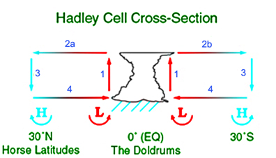
The Hadley cell is an eddy where warm air rises in the tropics (ITCZ), travels at high altitude supplying heat to support TOA IR emission, then descends in mid-latitudes (subtropical ridge) and returns via the surface trade winds. There are Coriolis effects, but the main heat engine effects can be considered without them.

The subtropical ridge is a region of high pressure, so the mass of air there is high. Where the cell rises, (ITCZ), the surface pressure is lower, so the mass of air is less. However, it is warmer, so the center of mass is actually higher.

To think of it as a Carnot cycle, the first thing needed is the reservoir of mechanical energy. Kinetic energy plays some role, but the main one is hydrostatics. The bouyant rise in the tropics carries the air to a high altitude, whence it travels gradually downhill to the descent phase. The potential energy gained carries it through the cooling phase. It is bouyancy that keeps the low pressure at the equaqtor, and negative bouyancy that pushes air into the pressure maximum at the subtropical ridge. The resulting pressure gradient drives the trade wind stage.

So next to the Carnot analogy, thinking first of a dry circulation. I've identified four stages. The heat source is the surface, so the step 1, where the working fluid picks up heat, is far from isothermal. The fluid gains internal energy, while still expanding. The expansion contributes by facilitating the gravitational gradient at high altitude.

The (adiabatic, approx) rise stage is enhanced by the internal energy thus gained. The expansion does work to maintain a slightly reduced hydrostatic pressure gradient, in turn maintaining the surface low pressure and the pressure gradient that drives the trades.

In the third, high altitude stage, heat is lost to the sink (space) by radiation. In the Carnot cycle, mechanical compression maintained the temperature. Here the gradual loss of altitude has the same effect. Potential energy is the reservoir.

In the final stage, the cold air compresses and warms. But it was dense air with relatively less far to descend, so the negative bouyancy allows to to recharge the high pressure zone at the subtropical ridge, keeping up the other end of the surface pressure gradient that drives the trade winds.
   Diagrams from Wikipedia


Effect of water vapor

That was a dry Hadley Cell. It's generally reckoned that evaporation and latent heat (LH) are powerful extra drivers. This is partly because wv is bouyant, but also because LH increases the heat carrying capacity of the air.

LH, if you count it as internal energy, is transferred to the air in addition to sensible heat at the trade wind stage, more especially at the later, warmer stage. But the necessary evaporation takes heat from something. Partly sea water, partly air. The cooled air may be further heated by the air-sea temp differential thus created, but still, there is probably less sensible heat taken up than in the dry case.

As I understand it, Lalibertie et al are saying that in fact you can't count the latent heat until it does actually condense. And as global warming proceeds, LH is a greater proportion of internal energy, and this is a limitation.

But obviously water vapor does condense somewhere along the cycle. And most of it will have done so before the end of the bouyant rise. In doing so, it warms (or slows cooling) of the rising air, and allows it to rise to a greater height than it otherwise would have. Or put another way, it helps maintain the surface low pressure, and thus the surface pressure gradient that drives the trade winds. So the fact that the condensation occurs later does not diminish the work available to the cycle.

Conclusions

Well, none. This is a blog, and these are tentative thoughts. What do you all think? Me, I'll read the paper again.


Friday, February 6, 2015

Why homogenise data?

I've been writing a lot lately (eg here and here) about homogenisation. The main message is that adjustment has relatively small effects and is not, as some say, the arithmetic basis of AGW. But sometimes the answer is, well, if it has little effect, why do it? So I thought to make some general remarks on homogenisation and adjustment.

Firstly, some common mis-characterisations. It isn't "altering the record". The true record sits with the national met offices, but organisations like NOAA have online unadjusted records, which are as accessible as the adjusted.

Secondly, records aren't adjusted in the belief that thermometers were read incorrectly. They are usually adjusted specifically for the calculation of a regional average. Station records are used as representative of a region. When something happens that is not climate-based, then it isn't representative of the region.

Let's look at a specific case. In 1928, the station for Wellington, NZ, was moved from Thorndon, at sea level, to Kelburn, at about 100m altitude. The temperature dropped by nearly 1°C, and the NOAA algorithm picked this up and reduced the pre-1928 readings.

Now the Thorndon readings aren't "wrong". What is wrong is the 1°C drop. There is no reason to believe that the region experienced that. So the adjustment is to make the record consistent ("homogeneous"). The convention is to leave the present unchanged and adjust the past. It doesn't matter which.

Averaging

There is a lot of pixels wasted on some alleged mis-adjustment of some individual stations. That misses the big picture. When you calculate a global annual average, you take over a million readings to get a single number. The averaging drastically reduces the noise. White noise would reduce by a factor of 1000. There are various dependences, but still, the reduction is huge. Noise isn't much of a problem. What is a problem is bias. That doesn't reduce.

But there is a counter to bias too - the use of anomalies. Consistent bias goes out with the mean. So the remaining problem is inconsistent bias. Inhomogenieties.

We saw this with TOBS in the US. There is a bias depending on which time of day you read. And there is no "correct" time. The bias doesn't matter unless the time of observation changes. And still, for trend, that wouldn't matter unless there was a bias in the direction of changes. Otherwise they would cancel. But there is a bias. In the US, volunteers used to ne enjoined to observe in late afternoon. That weakened, and morning obs became popular. That created a cooling bias.

Correction introduces noise

So NOAA and others try to recognise inhomogenieties and correct them. Sometimes that goes wrong. A real change is wrongly corrected. Or a real but temporary change gets corrected but by a wrong amount, or not fixed when the cause goes away.

But this comes back to the tradeoff between noise and bias. Correcting bias is important. If you create noise in the process, that may be acceptable. And a fixed algorithm can be tested with synthetic data to see if it introduces bias.

Resisting ad-hoccery.

Most of the fusses about adjustment are totally spurious. "Look, they are altering the record! data must not be touched!". But sometimes a definite error shows up. There may have been one at Reykjavik. Part of a temperature dip was wrongly considered an inhomogeneity. So should it be fixed?

No! As noted above, a good algorithm has been tested for lack of bias. If you start intervening, it loses that property. Noise won't hurt the average, but taking out the bits that displease naysayers certainly will.

So does it matter?

In TempLS, I use unadjusted data. I satisfied myself a while ago that there was little difference in outcome. But I could only do that because someone had identified and corrected the inhomogeneities, to give me something to check against. And it may just be good luck that this time the inhomogeneities cancelled.

Naysayers bang the drum about adjustments. But if none were done, then I bet we'd be hearing stories about how some station was moved, and ignored, so now the record is unreliable.

Appendix

Beset by people who couldn't shed the idea that data should only be adjusted if fault is proved, I gave this analogy. Here is a table of BHP share prices. Note the final column - price adjusted for dividends and splits. It's not that the old prices were defective; it's just that dividends and splits do not alter the productivity of the company, or to what you get in total from your shareholding. If you want to make historic sense of the raw prices, you have to keep making allowances. But the adjusted prices give a continuous picture of what a holding is worth.
If you were compiling a stock index (eg Dow, cf GISS) that is what you would use.


Thursday, February 5, 2015

Homogenisation makes little difference to global average

There has been much blog chatter (reviewed here) recently about homogenisation of temperature, and adjustment in general. A few individual stations have been picked out and pored over. But homogenisation is a general effort to reduce bias prior to computing a global average, and the logical place to look for its effect is in that average.

This was something some bloggers were interested in doing back in 2010. Zeke writes on that here. His own investigation was mainly US. At that time, I started the TempLS code, and I've been using it for monthly reporting for over three years. It uses by default unadjusted GHCN land data, with ERSST for ocean. There general experience, noted back in 2010, was that it made little difference. TempLS compares well with the major indices.

In this post, I'll try to quantify that more, using the current improved graphics. I can compare directly the variants of TempLS with and without adjustment, with an active map below. The results are a little surprising, but the end effect is still small. A typical result is for TempLS mesh, where the trend 1910-2014 is 0.711°C/Cen, or 0.759°C/Cen after adjustment. But that is actually a high point of adjustment effect, and over more recent periods, adjustment actually has a cooling effect. Claims that AGW is a creature of adjustments are way off.

My previous post reviewed the analysis of station trends. They tend to be dominated by relatively short periods, even with a cut-off. It is fairly easy for a short term to produce a high trend, but it's the longer terms that contribute most to the average.
Update. I should mention a 2012 benchmarking paper by Victor Venema and many others.

The map below is a variant of the one on the latest data page. I've restricted it to global surface measures, and included the adjusted TempLS, marked as TLS_m_a (mesh) and TLS_g_a (grid). The clearest showing of the effect is with "trendback" mode. This shows the trend from arbitrary start year to present. Start year is shown on the x-axis. I've set it up showing the TempLS mesh unadjusted and adjusted, but you can make other choices. The grid comparison is interesting. For any graph, you can press on Data and it will show a new tab with the numbers. The Trendback button toggles between Trendback and timeseries modes (common anomaly base 1981-2010). Operation details are here.


Looking just at the TempLS mesh curves, from about 1960 back to 1900, the adjusted trend is higher. That is the "cooling the past", but it isn't much. Max about 0.04°C/Cen. After about 1970, the unadjusted trend is higher. If you switch to timeseries most (click Trendback), it seems that adjustment has relatively cooled the global temp in just the last few years, which affects the short term trends. But again, it isn't much. It looks a lot in trend, but short term trends are volatile. The grid version of TempLS doesn't really show this. It could be an Arctic effect.

Another way of looking at it is that the difference between adjusted and unadjusted is about the same as that between GISS and HADCRUT.

Remember that you can drag the plot, change the scale etc. Also, of course, change datasets, regress and smooth.


Tuesday, February 3, 2015

Google Maps App showing GHCN adjustments.

Updated version here

 The current blog fuss seems to be about GHCN adjustments in Paraguay (see here, here, here). These things are mechanically contrived. There have been for a long time published a GHCN file of unadjusted monthly averages, and a file of homogenised data for calculating spatial averages. Anyone, when the mood takes them, can go through and find in the 7280 GHCN stations, some that have been adjusted upwards. This seems to happen about annually. Three yeasr ago, it was Iceland.

Then, I reran an analysis from V2 (Darwin, Dec 2009, it's a winter thing in the dark NH). It's here (Feb 2012), with an update here. It showed a histogram of the effect of adjustments on trends. It's a scatter (with a peak where zero adjustment occurred), with some positive and some negative. There is a modest positive bias, in the range 0.2-0.3 °C/Cen.

Part of the bias is due to TOBS, which is an absolutely justified adjustment. My analysis was based on simple averages, so the 1218 US stations have a disproportionate effect. So I did a revised analysis, showing that indeed the bias in US was higher, and elsewhere lower, though not zero.

Anyway, for the 2012 analysis, I included a Google Maps app which allowed the user to show stations with the usual GM facilities, and to select subsets with adjustment effects in various ranges (and other criteria). It allowed only trends of more than 60 years. I think that was a prudent choice, but it doesn't give much in S America. So I've done another version with trends of more than thirty years.

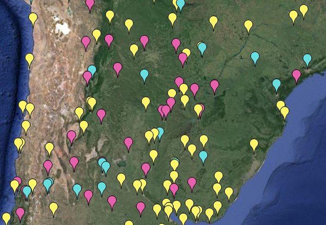
The GM app is below (may take a few secs to load). You can go to the 2012 link (with worked examples) or other apps for details, and also below the map. I'll also show below a screenshot of the 30-year trends (+ pink or - cyan) near Paraguay.


Here is what the app can show for the Paraguay region. Pink markers are GHCN stations which get a warmer trend (30+ years) after adjustment. Cyan stations get cooler. Yellow stations either don't have a trend change or don't have 30 years eligible data.


Details

The Google Maps facilities are available, and you can select and color various groups of stations. The pattern is that you make choices, press the radio button to prime them, and then press one of the top color buttons - your chosen subgroup will be recolored according to the button you press. They combine with or logic, so it is better at first to make sure only one radio button is pressed at a time (they toggle). I've marked with gold fringes the buttons relevant to this topic. You can choose a range of large pos or neg trends and color them. You'll probably find it clearer if you first set everything to invisible.

Principles of operation

  • There are a number of selectors. Each has a left button. The selector is live if the button is checked. The second buttons are toggles; the third is generally for numbers you can enter.
  • There are five colors at the top (incl invisible). If you press any one, stations satisfying the selectors will change to that color.
  • Simplest to have one live selector at a time. If more, they combine with or logic. A station satisfying any one of them will change.
  • The movie stuff is not relevant here - I'll take it out.


Tuesday, January 27, 2015

Echo Chamber at Climate Audit

I have been posting comments at Climate Audit for about eight years. They have generally been at odds with the prevailing thinking there, but have been, I think, fact-based, referenced, on topic and polite. And they have generally appeared, and attracted a vigorous response.

Recently there have been difficulties. I mentioned here back in September a problem that was affecting me at all Wordpress blogs. That was basically due to Akismet and has now gone away. This one is new.

At some stage during this thread, all my comments started going into moderation. At CA that is a semi-ban; moderation can take a day, and it is impossible to engage in any sort of dialogue. But then they started not to emerge at all.

Steve edits firmly at times, in ways that I don't object to. But it's usually transparent. What I do find objectionable is that recent threads have often been quite erroneous, and correction strongly resisted, and now suppressed.

A recent example of error was this, accusing Sven Teske of being a leader of the Nazca vandalism, based on a post of Shub Niggurath. In fact Shub hadn't said that, and clarified his comment. There was no other evidence, but although this was pointed out early (not first by me) there was no response or correction.

I'm writing now about his latest post. It is headed "Important New North American East Coast Proxy Data", and introduces the results of Sicre et al on alkenone analyses off Newfoundland. It suggests that they undermine the results of Marcott et al: "Obviously the Sicre 2014 results provide further evidence against Marcott’s supposed early-20th century blade. At the time, I pointed out that the Marcott blade does not exist in the data and is entirely an artifact of incorrect data handling. To borrow a term from Mark Steyn, the Marcott blade was f……..flawed. It is reprehensible that Marcott and coauthors have failed to issue a corrigendum."

And darkly suggests that they are quietened by the consensus: " Unsurprisingly, the new data was not press released and has thus far attracted no attention."

Well, I read all this and noticed that there were no quotes or references to what the paper actually said. It was based on the archived data and the notes with it. I wondered whether SM had read the paper, which was paywalled. None of the comments seemed to refer to it either.

So I read it, and it seemed to tell a quite different story. The focus of the authors is on the movement of the Labrador Current, which is very cold, and here not so far from the North Atlantic current (Gulf Stream, warm). They spend a lot of time talking about how the LC depends on strength of the NW winds, and may go quite differently to NH SST. The abstract says:
The ice-loaded Labrador Current (LC) is an important component of the western North Atlantic circulation that influences the position and strength of the northern limb of the North Atlantic Current (NAC). This flow of cold and fresh Polar Waters originating from the Arctic has a marked impact on the North Atlantic climate, yet little is known about its variability beyond the instrumental period. In this study, we present the first sub-decadal alkenone-based 2000-year long sea-surface temperature (SST) records from the western Labrador Sea, a climatically crucial region at the boundary between the LC and the NAC. Our results show a clear link between the LC strength and the Northern Annular Mode (NAM), with a stronger NAM and a more vigorous LC during the Medieval Climate Anomaly (MCA). This suggests enhanced LC activity upon future global warming with implications for the Atlantic meridional overturning circulation (AMOC).

So I commented. That comment, "Posted Jan 22, 2015 at 8:51 PM", stayed in moderation for a while, so I thought I would try something that seemed to work earlier, and submitted another version ("Posted Jan 23, 2015 at 1:26 AM") with my name slightly varied, and with a figure. Some time later those both appeared, with a response to the first.

It said, inter alia,
"I presume that you agree that the alkenone SST data indicates substantially warmer mid-Holocene East Coast temperatures than 20th century temperatures. Again, if you wish to argue that this is an expected theoretical outcome and provide references to authors who previously advocated this position"

Odd. I wasn't referring to that at all. Neither were Sicre et al; their results cover just 2000 years. It's in their title. And I was just quoting what they say. So I responded here. This went into moderation, but appeared quite soon. The response:
"Nor is Stokes’ theory of a cold MWP in Labrador consistent with other information discussed here"

Well, it's not my theory. It's Sicre et al, and I had showed their Fig 6. But by now, I was fairly convinced that Steve hadn't read the paper, so I asked:
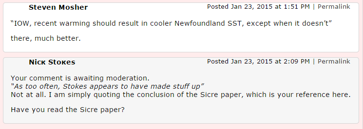


That is still in moderation, three days later. Meanwhile, there was a little further commentary, based on a claim that SST in Placentia bay had not gone down. I had pretty much given up at that stage, but one query by R Graf  (above the one shown) seemed addressed to me so I sought to respond:
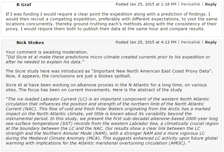


Still in moderation. So I had pretty much lost interest, when I saw that Steve McIntyre had, four days after my first comment, come up with a substantial response. It seems he has finally read the paper. But not allowed my earlier comments.

I'll respond a little here. He says
"Stokes says that Sicre et al “chose sites that are very sensitive to movements in the Labrador Current”. This is either an error or a fabrication in respect to the Placentia Bay site, used in the main comparison with Sachs et al 2007 Laurentian Fan site.
...
Sicre et al explicitly stated that the “SE site” (Placentia Bay) was in the “boundary zone between the Labrador Current and the Gulf Stream”. "

Exactly. The boundary zone is very sensitive to movements.


"Stokes asserts that Sicre et al 2014 postulated an “antiphase” relationship between the NE Bonavista Bay site (in the Labrador Current) and offshore Iceland.
...
There is no observable “antiphase” relationship between the Placentia Bay site and MD99-2275."

Yes. But this data is presented as a contradiction the the Marcott claim that temperatures rose in modern times. Whether antiphase or neutral, it does not provide that contradiction.

Update 11.22AM 27/01 Well, well. I see that my second comment there has now appeared, with a response. The screenshot I showed was timestamped 9.52 AM 27/01, both Melbourne time. The response basically argues that you can like the data without liking what the authors say about it.