The current blog fuss seems to be about GHCN adjustments in Paraguay (see here, here, here). These things are mechanically contrived. There have been for a long time published a GHCN file of unadjusted monthly averages, and a file of homogenised data for calculating spatial averages. Anyone, when the mood takes them, can go through and find in the 7280 GHCN stations, some that have been adjusted upwards. This seems to happen about annually. Three yeasr ago, it was Iceland.
Then, I reran an analysis from V2 (Darwin, Dec 2009, it's a winter thing in the dark NH). It's here (Feb 2012), with an update here. It showed a histogram of the effect of adjustments on trends. It's a scatter (with a peak where zero adjustment occurred), with some positive and some negative. There is a modest positive bias, in the range 0.2-0.3 °C/Cen.
Part of the bias is due to TOBS, which is an absolutely justified adjustment. My analysis was based on simple averages, so the 1218 US stations have a disproportionate effect. So I did a revised analysis, showing that indeed the bias in US was higher, and elsewhere lower, though not zero.
Anyway, for the 2012 analysis, I included a Google Maps app which allowed the user to show stations with the usual GM facilities, and to select subsets with adjustment effects in various ranges (and other criteria). It allowed only trends of more than 60 years. I think that was a prudent choice, but it doesn't give much in S America. So I've done another version with trends of more than thirty years.
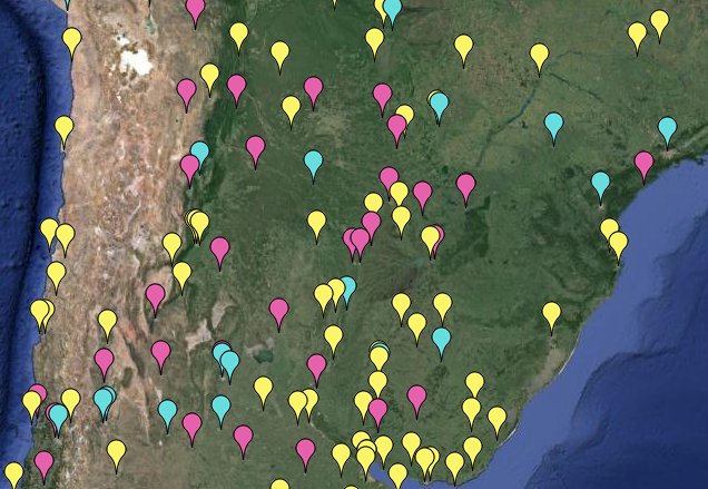
The GM app is below (may take a few secs to load). You can go to the 2012 link (with worked examples) or other apps for details, and also below the map. I'll also show below a screenshot of the 30-year trends (+ pink or - cyan) near Paraguay.


Here is what the app can show for the Paraguay region. Pink markers are GHCN stations which get a warmer trend (30+ years) after adjustment. Cyan stations get cooler. Yellow stations either don't have a trend change or don't have 30 years eligible data.

Details
The Google Maps facilities are available, and you can select and color various groups of stations. The pattern is that you make choices, press the radio button to prime them, and then press one of the top color buttons - your chosen subgroup will be recolored according to the button you press. They combine with or logic, so it is better at first to make sure only one radio button is pressed at a time (they toggle). I've marked with gold fringes the buttons relevant to this topic. You can choose a range of large pos or neg trends and color them. You'll probably find it clearer if you first set everything to invisible.Principles of operation
- There are a number of selectors. Each has a left button. The selector is live if the button is checked. The second buttons are toggles; the third is generally for numbers you can enter.
- There are five colors at the top (incl invisible). If you press any one, stations satisfying the selectors will change to that color.
- Simplest to have one live selector at a time. If more, they combine with or logic. A station satisfying any one of them will change.
- The movie stuff is not relevant here - I'll take it out.


How does one use this 'app'? I can't make sense of it from your post.
ReplyDeleteShub,
DeleteTo make the picture shown I:
1. went to the line marked in gold - trend adjustment, and clicked the left button.
2. Then to the right square, and change 1000 to 0
3. Then click cyan above. That makes all stations where adjustment had cooling effect turn cyan
4. Back to the gold, click the middle button. It changes to >. Now click pink, next to cyan. Warming stations go pink.
5. If I want to restrict to longer periods, I can go to Duration. Click the left button, and unset the corresponding trend button. Then click invisible (among the colors). Only stations with >50 years remain. Of course, you can change 50. Also with the trends, you can ask for >1 C/cen, say.
You can use all the Google Maps controls at any time to zoom, drag etc.
ps you can click on any marker to bring up the metadata
Delete