Sceptics complain a lot about adjustments made in indexing temperatures. Rarer is an acknowledgement of the argument for the adjustments. The fact is that if an adjustment is appropriate, then it is required. It's not optional.
This post will set out the quantitative basis for one of the
larger adjustments to USHCN, a frequent object of this complaint. This is TOBS, the time of observation. It arises because USHCN gets its data from a wide variety of observers, many voluntary. The time at which min/max thermometers are read and reset is recommended but not mandated, but is on record. For many stations it has changed, and this matters.
In this post I take a USCRN station, Boulder, Colorado, with hourly data from 2009-2011. I calculate the effect of varying the notional reading time of a min/max thermometer. There is a positive bias of about 1.3°F if it is read in mid-afternoon, tapering to nearly nil around midnight. There is potentially a cooling bias in the morning, though for this site it was small.
But firstly, a discussion of why temperature measurement is relevant to the climate debate, and what kind of measure should be used.
The role of temperature measurement
The climate debate is about potential global warming caused by the addition of carbon dioxide and other greenhouse gases to the atmosphere. Sometimes the impression is created that the basis for worry is in fact the observation of rising temperatures, and if doubt can be cast on this observation, the worry goes away.
This is not true. The case for AGW is now, and always has been, based on the physics of the greenhouse effect. Addition of GHG's to the atmosphere leads to warming. The amount of warming (climate sensitivity) is not perfectly known, but there are reasonable estimates.
GHG's have increased, so a rise in temperature should be discernible. If there were none, then AGW would be in doubt. That is why a study of historical measurements is important. But history shows that temperatures have risen. There are of course uncertainties about all measurements, and there are short-trerm fluctuations which can obscure trends. But the rise is
consistent with AGW. It is not the proof of AGW.
Measuring daily temperatureEvery now and then a post like this appears, in which someone discovers that the measure of daily temperature commonly used (Tmax+Tmin)/2 is not exactly what you'd get from integrating the temperature over time. It's not. But so what? They are both just measures, and you can estimate trends with them.
The reason (Tmax+Tmin)/2 is used is that a very long history is available. In pre-electronic days, observers used min-max thermometers like the one on the right. The pins are pushed up as the mercury rises, and do not descend until reset. Note that the minimum scale is reversed. Typically, once a day the position of the pins is read and the pins are moved (eg with magnet) back to sit on the current position of the mercury. The reading gives the max and min of the previous day, but the time when they occurred is not shown. Typically an observer would record the location of the pins and the temperature at the time of reading.
Regular hourly readings are only widely available since the introduction of MMTS a couple of decades ago.
Note that with the minmax thermometer, if you reset the max when the temperature is falling, it may happen that the temperature may not return to that level for the whole next day. In that case, the next max you read will be the value that you set it to. This is, as I'll show, why time of observation matters. | 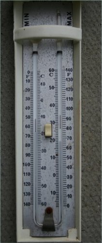 |
USHCN Adjustments
Discussions of
USHCN adjustments often refer to this plot:

Note that is is V1, and so out of date, but it does show the TOBS effect.
This paper of Vose et al has more details, and describes the underlying cause thus:
[3] The majority of weather stations in the U.S. Cooperative Observing Network (and therefore in HCN) are staffed by volunteers. Consequently, the network has no mandatory time at which daily measurements must be taken. Most individuals prefer observing times other than midnight, resulting in an observation day that differs from the standard calendar day. For example, at a station where the volunteer reads the thermometers at 0800 LST, the observation day extends from 0800 LST the previous day to 0800 LST on the current day. At a station where the volunteer reads the thermometers at 1700 LST, the observation day starts and ends 9 hours later. Nevertheless, the observations at both stations are recorded for the same calendar day.
[4] When the observation day differs from the calendar day, a ‘‘carry over’’ bias of up to 2.0°C is introduced into monthly mean temperatures. This bias occurs when atmospheric conditions cause a temperature from one day to be ascribed to the following day. For instance, suppose an observer reads the maximum and minimum thermometers at 1700 LST on April 1, then a cold front passes through the area overnight. If the temperature on April 2 never exceeds the value at 1700 LST on April 1 (when the thermometers were last reset), then the recorded maximum will actually be the temperature at 1700 LST on April 1. This temperature will be higher than if the 24-hour measurement ended at midnight, and because the monthly mean is computed by averaging the daily maximums and minimums, the mean for April will likewise be artificially high. In general, this carryover phenomenon results in a warm bias for observation days ending in the afternoon and a cool bias for those ending in the morning.
Station observations - Boulder Colorado
As mentioned, I was looking around for a station with a good set of hourly readings for some years, with few missing values. I first looked at Washington, DC, but there were lots of gaps. So I thought the USCRN station at Boulder was promising, and indeed it had 2009-2011 with only 38 missing hours (which I interpolated). To simplify, I used MST (Mountain Standard Time) only, no daylight saving. All temperatures are in Fahrenheit.
Diurnal pattern
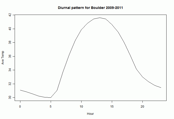
The diurnal pattern varies through the year. But here is a graph of the hourly averages (°F) for all of those three years. As expected there is an afternoon maximum and a minimum in the early morning.
Time of observation effect
This is simulated, supposing that we took the max and min of 24-hour blocks. Often the max measured is the afternoon max of each day, and the min is the early morning min. Then the time of observation doesn't matter.
But sometimes the reset value is not reached again in the next 24 hours. Then the "max" recorded is not a real max - it reflects the warmth of the previous 24-hr period, rather than the cold of the next. So it is a warm bias. If the same thing happens with the min, it is a cold bias.
The following tableau shows the frequency of times of max measurement subject to this notional reset. Here and later it is assumed that the reset occurred just before the time stated. The times are 0:00, 6:00,9:00,14:00,17:00,21:00 MST. Any of the plots can be expanded - just right click and View.
If you look at the first plot, with reset at midnight, you see the expected afternoon peak of maxima, but also a peak at midnight. This says that about 80 times in 3 years the maximum of a calendar day occurred at midnight. This implies that the weather turned cold after midnight. The max doesn't reflect how cold it became. There is a smaller peak at 11pm, reflecting the fewer occasions on which a warm front came through.
Resetting at 6 am, there are still a few days where there is a measured max there. But moving on to 5 pm, there is now a very marked peak. In fact, for more than a fifth of days, the 5 pm temperature is higher than for the next 24 hours. This is significant because the NWS recommendation had been to reset at 5 pm.
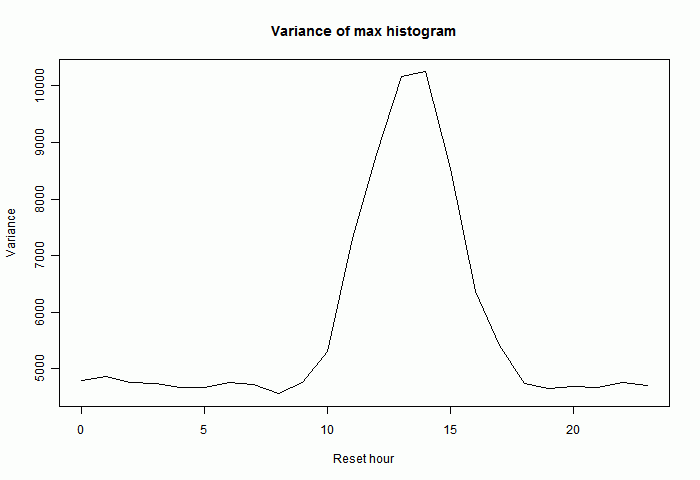
A more sensitive histogram is of the durations between maxima, shown below for the same reset times. "Normal" is about 24 hours. A short interval, or a long one of near 48 hours, indicates that the same peak is effectively being counted twice. This is very marked at 2pm, but also strong at 5 pm (and significant at 9 am).
I'll show this side-lobe effect as a daily cycle by plotting the variance of the histogram. This increases with the size of the side lobes:
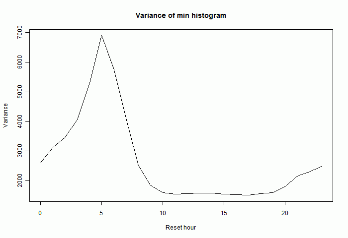
Minima behave somewhat similarly, though with the afternoon effects replaced by morning. Here is the variance plot for the difference between minima. In fact doubling of minima is rarer, perhaps because the minima themselves vary less, or because the daily minimum is less peaky.
Temperature bias
So here is a plot, as a function of reset time, of
- the three year average max, Tmax
- the three year average min, Tmin
- (Tmax+Tmin)/2, the min/max used in indices (in black)
Each is plotted relative to its mean
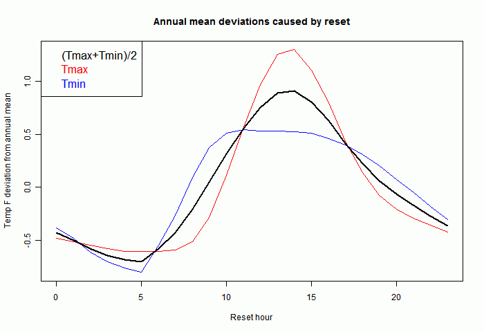
Each temperature should be adjusted to restore it to a standard reset time. Vose et al quoted above say this should be midnight. This adjustment really only is important if the time of observation changes, introducing an apparent trend. Again Vose et al explain how changes did occur in USHCN. I've also plotted each individual year, just for the min/max, to show that the pattern is fairly reproducible from year to year:
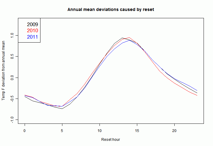
So there is every reason to expect that adjustments calculated from the present hourly obs can be applied to past readings where we only know the min/max and time of obs.
Adjustment
The range shown here is quite large (for this 1 station), about 1.5°F, while the TOBS adjustment in practice was only about 0.3°F over a century. Not all stations did change their time of obs, and those that did typically changed from about 5pm to 9am, which only has a fraction of the full effect.






 Posts
Posts


