Monday, September 10, 2012

August TempLS Global Temp up slightly (0.01°C) from July


The TempLS analysis, based on GHCNV3 land temperatures and the ERSST sea temps, showed a monthly average of 0.48°C for August, up from 0.47 °C in July. After a rapid rise to April this year, TempLS has been steady, with a small downward drift. There are more details at the latest temperature data page.

Below is the graph (lat/lon) of temperature distribution for August 2012. I've also included a count and map of the stations that have reported to this date, and a survey of the degree of error caused by my customary early reporting.
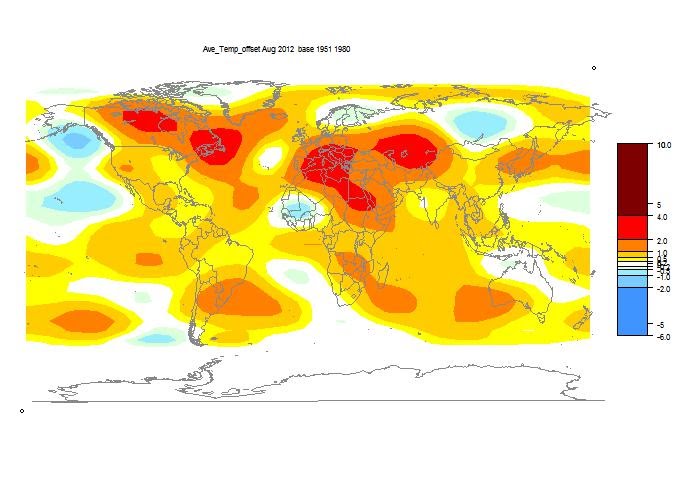


This spherical harmonics plot is done with the GISS colors and temperature intervals, and as usual I'll post a comparison when GISS comes out.

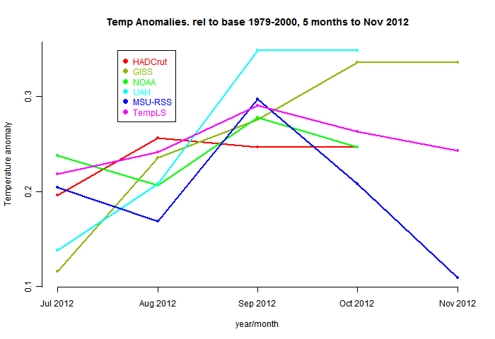
And here, from the data page, is the plot of the major indices for the last four months:

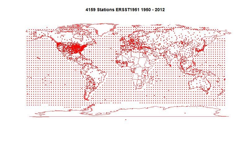
Here is the map of "stations" which contributed to this report. Over half are SST readings from the ERSST grid, and generally all of these are available (subject to modification) from the start of the month. But numerous land stations haven't reported. There are a total of 4195; past months with more complete reporting have about 4500.


I was curious to test the effect of incomplete data. I report earlier, and with less complete info, than the majors. This is partly to be first, but also so the calculation is a real test of TempLS's ability to independently assess the average. But I was curious to see what the penalty was. It isn't much. Here is a table of the difference between the originally posted monthly averages for 2012 and the current values, including the extra data that has come in since.

JanFebMarAprMayJunJul
0.0180.0090.0280.000-0.0050.005-0.003


Sunday, September 9, 2012

Cold Confusion


Eli has noted a rather remarkable scientific riff from Mitt Romney:
I do believe in basic science. I believe in participating in space. I believe in analysis of new sources of energy. I believe in laboratories, looking at ways to conduct electricity with -- with cold fusion, if we can come up with it. It was the University of Utah that solved that. We somehow can’t figure out how to duplicate it.

Well, of course Romney doesn't claim to be a scientist. It sounds like he's mixing up cold fusion with high temperature superconductivity. And I guess the last sentence is true.

Anyway, I was curious to track down the source and context. It's from an interview Dec 7 2011 with the Washington Examiner. The transcript and video are here. It's on video part 2 (actually audio only) at about 5 min.

Tuesday, September 4, 2012

Empirical Model - WUWT Style


At WUWT, Girma Orssengo, PhD, has a guest post showing some of the empirical models that he often posts in comments at Climate etc and elsewhere. It shows a parabolic+sinusoid fit to HADCRUT3:


The key plot is the one on the right. It's often been observed that a 60-year (or thereabouts) cycle plus a linear or quadratic does fit in this way. The question is, what does it mean? And in particular, can it be used for prediction?

Girma says that it isn't meant as a basis for physics interpretation. But when challenged about prediction, he said:

" Girma says: September 4, 2012 at 12:53 am

Nylo
A model is only useful if it allows predicting future behaviour. I see no predictions by the author that could be later falsified by the real outcome.

The model established a pattern as shown in Graph “f”. From this graph, It is easy to predict the climate if the pattern continues => Little warming in the next 15 years."


So prediction does seem to be an aim.

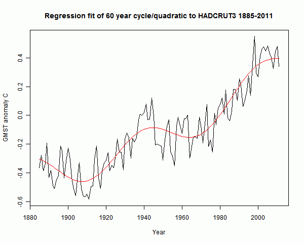
The problem with curve fitting is that behaviour outside the range is determined by the rather arbitrary selection of basis functions. I tried a regression fit in R using the same basis functions, with similar results:


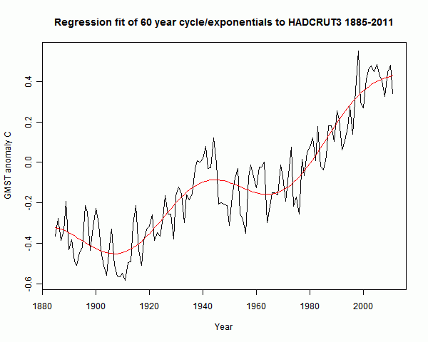
Then I tried the same sinusoid, a 60-year cos function with min at 1910, but instead of t and t2 I used exp(t/20) and exp(t/100):


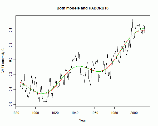
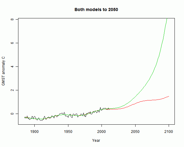
The fit is very similar, and it's not easy to declare that one is better than the other. Here they are on one plot:


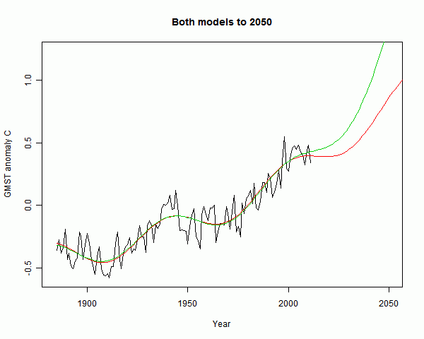
But they give very different predictions. The divergence looking forward to 2050 is not so huge:


But looking forward to 2100, the exponential model (green) runs right away, warming by 8°C. Grim.


The bind with fancy curve fitting is that it really can't be used much outside the range. And within the range, it isn't telling you anything you didn't already know, unless you are confident that you can make a useful deduction about the physics.

So what about linear regression - very commonly used? Well, it isn't "fancy" curve fitting. But the underlying principle is there. If it is a time series, you need to be open to the possibility that there is a real underlying rate of change. Then regression (curve fitting) can estimate the rate for you. But it doesn't prove that the linear model is right.

Friday, August 24, 2012

New JAXA record low Arctic Sea Ice Extent


The lowest previous SIE in the IJIS JAXA record since 2002 had been 4,254,531 sq km on 25 September 2007.

The value for August 24 2012 is 4,189,375 sq km.

JAXA has been apt to correct upward current day readings, and the latest melt day was 149,000 sq km. But still there is a fair cushion there. JAXA melting is still very rapid.

Sunday, August 19, 2012

Lucia's bet on Arctic Sea Ice


Lucia is taking quatloo bets on the NSIDC average for September 2012. In the linked post, she's looking at some history, and wondering whether it will be a new record low. Her modelling so far isn't sure.

I think there will be a new record. NSIDC, like JAXA, is low and dropping fast.  So I drew some graphs to show some recent precedents.


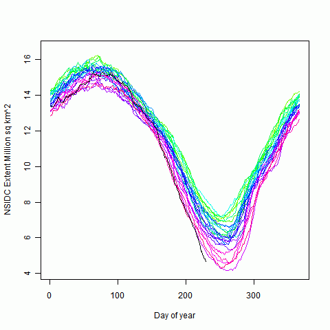
Firstly, just the conventional full year plot of NSIDC ice extent. I've used rainbow colors for the years, except for 2012 in black.


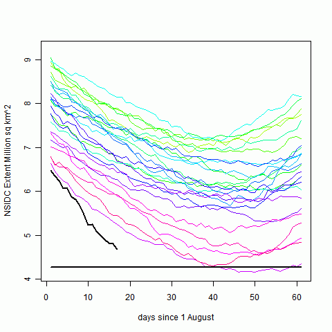
Next, the same plot but for August and September only. I've marked the 2007 min September average.


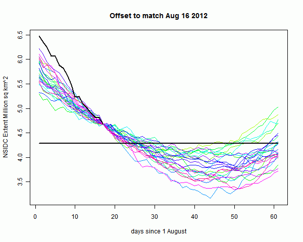
Now here is a plot with all years translated to match the August 16 2012 value (a few early years didn't have a Aug 16 reading and are omitted). Again the 2007 min value of 4.28 million sq km is marked, although it hasn't been translated. The idea is to show that the melt from hereon, if following the path of earlier years, would generally go well below 4.28. The exceptions are years before 1995, when there was much less melting overall.


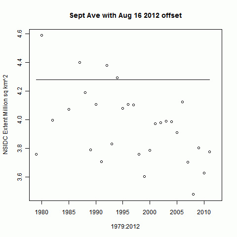
And finally, here is a plot of the September averages, again offset as if each year was starting on Aug 16 from the 2012 value. As you see, if 2012 were not below 4.28, it would be an outlier relative to recent history.


None of which, of course, says that a record is certain.


Saturday, August 18, 2012

Sea Ice - more melting


I've added to the table at the ice/temp update page. It now includes the 2012 NSIDC numbers from here. They are on the right, in purple (h/t Neven).

NSIDC doesn't update as promptly as JAXA, so I've just put the total following the last day's difference reading. NSIDC also seems to be noisier.

However, both are showing rapid melting currently. JAXA stands at 4.664 m sq km, only about 0.4 m above the record 2007 low, and it has lost 0.377 m sq km in the last three days. The NSIDC index is showing a similar situation.


Tuesday, August 14, 2012

July GISS Global Temp down 0.09°C


GISS showed a global temperature anomaly drop from 0.56°C to 0.47°C. The June figure was also adjusted down a little from my earlier post, so that makes a total GISS drop of 0.19°C in two months. TempLS dropped only 0.05°C in that time. Both NOAA and HADCRUT were even steadier from May to June, so it will be interesting to see what they say this time. The satellites also diverged, with UAH down like GISS, while MSU-RSS was similar to TempLS.
Update - NOAA has posted, down 0.019°C. NOAA and TempLS have tracked very closely in recent months.

Time series graphs are shown here

As usual, I compare the previously posted TempLS distribution to the GISS plot.


Here is GISS:


And here is the previous TempLS spherical harmonics plot:

.

Previous Months

June
May
April
March
February
January
December 2011
November
October
September
August 2011

More data and plots