Updating of GHCN V4 this month is fitful, so this figure may change. I see that BEST has delayed publishing November's result.
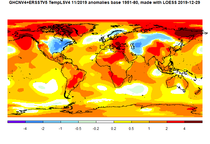
The overall pattern was similar to that in TempLS. Cool band through Central Asia into Siberia. Warm just about everywhere else, especially Arctic.
As usual here, I will compare the GISS and earlier TempLS plots below the jump.
Here is GISS V4

And here is the TempLS V4 LOESS-based plot
This post is part of a series that has now run for seven years. The GISS data completes the month cycle, and is compared with the TempLS result and map. GISS lists its reports here, and I post the monthly averages here.
The TempLS mesh data is reported here, and the recent history of monthly readings is here. Unadjusted GHCN is normally used, but if you click the TempLS button there, it will show data with adjusted, and also with different integration methods. There is an interactive graph using 1981-2010 base period here which you can use to show different periods, or compare with other indices. There is a general guide to TempLS here.
The reporting cycle starts with a report of the daily reanalysis index on about the 4th of the month. The next post is this, the TempLS report, usually about the 8th. Then when the GISS result comes out, usually about the 15th, I discuss it and compare with TempLS. The TempLS graph uses a spherical harmonics to the TempLS mesh residuals; the residuals are displayed more directly using a triangular grid in a better resolved WebGL plot here.
A list of earlier monthly reports of each series in date order is here:


I looked at the old dTs dataset and noticed something weird.
ReplyDeletehttps://data.giss.nasa.gov/gistemp/tabledata_v4/GLB.Ts.txt
November 2019 is new record by almost 0.2 degrees C. When I looked at the Gistemp temperature map (setting SST to none), a large dark red blob showed up in the south Atlantic. A further investigation into the used Gistemp (adjusted) data suggested that the following Islands had anomalies 3-5 C above normal; The South African Gough and Marion Islands, The Canary Islands.
I believe this is spurious. The CLIMATview map show quite normal anomalies for these stations
http://ds.data.jma.go.jp/tcc/tcc/products/climate/climatview/frame.php
Has GHCN-daily based data gone astray, and the PHA hasn't been able to fix it?
It did seem to me when I looked at the sources that GHCN daily was the one not updating.
DeleteOK, are there other sources for GHCN4 than CLIMAT messages and GHCN-Daily? What may have gone wrong?
Deleten b These island errors have only minor impact on Gistemp loti since the station temps only get extrapolated 100 km out in the sea.
But dTs that doesnt blend with SST has full 1200 km interpolation, which gives a large impact for lonely islands like Gough Island
Olof,
DeleteGHCN has a directory of source data here. GHCN Daily is by far the biggest file. MCDW is the other significant file, apart from the CLIMAT variants.
My mesh plot here shows the island situation clearly. It is strange, just a few Atlantic islands. The plot also shows how little weighting they get with land/ocean.
Thanks Nick,
DeleteI think NOAA has some technical problems with temp data this month.
I saw that the US National temperature index for November, based on ClimDiv, hasn't been published yet ( but the USCRN version has). They normally do this within a week after the end of month.
Nick, seems like your TempLS usually shows a closer difference from the previous month versus GISS than happened in November. I compared the maps you presented and noticed that the GISS map shows higher anomalies in much of the Arctic and Antarctic, but otherwise the comparison looks fairly close. Any thoughts as to why?
ReplyDeleteBryan,
DeleteYou're right about the sequence; this plot shows that GISS and TempLS have followed closely, but deviated in November. I don't know why, but I have seen it before, and the discrepancy is usually followed by a restoring change next month. I suspect it comes when there is an unusual month in the Arctic or Antarctic, which they interpret differently, as your comment suggests.
I update my prediction for GISS temperature anomaly using data up to Nov19.
ReplyDeleteGISS.v4
J-D19 0.97+-0.02
DJF20 1.05+-0.21
MAM20 1.04+-0.20
JJA20 0.91+-0.14
SON20 1.01+-0.16
The year 2019 of the GISS LOTI will be the second warmest, only behind 2016.
Assuming the 2019 temperature anomaly the prediction for 2020 is:
J-D20 0.99+-0.14
Thanks. Keep the technical stuff going as it's the only plus that blogs have now. Noticed that Moyhu has leapfrogged the "And Then There's Physics" blog in terms of Alexa popularity rankings as ATTP descends into pointless meta discussion and over-moderation.
ReplyDeleteProbably pointing out the obvious to you, but as Australia is burning up, it's more important now than ever to analyze the man-made and natural variations in climate. Randall Gates on Twitter noticed a massive SSW event in September and speculates on whether this had an impact on the Oz hotspot, perhaps through a connection to the SAM/AAO index
https://twitter.com/rgatess/status/1208499507790409728
Thanks Paul. Actually I have couple of technical papers on the way which may restore the Alexa status quo :(
DeleteYes, understanding the natural variation is very important. The Indian Ocean dipole is mentioned as a cause of the last heat burst. I don't know as much about it as I should. There seems to be another burst coming.
The IOP and ENSO often coincide like they may have back in 1878
Deletehttps://www.insidescience.org/news/historys-greatest-el-ni%C3%B1o-may-have-caused-severe-19th-century-famine
What is the difference between IOD and ENSO? Are they distinguished by the distinct primary standing wave modes characterizing the two ocean basins? From the time-series data, the IOD appears to contain a wavenumber that is 3x the value of the primary ENSO dipole leading to perhaps shorter and sharper spikes.
https://geoenergymath.com/2019/08/11/the-indian-ocean-dipole/
East of New Zealand a strong dipole node -- this one likely related to SAM
Delete"The strange Pacific Ocean 'hot blob' off New Zealand coast and why it's growing"
https://www.nzherald.co.nz/nz/news/article.cfm?c_id=1&objectid=12296684
Yes, it sure has grown. It's more the size of Australia than NZ. It shows in the latest NCEP plot, but the best detail is on the hi-res SST page. There is a snapshot here.
DeleteLatest from BOM showing the size of the IOD excursion
Deletehttps://twitter.com/BOM_au/status/1209302687344447488
Australia’s Angry Summer: This Is What Climate Change Looks Like - The catastrophic fires raging across the southern half of the continent are largely the result of rising temperatures
Deletehttps://blogs.scientificamerican.com/observations/australias-angry-summer-this-is-what-climate-change-looks-like/
"One of the factors driving this long-term loss of winter rainfall is the positive trend in the Southern Annular Mode (SAM). This change is causing the westerly winds that circle the Southern Ocean to shift southward toward Antarctica, causing rain-bearing winter cold fronts to pass south of the Australian continent. The role of anthropogenic climate change in driving this trend in the SAM is also clear in the science."
"In the tropical Indian Ocean, one of the most severe positive Indian Ocean Dipole (IOD) events on record played out this year. The unusually cold sea-surface temperatures in the eastern Indian Ocean cut off one of Australia’s critical moisture sources, adding to the ongoing drought in southern parts of the country. Australia’s worst fire seasons typically follow positive IOD events, much more so than the influence of El Niño events in the Pacific. Again, climate change is part of the story, because anthropogenic warming is causing positive IOD events to become stronger and more frequent.
At the same time, this year, a rare sudden stratospheric warming event developed over the Antarctic in late winter. Weakening of the polar vortex over Antarctica in spring increases the forest fire danger index across eastern Australia. This is because a northward shift in the Southern Hemisphere westerlies (i.e., a negative SAM) at this time of year causes very hot and dry westerly winds to be drawn across the continent."
Australia warming in context
Deletehttps://twitter.com/Gergyl/status/1212565758493880320
Yes. The ABC has a detailed article here. Australia has reached a 2°C warming already. And without a push from El Nino.
DeleteSou has more here at HotWhopper.
DeleteThis comment has been removed by the author.
DeleteThis is a 2016 Nature Scientific Reports paper that looks at the confluence of dipoles
Deletehttps://www.nature.com/articles/srep23113
Some of the meteorologists are catching on to the dipoles
https://twitter.com/antmasiello/status/1212906842038378504
and this meteorologist from the Weather Company
https://twitter.com/MJVentrice/status/1212758256210321410
This tweet is getting a lot of blow-back
The Australian AGW-skeptic Ian Wilson is apparently brewing up a new paper on ENSO modeling:
ReplyDeletehttps://astroclimateconnection.blogspot.com/2019/12/the-lunar-alignment-density-index-and.html
He is tight-lipped about his Lunar Alignment Density Index (LADI) model though:
"The exact nature of the LADI cannot be discussed at this point because it is being submitted for publication in the peer-reviewed literature."
Wilson is also excited about this open paper in Nature's Scientific Reports: "Switch Between El Nino and La Nina is Caused by Subsurface Ocean Waves Likely Driven by Lunar Tidal Forcing", Lin & Qian: https://www.nature.com/articles/s41598-019-49678-w
This is intriguing because Scientific Reports has been taken a beating recently for publishing the since debunked article by AGW-skeptic Valentina Zharkova and several others on theoretical physics. So I question whether the paper by Lin & Qian would have been published in a more climate-oriented journal, since the overriding consensus is that wind causes the switches between the states.
Have to wait and see if the Wilson paper is warmed-over stuff that I've already published.