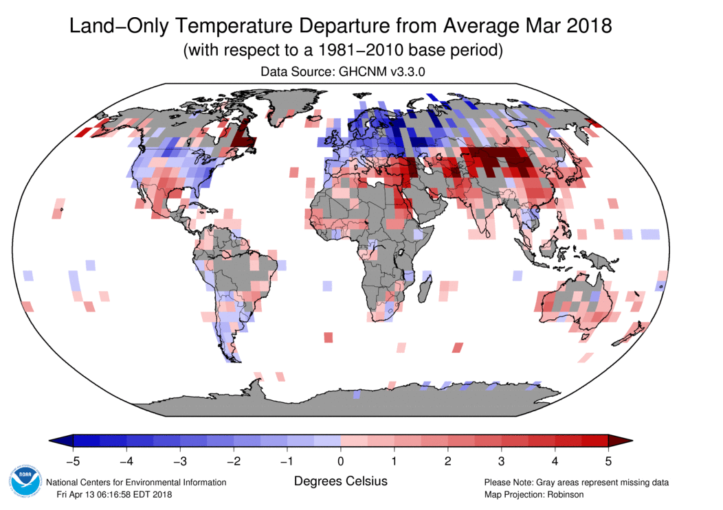
It is a 5x5° grid, but it does look as if there are a lot of empty cells, particularly in Africa. But if you look at the fine print, it says that the map was made April 13. That is still fairly early in the month, but NOAA doesn't update. There is a lot of data still to come. Station coverage isn't ideal, but it isn't that bad.
I took issue with a similar graph from SPPI back in 2010. That was quite a high visibility usage (GISS this time). Fortunately GISS was providing updates, so I could show how using an early plot exaggerated the effect.
The issue of spread out arrival of data affects my posting of monthly TempLS results. I calculate a new monthly average temperature each night, for the current month. I post as soon as I can be reasonably confident, which generally means when the big countries have reported (China, Canada etc). I did comment around January that the temperatures were drifting by up to about 0.04°C after posting. I think that was a run of bad luck, but I have been a little more conservative, with stabler results. Anyway, I thought I should be more scientific about it, so I have been logging the arrival date of station data in GHCN-M.
So I'll show here an animation of the arrival of March 2018 data. The dates are when the station data first appears on the posted GHCN-M file. Click the bottom buttons to step through.
The colors go from red when new to a faded blue. The date is shown lower left.
The behaviour of the US is odd, and I'll look into it. About 500 stations post numbers in the last week of February. I presume these are interim numbers, but my logging didn't record changing values. Then another group of stations report mid April.
Otherwise much as expected. The big countries did mainly report by the 8th. A few medium ones, like South Africa, Mongolia, Iran and Sudan, were quite a lot later. But there is substantial improvement in overall coverage in the six weeks or so after April 1. Some of it is extra stations that arrive after a country's initial submission.
There certainly are parts of the world where more coverage would be useful, but it doesn't help to exaggerate the matter by showing incomplete sets. The good news from the TempLS experience is that, even with an early set, the average does not usually change much as the remaining data arrives. This supports the analysis here, for example, which suggests that far fewer stations, if reasonably distributed, can give a good estimate of the global integral.


Interesting and nicely depicted, but not too surprising considering the problems with late data you have mentioned in the past. I can imagine that each month may be a bit different in the timing and sequence of data arrival. Reassuring to know that the TempLS global integration index does not change much with the late stragglers, although I would expect it to be very unusual for a few late stragglers to have much impact on the integration of the mass of data already in. The only exceptions might be if there were stragglers from isolated areas (thus higher weighting) that happened to have very large anomalies, but I'm guessing this would be quite rare and still a small effect.
ReplyDeleteAlso interesting to compare the station coverages by nation. Some very poor nations, like Bolivia, have much higher station density than wealthy nations like Australia and Canada. I'm surprised that the Greenland Summit station does not seem to be included. It reports to the global synoptic weather network as station 04416. Also, Canada has a large number of synoptic weather stations that are not showing up. Odd that they are not included when the data should be readily available from the synoptic network.
Bryan,
DeleteInteresting to mention Bolivia; how things change!
Yes, it's true that the sequence is different for different months - March was fairly free of major stragglers.
Nick, thanks for the link about Bolivia. Do you happen to know if we now have actual measurement data for GHCN stations in Bolivia now? Or is it still inferred from surrounding areas as mentioned in the link beginning 1990?
DeleteBryan,
DeleteGHCN only records actual measurements. You can see the raw data submitted each month via CLIMAT at Ogimet. I've set the link to bolivia.
Thanks Nick. I've never looked at the CLIMAT reports on Ogimet before. I noticed from your link for Bolivia that most of the stations reporting for April 2018 have relatively high atmospheric pressures and warm temperatures and only a few have much colder temperatures and low pressures indicating high altitudes. I also noticed that when I change the year to "2017" or "2016" in the URL, there is no data reported, unlike what I see for the synoptic data maps at Ogimet where I can jump back to previous years for comparison by editing the URL. So, perhaps CLIMAT data from these sites is very new and thus difficult to convert to anomalies for use in global or regional integration?
DeleteIt would be interesting to compare anomalies from such a wide range of altitudes in fairly close proximity.
Well after posting above, I now see that you have managed to calculate anomalies for the GHCN stations in Bolivia for April 2018 as seen on your WebGL map of temperatures. I saw that I could click on the station to see the name, anomaly, and temperature average in small box on the right. I missed seeing an anomaly reference period. Nicely done, but how are you able to generate an anomaly?
DeleteI presume there must be more data than what I see in Ogimet?
Bryan,
DeleteThere isn't a reference period. I've explained the method here. It's the same method now used by BEST.
You can look up individual Bolivia records using the portal. Click the GHCN Stations radio button and search Ctrl F for Bolivia. There is a lot of data, with a lot of gaps. Least Squares is good for that.
Nick, thanks for the links. I will check them out. I've been wondering how BEST was bringing in so much short period data and getting anomalies.
DeleteI forgot to mention that you can see the synoptic temperature data coverage here:
ReplyDeletehttp://www.ogimet.com/gsynop_nav.phtml.en
Click on the map to select an area and then select "temperature" in the table of variables under the map.
I notice that Russia also has a huge number of synoptic weather stations reporting temperature compared to the GHCN stations on your map. I'm guessing that BEST may be picking up the additional synoptic station data, but have not checked into it.
It would be cool to show how the average changes as reports come in.
ReplyDeleteI know we do our reports early, and can recall only one time when late data made a noticable difference
Steven,
DeleteAs soon as ERSST comes in, I post the current estimate here, along with a map and station count. I don't keep a record (I should), but I do post on about the 8th, so that can later be compared with the more complete count here. For March, I posted 0.704°C; it now stands at 0.721°C (mostly seems to go up, probably because sea-based gets replaced by land).