I think interactive plotting is a powerful Javascript capability. You can move the curves around as you wish - expanding or contracting the scales. You can choose which of a large set of data offerings to show. You can smooth and form regression lines.
But the old version, shown with that old post, looks a bit raw. I found I was using it more for display graphs, so I have cleaned up the presentation, using PrintScreen on my PC, and pasting the result into Paint. I have also simplified the controls. I had been using draggable popup windows, which are elegant, but not so straightforward, and don't make it easy to expand facilities. So I have reverted to an old-fashioned control panel, in which I can now include options such as writing your own headings and y-axis label. There is now also the option of changing the anomaly base, and you can choose any smoothing interval. Here is how it looks, in a working version:
You can choose data by clicking checkboxes on the left. Dragging in the main plot area translates the plots; dragging the pointer under the x-axis changes the time scale, and dragging vertically left of the y-axis changes the y-scale. At bottom left (below the checkboxes), there is a legend, only partly visible. This reflects the colors and choice of data, and you can drag it anywhere. The idea is that you can place it on the plot when you want to capture the screen for later presentation.
The control panel has main rows for choosing the regression, smoothing and anomaly base. When you want to make a choice, first tick the relevant checkbox, and then enter data in the textboxes. Then yo make it work, click the top right run button. The change you make will apply either to all the curves, or just to one nominated on the top row, depending on the radio buttons top left. The nominated curve is by default the last one chosen, but you can vary this with the arrow buttons just left of the run button. However, the anomaly base can only be altered for all, and the color selection only for one.
Choosing regression over a period displays the line, and also the trend, in the legend box, in °C/century units. You can only have one trend line per dataset, but possibly with different periods. If you want to make a trend go away, just enter a date outside the data range (0 will do). You could also deselect and reselect the data.
Smoothing is just moving average, and you enter the period in months. Enter 1 for no smoothing (also the default).
There are two rows where you can enter your own text for the title and y-axis label. Click run to make it take effect. The title can include any HTML, eg bold, text-size etc. You can use heading tags, but that takes up room.
Color lets you choose from the colored squares. A choice takes effect immediately, for the nominated data only.
Generally keep the checkboxes in the control panel unchecked unless you are making a change.
For anomaly base, you can also enter an out of range year to get no anomaly modification at all. The plots are shown each with the suppliers base. I don't really recommend this, and it tends to get confused if you have already varied base choices.
There are two more buttons, on the right of the control panel. One is Trendback. This switches (toggles) to a style which was in the old version, and is described here, for example. It shows the trend from the time on the x-xis to present (last data) in °C/century. In that mode, it won't respond to the regression, smooth, or anomaly base properties. The other button is "Show data". This will make a new window with the numbers graphed on the screen. This can be quite handy for the trendback plots, for example. You can save the window to a file.
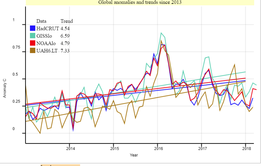
Here is how the plot might look if you drag the legend into place:


0 comments:
Post a Comment