In the
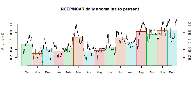
Moyhu NCEP/NCAR index, the monthly reanalysis anomaly average fell from 0.372°C in October to 0.253°C in November, 2017, making it the coolest month since June. The month started warm, with a cold period mid-month, and ended warm.
The main cold spots were China and E Siberia, and Canada. Arctic was warm, as were SW USA and European Russia. The Pacific showed a rather La Nina like pattern; cold in the SE and a band at the Equator. Warm around New Zealand/Tasmania.


Looks like LA Niña conditions warmth is extending well into December, so 2nd warmest year is still alive. - JCH
ReplyDeleteWhat is dead are the chaotic models for El Nino/La Nina by the likes of Tsonis. The more detail that is applied in getting the applied forcing calibrated to lunar variations, the better the correlations are to the ENSO time series.
Deletehttp://contextearth.com/2017/12/03/derivation-of-an-enso-model-using-laplaces-tidal-equations/
It's a forced response system, not a chaotic or stochastically resonant one. Same as the tidal models, which were developed to high precision over a century ago. The deniers such as Tsonis and Curry are once again dead wrong.
http://imagizer.imageshack.us/a/img924/3745/MKI6fk.png
This is supposedly an area weighted global average. Do we really accept that the global average temperature can change by almost the entire anomaly value in just a few days, and then come back again? Or is it more likely that the area weightings are applying too much to some areas (such as the cold spell in Europe in January 2017)?
ReplyDeleteThe anomaly base level itself is arbitrary. But yes, I think that is real. I don't do much weighting - just by latitude to allow for cell area. The reanalysis weights the data ingested. I am curious whether the rather characteristic time scale of these deep dives somehow reflects the model built into the reanalysis. But I don't think they are unrepresentative of area.
DeleteNick, you might want to correct the title...
ReplyDeleteThanks. I checked the text, but not the title. Oops.
DeleteNick, I suppose you mean "Warm" around New Zealand/Tasmania, also..
DeleteAnyway, are the intense thunderstorms and flooding in the Melbourne area caused by these very high SSTs?
Thanks, Olof, fixed
DeleteI'm not sure about the storms and SST. We had a very warm November - about 4°C above average in Melbourne, despite a cold start. That was said to be due to a blocking high over that area, although I don't know whether the warmth contributed to the blocking. The storms came from the west, and the worst passed to the North of us (inland), so not obviously SST related, although that may have added to the humidity. My main worry has been summer bushfires, and the warm seas might contribute to that, but the rain will help there for a few weeks at least.
There is a certain discrepancy over at http://www.karstenhaustein.com/climate
ReplyDeletewhere the real-time GFS compilation has Nov as the third warmest month 2017 (down 0.04 C from Oct), whereas NCEP/NCAR is down by 0.16 from Oct and the second coolest month 2017.
Which one is right? It will be interesting to see the other reanalyses and the observational surface datasets when they arrive.
Anyway, it is pretty clear by now that 2017 will be the second warmest year on record. There will hardly be an immense global temperature drop in the remaining part of December..
I'm afraid GFS introduced a substantial warm bias with their latest update in July. Not only has the forecast bias changed (for the worse), but also the analysis bias is much larger than before. Too early to tell, but I guess it's safe to say that my GISS-based bias correction needs to be readjusted as soon as enough data have become available.
Delete@KarSteN
ReplyDeleteyes, I observed also a strong disagreement between GFS, NCEP, and GISS since about July/August this year. Until this date it was possible to forecast GISS monthly temperature anomaly from y-o-y monthly change in the GFS anomaly, even from about half a month data of the graphic on the top of your site. This is not possible any more. Now -0.02 y-o-y change Nov for GFS, but -0.23 y-o-y change for NCEP. From the last months GFS was off, so maybe GISS will cool more like NCEP, but I can not tell.
The ERAI November GMSTA estimate is down -0.13C from October, more in line with NCEP/NCAR R1. I am still waiting to see the CFSR daily estimates for November from UM CCI, although WxBELL reported the CFSR GMSTA to be down -0.09C from October to November and usually UM CCI's output tracks closely. Since Ryan Maue left WxBELL they have removed the graphs of daily CFSR trends they once had available to the public, but still show the latest month-to-date GMSTA map. As others have reported, I too have noticed that the GFS-based GMSTA estimates have been running a bit high lately, both at UM CCI and at Karsten's website. I notice the drift getting worse going into winter, implying a seasonal issue with the updated GFS.
ReplyDeleteBy eye-balling the anomaly maps over at Karsten's, the most obvious difference seems to be Saharan/Arabian desert zone, where GFS has been warmer than NCEP/NCAR the recent months.
ReplyDeleteThe recent 12 month mean ( through November) of Era-Interim/Copernicus is 0.09 C above annual 2015, so 2017 will most likely become the second warmest year (unless the December anomaly drops to -0.6 C)
Also, I believe that the blended observational datasets may not drop as much as the reanalyses from Oct to Nov.
I took a quick look at Oct to Nov change of ice free oceans (60 N-60S:
NCEP/NCAR 2m, -0.11 C
NCEP/NCAR skin/SST, -0.03 C
ERSST5, -0.03 C
Hence, it looks like SST will reduce the Oct to Nov drop..
Olof, after seeing your comment, I went and did the same with Karsten's November Robinson maps (GFS and NCAR). The large area over northern Africa is most obvious as warmer on the GFS vs NCAR, but I also see substantial warmer areas in Afghanistan-Pakistan, parts of China, and a fairly large area in Antarctica south of South America.
DeleteSo then I went to compare the ERAI November map to both of these (ERAI Nov can be seen here). Interestingly, the ERAI analysis subjectively to me compares much closer to the NCAR analysis, including all of the areas I mentioned above.
I also have a graph comparing Nick's NCAR daily versus UM CCI's daily GMSTA estimates which can be seen here. It shows the gradual increase in separation with the UM CCI GFS estimates running higher since about late July. This graph uses UM CCI daily CFSR data up to January 2017 and UM CCI GFS daily data beginning February 2017.