Below is the graph (lat/lon) of temperature distribution for March. The big US hotspot is very clear

This is done with the GISS colors and temperature intervals, and as usual I'll post a comparison when GISS comes out.
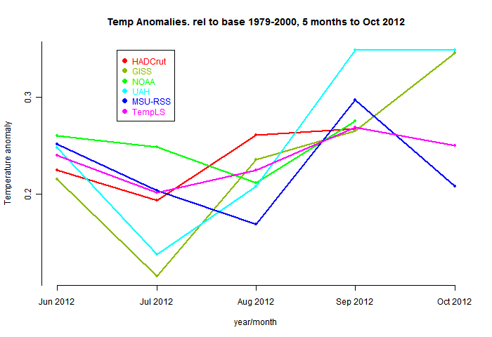
And here, from the data page, is the plot of the major indices for the last four months:


0 comments:
Post a Comment