And here is how the warmth was spread around:

Update - I haven't been properly clear here on anomaly bases. For the time series plots I used 1979-2000, so I could plot them all on one graph. For the spatial plot, I actually used the default - the average for the whole period, which was 1960-2011. Since I'm using GISS colors, it would be better to use the GISS period which is 1951-80. That will require exrending the calc back 10 years. It doesn't make much difference to the color plot; the change will be small relative to the range of monthly means, and one could simply adjust the color scale zero, leaving the plot unchanged.
There's a lot more to say about how this was done. Obviously, I'm using fairly early information. But the coverage is pretty good. We'll soon see how it holds up against the major indices. Details below the jump.
I used a combination of GHCN V3 and ERSST v3b. I ws waiting for HADSST2, which the previous month was based on, mainly because I am more familiar with it. But the ERSST data came out on Aug 3, and seems fairly complete. Maybe some numbers will change. The GHCN file was ghcnm.v3.0.0.20110809, dated 9 Aug, though apparently posted on 10th.
The ERSST data has 2x2° resolution. That's a bit more than I need, and would tend to swamp the land stations, so I amalgamated cells to 4x4°. Total land and sea station numbers were good - 4000 (2102 sea, 1898 land), compared with 4084 in June and 4262 in May. It seems that when all stations have reported, totals currently are about 4500 (land and sea).
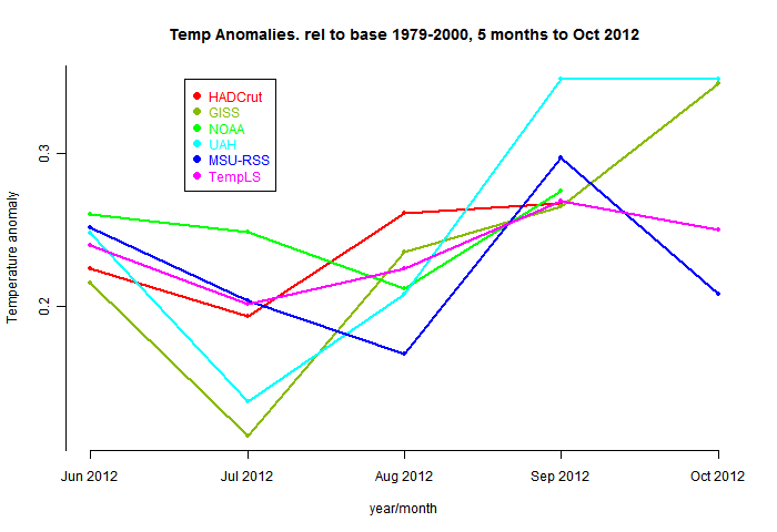
Here is the plot of the last 48 months. You can find these plots and the numbers (not set to the 1979-2000 base) at the regular current data site.

Some more details - I used, in TempLS V2.2, the weighting scheme that I've called type zero, with equal area cells. I ran the reconstruction from 1960, to get the normals. The shaded plot is made using 140 spherical harmonics.
Here is the pattern of stations that have reported so far. As previously, the equal area cells used for weighting are shown in blue if they contain stations that reported in July, else yellow. You can click to enlarge.

|

|

|

|


Quite interesting to see that UAH is higher, I've created a few global temp maps going from Jan-2009 through Jul-2011 and combined them into a megaplot
ReplyDeletehttp://img847.imageshack.us/img847/8510/uahtempmaps20092011.png
The tropics are above the base period, I also noticed that the Antarctic region was particular warm for July, this could also contribute to the divergence between RSS and UAH, since RSS has less coverage at the south pole.
PS I also have a Quicktime movie of the sequence, not sure how to share this on a blog in a an easy way.
MP
Maybe QBO also affects the anomalies, this oscillation mainly affects the poles at higher altitudes and has an approximate period of two years. Lean used it for a regression analysis of the lower stratosphere temperature. It peaks around July.
ReplyDeletehttp://en.wikipedia.org/wiki/Quasi-biennial_oscillation
also see http://www.cpc.ncep.noaa.gov/data/indices/
http://www.cpc.ncep.noaa.gov/products/CDB/Tropics/figt3.gif
MP
MP,
ReplyDeleteThat's a great plot of the LT monthly data. It does bring out the oscillations. These were a big feature of the surface temp plot for July, especially in the NH. I was a bit worried that the marked NH periodicity was an artefact of the spherical harmonic fitting, but I see that your plot has similar features.
I'd be happy to help make the quicktime available - I could certainly host it here, but I have no experience with actual embedding. I'll check.
Dear Nick,
ReplyDeleteThanks, I've sent you the file with wetransfer.com; I used your westnet e-mail address.
Cheers,
MP
MP,
ReplyDeleteThanks, I've recovered it, and uploaded. The address is
https://sites.google.com/site/moyhudocs/pics/aug/UAH_T2LT_Global_2009-2011.mov
Now I'll try to embed it.
MP,
ReplyDeleteI had to embed it through the Blogger system - if this poses any restrictions, the download address should work. It did work for me. It runs rather quickly.
Nick,
ReplyDeleteYes it runs rather quickly, I've tried to fix that before but could not get it to work for a lossless quicktime movie (I use the ffmpeg encoder to convert images to a movie). I mainly use these type of movies as an image browser, with the slider in quicktime you can go back and forth, which gives a good impression.
MP
Nick,
ReplyDeleteI wrote a matlab script that allows me to generate maps of single months, seasons, years, moving averages, trends (linear slope) and moving trends. I visualize these maps with GMT (generic mapping tool) using cygwin. I can choose different baselines, and also set the colormap (exponential or linear) It is a messy script, not so portable and a bit slow but it seems to work pretty ok.
I've implemented all major temperature indices, Hadley/CRU (land, ocean or land+ocean), GISS (250, 1200 land+ocean), NCDC (land+ocean), JMA (land+ocean), UAH (t2lt, t2, t4 and t24-Zou,Fu), RSS (TLT, TMT, TTS, TLS, t23-Zou,Fu and t24-Zou,Fu), STAR (t2, t3, t4, t23-Zou,Fu and t24-Zou,Fu) and a few non temperature indices, like TOMS total column ozone, KNMI MSR ozone and ocean heat content. I was also looking at aerosols, but this is a bit of a jungle.
If you are interested in a particular set of maps I can try to make it.
MP
Nick,
ReplyDeleteI had a closer look at the spectrum of QBO (data : http://www.geo.fu-berlin.de/en/met/ag/strat/produkte/qbo/) and SH temp, QBO shows a peak around 2.3 years, a hint of this is present in SH temp, however not very convincing. Unfortunately I am not an expert in spectrum analysis. Lean also did regression analysis of temperature against forcings/enso etc on maps, I have been playing with the idea to do this on zonal means, need to find time to do it...
I've created two more graphs of zonal temperature anomalies for UAH and RSS
http://img684.imageshack.us/img684/2053/uahzonal.png
http://img695.imageshack.us/img695/9757/rsszonal.png
I've chosen zones which have approximately equal areas. My impression is that the difference in coverage does affect the global mean of RSS.
MP
MP,
ReplyDeleteThanks for all that. I'll make this the subject of a new post, using your images (if that's OK) - esp GISS.