Showing posts sorted by relevance for query uah. Sort by date Show all posts

Saturday, April 28, 2012

Interactive JS plotter data list


Some more news and information about the Moyhu interactive plotter. The main content of the post is a listing of the data, with links. But first some discussion of versions and some updates on progress.

I have reinstated in V2 the ability to copy a URL which will reinstate the plot as you see it. This is intended for linking. There are minor limitations - it won't pass on user data, and it won't regenerate vectors made with the Calc box.


This got me thinking about version stability. If people are going to store links, I need to ensure that the code will still work if I add more data, for example. So my plan now is this. Versions will appear in blog posts, and I'll then leave them alone except for bug fixes. If you copy a link from such a site, it will refer back to that post, and should work indefinitely.

I'll keep the latest version of the plotter on a page. You can see the pages listed top right. I might add data there, and not post a new version for a while. It will allow you to copy URL's which will refer to that page but I won't guarantee that they will work in exactly the same way long into the future. For that, you should go to the most recent blog post version.

Data listing

The general way to get documentation in the plotter is to Ctrl-Click on any active button. That is, click with the Ctrl key depressed. On the Mac, I believe the Command key has similar effect. The information appears bottom right (green window) or on a separate tab if you have checked the New Window button.

If the button connects with data, you'll get info about the data. The buttons next to the selection boxes give a general description for the datasets contained. If you have plotted a set, there will be an entry in the plot list with a checkbox to it's right. If you Ctrl-Click that, the info window (bottom right) will show specific info, usually a link to source and another to an info page on the web.

Below is a listing of that information for each of the data sets that you can plot. The red headings below are the names of the selection boxes - then follow the contents.


Hadcrut
1HADCRUT 3HADCRUT 3 Global Land and Ocean Index Source More information
2HADCRUT 4 GlobeHADCRUT 4 Globe Source More Info
3HADCRUT 4 NHHADCRUT 4 NH Source More Info
4HADCRUT 4 SHHADCRUT 4 SH Source More Info
5HADCRUT 4 TropHADCRUT 4 Tropical Source More Info
6Had 4 NH Nov-FebHADCRUT 4 NH Nov-Feb Source More Info
7Had 4 NH Mar-MayHADCRUT 4 NH Mar-May Source More Info
8Had 4 NH Jun-AugHADCRUT 4 NH Jun-Aug Source More Info
9Had 4 NH Sep-NovHADCRUT 4 NH Sep=Nov Source More Info
10Had 4 SH Nov-FebHADCRUT 4 SH Nov-Feb Source More Info
11Had 4 SH Mar-MayHADCRUT 4 SH Mar-May Source More Info
12Had 4 SH Jun-AugHADCRUT 4 SH Jun-Aug Source More Info
13Had 4 SH Sep-NovHADCRUT 4 SH Sep-Nov Source More Info
14CRUTEM3CRUTEM 3 Global Land Only Source More information
15HAD NHHADCRUT3 NH mean Source More information
16HAD SHHADCRUT3 SH mean Source More information

GISS
17GISSGISS Global Land and Ocean Source More information
18GISS TsGISS Met Stations (Land Only) Source More information
19ConUSAnnual Temp Anomaly Lower 48 USA Source More information
20ArcticAnnual Temp Anomaly Arctic 64-90°N Source More information
21NH TempAnnual Temp Anomaly NH Temp 24-64°N Source More information
22TropicAnnual Temp Anomaly Equator -24-24°N Source More information
23SH TempAnnual Temp Anomaly SH Temp 24-64°S Source More information
24AntarcticAnnual Temp Anomaly Antarctic 64-90°S Source More information

NOAA
25NOAA GlobNOAA Glob Land/Ocean Source More information
26NOAA NH Land/OceanNOAA NH Land/Ocean Source More information
27NOAA SH Land/OceanNOAA SH Land/Ocean Source More information
28NOAA Glob LandNOAA Glob Land Source More information
29NOAA NH LandNOAA NH Land Source More information
30NOAA SH LandNOAA SH Land Source More information

Satellite Temp
31UAHUAH Lower Troposphere Source
32MSU-RSSMSU-RSS Lower Troposphere Source More Info
33UAH GlobeUAH Globe Source More Info
34UAH All LandUAH All Land Source More Info
35UAH All OceanUAH All Ocean Source More Info
36UAH NH AllUAH NH All Source More Info
37UAH NH LandUAH NH Land Source More Info
38UAH NH OceanUAH NH Ocean Source More Info
39UAH SH AllUAH SH All Source More Info
40UAH SH LandUAH SH Land Source More Info
41UAH SH OceanUAH SH Ocean Source More Info
42UAH TropicsUAH Tropics Source More Info
43UAH TropicLandUAH TropicLand Source More Info
44UAH TropicOceanUAH TropicOcean Source More Info
45UAH NH ExtraTropUAH NH ExtraTrop Source More Info
46UAH NHExtr LandUAH NHExtr Land Source More Info
47UAH NHExtr OceanUAH NHExtr Ocean Source More Info
48UAH SH ExtraTropUAH SH ExtraTrop Source More Info
49UAH SHExtr LandUAH SHExtr Land Source More Info
50UAH SHExtr OceanUAH SHExtr Ocean Source More Info
51UAH NPolar AllUAH NPolar All Source More Info
52UAH NPolar LandUAH NPolar Land Source More Info
53UAH NPolar OceanUAH NPolar Ocean Source More Info
54UAH SPolar AllUAH SPolar All Source More Info
55UAH SPolar LandUAH SPolar Land Source More Info
56UAH SPolar OceanUAH SPolar Ocean Source More Info
57UAH USA48UAH USA48 Source More Info

Misc Temp
58BESTBEST Land Only Source More information
59TOS ModelSource More information
60Foster/Rahm GISSFoster&Rahmstorf GISS land/ocean modified for exogenous effects Source More information
61Foster/Rahm NCDCFoster&Rahmstorf NCDC land/ocean modified for exogenous effects Source More information
62Foster/Rahm CRUFoster&Rahmstorf CRU land/ocean modified for exogenous effects Source More information
63Foster/Rahm RSSFoster&Rahmstorf RSS land/ocean modified for exogenous effects Source More information
64Foster/Rahm UAHFoster&Rahmstorf UAH land/ocean modified for exogenous effects Source More information

SST/Ocean/Oscillation
65HADSST3HADSST3 Global Sea Surface Temperature Source More information
66HADSST2HADSST2 Global Sea Surface Temperature Source More information
67HADiSSTHADISST Global Sea Ice and Sea Surface Temperature Source More information
68NOAA Glob OceanNOAA Glob Ocean Source More information
69NOAA NH OceanNOAA NH Ocean Source More information
70NOAA SH OceanNOAA SH Ocean Source More information
71OHC 0-700mGlobal Ocean Heat Content 0-700m 10^22J Source More Information
72UEA SOISouthern Oscillation Index (UEA) Source More Info
73AMOAMO Reconstruction (Mann 2009b) Source More Information
74PDOPDO Reconstruction (Mann 2009b) Source More Information
75JISAO AAOSouthern Oscillation Index (JISAO) Source More Info
76JISAO NAMNorthern Annular Mode (JISAO) Source More Info
77JISAO ENSOENSO (JISAO) Note that ENSO has short term variation and annual averaging smooths it a lot. Some peaks are lost. Source More Info

Giss Forcings
78AllGISS Model E forcings Global mean net Source More information
79W-M GHGGISS Model E forcings Well-Mixed GG Source More information
80OzoneGISS Model E forcings Ozone Source More information
81StratH2OGISS Model E forcings Stratospheric water Source More information
82SolarGISS Model E forcings Solar Irradiance Source More information
83LandUseGISS Model E forcings Land Use Source More information
84SnowAlbGISS Model E forcings Snow Albedo Source More information
85StratAmerGISS Model E forcings Stratospheric Aerosols Source More information
86BCGISS Model E forcings Black Carbon Source More information
87Refl AreGISS Model E forcings Reflectic Trop Aerosols Source More information
88AIEGISS Model E forcings Aerosol Indirect Effect Source More information

GHG/Solar/Emissions
89MLO CO2Mauna Loa CO2 Source More Information
90C13/C12 MLOMauna Loa δC13 Source More Info
91C13 SignatureGlobal Stable Carbon Isotopic Signature Source More Information
92GISS CO2GISS CO2 Source More Info
93Nitrous OxideNitrous Oxide Source More Info
94MethaneMethane Source More Info
95TSI ReconTSI Reconstruction Dora Source More Information
96SIDC SunspotsSIDC Yearly Sunspot Number Source More Info
97FF emissionsTotal carbon emissions from fossil fuels million metric tons of C Source More Info
98FF Gascarbon emissions from gas fuel consumption Source More Info
99FF Liquidcarbon emissions from liquid fuel consumption Source More Info
100FF Solidcarbon emissions from solid fuel consumption Source More Info
101From Cementcarbon emissions from cement production Source More Info
102Flaringcarbon emissions from gas flaring Source More Info
103FF Per CapPer capita carbon emissions metric tons of carbon after 1949 only Source More Info

TempLS
104TempLSTempLS Global Land and Ocean Source
105TempLS GHCN 3 HSST2TempLS GHCN 3 with HadSST2 More Info
106TempLS CRUT 3 HSST2TempLS CRUTEM 3 with HadSST2 More Info
107TempLS GHCN 3TempLS GHCN 3 Land Only More Info
108TempLS CRUT 3TempLS CRUTEM 3 Land Only More Info
109TempLS GHCN 3 HAD3TempLS GHCN 3 with HADSST3 More Info
110TempLS CRUT 3 HSST3TempLS CRUTEM 3 with HadSST3 More Info

NCEP
111NCEP-PWPrecipitable Water Source More Information
112OLROutgoing Longwave Radiation Source More Information
113NCEP-MEINCEP Multivariate ENSO Index Note that ENSO has short term variation and annual averaging smooths it a lot. Source More Info
114NCEP-NAONCEP Nprth Atlantic Oscillation Source More Info
115NCEP-NINO3NCEP East Central Tropical Pacific SST Source
116NCEP-ONINCEP Oceanic Nino Index Source
117NCEP-SOINCEP Southern Oscillation Index Source More Info Units, 10*t-stat
118Surf SHSpecific Humidity 1000Mb Source More Information
119NCEP-SH850Specific Humidity 850Mb Source More Information
120NCEP-SH700Specific Humidity 700Mb Source More Information
121NCEP-SH600Specific Humidity 600Mb Source More Information
122NCEP-SH500Specific Humidity 500Mb Source More Information
123NCEP-SH400Specific Humidity 400Mb Source More Information
124NCEP-SH300Specific Humidity 300Mb Source More Information


Wednesday, January 24, 2018

Satellite temperatures are adjusted much more than surface.

I continually come across claims that surface temperatures should be ignored in favour of satellite troposphere temperatures, because the surface temperatures are adjusted. It's an odd argument to conduct, because while at least there is a recognised surface temperature reading that can be adjusted, satellite temperatures are the product of a long and complex calculation sequence, in the course of which many judgement calls are made. Here, for example, is Roy Spencer's (+Christy + Braswell) explanation of the changes that were made in going to UAH version 6. He describes the need for it thus:
One might ask, Why do the satellite data have to be adjusted at all? If we had satellite instruments that (1) had rock-stable calibration, (2) lasted for many decades without any channel failures, and (3) were carried on satellites whose orbits did not change over time, then the satellite data could be processed without adjustment. But none of these things are true.
...
After 25 years of producing the UAH datasets, the reasons for reprocessing are many. For example, years ago we could use certain AMSU-carrying satellites which minimized the effect of diurnal drift, which we did not explicitly correct for. That is no longer possible, and an explicit correction for diurnal drift is now necessary. The correction for diurnal drift is difficult to do well, and we have been committed to it being empirically–based, partly to provide an alternative to the RSS satellite dataset which uses a climate model for the diurnal drift adjustment.
...
So instead of continually making small adjustments, as in the surface dataset, they produce new versions in which these decisions are revisited and often radically revised. The changes are much larger in overall effect than the changes to individual surface station averages.

Two years ago, I wrote a post about the changes that happened when Version 5.6 of the UAH index went to version 6. This decreased trends a lot, and so was popular with contrarians. I was prompted to write by Roy Spencer's claim:
"Of course, everyone has their opinions regarding how good the thermometer temperature trends are, with periodic adjustments that almost always make the present warmer or the past colder."
So I compared the change in TLT (lower troposphere) going from V5.6 to 6.0, to the cumulative effect of changes in GISS from archived time series of 2005 and 2011, with the then current 2015 GISS. GISS was far more stable than UAH, even though the period of changes was much longer.

Meanwhile, RSS also updated their troposphere data, going from V 3.3 to V4. RSS had been a favourite of contrarians, because it had a much lower trend than UAH. Roy spencer noted this, saying:
"But, until the discrepancy [in trend with UAH higher]] is resolved to everyone’s satisfaction, those of you who REALLY REALLY need the global temperature record to show as little warming as possible might want to consider jumping ship, and switch from the UAH to RSS dataset."
They needed little persuasion. Lord Monckton wrote a monthly series at WUWT about the length of the "Pause", which he defined as the maximal period of zero gradient of RSS TLT, starting about 1997. He scorned UAH then, as it was similar to the surface data. But RSS V4 turned that around too, showing much greater trends historically, and severely damaging the "Pause". I commented on some of this here, before any of the new versions.

Lord Monckton did not like it. His tamper tantrum is here. Any change which increases the trend is "tampering". Why going from V3.3 to V4 is tampering, but going from 3.2 to 3.3 or the earlier steps is not, was never explained.

Anyway, I thought it would be worth updating my graphs of Dec 2015 to include the changes to RSS. In fact, the two indices neatly changes places, so that RSS V4 is close to UAH V5.6, and UAH V6 is close to RSS V3.3. So in both cases the change is large.

An amusing sideshow of the more satisfactory UAH V6 is that surface datasets were being accused of fraud for differing from it - eg NOAA’s Fake SST’s Not Supported By Atmospheric Data. But the reviled discrepancies were not there with V5.6, which was far closer to the surface data than to V6. So was V5.6 also "fake"?

Anyway, here are the plots. I'm using the same old versions of GISS as in the previous post and sourced there. They can be got at the Wayback Machine. I convert everything to the same anomaly base, which this time is 1979-2008. I chose that because there isn't quite a 30 year span common to GISS2005 and the sat sets, but this reduces the gap to three years. So I set the other sets to zero average on this span; then I make the GISS2005 match the rebased GISS_current on its range.

First, as before, I just plot the time series. I use reddish colors for RSS versions, bluish for UAH, and greenish for GISS. Because the curves are tangled, there are four different color views of the same plot, which you can access with the buttons below. The text and content are the same for each, but transparency is used so that only one group stands out. Here is the plot:


This plot is good for a general appreciation of the deviations. The GISS variants bunch together, and the upper sat variants, UAH V5,6 and RSS V4.0, tend to follow them. The other pairing, RSS V3.3 and UAH V6, is the outlier, deviating rather markedly below from about 2008 onwards.

The values relative to each other are easier to see if they are expressed as differences from a common value, and for this I chose current GISS. In principle any value will do, but because the satellites respond with big spikes for El Niño, this would be inverted into a negative spike for GISS, which would be confusing. So I'm using the same colors, and choice of variants - GISS shows as the zero line:


Next I plot the difference from one version to the next - ie the "adjustment". In each case, it is new minus old. Again you can use the buttons to cycle through different colors.


This shows most clearly what happened in the recent changes. The trend of UAH went way down, and the trend of RSS went way up. These changes dwarf the minor and fairly trend-free changes to GISS. Interestingly, especially for RSS, most of the change happens post-2000.

Of course, GISS has more changes going further back. But satellites do not have an advantage there. They have no data at all.


Thursday, March 5, 2015

Klotzbach revisited

Not a perfect title; it's actually my first comment on the 2009 GRL paper by Klotzbach, Pielke's, Christy et al. It was controversial at the time, but that was pre-Moyhu, or at least in very early days. And I hadn't paid it much attention. But it surfaced again today at Climate Etc, so I thought I should read it.

The paper is very lightweight (as contrarian papers can be). It argues that observed surface trends since 1979 actually exceed troposphere trends, as measured by the UAH and RSS indices, which CMIP etc modelling suggests that the troposphere should warm faster.

Now for global you can simply get those trends, and many more, with CIs from the Moyhu trend viewer. You might say, well, figuring out what the models said should be rated substantial. But they way oversimplified, were corrected at Real Climate (Gavin) and had to publish a corrigendum. There has been more discussion then and over the years. Here, for example, is a post at Climate Audit, with Gavin participating. But the audit didn't seem to pick up the CI issue, though other methods were discussed. Later a Klotzbach revisited WUWT post (my title echoes) two years ago; more on that from SKS here. And now another update.

But what no-one, AFAICS, has noticed is that the claims of statistical significance are just nuts. And significance is essential, because they have only one observation period. The claim originally, from the abstract, was:
"The differences between trends observed in the surface and lower-tropospheric satellite data sets are statistically significant in most comparisons, with much greater differences over land areas than over ocean areas."
I've noticed that the authors are quieter on this recently, and it may be that someone has noticed. But without statistical significance, the claims are meaningless.

Update: I think that the CI's they are quoting may relate to a different calculation. They computed the trends in Table 1, with CI's, and in Table 2 the differences. They say in the abstract that these are differences of trends, but the heading of Table 2, which is not very clear, could mean that they are computing the trends of the differences (a new regression) and giving CI's for that. That is actually a reasonable thing to do, but they should make it clear. I have got reasonably close to their numbers for comparisons with UAH, but not with RSS; it may be that the RSS data has changed significantly since 2009.


I'll describe this in more detail below the jump.

Here is their Table 1 of trends in C/decade with 95% CI's
Table 1. Global, Land, and Ocean Per Decade Temperature Trends and Ratios Over the Period From 1979 to 2008
Data Set         Global Tren         Land              Ocean Trend
NCDC Surface     0.16 [0.12-0.20] 0.31 [0.23-0.39] 0.11 [0.07-0.15]
Hadley Surface   0.16 [0.12-0.21] 0.22 [0.17-0.28] 0.14 [0.08-0.19]
UAH Lower Trop   0.13 [0.06-0.19] 0.16 [0.08-0.25] 0.11 [0.04-0.17]
RSS Lower Trop   0.17 [0.10-0.23] 0.20 [0.12-0.29] 0.13 [0.08-0.19]

My own calcs (to 2014) gave CI's comparable to these.

I've been commenting at CE here and here, and I extracted σ values here
NCDC Surface   0.16 [0.12-0.20]  0.04
Hadley Surface 0.16 [0.12-0.21]  0.04
UAH Lower Trop 0.13 [0.06-0.19]  0.06
RSS Lower Trop 0.17 [0.10-0.23]  0.06

 But you don't need them to see that the results in Table 1 are very unlikely to be significant. Virtually all the trends lie within the CIs of the sat indices. Consider a comparison of NCDC 0.16 and UAH 0.13 [0.06-0.19]. There is no way NCDC is inconsistent with the range of UAH, even if it did not have error of its own.

Anyway, what Klotzbach et al did was to show a table of differences with CIs:

Table 2. Global, Land, and Ocean Per Decade Temperature Trends Over the Period From 1979 to 2008 for the NCDC Surface Analysis
Minus UAH Lower Troposphere Analysis and the Hadley Centre Surface Analysis Minus RSS Lower Troposphere Analysis
Data Set               Global Trend (C)    Land Trend (C)     Ocean Trend (C)
NCDC minus UAH           0.04 [0.00- 0.08]  0.15 [0.08- 0.21]    0.00 [-0.04-0.05]
NCDC minus RSS           0.00 [-0.04- 0.04] 0.11 [0.07- 0.15]   -0.02 [-0.07- 0.02]
Hadley Center minus UAH  0.03 [0.00- 0.07]  0.06 [0.02- 0.10]   0.03 [-0.01-0.07]
Hadley Center minus RSS  -0.01 [-0.04- 0.03] 0.02 [-0.02- 0.06] 0.00 [-0.04-0.04]
Trends that are statistically significant at the 95% level are bold; 95% confidence intervals are given in brackets.

So compare, say, Had-UAH global: 0.03 [0.00- 0.07]
But Had was:
Hadley Surface 0.16 [0.12-0.21]
and UAH
UAH Lower Trop 0.13 [0.06-0.19]  0.06

The CI for the difference has about half the range as for RSS alone. This is reflected throughout the table.  But the normal method requires that Ïƒ's  be added in quadrature. The range for the difference must be larger than for each of the operands.

Now it might be possible to construct an argument that dependence would make a lower CI for the difference. But there isn't much data to resolve dependence as well. And this is basically a test for dependence. You can't start off by assuming it. In any case, the paper doesn't say anything about how the difference CI's were calculated. And I have no idea.

Table 3 shows the differences between amplified (x 1.2) surface vs troposphere. It is little different, and again the CI's are far too narrow. Yet that is where the main claim of significance is based. I won't reproduce here; it is muddied by the changes made in the corrigendum. But they do nothing to repair the situation.

I do not believe any of these trend differences are significant.
Update - see above. I think that interpreted as the CI's of a regression on the differences, the original significance claims may be justified.

Update. A commenter at Climate Etc challenged me to calculate a corrected Table 2. He also wanted Table 3, but it's a bit late for that. Here is Table 2. I've shown under each original line, my variance-added numbers. I've worked with rounded data, so there are rounding discrepancies.


Data Set               Global Trend (C)    Land Trend (C)     Ocean Trend (C)
NCDC minus UAH           0.04 [0.00- 0.08]  0.15 [0.08- 0.21]    0.00 [-0.04-0.05]
                          0.03 -0.05 0.11   0.15  0.03 0.27     0.00 -0.08 0.08
NCDC minus RSS           0.00 [-0.04- 0.04] 0.11 [0.07- 0.15]   -0.02 [-0.07- 0.02]
                         -0.01 -0.09 0.07   0.11 -0.01 0.23    -0.02 -0.09 0.05
Hadley Center minus UAH  0.03 [0.00- 0.07]  0.06 [0.02- 0.10]   0.03 [-0.01-0.07]
                         0.03 -0.05 0.11    0.06 -0.04 0.16     0.03 -0.06 0.12
Hadley Center minus RSS  -0.01 [-0.04- 0.03] 0.02 [-0.02- 0.06] 0.00 [-0.04-0.04]
                         -0.01 -0.09 0.07    0.02 -0.08 0.12    0.01 -0.07 0.09
As you can see, there is now only one case that is barely significant - NCDC-UAH on land. But that is at 95% - we could expect it 1 in 20 times. And here are 12 tests.


Sunday, December 6, 2015

Big UAH adjustment.

I noticed in Roy Spencer's latest post the following observation:
Of course, everyone has their opinions regarding how good the thermometer temperature trends are, with periodic adjustments that almost always make the present warmer or the past colder.
It's true that adjustments at his UAH are less frequent. But when they happen, they are large. I decided to plot adjustments to UAH in this year, compared to the adjuatments in GISS (thermometer land/ocean) made over four years. The GISS version of Dec 2011 was the earliest I could find on the wayback machine. UAH brought out v6 in beta during 2015, replacing v5.6, which is however still maintained.

Update. I have found on wayback more GISS data going back to 2005 (the directory name had changed). I won't add it to the original graph; it is too close to the other GISS to show. I've added below the fold a graph of differences between each dataset, new minus old, to show adjustments on a better scale. The accumulation of 10 years of "periodic adjustments" to GISS is still dwarfed by the adjustment made to UAH in 2015.

I've set GISS to the UAH anomaly base, 1981-2010, and smoothed the monthly data with a running 12-month mean. I've used reddish for UAH, and blue for GISS.
Update: I have appended a plot including GISS 2015 an RSS, with better scaling, below.


AS you see, GISS adjustments are much smaller. I should mention that if you use the GISS base of 1951-1980 the adjustments look larger. The reason is that GISS is a much longer record, and adjustments are cumulative, and the earlier base period brings in all the adjustments since 1951.

Eli has a forceful critique of UAH here. Measurement by satellite interpretation of a very indirect signal in a place that is hard to locate exactly is always going to be chancy. As Dr Mears, the man behind the RSS satellite measure, said, in discussing measurement errors:
A similar, but stronger case can be made using surface temperature datasets, which I consider to be more reliable than satellite datasets (they certainly agree with each other better than the various satellite datasets do!).
His comment on agreement was made before UAH v6, which improved the agreement, but not confidence in their stability. I suspect that UAH (and RSS) should adjust more often, but that it is not done because of the inherent uncertainty.
Difference plot below


Tuesday, July 4, 2017

New RSS TLT V4 - comparisons

As mentioned in my previous post, RSS has a new V4 TLT out - announcement here. I'm now using it in place of V3.3. The J Climate paper describing it is here:

A satellite-derived lower tropospheric atmospheric temperature dataset using an optimized adjustment for diurnal effects

Carl A. Mears and Frank J. Wentz
Remote Sensing Systems, 444 Tenth Street, Santa Rosa, CA, 95401

I quoted from the abstract in my previous post.

The changes are described in those links, and are not surprising, given the previous datasets (eg TMT, TTT) that have come out in V4. I thought here I would just show a comparison of recent changes in both UAH and RSS - they are rather complementary. In the graph below, I have converted RSS from 1979-1999 to the UAH base of 1981-2010. I use reddish for UAH, bluish for RSS (12 month running mean):


The effect of the change is clearer if a common measure is subtracted - I use the average of the four sets here for that:


Now you can see what has happened. RSS TLT V4 is close to UAH V5.6, and UAH V6 is close to the old RSS V3.3 (which RSS described as having a known cooling bias). As they noted, the new RSS V4 shows more uniformity over time. The overall picture is that TLT measures are not stable; much less so than surface measures, as I noted here.

Contrary to some (mainly sceptic) opinion, satellite measures are not naturally superior. Measuring the temperature at various levels of the troposphere is a worthwhile endeavour, but it is not a substitute for surface. In fact, I think TLT has had undeserved prominence, and I rather thought RSS should drop it altogether. It is an attempt to get as close to surface as possible, but it isn't very close, and sacrifices much reliability in trying to get there. I notice the John Christy now usually quotes UAH TMT.

The reason for loss of reliability is that the MSU is trying to make deductions from a microwave signal which is a mix of various layers in the troposphere, with a large background noise generated at the surface. It is hard to discriminate, and harder as you try to see closer to the surface. They try to get around this by taking two measures designed for higher levels (TMT and, for UAH, a tropopause level TP), and forming a linear combination which is designed to subtract out the higher troposphere and stratosphere levels. But as with any such differencing, errors increase.

People have the idea that satellites just have to be better, because they can survey the whole Earth with one instrument. But that is far from true. The downsides are described in this UAH overview and the various RSS papers, and include:
  • There is only one instrument, or at most a few, while at the surface there are thousands, creating lots of redundancy. One consequence is that with satellites there is a big problem with the inevitable changeovers. Surface stations needd some adjustment when the instruments or environments change but that is minor compared with changing the whole instrument base every few years.
  • The instrument doesn't read a thermometer at every level. It has to resolve a mixed incoming microwave beam, confounded with surface noise. You can get some resolution with frequency bands, and a little more with differing angles of view. But it is really squinting, and in the end you have to solve an inverse problem, which takes adventurous mathematics.
  • The instrument gives a snapshot just twice a day. At surface, even the old min/max thermometers, though read only once, continuously monitored the minn and max for 24 hours, and of course now we have thousands of stations recording at high frequency. A problem with twice a day is that you have to make adjustments for what time of day it is, because of diurnal variation. And that diurnal pattern depends on the level (not clearly known), season etc. A hard enough problem, but the big one is
  • diurnal drift. It isn't the same time every day, due to orbit changes, and they seem to have trouble deciding exactly what time it is. Roy Spencer says of V6:
    For example, years ago we could use certain AMSU-carrying satellites which minimized the effect of diurnal drift, which we did not explicitly correct for. That is no longer possible, and an explicit correction for diurnal drift is now necessary. The correction for diurnal drift is difficult to do well, and we have been committed to it being empirically–based, partly to provide an alternative to the RSS satellite dataset which uses a climate model for the diurnal drift adjustment.
  • It is a long standing bugbear, and much of the RSS change also seems to be in the drift correction. From their paper abstract:
    Previous versions of this dataset used general circulation model output to remove the effects of drifting local measurement time on the measured temperatures. In this paper, we present a method to optimize these adjustments using information from the satellite measurements themselves. The new method finds a global-mean land diurnal cycle that peaks later in the afternoon, leading to improved agreement between measurements made by co-orbiting satellites.

Those are just some of the problems which lead to such large version changes.

Update: From a tweet from Carl Mears, here is a useful FAQ on the changes.


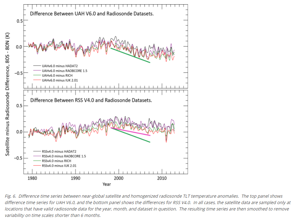
Further: David asked below about comparison with radiosondes. That FAQ has a diagram showing the comparison:


It is sat - sondes, so when you see in this century that the plot goes down, it means that radiosondes are showing more warming that satellites. With UAHV6.0 it is a lot more; with RSS TLT V4 it is closer, but sondes still show more warming. As the FAQ says:

"Note that all satellite data warm relative to radiosondes before about 2000, and then cool after about 2000. We don't know if this overall pattern is due to problems with the radiosonde data, with the satellite data or (most likely) both."


Saturday, December 8, 2012

TempLS correlation with other indices.


Since June 2011 I've been posting monthly TempLS global averages, before the other surface indices appear. The purpose of this haste is partly to see how well it performs in comparison, uninfluenced by "peeking". Here is a recent monthly comparison, with links to earlier months. I post the data here.

So it's now time for a review on how well TempLS tracks. Along the way, I found some interesting results on how the main indices track each other.

Data plot

The data sources are:
HADCrut 4
Gistemp Land/Ocean
NOAA Global Land Ocean
RSS MSU Lower Troposphere
UAH Lower Troposphere
and TempLS. The data is tabulated
here

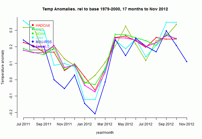
So here's a plot of the indices for those 17 months, set to a common anomaly base period of 1979-2000. Generally the surface-based (non-satellite) follow each other pretty closely:


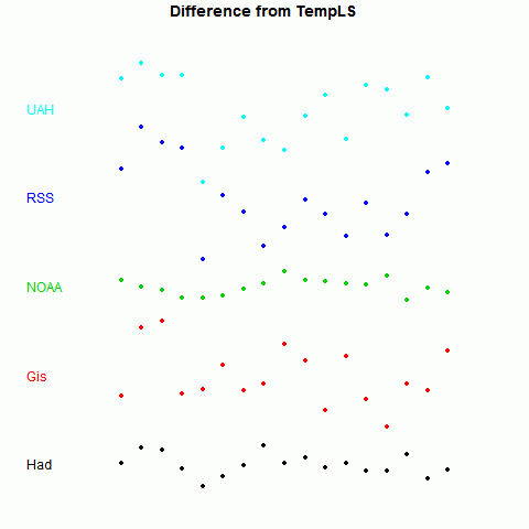
Now to show more detail of the differences, I'll plot the monthly differences between TempLS and the others. I'll arbitrarily zero the plots in a staggered way to make a point:


Now it becomes clearer. TempLS tracks NOAA very well, HADCrut 4 a little less, GISS less again, and the lower troposphere indices rather poorly.

There is, of course, a good reason for this. TempLS and NOAA use very similar datasets - GHCN land data, and ERSST. TempLS uses unadjusted GHCN, but there is very little adjustment in this time frame.


Quantification

I wanted to see also how the other indices track each other, and to give a statistically testable measure. An obvious one is just the standard deviation of the scatter seen in the figure above. Here is a table of that measure for each pairing:

Standard Deviations of differences (°C)

HadGisNOAARSSUAHTLS
Had00.05790.02740.08360.07210.0248
Gis0.057900.06920.08250.10170.0653
NOAA0.02740.069200.09250.07560.0183
RSS0.08360.08250.092500.05610.0867
UAH0.07210.10170.07560.056100.0754
TLS0.02480.06530.01830.08670.07540

The differences are marked - 0.0183°C for NOAA vs 0.0653°C for GISS, relative to TempLS.

Another measure is the correlation coefficient ρ for the monthly changes. This has the advantage that it can be easily tested for significance, with the formula for t-value:

t = ρsqrt((n-2)/(1-ρ*ρ))
where n is number of months. As usual, t is significantly above zero at 95% confidence if it exceeds 1.96. Actually, the significance is diminished by autocorrelation etc. Still, in cases of interest it clears that level by a wide margin.

Correlation coefficients of monthly changes

 
HadGisNOAARSSUAHTLS
Had00.5940.8450.6010.6780.923
Gis0.59400.4230.4040.1480.505
NOAA0.8450.42300.5490.7220.968
RSS0.6010.4040.54900.8740.599
UAH0.6780.1480.7220.87400.71
TLS0.9230.5050.9680.5990.710

t-value of monthly changes

HadGisNOAARSSUAHTLS
Had02.765.922.813.458.99
Gis2.7601.751.650.562.19
NOAA5.921.7502.463.914.43
RSS2.811.652.4606.742.8
UAH3.450.563.96.7403.77
TLS8.992.1914.432.83.770

The correlation of TempLS with all the indices is significantly positive, although with GISS barely so, over this period

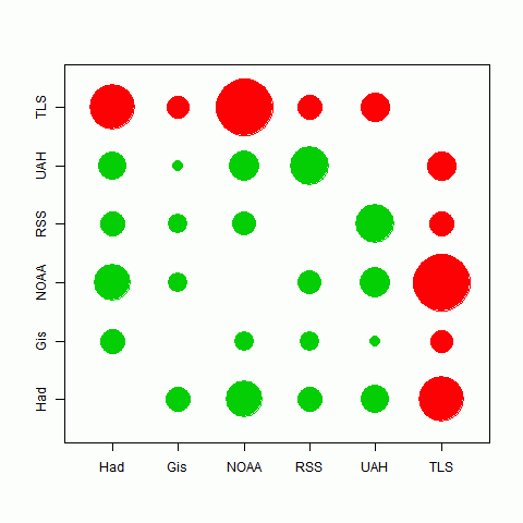
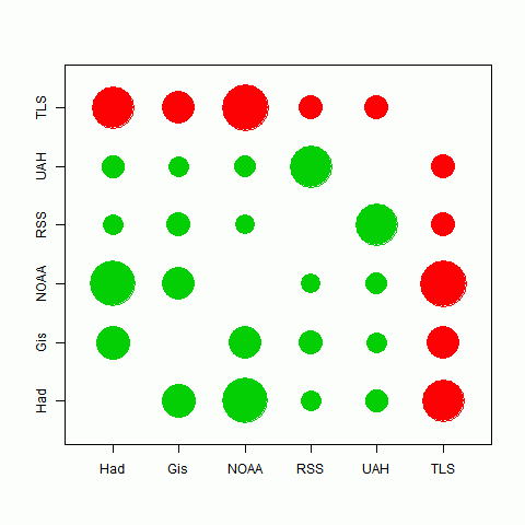
Here's a graphical representation of the correlation. The circle areas are proportional to the t-value of the pairing. Big means close tracking. In fact, the area is proportional to ρ*sqrt(1/(1-ρ*ρ)); there's no difference for one plot, but it means that when I compare to different periods, the circles do not inflate with the longer period.
The best correlations are in fact between TempLS and HADCrut and NOAA, which likely indicates the commonality of their data sources. There is also quite good tracking between the satellite indices. It seems that the different methods used have less effect than the different data sets.


Longer periods

I looked at the 17 months for which TempLS made predictions. But comparisons between other indices are valid beyond that period. As indeed are comparisons with TempLS, because in calculating the monthly values I actually didn't peek.

The story is very similar. All the correlations are now highly significant. I'll just show below the circle plot for periods of five and ten years:

Correlations over 5 yearsCorrelations over 10 years
Correlation of TempLS and GISS seems better over the longer periods, and with NOAA not quite so good..


Conclusions

There are interesting patterns of correlation between the various temperature indices. Those using similar datasets correlate very well. GISS, which uses a more diverse set, behaves rather differently.

TempLS fits very well into the NOAA/HADCrut grouping.

Sunday, November 17, 2013

Cowtan and Way trends


A new paper by Kevin Cowtan and Robert Way in QJRoyMetSoc is getting a lot of discussion. See Real Climate here, SkS here and here, Lucia here and here, Cliamte Etc here.

The authors say:
"A new paper published in The Quarterly Journal of the Royal Meteorological Society fills in the gaps in the UK Met Office HadCRUT4 surface temperature data set, and finds that the global surface warming since 1997 has happened more than twice as fast as the HadCRUT4 estimate."

Some eyebrows have been raised at the size of the trend change from improving a relatively small area. I was surprised, too. So I did some calculations to see.

Update: The R code for calc and plotting is here. The data is provided by the authors here.

The need for the change

Met station coverage of the Earth is uneven. When grid averages are taken, and then combined for a hemisphere or global average, quite a lot of cells have no data. What to do?

The default is to leave them out of the average. But that is not a neutral decision. In arithmetical effect, they have been replaced by the average value of the cells with observations. And this may be a poor approximation. It should be improved with whatever information is available.

The particular issue with Hadcrut is data at the poles. In computing trends, missing cells are given the global average trend, but the poles are warming much faster. This is a big bias.

Cowtan and Way used UAH satellite data to get that improvement. I won't go into detail here about how they did it, but I'll just look at the dataset results. They looked in particulat at a period from 1997-2012 (16 years) which is commonly discussed as a pause. They showed trends including their hybrid method, which uses UAH-based infill:
DatasetHADCRUT 4     UAH            C&W hybrid
Treend C/dec0.046     0.0940.119
Actually, I don't think they cited the UAH trend, but I calculated it from the data they used.

So the new trend isn't that much greater than UAH. But to see just how modifying polar trends made the difference, I'll show the latitude averages for the 5° ranges.

Latitude averages


In computing these for the HAD 4 data, I replaced data-free cells with the global average for that month. So they aren't a good guide (for HAD 4) to actual trends, but, as described above, they do correspond to what effectively goes into the global average, so you can see the effect of changes. Here's the plot:


(An earlier version of this plot had the sign of latitude wrong)

As you'll see, the Antarctic and Arctic trends for the hybrid are large, but not so very much larger than UAH. I am still a little surprised that this is so, but it's not unbelievable.

Appendix

Here are the numerical results as plotted:
LatitudeHAD 4UAHC&W hybrid
87.50.1390.8191.509
82.50.190.9871.692
77.50.3730.8971.452
72.50.6170.6411.196
67.50.570.4950.825
62.50.2360.3170.353
57.50.0410.120.088
52.5-0.0830.05-0.035
47.5-0.0560.013-0.034
42.50.115-0.0280.102
37.50.0610.0260.066
32.50.0670.1310.074
27.50.0850.1040.086
22.50.0510.0680.091
17.50.0740.0090.09
12.50.085-0.0150.093
7.50.056-0.0080.059
2.5-0.003-0.027-0.011
-2.5-0.031-0.017-0.044
-7.5-0.039-0.037-0.04
-12.5-0.01-0.039-0.004
-17.5-0.002-0.0280.01
-22.50.050.0360.063
-27.50.0880.0620.093
-32.50.1370.0660.141
-37.50.0820.0530.094
-42.50.0460.1260.074
-47.5-0.0790.202-0.048
-52.5-0.1140.215-0.039
-57.5-0.170.154-0.041
-62.50.040.102-0.009
-67.50.080.1520.099
-72.50.0790.5690.566
-77.50.1220.4370.646
-82.50.0860.2990.685
-87.50.1010.2230.901
Global0.0540.0940.119


Saturday, September 6, 2014

Fragility of the "pause"

This post relates to a technical meaning of the pause, often dwelt on on skeptic sites. Some number of years for which the global temperature trend to present has been negative or zero. Of course the pause itself should be more broadly defined as a period where the trend is substantially less than some expected value. But the zero trend seems to attract people, so I thought some prognosis of it might be interesting.

Actual zero trend tends to get mixed up with trend not significantly different from zero. I'll stay away from the latter as I think it is a misuse of statistical significance (SS). If you have SS, you can infer something. If you don't, you can only infer that a test has failed. Maybe too much noise; maybe an inadequate test.

Werner Brozek runs monthly articles at WUWT. He looks at a variety of indices, and notes the number of years of zero trend. He also looks at SS tests, which I think are misplaced. Anyway, something is happening there. The pause given by most indicators is shrinking.

Lord Monckton runs monthly posts with titles like Global Temperature Update – No global warming for 17 years 11 months. He is always referring to the MSU-RSS index, which is not surface, but lower troposphere. Dr Spencer, who manages the other LT index from UAH, wrote about how UAH and RSS are diverging, and advised:
"But, until the discrepancy is resolved to everyone’s satisfaction, those of you who REALLY REALLY need the global temperature record to show as little warming as possible might want to consider jumping ship, and switch from the UAH to RSS dataset."
Lord M is following that advice, as we shall see. Indeed, from 18 years ago to present, RSS has zero trends. But as you'll see below, all other indices have trends from 0.5°/Century to 1°/Century. No 18 year pause there.

Anyway, I took a number of indices (most sources, graphs and some tables here), and plotted for each index the trend from time x in the past to now (July 2014). I've plotted the last 18 years, to match Lord M, skipping post-2012 since short trends are large and variable and mess up scales. Here is a resulting plot:


The skeptic convention is that the pause goes back to the earliest crossing of the x axis. So for example HADCRUT 4 would be "paused" since about 2001, and you can see Lord M's 18 years for RSS. You can also see why he likes RSS. It really is an outlier. Interestingly, UAH is almost an outlier in the other direction, with a pause of about six years. The surface measures are fairly consistent.

The ups and downs of the curves follow peaks and valleys in the temperature curve itself, and I've shown faintly the UAH time series near the bottom (12-month centered running mean). A high temp lowers the trends in later times. To get a broader view, I'd recommend the Moyhu trend viewer. Here for example is HADCRUT 4 - in the original you can click on both the triangular plot and the time series to find out various numerical information. The top corner looks like this:


The right end is where trends ending at present are found, and as you go down, the starting point gets earlier (difference in years shown on axis). As you go left, the end point gets earlier. The diagonal shows trends of 1 year duration. So the plot above represents colors along the right edge. Brown represents zero trend, and you can see a bluish (negative) area bottom right, where the brown boundary tangles with the edge. The brown points on the edge correspond to the crossing points (red HAD4 crossing the x xis) in the graph.

You'll see something similar in other plots that you can get by pressing buttons. The key thing is that we are reaching the edge of that region. It will soon be left behind, and won't leave any brown on the axis. The pause will contract dramatically.

Here is a movie plot that shows that. I have plotted how the trend plot would look if you started in March 2014, April etc. And I have padded the future with reflected temperatures - August supposed to be the same as July, September =June etc. This enables us to see how the arithmetic pans out if the present warmth continues. There are in fact data for UAH and MSU-RSS for August, which I have used (both went down). Click the buttons at the top to flick through.


You'll see from March onward, all the plots are moving up, so the pause has tended to shorten. Not so much for RSS, though, as Lord M has been repetitively noting. Now the interesting thing is that projecting through to November, all the indices except RSS have cleared the axis, and UAH still has the 2010 dip. Even HADCRUT clears, though only just. No more pause at all for surface indices!


Thursday, April 30, 2015

UAH v6 trends


Roy Spencer has announced the beta version of V6 of the UAH lower troposphere temperature index. Sou has the story.

The result now look much more like RSS. The big things that made this happen seem to be that
  • UAH now uses a previously deprecated diurnal correction
  • UAH has reduced sensitivity to land surface emission, making it a more purely tropospheric measure (and more different from surface)

Incidentally, Dr Spencer's announcement is very informative on how the UAH sausage is made.

I was curious to see what difference it made to the back trend plots, as available here with the trendback button. It shows the trend from the various years on the x-axis to present. UAH is now similar to RSS, though not as low, and the pause is back. And the distinction between surface and troposphere indices is very clear. Here is the plot:


Sunday, January 10, 2016

Satellite temperature readings diverge from surface, and each other.

The satellite indices from UAH and RSS try to measure temperature in the lower troposphere by a very complicated process of deduction from microwaves emitted by oxygen. Recently, they indicate temperatures that are rising more slowly than surface measures. So they are popular with naysayers, who gloss over the fact that they are actually measuring (or attempting to measure) very different things.

A prominent recent example was Ryan O'Hare, in the Daily Mail, headline:
"2015 may NOT have been the hottest year on record after all: Satellite data shows temperatures were lower than first thought"

Totally inaccurate, of course. Satellite temperatures do not contradict the surface record. They say (less reliably) something about the temperature in a different place. But this seems to be being worked up as the standard distraction from the 2015 record temperature. For last year's record, they tried Oh, but we can't be sure. This time the margin will be too great for that, so satellites will have to do.

There is a WUWT post here which tries by comparison to suggest that surface temperatures are trending differently to troposphere, and are therefore wrong. It's one of many, and graphs like this crop up:


I drew attention here to the huge adjustment that was made to UAH this year, in going from V5.6 to V6. In fact, the V6 plotted above is still in beta, and V5.6 is still maintained. So recently I restored it to the datasets that I collect and plot, and you can see it in the active plot. So I thought I would add V5.6 to this comparison. And sure enough, V5.6 is far closer to the surface measures than it is to V6 (or RSS). Below the fold is a snapshot, where the anomaly base is 1981-2010 for all:

Monday, September 9, 2013

More on global temperature spectra and trends.


In my previous post, I looked at ARIMA models and their effect on uncertainty of temperature trend, using autocorrelation functions. I was somewhat surprised by the strength of apparent periodicity with a period of 3-4 years.

It is plausible to connect this with ENSO, so in this post I want to probe a bit with FFT's, removing ENSO and other forcings in the spirit of Foster and Rahmstorf. But first I'd like to say something about stat significance and what we should be looking for.

Statistical significance is to do with sampling. If you derive a statistic from a sample of a population, how much would it vary if you re-sampled. How this applies to time series statistics isn't always clear.

If you measure the average weight of people on a boat, and you are interested in whether that boat will float, then yo don't need statistical significance. You only need to measure accurately. But if you want to make inferences about a class of people on boats, then you do. And you need to define your population carefully, and decide to worry about variables like age and sex.

A trend is just a statistic;  is a measure of growth. You can quote a trend (for a fixed period) for something that is growing exponentially, not of course expecting it to be constant over other times. Trend is a weighted average, and the same issue of statistical significance applies. You can quote a trend for 20 Cen temperature anomaly without worrying about its properties as a sample, or that it was not very linear. But if you want to make inferences about climate, you do need to treat it as a sample, and form some model of randomness. That involves the study of residuals, or deviation from linearity, and so apparently non-random deviation from linearity also becomes important, because you have to distinguish the two.

The autocorrelation functions of the previous post illustrate (and help to solve) the issue. Short term lags form the basis of the stochastic models we use (ARIMA). But once we get beyond lag ten or so, there is behaviour that doesn't look like those models. Instead it is due to periodicities, and quadratic terms etc.

Now in that case, the (lag stochastic/secular) regions were not well separated, and it is likely that the secular effects are messing with the ARIMA models.

So, coming back to what "sampling" means here. It's a notion of, what if we could rerun the 20th cen? Of course, with GCM's we can. But would the secular effects repeat too? ENSO is a case in point. It has aspects that can be characterised - periods etc. But they aren't exactly predictable. Phase certainly isn't. Should they have some kind of stochastic representation?

We can defer that by using what we know of that instance of ENSO forcing (and volcanic and solar) to try to focus more on the ARIMA part of the acf's. I'll do that here by looking at the Foster and Rahmstorf residuals.


Power spectra

But first I'll revisit the previous analysis and its apparent periodicity. Here are the acf's:


HADCRUT
GISS
NOAA
UAH
MSU-RSS

And here are the corresponding power spectra, which are the discrete Fourier transforms of the acf's


HADCRUT
GISS
NOAA
UAH
MSU-RSS


You can see the prominent peak at about 0.22 yr-1 (45 months) which Is likely ENSO related.

Removal of forcings

Foster and Rahmstorf (2011) used known forcings (ENSO, volcanic and solar) to regress against temperature, and showed that the residuals seemed to have a much more even trend. I did my own blog version here. But for this exercise I used the F&R residuals described by Tamino.

First, here are the power spectra. The marked frequency at about 0.22 yr-1 (or its harmonic at 0.44 yr-1) is still often dominant, but its magnitude is reduced considerably:


HADCRUT
GISS
NOAA
UAH
MSU-RSS

And here are the acf's. The critical thing is that the oscillation near zero is reduced, and intrudes less on the peak at zero, which is smaller, and should be freer of secular influences.


HADCRUT
GISS
NOAA
UAH
MSU-RSS

Here are the acf's with models fitted. It is no longer the case that ARMA(1,1) is clearly better than AR(1), and both taper close to zero before the acf goes negative. For the satellite indices, there is little difference between the models. In all cases, the central peaks of the acf's are much less spread, indicating much tighter CIs.


HADCRUT
GISS
NOAA
UAH
MSU-RSS

Finally, here is the table of model fit results:

ResultHADCRUT4GISSNOAAUAHMSU-RSS
OLS trend β1.70201.70921.75001.40861.5676
OLS s.e. β0.04630.06510.05140.06650.0641
AR(1) trend β1.69841.70841.74491.41611.5678
AR(1) s.e. β0.07850.09360.07650.11010.0978
AR(1) Quen s.e.0.07810.09330.07620.10960.0974
AR(1) ρ0.48020.34450.37350.46130.3948
ARMA(1,1) trend β1.69531.70251.74231.41881.5687
ARMA(1,1) s.e. β0.09460.11320.09360.11890.1027
ARMA(1,1) Quen s.e.0.09400.11230.09300.11820.1022
ARMA(1,1) ρ0.69010.64330.66720.56960.4849
ARMA(1,1) MA coef-0.2744-0.3378-0.3447-0.1353-0.1058


As Foster and Rahmstorf found, the trends are not only quite large, but have much reduced standard errors, whatever model is chosen.

Conclusion

Subtracting out the regression contributions of the forcings (ENSO, volcanic and solar) does reduce the long-lag oscillatory contributions to the acf, though they are not eliminated. This enables a better separation between those and the stochastic effects.