OK, this has nothing to do with climate. But it's connected with the trends gadget. I made a nudger that looked like this <<<<>>>>. If you click on the center symbols, you nudge by one month. Next out by 2, then four, and in this version, the outermost move by 8.
Well, suppose the sequence of symbols continued, in powers of 2, as far as needed. How far can you be sure of being able to move with, say, 2, 3, 4 or 5 clicks. More precisely, what is the least number that requires n clicks.
For n=2, it's 3. For n=3 it's 11 (8+2+1 or 16-4-1). But 4? 5? Can anyone think of a rule?
I can think of an upper bound for any n. It's less that 4^(n-1). But not a general formula.
Sunday, November 13, 2011

Friday, November 11, 2011
A JS gadget for viewing temperature trends.
In my previous post I showed a map of all possible trends calculated over sub-time intervals of a period, with a mechanism for selecting different datasets and periods. Since there seem to be ongoing interest in viewing trends, I thought a useful Javascript gadget could be developed from that.
Now when you select a dataset/time combination, a corresponding time series plot is displayed, with two colored balls representing the start and end of each trend period. The numerical data are displayed on the right. There are several ways of controlling the horizontal position of the balls:
Also on the right you'll see a URL. You can copy this and use it to link to produce directly the configuration you have created. My JS kungfu is not yet up to putting it in the address bar.
You'll notice there is a second set of controls for selecting datasets/times. You can use either that or the one on the top graph. I made the second one so that it was close to the bottom graph.
The blue ball is always the rightmost one. If you try to cross them, they will just switch - you'll still get the plot you were asking for.
The calculation is the same as previously - OLS regression with no allowance for autocorrelation. The black curve in the plots of monthly data is a centred 12-month moving average.
Now when you select a dataset/time combination, a corresponding time series plot is displayed, with two colored balls representing the start and end of each trend period. The numerical data are displayed on the right. There are several ways of controlling the horizontal position of the balls:
- You can click on the colored triangle. Each position represents a start/end combination, so the balls will move to the endpoints of the fitted regression line, and the slope and locations will appear on the right. It's a realisation of the color on the plot, and should correspond.
- You can move the balls by clicking on the red or blue bars on the graph.
- You can nudge, for fine control, using the <<<<>>>> device of the appropriate color. The outside symbols move the ball of that color by 8 months, the next by 4 and the innermost by 1.
Update: It seems to be working now.
Well, it almost works. Unfortunately, on this blog system you can't test JS in the editor - I have to go straight from the home computer (where it worrks) to live. In fact everything is working except the movement of the balls. In particular, you can click on the color plot and the numerical values will appear on the right. The issue with the balls is that I have to move them by absolute position, and so I have to find out what Blogger containers they are in. We'll get there.
Update. I've posted this at another site here. It seems to work correctly there. It's possible Blogger just isn't going to let me set the balls in motion.
Well, it almost works. Unfortunately, on this blog system you can't test JS in the editor - I have to go straight from the home computer (where it worrks) to live. In fact everything is working except the movement of the balls. In particular, you can click on the color plot and the numerical values will appear on the right. The issue with the balls is that I have to move them by absolute position, and so I have to find out what Blogger containers they are in. We'll get there.
Update. I've posted this at another site here. It seems to work correctly there. It's possible Blogger just isn't going to let me set the balls in motion.

| 

|
Also on the right you'll see a URL. You can copy this and use it to link to produce directly the configuration you have created. My JS kungfu is not yet up to putting it in the address bar.
You'll notice there is a second set of controls for selecting datasets/times. You can use either that or the one on the top graph. I made the second one so that it was close to the bottom graph.
The blue ball is always the rightmost one. If you try to cross them, they will just switch - you'll still get the plot you were asking for.
The calculation is the same as previously - OLS regression with no allowance for autocorrelation. The black curve in the plots of monthly data is a centred 12-month moving average.
Monday, November 7, 2011
GMST trends - a cherrypicker's guide.
Update
I've developed the diagram of this post into an interactive trend-viewer here.With the conversation about the new BEST data, there has been an uptick in the posts showing plots from WoodForTrees with trends proving something or other. Here is a recent duel.
So I decided to expand the plots from the previous post to maybe make all this redundant. You'll see a plot of all the popular time intervals, with trends presented in a colorful array. Now all you have to do is spot the color you like, and look up the endpoints on the axes. Or if your disposition is wonkier you can try to spot patterns in the way the trends vary.
Some math details - I've taken each of nine indices and done an OLS regression of the monthly temperature against time for each pair of start and end points an various ranges. No prior smoothing, no annual averaging. There is a little colored square indicating the trend, in °C/century, for each pair. I haven't included periods shorter than four years. I've used rainbow colors, except for two ranges which help to calibrate by eye. These are zero trend, in gray, and 1.7°C, representing a recent average, in brown.
The plot itself is an interactive compendium of 36 images, for the 9 datasets and four time ranges. The times are from 1999 to present, 1989 to present, 1960 to present, and 1901 to present. They are presenting different fragments of the same trend array. I chose 1999 to present a popular contention at the moment that over a decade the trend is zero or less. For the land/sea indices there are certainly ranges for which that is true - I think this plot gives a fuller picture.
To use the interactive aspect, you can click on either of the legends in red to get any combination of index and time. Your current choice will be shown in black. As with all these plots that I do, the images are downloaded when requested, so when you first click there is a short pause - however, when you revisit that image, it's now in cache.
Below the jump, I'll say a bit more about some stationary images.
Update - I see now that {'ve posted that the interactive part doesn't work in IE (this seems to be an issue of security settings). It works in Firefox, and I expect that it will work in Safari and Chrome. I have added at the bottom of the post a table of links to the still images.
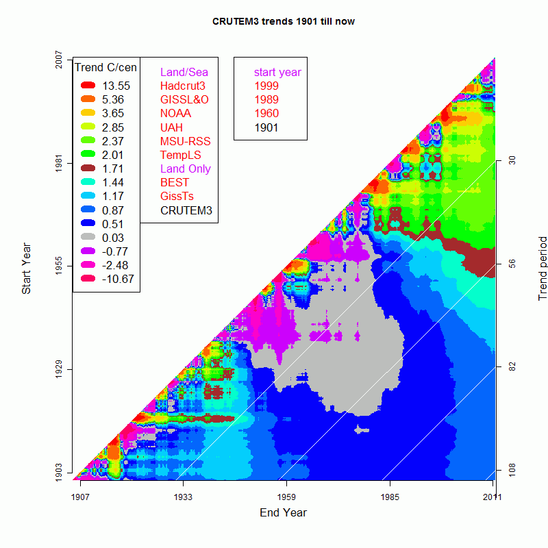
Firstly, a few more details about the plots. The faint diagonal lines show the trend period, as enumerated by the axis on the right. I don't go below four years, and part of the purpose of this presentation is to show how noisy short term trends can be. You'll see that the BEST plot stops in March 2010 - I did not include the data-deprived months of April and May, and there is no data for later months.
The data sources for the plots are:
- HADCRUT3
- GISS Land/Sea
- NOAA
- UAH Satellite
- MSU-RSS
- CRUTEM3
- GISS MET stations
- BEST all land monthly averages
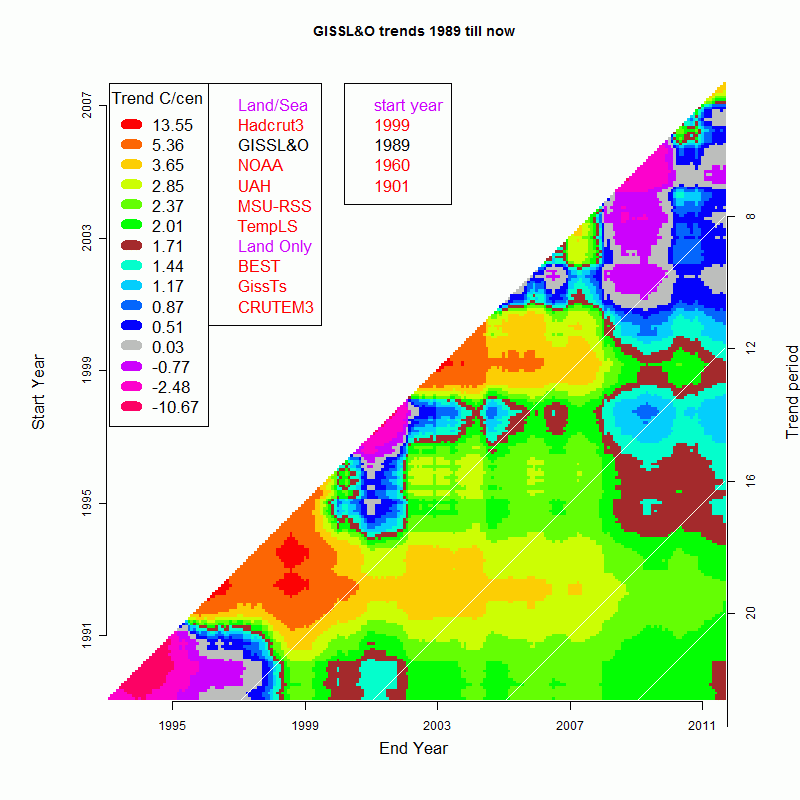
Here is the GISS Land/Ocean plot shown over a 20-year range. This image is not interactive. You can see some horizontal and vertical patterns. The vertical stripe at 2008/9 shows that this was a relatively cold year, and so trends that terminate there are likely to be negative, There was indeed a flurry of trend-watching at that time, and this plot shows why. Remember gray is approx zero trend, so the short-term trends based on 2008 go negative.
Another strong feature is the 1998 hot year, showing as a horizontal stripe. That stripe has lower trends, because the peak sits at the start of the trend period. One would expect the vertical bar below to have markedly positive trends, and it doesn't. I think the reason is that there is another feature - the positive horizontal bar produced by the cold Pinatubo years around 1993. The result is positive, but the pattern by eye goes with the horizontal rather than vertical.
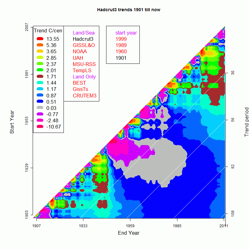
Here's HADCRUT3 over the century. The longer time shows how the noise gathers on the shrt-term diagonal, with more sustained patterns as you get away from that. Right in the middle there is a big zero to negative trend region corresponding to the post-1940 cooling. The warm '30's show out as a vertical bar. And towards the top right, the shorter term recent segments have a strong tendency to be positive.
Well, I could go on, but I think this may help explain how to use the plots. So click away!
Here is a table of links to the still pictures:
| Time | HADCRUT | GISS LO | NOAA | UAH | MSU-RSS | TempLS | BEST | GISS Ts | CRUTEM3 |
| 1999- | Link | Link | Link | Link | Link | Link | Link | Link | Link |
| 1989- | Link | Link | Link | Link | Link | Link | Link | Link | Link |
| 1960- | Link | Link | Link | Link | Link | Link | Link | Link | Link |
| 1901- | Link | Link | Link | Link | Link | Link | Link | Link | Link |
Subscribe to:
Posts (Atom)


 Posts
Posts


