Thursday, February 19, 2026

January global surface TempLS up 0.04°C from December.

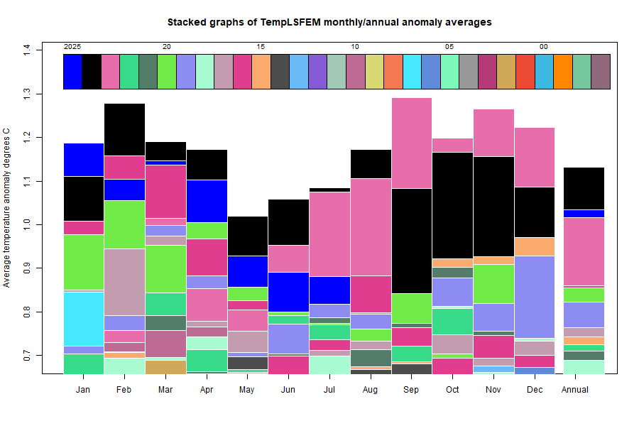
The TempLS FEM anomaly (1961-90 base) was 0.886°C in January, up from 0.845°C in December.

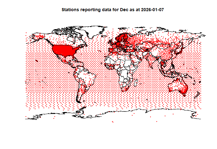
There was again a strange sequence in the GHCN V4 monthly reports. Until last August, by about 6th of the month I would have about 3200 or so land stations reporting outside the US (ie ROW), which was enough to publish. After August, data was much more sketchy, with countries like China missing, and struggling to reach about 2600 stations. By about 10th month, I could get a reasonable result with merging JMA (Japan) data.

In January, there was suddenly an early flush of ROW data, even more than before August. But this month, by the 7th, there were only 1164 ROW stations. Then the situation improved, and now there are 3194, almost back to the old days. So I have confidence in publishing.

However, I looked into using GHCN Daily data, which is where GHCN-M comes from. I found, when GHCN-M had only 1164 stations, that the number of monthly averages I could get from GHCN-D was very dependent on how many days I insisted the month should have. 25 did not do much better than 1100, but if I relaxed to 20, I could get up to 3000. I presume that the last days of the month are coming in slowly.

So I may switch to daily to get a better idea of what is happening, and maybe post earlier. However, for now I am still using GHCN-M (+JMA)/

Here is the temperature map, using the FEM-based map of anomalies. Use the arrows to see different 2D projections.


As always, the 3D globe map gives better detail. There are more graphs and a station map in the ongoing report which is updated daily.

Monday, January 5, 2026

December TempLS down 0.161°C; 2025 was second warmest year (just).

The TempLS FEM global anomaly anomaly average temperature (1961-90 base) was 0.862°C in December, down from 1.023°C in November. This quite large drop almost put 2025 into third place among years. But not quite, at 1.017°C it was well behind 2024 (1.127°C), but a whisker ahead of 2023 (1.016°C). That is effectively a tie.

There was an apparent turnaround with GHCN this month. Since July 2025, it has taken many days to get more than about 2500 stations outside US (the resolution-limiting number), and then omitted countries like China and Iran. So I had to supplement with data from JMA, which also took about 10 days to appear. But now, on the 4th of the month, we have 4263 such stations, which is more than the best of times in the past. I'm cautious about it - sometimes the number goes down. Anyway, here is the map of stations, including China and Iran:

Here is the corresponding stacked graph, note the annual values:


Being so close to 2023, 2025 is barely visible. Below is the temperature map for December, using the FEM-based map of anomalies. Use the arrows to see different 2D Earth projections.


As always, the 3D globe map gives better detail. There are more graphs and a station map in the ongoing report which is updated daily.

Trump's electricity price rises and renewables.

I've been arguing again at WUWT, eg here and here. The context is a campaign being waged to try to shift responsibility for coming US electricity price rises away from the Trump administration, to other scapegoats - while still blaming Biden, of course. The talking point seems to come from the White House. It is that you can blame the blue states, because their climate policies make electricity prices higher than red states.

Well, it's true that generally prices are higher in blue states - WUWT posted this map to make the point:

But I added in yellow the percentage of generation performed by wind in the top ten wind states. They are mostly red states, and have quite low electricity prices. So it isn't use of wind, at least, that makes the difference.

A commenter, Mark BLR, showed a graph of price versus wind use which makes the point more comprehensively. My version is here:

States with high wind use, red or blue (but mostly red) have prices pretty much at the minimum.