Notably, there were heat waves in W and N Europe, extending in a band through Russia, and into N Sahara. Parts of W and E North America were also hot, but unevenly so. Cool areas in S America and Southern Africa, and Central Siberia. The Arctic was mixed, with some cold, and the Antarctic even more so.
BoM is on El Niño Watch, meaning about a 50% chance, they say, but nothing yet.
Arctic Ice seems to have thawed rapidly lately, but there may be recent artefacts. JAXA has been irregular.
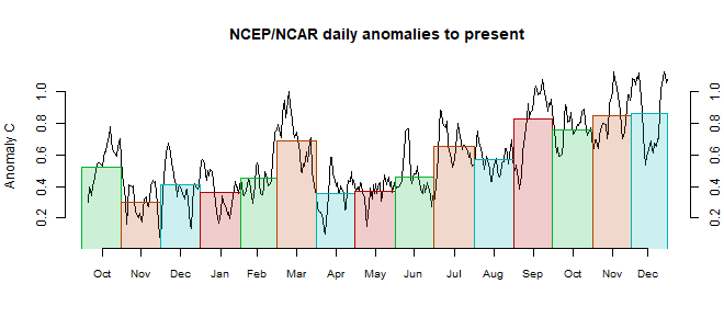
This post is part of a series that has now run for some years. The NCEP/NCAR integrated average is posted daily here, along with monthly averages, including current month, and graph. When the last day of the month has data (usually about the 3rd) I write this post.
The TempLS mesh data is reported here, and the recent history of monthly readings is here. Unadjusted GHCN is normally used, but if you click the TempLS button there, it will show data with adjusted, and also with different integration methods. There is an interactive graph using 1981-2010 base period here which you can use to show different periods, or compare with other indices. There is a general guide to TempLS here.
The reporting cycle starts with a report of the daily reanalysis index on about the 4th of the month. The next post is this, the TempLS report, usually about the 8th. Then when the GISS result comes out, usually about the 15th, I discuss it and compare with TempLS. The TempLS graph uses a spherical harmonics to the TempLS mesh residuals; the residuals are displayed more directly using a triangular grid in a better resolved WebGL plot here.
A list of earlier monthly reports of each series in date order is here:


BoM models apparently are not forecasting an El Niño in 2018.
ReplyDeleteI see you interacted on WUWT with the Death Valley Post. What I find frustrating is that Watts is _so close_ to actually being able to do useful comparisons... but doesn't have the right frame of mind.
ReplyDeleteFor example, he has nice documentation of changes between 2005 and present. The question is, how much do changes 70 feet away matter, and what direction is the effect?
Then, he notes that there's a nearby USCRN site. But he picks only the absolute temperature of the USCRN site, and uses that to discount the absolute temperature of the Furnace Valley site, which is dumb, because they are 20 miles apart.
What he SHOULD have done, is taken the USCRN data from 2004-2018 and compared it to the Furnace Valley data from 2004-2018, which would actually give us at least some indication of what effect resulted from the post-2005 Furnace Valley changes. But, alas, he's a nit-picker, not an actual analyst...
-MMM
Yes, 20 mi away, but also 77 m higher. And if you correct with lapse rate, that brings Furnace Creek into agreement with the CRN station at Stovepipe Wells. Of course, it is just one month...
DeleteThere was a lot of detail at WUWT, but I didn't really get a sense of what changes were supposed to be having an effect. The distances were rather large.
Yes, exactly: lapse rate is one of the ways for there to be an absolute temperature offset between two stations, which is why showing that there is an absolute temperature difference between two stations in one month tells us pretty much nothing. If Watts could show that there was a larger warming trend in the Furnace Valley station than in the USCRN station, THAT would be something. But, in my opinion, despite all the time he spends with the temperature station and his vast body of trivia knowledge about them, he doesn't have a fundamental understanding of how to interpret and understand the data. (e.g., the several times he made errors because he was comparing global temperature records that had different baseline periods, or his assuming that dropping cold stations would bias the record warm, etc. etc.)
Delete-MMM
OT Re: discussion at WUWT (I am banned). I think Senor Garcia has the right station. The Montoro station seems to have a reference number of 5361X and it's own AEMET page here
ReplyDeletehttp://www.aemet.es/en/eltiempo/observacion/ultimosdatos?l=5361X
Clicking the location link takes you to a map centred on co-ordinates 38°00'48.0"N 4°19'49.0"W. The Google Earth imagery shows the same structures as on Paco's tweeted pictures.
What he omits is that the station is around 30m from a large river.
[btw - Apparently one-third of the Met Stations in Portugal broke records on Saturday. I never knew that country had so many airports]
It may be the right station. But it isn't the right instrumentation. If you scroll down the page you linked, it gives current hourly readings. Those didn't come from that Stevenson screen.
Delete"I am banned"
DeleteYou could try again. I think their change to a new system cleared the lists.
Good point. Wouldn't be the first time the official location of a station was misreported.
ReplyDeleteI think the AWS may be quite close by, so the coords may be correct.
DeletePretty clear, as noted at WUWT, from the waist-high grass around the Stevenson nobody is visiting that enclosure daily, never mind hourly. The logical conclusion is that the data is likely from an automatic station located elsewhere and AEMET have not updated the location record.
ReplyDeleteOne would have hoped for a little more due diligence before the accusations of malpractice were published to the world. One wonders if Watts is just lazy, incompetent, or both?