Update: I have replaced the CSV at that link with a zipfile that contains the 2014/5 csv, a 1994-2013 csv, and a readme.
I see the associated WebGL map noticed the heat in Southern Australia. In Melbourne, we had two days at 35°C, which is very high for just two weeks after the equinox. And bad bushfires, also very unusual for early October.
Early results from TempLS mesh for Sept show a fall relative to August; TempLS grid is little changed. I'll post on that when more data is in.
Update. Today 0.865. Extraordinary. I naturally wonder if something is going wrong with my program, but Joe Bastardi is noticing too:

Update. Ned W has made a histogram (see comments) showing how unusual these readings are.


Thanks, Nick.
ReplyDeleteJust for fun ... aggregating to monthly periods, the 20 months from Jan 2014 thru Aug 2015 have a mean of 0.208 and a standard deviation of 0.0777.
October is only one week old, and temperatures will presumably drop soon, but so far the "monthly" average is 0.6268, which is 5.4 standard deviations above the mean.
Surely that won't last, but ... wow.
Are you sure about "That is on an anomaly base of 2014-5."? Seems you meant some other base.
ReplyDeleteYes, indeed. That was the period of data I filed. The base is 1994-2013. Thanks.
ReplyDeleteWow... now up to 0.865
ReplyDeleteThe evangelicals will divine something from the Oct month-to-date average of 0.666. No doubt that it portends an AGW fueled rapture in the future... :-)
Yes, it seems to be zooming upward.
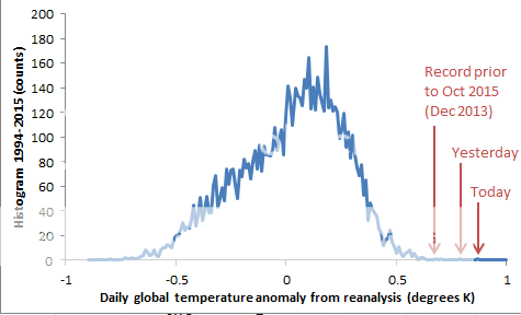
DeleteHere's a histogram of daily anomalies from 1994-present, based on Nick's CSV sheets.
Prior to this week, the record (from Dec. 2013) is about where you'd expect ... just above the very end of the upper tail of the histogram. Yesterday's 0.79 was way above that previous record. And today's value is even further out beyond the tail of the histogram.
Yes, I've just added an update. I looked around for some confirmation. Joe Bastardi has also commented on NCEP/NCAR. I haven't found any other direct confirming data.
DeleteThanks, Ned - I've added your histogram in an update.
DeleteThank you, Nick.
DeleteBastardi seems to show a weatherbell image of NCEP CFSv2 which is quite similar to your NCEP/NCAR index. But I wouldn't say it's a total confirmation because NCEP/NCAR rises more than CFSv2 on the 2 or 3 last days. CFSv2 shows a big rise but not as much : between the 6th and the 8th of october, it's about +0,65°C while the month to date is +0,58 (base 1981-2010) for october. But the big picture is the same : very warm.
ReplyDeleteI think this is the peak ( 6-7 Oct), but according to GFS forecasts global temperatures will fall back slowly during the next 7-8 days, so the first half of October will be really hot.
ReplyDeleteI was wondering about the specific weather conditions behind this event, and took a quick look at the CCI global map. I don't know, is this a correct assessment of the situation?
Cloudy near the Arctic and Antarctica, insulating the heat.
Clear and sunny in the subtropics
Full convection near the equator, releasing heat from the warm ocean surface into the atmosphere
Indeed GFS predicts lower anomalies. What happened to create such global warming (0,86). It seems the antarctic is the main reason with temps about +1,7 wich is really high for 2015 when we had cold temps all year long. The shift to negative southern annuler mode on the first days might explain that.
DeleteKC,
DeleteYes, Antarctica seems a likely cause. TempLS says that Antarctica depressed the September average by about 0.1°C. A turnaround there would be a large part of the explanation. And also probably the difference between this index and GFS, since the data there is thin.
Do you think the large influence of Antarctica to the global mean is real? That means real large temperature change across Antarctica? Or may this an effect of the small number of stations there? So it may simple noise?
DeleteDo you think the periods when antarctica reads cold are real?
DeleteAnon,
DeleteI've just posted the September TempLS results, with an analysis of the Antarctica effect on that index. It's true that to get the best estimate of Antarctica's contribution, a few stations carry a lot of weight, and that adds to noise. It's a limited contribution, because the areas affected are limited. I don't know how thw corresponding weights are in the reanalysis. They use more sources, so upweighting may be less.
If you look at the WebGL map, there are both warm and cold patches over Antarctica. That may be how it is, or maybe showing noise as well.
Nick, in this paragraph are you suggesting that noise is being seen as signal? Maybe someone left the door next to the sensor open for a couple of nights. Maybe there is a risk to burdening a few sensors with the responsibility of representing vast areas.
Deletejf,
DeleteIt's always possible that noise can be seen as signal. For the global average, noise mostly cancels, but the rather unique character of Antarctica does make it possible for noise there to affect the result. I have written a new post with more detailed pictures and analysis. The cold in Antarctica is widespread and fairly uniform. I don't see clear evidence of the result being noise.
Nobody seems to think this is spurious. Last years reanalysis daily map for October doesn't have numbers anywhere close to the numbers posted this year. Last October, on GISS, was .86C. The forecast for this year shows lower numbers coming, but they look like warmer numbers than last years. Logically, with El Nino strengthing and positive PDO, and spiking AMO, the globe surface get very very warm.
ReplyDelete