I'll post about it here, because it illustrates the averaging fallacies I've been writing about regarding Steven Goddard and colleagues (also here). And also because "Alice Springs" is one of those words naysayers sometimes throw at you as if no further explanation is required (like Reykjavik). People who do that generally don't know what they are talking about, but I'm curious, since I've been there.
There are actually two issues - the familiar time series of averages of a varying set of stations, and anomalies not using a common time base. I'll discuss both.
The stations are obtained from the GISS site. If you bring up Alice Springs, it will indicate other stations within a radius of 1000 km. My list was 29, after removing repetitions. I've given here a list of the stations, together with the calculated trends (°C/century) and the long term normals. For all calculations I have used annual averages, discarding years with fewer than nine months data. The annual data (unadjusted GHCN V3 monthly from here) that I used is in CSV form here.
The Goddard Fallacy
So Euan's post shows a time series of whetever reported in each year:

And, sure enough, not much trend. But he also showed (in comments) the number of stations reporting

Now what his average is really mainly showing is whether that highly variable set has, from year to year, hotter or colder locations. To show that, as usual I plot the same averaging process applied to just the station normals. This has no weather aspect:
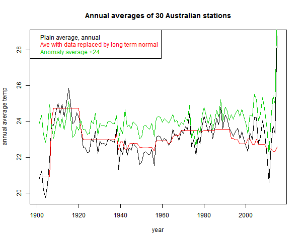
You see the red curve. That incorporates much of the signal that the fallacious black curve includes.
The effect is not as severe as Goddard's, because the stations are more homogeneous. The range of normal variation is less. It can be reduced, of course, by subtracting the mean. That is the green "anomaly" plot that I've shown. It is more regular, but still not much trend. That brings up the anomaly fallacy.
The anomaly fallacy
This is the fault of comparing anomalies using varying base intervals. I've described it in some detail here. If the stations have widely different periods of data, then the normals themselves incorporate some of the trend. And subtraction removes it.
This is a well-known problem, addressed by methods like "common anomaly method" (Jones), "reference stations method" (GISS), "first difference method" (NOAA). I mention these just to say that it is a real problem that major efforts have been made to overcome.
As a quick and mostly OK fix, I recommend using regression fits for a common year, as described here. But the more complete method is a combined regression as used in TempLS (details here)
Update - to be more specific, as in the link it is best to do this in conjunction with some scheme for preferring data local to a region. There I used weighting. But to stick closest to the convention of using a fixed interval like 1961-90, my process would be:
1. If there is enough data in that interval (say 80%) use the regression mean over the interval
2. If not, then extend the interval to the minimum extent necessary to get 30 (or 24) years of data.
The anomaly fix
So I've done a combined regression average:
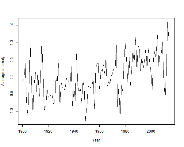
It's clearly warming since about 1940. And by about a degree.
Other evidence of warming
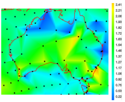
The station trends over their observed periods are almost all positive. So they are over a fixed period. Here, from the active trend map is a snap of trends in Australia since 1967:
Plots of the station data are somewhat obscured by noise. From Climate Etc:

It is rising. But a modest degree of smoothing - a 9 point triangular filter, gives:
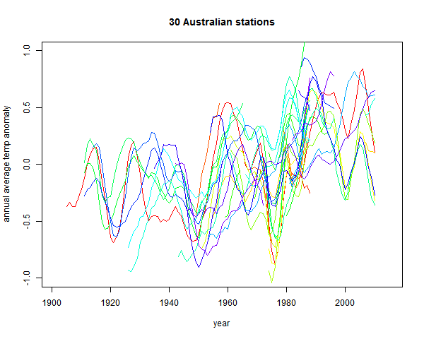
The uptrend is now unmistakeable.


Thanks for this, Nick. I had a look at the BoM records for this the other day, when I read the article at Curry's place. Alice Springs record seems to be a combination of a weather station at the Post Office (until the early 1950s) and one at the airport that goes from the middle of last century to now. There are only a few years of overlap in the mid-20th century, but it seemed that the PO was "warmer" than the airport weather station.
ReplyDeleteI found the same as you - just looking at Alice Springs (I didn't look at the nearest neighbours, which wouldn't be very near I'd have thought). There's been quite a lot of warming there. More than the global average.
Sou,
DeleteYes, it is an interesting history. It was at the Telegraph station until 1932, and then to the PO, and then quite early (1953) to the airport. There has been reasonable warming, though AS quite a lot less than nearby.
Although the airport isn't far away, there is a mountain range in between. The GHCN record is here. They actually adjusted down a little at the change.
> The uptrend is now unmistakeable.
ReplyDeleteNot to me. I just get a broken picture symbol.
That's odd. Is it just that one? Several other imagess are in the same location. I can see it, with FF, IE and Chrome. The URL is here.
DeleteI've had no issues. I've tried multiple browsers, versions of O/S's etc. Haven't tried any LINUX systems. though.
DeleteMearns is one of those pessimistic peak oilers that has a thing against global warming. I don't know what it is exactly -- that since they have a geology background that they are automatically qualified to discuss climate?
ReplyDeleteIn the past he has admitted that "math is not my strong point" . Make of that what you want.
I find it interesting that he doesn't think there is such a thing as a "climate scientist" since they pull/pool from a variety of professions. Geology is hardly a pure science, with "geologists" anything from geochemists to paleontologists to geophysicists.
DeleteBut like most pseudosceptics, the rules are rigid for others, but bent accordingly when applied to himself.
Nick, what difference would area weighting make?
ReplyDeleteIt depends on the spatial heterogeneity, Looking at the map I showed for trends since 1967, the warming seems stronger in the south. If so the result will depend on the N-S balance of stations in the sample, which will fluctuate over time. Area weighting should give a better and more reproducible answer.
DeleteNice work Nick
ReplyDeleteWhat is interesting in the final graph is the clearly defined dip centred on 1975. However you model climate and whatever way you try to analyse it this dip ( which is global in scope ) is something that just won't fit.
It is also interesting that there is a strong post WWII dip but it's not the permanent offset that gets injected into the Hadley SST record as "bias adjustment".
How do you know that dip is not one of your "inverted negative lobes"? :)
DeleteNick, I am a lurker on this site and have learned a lot from your posts and the discussion in the comments. Thanks for your work.
ReplyDeleteI hope I am not too far off topic with this question. I have been commenting on a YouTube blog where Muller made the point in a video interview that BEST finds the same results as all of the other surface temperature groups. Naturally the usual suspects have turned up to talk nonsense.
After a post from me noting that there is little difference between global raw and adjusted data one of the commenters came back with the following:
"No actually, with station data you build a map of Thiesen Polygons. That is what climatologists do. These are polygons showing area that is closer to a given station than any other. Then you assign the weather studied to the station covered by each polygon. Okay, you have a fine net of polygons in the U.S., but Hawaii covers half of the Northern Pacific. This means all do not have the same importance. All you have to do is doctor Hawaii and other large polygon coverage stations, and you change the record. It does not take much."
My lay person response would be that the uneven nature of surface temperature records is well known but that the major problem it presents is in the Arctic which is the fastest warming part of the globe which would support the view that the surface temperature records understate the amount of warming (I would also have a go at his conspiracy ideation at end).
Am I on the right track? Is there a more technical response to the claim made in the quote I provided?
Thanks, Steve,
Delete"Thiesen polygons"? I'm not aware of climatologists doing that, but I do. I know it as Voronoi tesselation. And I did try with large areas here, and got similar results as using more data. But almost all attention now is on land/ocean indices, and the open ocean is quite well covered. So Hawaii doesn't have to represent much of the N Pacific.
You are right about the Arctic. The data gaps are not open ocean, but some land areas and polar. Those can make some difference, but not huge.
Steve,
DeleteOne can get most of the ocean variability from two measurements in the Pacific -- Tahiti and Darwin. This generates the Southern Oscillation dipole that leads to El Nino's and La Nina's.
All this detailed global temperature tracking needs to be compared to what one can predict from the SO Index.
We have likely determined the mathematical behavior behind the SO dipole here: http://forum.azimuthproject.org/discussion/1608/enso-revisit#latest
Not so difficult if you know how to solve the wave equation.
Thanks Nick and WHT for your replies, which have helped me improve my understanding of the issues.
ReplyDeleteAs I now understand it the Ocean part of the Land/Ocean temperature data sets is Sea Surface Temperature which seem to be in good agreement with the Marine Air Temperatures (MAT) data. MAT would be a better ocean analog to surface land temperatures but there is more reliable data for SST. (Interestingly MAT measurements taken at night - NMAT - are more reliable than day time measurements.) Here us a link to some charts demonstrating the relationship between MAT and SST anomalies: https://www.ipcc.ch/publications_and_data/ar4/wg1/en/figure-3-4.html .
SST is developed from a variety of sources, including fixed buoys, Argo floats, ship measurements and satellite measurements.
I will probably post a version of this on the YouTube thread I mentioned, but before I do that is my understanding correct?
"MAT would be a better ocean analog to surface land temperatures"
DeleteIt would, but I don't see that as a requirement. On land we try to measure the temperatures that affect us (and at eye level). MAT has no such status - SST is probably more important, both for sea life and for evaporation. Land/ocean is just an index; the inhomogeneity might be important to the index if sea area varied, but it doesn't.
And as Fig 3.4 shows, they keep very close anyway.
Thanks for the quick reply Nick
DeleteThe MAT measurements are vitally important for calibrating the SST measurements in historiical terms. There has been enough variability in SST measurement techniques (since thermometers in water can rapidly cool when exposed to air), that without MAT measurements, we would think it was much cooler in the earlier 20th century. However, MAT measurements have very poor coverage, while SST are associated with the traffic in the shipping lanes and so are ubiquitous..
DeleteNick,
ReplyDeleteLet me try to get this straight.
First you must be correct that a changing population of stations gives rise to biases in the average temperature. For example if there is a plateau 1000m high in the middle of the area, then the average temperature will depend on how many stations are included on that plateau. To avoid this we have to use normals calculated at each station and to measure 'anomalies' relative to this 'normal'. So if all stations show the same difference then the climate has warmed in that region. Or if the average of all the anolamies increases over time then the local climate is warming.
There are two ways to calculate normals: 1) monthly 2) annual depending on which time resolution you want. In the first case we have 12 normals and in the second place just one. The next choice is the time period over which you define the normal. The community seems to have chosen 30 years currently 1961-1990. This has to be a compromise since why should that particular period be considered 'normal'. Instead it is most likely chosen because it has the highest number of stations available.
Why 30 years and not 10years?
Why 30 years and not 60 years?
If you look at a hypothetical climate which is warming at 0.2C/decade. For the annual normalisation it doesn't really matter how you make the normals the trend will allways emerge.
This process of detecting global warming from station data is fraught with biases. Are you sure that the current methods have the least in-built bias ?
Clive,
DeleteThe basic issue is that. When you average, you are trying to ascertain the mean of a population from a sample. If the population is heterogeneous, you have to do a lot of work to ensure that the sample is representative. The more homogeneous it is, the less that is required.
Say you are polling on an issue where men and women think differently. You have to be sure to get equal numbers in the sample, or to re-weight. But if there is no indication they think differently, it doesn't matter.
With temp, you get the sample there is, and can't improve it. So you have to try to improve homogeneity - ie deal with a quantity that has about the same distribution at each point. Or at least the same expected value.
That is what anomaly does. You try to subtract your best estimate of the expected value, so the residue is zero everywhere. Then there isn't a predictable difference when the sample changes. It's safe to average.
An anomaly based on a single point is a big improvement on nothing at all. A wider base gives more stability. Exactly how wide isn't critical. 30 years is a reasonable compromise, balanced against the problem of finding stations reasonably represented in the range. 20 years would be fine too.
"For the annual normalisation it doesn't really matter how you make the normals the trend will always emerge. "
I did an example here to show why this isn't true. Just take 1 station, uniform rise .1°/dec from 1900-2000. Then split it into two stations, one pre-1950, one post. If you use each average as the anomaly base, the trend is drastically reduced - to about 0.025. The reason is that the anomalies you subtract do themselves make a step function in time, which contains most of the trend.
Nick,
DeleteI agree 90% with your arguments.
However, you wrote earlier. "There is no need for interpolation, and no base period. The linear model handles the time shift.The linear model handles the time shift."
Could you explain what your linear model is - as I am still mystified?
Clive
Clive,
DeleteThere is an overview article on TempLS here and a description of the linear model here. The idea of a linear model for your task - averaging over a cell, was proposed by Tamino, and discussed by RomanM here, where he says:
"The reason that makes such an accommodation necessary is the fact that there are often missing values in a given record – sometimes for complete years at a stretch. Simple averages in such a situation can provide a distorted view of what the overall picture looks like."
I extended the idea of linear model to dispense with cell averaging, and fit an area-weighted model to the whole set of readings.
Thanks - very interesting.
ReplyDeleteI am wondering if there is not another way to label stations by their variance from the monthly temperature means in which they appear. Then as a second step isolate any underlying slow temperature trends within a single cell.
Imagine if you had perfect long term coverage with thousands of evenly spaced stations in each grid cell; then you would be able to measure the average surface temperature rather accurately. Instead we have a changing set of biased measurements, so the best you can do is determine the variance of each station from the mean in order to correct for historical population biases. You may also decide that the best normal seasonal variance for each grid is measured when you have the closest to perfect coverage (1961-1990) and calculate anomalies for each month based on the variance of those stations contributing.
Looks good to me.