Now WUWT, following JoNova, is pouring scorn on BoM, saying basically that they are making it up, since they don't have a record. But there is a very good reason why they don't have a record. It wasn't then a BoM site. It was Air Force, and they get the records from them. And the RAAF has its own priorities.
However, the need for the change, and the amount, is obvious if you just look at neighboring stations, and the BoM program did. I'll show this below the jump.
BoM has all the unadjusted data you need, starting on this page. Ask for the kind of data (monthly, mean min etc), with Amberley in the matching towns. Under Nearest Bureau stations, unset the "only show open" button, and it gives the nearest stations with that data. I want stations with data from 1975 to 1985; enough to see what is happening around 1980. The nearest with this data are Ipswich, Samford and Brisbane. I didn't include Mt Glorious because it is on a mountain top; the others are pretty much on the level.
I then subtracted the monthly means for that decade, to remove seasonality. So here is the graph:
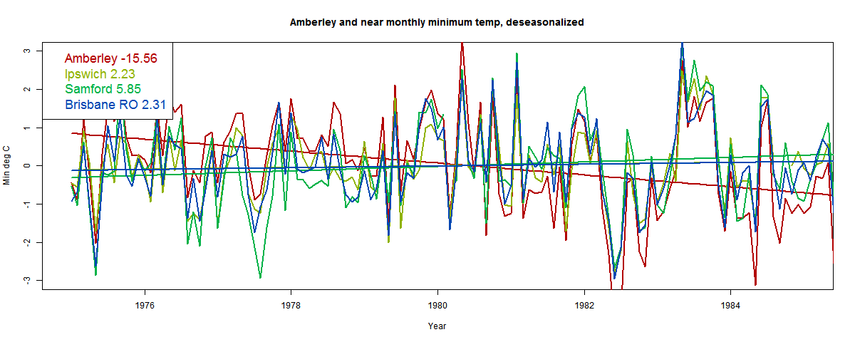
It shows the fitted lines, with trends over the decade shown in the legend. Note that the red Amberley curve is pretty much above everything before 1980, and below soon after. The other stations track each other well. Here is tabulated the trends in °C/century. Notice that one of these is not like the others.
| Amberley | -15.56 |
| Ipswich | 2.23 |
| Samford | 5.85 |
| Brisbane RO | 2.31 |
Update. To show the contrast more clearly, and following a suggestion from Victor Venema, here is a plot of the same data, but with the Ipswich values subtracted - ie relative to Ipswich (chosen because it is by far the closest to Amberley):

The fact that Amberley crosses the axis during 1980 is now much clearer.So I added an adjustment of 1.4°C after Jan 1980. Let's see what it looks like now:

Interesting. Amberley is now back tracking the others, except for some disturbance during 1980. And the slope matches the others. But it's irregular during 1980. That means I haven't guessed the date quite right. I've adjusted upward too early. About August 1980 looks right. Here we go:

Yes, that did it. Now tracking the three neighbors very well. And yes, the slope has gone from -15.6 to 3.51, right in the mid-range of the neighbors.
Where did I get 1.4°C? It's a linear calc - to bring the slope back to mid-range. How does this affect the whole trend for Amberley? It increases the trend by 2.86 °C/Cen. Apparently the BoM adjustment was 3.5°C/cen. I'm sure they looked at more stations.
So there you go. The change happened in August 1980, and it dropped temperatures artificially by


Nick,
ReplyDeleteHow do I obtain the 'raw' data from the BOM page. The link I get seems to be to the adjusted data.
Thanks.
DavidR,
DeleteDid you go to this page? Why do you think it is adjusted? Apart from Amberley, these are not ACORN stations.
I see. Thanks.
DeleteIs it possible to access the raw data from the ACORN stations only? It might be useful to compare the adjusted and unadjusted trends from these on a national scale to see if there is any significant difference.
BOM say they've done this and it that there is no significant difference in trend. Do you happen to know if there's a graph somewhere comparing the two?
It seems to me that if there's no significant trend difference between raw and adjusted data it would pretty much end the argument that skulduggery is afoot.
DavidR,
DeleteI don't know of a location that has just the Acorn stations. But you could pick them out individually. In my previous post, I gave a portal list for HQ stations. I could have restricted to ACORN.
I've shown here histograms of trend for the similar GHCN homogenisation. There is a small upward shift bias, but it's not far from balance.
how did adding 1.4C August 1980+ decrease the values pre August 1980? Looking at the value in your chart for Amberley raw data the first dip appears to be approx -1C and in the last two graphs it appears to be closer to -1.6C
ReplyDeleteI added the adjustment before subtracting monthly means. So in effect, it's subtracting 0.7 before, adding 0.7 after.
DeleteHow do these adjustments take into account any micro-climate differences? It would seem these differences are lost when the data is Homogenised.
ReplyDeleteThe whole idea of anomalies is to leave micro-climates behind, so you can usefully average over large areas. We want to use Amberley data to tell us about the nearest 50 km say. That can't depend on which particular location on the airbase we are measuring.
DeleteBut you have 2 different sites within meters of each other giving a different story don't you? Which one, if any, is right?
DeleteAn example talked about a while ago was Wellington. The station used to be at Thorndon, at sea level. In 1928 it moved to Kelburn, only about a mile away, but 128 m altitude, and 0.8°C colder.
DeleteSo which is right? Both. But between them we have a long term record for the Wellington area. But that area didn't have a 0.8 drop in 1928. So we take it out and have a long term composite measure for the region. It doesn't matter whether it is a Thogndon measure or a Kelburn measure, as long as it is consistent.
So the adjustment you showed here was not the best way to do it, you needed to take one on the "sites" and adjust the data from the other so that you can then join the 2 together to give a more represenattive view for the period. Does that preserve the trend, irrespective of which series is kept intact?
ReplyDeleteThe atmosphere at JoNova seems to be even worse than at WUWT. Or is this post a bad example? Very unpleasant.
ReplyDeleteYou could compute the difference time series of Amberley and the other three stations. That would visualize the change even clearer and also make it easier for you to estimate the right date of the break.
I was going to suggest exactly the same thing; that would show any step changes very clearly.
DeleteSteve Fitzpatrick
Yes, I've tried plotting differences each from Ipswich (the nearest to Amberley). I had hoped to see a near step function, but it's not quite so clear. I have to take a break, but I'll get something out soon.
DeleteIpswich is a major growing urban centre.
ReplyDeleteBrisbane and Samford are nowhere near the same type of climate type.
The period here is 1975-1985. The thing is, the stations track each other very well; Amberley only after adjustment.
DeleteThere is NO RECORD of any site move at Amberley. You are adjusting the data using a whim and a fabrication.
ReplyDeleteThe AGW way !
There's no record of a non-move either. The scientific way is to look at all the data and make the best estimate.
DeleteThat is a pretty UNSCIENTIFIC reply.
DeleteAdjusting data because you don't like it, is NEVER science.
There is NO REASON to assume any of the three stations you are using have any relationship to Amberley.
There is NO REASON to assume that there is anything wrong with the Amberley raw data.
"There is NO REASON to assume that there is anything wrong with the Amberley raw data."
DeleteOne of these things is not like the others.
"There is NO REASON to assume any of the three stations you are using have any relationship to Amberley."
Ipswich is only 5km away. It's hard from the graphs not to see some relation in trheir behaviour.
"Adjusting data because you don't like it, is NEVER science."
You have data, you learn from it. I've been a scientist all my life. That's what I do. Producing a homogenised series is the result of learning.
Good morning Nick
ReplyDeleteLooks like you have done almost exactly the same analysis of local sites as I did (except I looked at UQ Gatton as well, and used 1961-1990), plus I also checked vs nearest Acorn sites. Yes I see the big change in 1980- some adjustment appears warranted. However, how big should this adjustment be, and should it be applied to every year previous to 1980? There is another discontinuity around 1968 when Amberley minima rises above the mean of its close neighbours until 1980 when it drops below. The Acorn adjustment creates a trend that is greater than any of the Acorn neighbours, which is questionable.
Ken
Thanks for calling in, Ken. I'm a bit rushed just now, but hope to discuss more of what you've done soon. Interesting to compare with Dr Bill Johnston below; basically similar, but he puts the earlier change at 1973. He gets a similar 1980 shift to mine.
DeleteAs to when it should be applied, a shift is a shift. Something happened. So either shift before or after - doesn't matter - convention is before. Of course, there may be other shifts like 68/73.
Ken,
DeleteThe reason I used a decade rather than 30 yr is that, if there is a jump, it will produce a relatively larger trend, as here. Then it's not only easier to recognise Amberley as anomalous, but to estimate the change needed to get it in range. ie what jump will change the trend from -15 to about 3? (ans 1.4). Probably a shorter interval could have pinned it down even better.
Nick,
ReplyDeleteThe only doubt I have about the homogenization algorithm is the (apparent) potential for circularity. If adjustments are made to individual stations (like the example above) based only on raw data for surrounding sites, then there can be no circularity. But if the surrounding neighbors have themselves been subjected to homogenization (with other neighbors), then there would seem at least some potential for adjustments to become exaggerated via multiple cycles of homogenization. Do you have any insight on this? Is homogenization based only on raw data for surrounding sites?
Steve Fitzpatrick
Steve,
DeleteI'm not sure about what is done, and just at the moment don't have time to look it up. But it is certainly possible to use only raw data. In this case I have used non-Acorn stations - these are never homogenised.
In fact it doesn't matter much. We're looking at individual events. If Brisbane, say, had a homogenisation change made in say 1986, it wouldn't affect this analysis at all, because I subtract out 1975-1985 means. It's only when the nearby station itself has an event in the range that there is an issue. Probably best then to just not use it as part of the reference sample.
Steve Fitzpatrick, if you would do it the wrong way, this would be possible. Non-experts sometimes use homogenized data to homogenize new data. You are right that that is not a good idea.
DeleteThe best method we have at the moment computes the corrections for all stations in a small network simultaneously (this method was introduced by Caussinus & Mestre, 2004; it is available in the open homogenization package HOMER (Mestre et al., 2013), which you can download from: http://www.homogenisation.org/ ).
The method assumes that all stations experience the same regional climate signal and that every station has its own break signal with jumps at the detected breaks. By minimizing the difference between the measured data and this statistical model, you can estimate the regional climate signal and the sizes of all the jumps simultaneously.
Victor wrote with my emphasis: "The method ASSUMES that all stations experience the SAME REGIONAL CLIMATE signal AND that every station has its own BREAK signal with jumps at the DETECTED BREAKS. By minimizing the difference between the measured data and this statistical MODEL, you can estimate the regional climate signal and the sizes of all the jumps simultaneously.
DeleteThere is no proof that any of these assumptions are true. The microclimate around each station may respond differently at different sites - especially when you are talking about tenths of a degC in monthly averages vary 3-4 degC. Even when you detect a breakpoint with high statistical certainty, you have no evidence that proves it was created by a change to new observing conditions and not a restoration of earlier observing conditions.
Frank
Hi I'm Dr. Bill Johnston and I was mentioned in Graham Lloyd's article in today's Australian.
ReplyDeleteI have analysed Rutherglen's and Amberley's minimum temperature series using annually resolved data. For Amberley, few people realise there are 3 datasets. The RAW; an early high-quality set (HQ), said to be fully homogenised; and ACORN-Sat, a homogenised daily set, which I summarised into annual averages.
Amberley RAW shows a negative trend; HQ a trend of 0.05 deg.C/decade and ACORN, 0.26 degC/decade.
For the RAW data, statistically significant step-changes were evident in 1973 (+0.71 deg.C) and 1981 (down 1.23 degrees) giving a net change of minus0.52 deg.C between 1972 and 1981. In ''73 the Vietnam war was raging and there were many changes at Amberley. The data suggests a temporary station move. The 1981 shift was consistent with establishment of a new site; presumably the current one.
Importantly, with those step-changes removed (deducted from the actual data) there was no residual trend. I used sequential t-tests (STARS), an Excel addin freely available from http://www.beringclimate.noaa.gov/regimes/ (Version 3.2).
Thanks for calling in, Dr Bill. I'll probably respond in more detail later, but on this:
Delete"For the RAW data, statistically significant step-changes were evident in 1973 (+0.71 deg.C) and 1981 (down 1.23 degrees)"
I haven't checked the statistical significance of my August 1980 change, but would expect it to be very high with monthly resolution. My change of 1.4°C I think is close to your 1.23.
Hope to say more soon.
My main points are:
Delete(i) that over the length of the series (from the first full-year (1942), we had 2 significant back-to-back changes, resulting in a net reduction of -0.52 degrees, not a single step-change of 1.23 or your 1.4.
(ii); there are two "high-quality' all-assured, fully homogenised datasets (HQ is no longer available from BoM, but I archived a full set of HQ data). They give remarkably different trends.
Perhaps BoM will re-homogenise again, to give say an ultra-homogenised series (UHS), with another trend.
It is ridiculous isn't it when the data themselves can tell their own story.
Cheers,
Bill
Bill,
DeleteI don't think it helps to say they are back-to-back changes. There may be some mechanism relating them - eg the site was moved temporarily and then back, but probably not. So they should be sought separately. In fact, I can't see any other way.
Of course, it may happen that the algorithm finds one and not the other. It isn't perfect. But it's used for averaging. A lot of stuff cancels out.
You can also check out the GHCN homogenisation pictured at this NOAA page.
Further to what Bill said about the HQ data. The HQ data was created in 1996 when the Australian Temperature series was first homogenized.
ReplyDeleteTorok, S. and Nicholls, N., 1996. An historical
temperature record for Australia. Aust. Met. Mag. 45,
251-260
Here is the homogenize method used in 1966 for Rutherglen Station 82039.
Key
~~~
Station
Element (1021=min, 1001=max)
Year
Type (1=single years, 0=all previous years)
Adjustment
Cumulative adjustment
Reason : o= objective test
f= median
r= range
d= detect
documented changes : m= move
s= stevenson screen supplied
b= building
v= vegetation (trees, grass growing, etc)
c= change in site/temporary site
n= new screen
p= poor site/site cleared
u= old/poor screen or screen fixed
a= composite move
e= entry/observer/instrument problems
i= inspection
t= time change
*= documentation unclear
Station Number - Max or Min - Year - all years prior or single year - change - Adjustment - Cumulative adjustment - reason as per chart above.
Minimum
82039 1021 1948 0 -0.4 -0.4 odp
82039 1021 1926 0 -0.5 -0.9 odm*
82039 1021 1920 1 -1.0 -1.9 frd
82039 1021 1912 0 -2.1 -3.0 oda
Maximum
82039 1001 1980 0 -0.2 -0.2 od
82039 1001 1950 0 +0.2 +0.0 odp
82039 1001 1939 0 -0.6 -0.6 odu
82039 1001 1912 0 -1.0 -1.6 orda
There was a move in 1912 so all min prior to 1912 were dropped - 2.1 and Max -1.0. Apparently a fixed screen in 1939 caused all max prior to 1939 to be lowered -0.6.
They started with 1418 stations and broke it down to 224 for the HQ data set. The ACORN data set is from 112 stations and only post 1910.
The data available via - http://www.bom.gov.au/climate/data/ - is the HQ data so you are comparing homogenized with homogenized.
To obtain the Raw data set you must de-construct the HQ data and the data above shows you how.
Not so. The RAW data is directly available from BoM's climate data on-line.
DeleteThe point being laboured, is that if the RAW data shows no statistically-detectable impacts; then they probably don't exist.
These changes relating to HQ, were arbitrarily applied, and it seems from step-change analysis of RAW that they were not justified. There was no move in 1912; that was when the data started. Perhaps really, you should re-run the whole blog, to reflect these important issues and biases.
Cheers,
Bill
Here is Observatory Hill on the current BoM Data site
Deletehttp://www.bom.gov.au/jsp/ncc/cdio/weatherData/av?p_display_type=dataGraph&p_stn_num=066062&p_nccObsCode=36&p_month=13
Here is the raw data before and after homogenization using the data I downloaded in 2010 from the same site.
All the stations on the BoM data site have a 0 prefix. Observatory Hill is 066062 whereas when I downloaded it in 2010 it was 66062.
http://users.tpg.com.au/johnsay1/Stuff/Observatory_Hill_Full_Adjustments.png
Here is the file.
Deletehttp://johnlsayers.com/Stuff/Sydney_Torok_max.xls
John,
DeleteWhat exactly are you saying here? That apparently raw Sydney data has been homogenised?
Yes Nick.
ReplyDeleteWell, John, I can't believe that. I looked up Sydney Obs, Daily Max data for 1939. I look for 14 Jan - until recently a record, at 113.6°F (as I remember it). It says 45.3C = 113.54F. I look for the month ave - 26.1. Annual 21.9. I check the monthly data - 26.1.
DeleteYou'll have to lay out the evidence a lot more clearly to convince me.
Hi Nick. Ain't life grand?
ReplyDeleteYup. Beautiful sunny day, max 20. Not bad for Melbourne winter.
DeleteWell Nick
ReplyDeleteI think this is murkier and more confused than ever. We have a number of factors in play here.
Raw data is taken. It may or may not be accurate for the dozens of reasons I cited in a previous article. But it IS the raw data
Then we have interpolation of data from sometimes many miles away that might use an average of wrong data, adjusted data or raw data.
Then we have an algorithm applied a la Mosh whereby the data of the past is adjusted to take into account new data.
Where do we end up? With an end product that now has added value and has limited relationship to the original product..
Camuffo was provided with 7milion euros to examine half a dozen long lived European data sets. If you really want to see the numerous factors that can be identified to 'justify' adjustments please let me know and I will link to his book. However, it is a safe bet that the changes being made to the type of data in your post has only received a fraction of the investigation that Camuffo carried out.
In the Met Office library are year books of temperatures for the UK, America and I am pretty sure that of Australian stations, going back to the end of the 19th Century.
It would be interesting to publish the original printed data AND the modern interpretation and see just where (and why) the changes have been made and whether the type of adjustment being made at such places as Amberley are common. Do you ever go back to the archived printed sources?
tonyb
Tony,
Delete" Do you ever go back to the archived printed sources?"
I rely mainly on GHCN unadjusted, monthly and daily. Here I describe a whole lot of Daily data, and mention how I checked quite a lot of days against original news reports. It matched every time.
"Then we have interpolation of data from sometimes many miles away that might use an average of wrong data, adjusted data or raw data."
I don't think you're getting the idea of spatial averaging. You just have to interpolate. Basically you divide the surface into regions, and estimate a value for those regions t each time.
Suppose you thought of these 4 stations representing such a region. You'd find 3 give a very consistent account. One doesn't. How to estimate.
You could average anyway - not very good. You could downweight the outlier - loss of info. Or you could say that most of the variation reported at Amberley is good, but a jump adjustment is needed.
The thing is, you add a whole lot of station data to end up with one average. Noise cancels, and bias remains. The thing to focus on is not the making of noisy errors, but the effect on bias. These correction algorithms do not introduce bias, and will remove some if present. That is carefully monitored.
Nick
Deleteyou said;
'I don't think you're getting the idea of spatial averaging. You just have to interpolate. Basically you divide the surface into regions, and estimate a value for those regions t each time.'
I do understand it, but its value depends on a variety of factors. For example I had a long discussion with John Kennedy at the Met Office about SST's. The interpolation there is based on the very minimal of records historically, within a grid square (one a year in the extreme example can then be carried over for adjacent squares)
I am not suggesting for a moment that the temperatures under discussion here are that sparse, just that interpolation can be a bit of a blunt tool and needs to be of a certain standard before it aquires a scientific value.
To date I am unconvinced by either side in the debate in any of the venues carrying this topic. No one has yet delivered a knockout punch so I wait to see where the weight of evidence eventually lies.
Sou did a good post on the other Australian station. Lets see if that throws any light on Bom's alleged adjustments.
tonyb
Surely the take away message here is that the raw data appear to be from several different sources, which need to be viewed as different sites for the analysis. Presumably one of these sites can be taken as reliable, and the other sites need to be adjusted by comaprison with nearest neighbouring similar sites over the same period, as long as they have not been adjusted. I cannot see that Nick's post above has much relationship to the adjustments that needed to be done here, it's probably a good example of what not to do in this case, but a good starting point for a discussion on the subject.
ReplyDeleteI thought we started off about Amberley, then in from the side comes Sydney; then the whole conversation gets lost.
DeleteTo summarise, Amberley is a continuous record. Its early part, probably up to the 1981 shift was collected by the RAAF. After the shift it was run by BoM. During the Vietnam era, there were many developments at the RAAF base, including upgrades and runway extensions to handle F111 and heavy-lift aircraft. DATA suggests a site move, to someone that was hotter (for minimum temperatures at least). Annual variation during the move period was flat (the character of the data changed). Then along came BoM. The met radar stayed where it was; but the observation lawn/site was moved to the east of the main runway, where it has stayed ever since. The character of the data changed again. An AWS was installed later. That change does not show-up in the annual data, but it probably does in the daily data (which I have not analysed). (AWS are more precise, their decimal rounding values are more randomly distributed cf. observers.)
All this stuff can be gleaned from the data themselves. When step-changes due to suspected station re-locations are deducted (call them station effects), there is no residual trend. No amount of mushing about with the data will change that.
Cheers,
Bill
Nick: Have you ever read this passage from Feynman's Cargo Cult Science?
ReplyDelete"We have learned a lot from experience about how to handle some of the ways we fool ourselves. One example: Millikan measured the charge on an electron by an experiment with falling oil drops, and got an answer which we now know not to be quite right. It's a little bit off because he had the incorrect value for the viscosity of air. It's interesting to look at the history of measurements of the charge of an electron, after Millikan. If you plot them as a function of time, you find that one is a little bit bigger than Millikan's, and the next one's a little bit bigger than that, and the next one's a little bit bigger than that, until finally they settle down to a number which is higher.
Why didn't they discover the new number was higher right away? It's a thing that scientists are ashamed of--this history--because it's apparent that people did things like this: When they got a number that was too high above Millikan's, they thought something must be wrong--and they would look for and find a reason why something might be wrong. When they got a number close to Millikan's value they didn't look so hard. And so they eliminated the numbers that were too far off, and did other things like that. We've learned those tricks nowadays, and now we don't have that kind of a disease."
If you have ever done the Millikan oil drop experiment, you'll know that it produces noisy data with some outliers. It is easy to see how knowledge of the "correct answer" caused this to happen.
What you have done in this post is take data from four independent experiments and used the data from Ipswich to correct the data from Amberley - without any evidence that a problem actually exists with its data. (No studies with reliable equipment that doesn't require homogenization have been done showing how much trends actually vary within a region, but perhaps the USCRN will someday provide such information.) There are legitimate ways of identifying outliers in data, but one DISCARDS the bad data and reports the result from three experiments. One NEVER adjusts the outlier so it duplicates one experiment and reports results for four experiments! That is what you did when you produced your last graph. If you thought of this data as four replicates from a physics experiment, you would never process the data the way you did above. You would never guess which data was right or wrong - or use knowledge or guesses about the "right answer" to decide. Feynman's anecdote explains why.
Homogenization algorithms start by identifying breakpoints with a high degree of statistical certainty. Unlike your effort above, they have evidence that a problem exists in the data. Unfortunately, most stations have many breakpoints in their data, an average of one a decade if my memory is correct. No one can tell if a breakpoint should be corrected unless they have metadata documenting new observing conditions: a station move, a change in TOB, a change in equipment. Some breakpoints may be due to maintenance that restores earlier observing conditions. The latter breakpoints shouldn't be corrected.
Frank
Frank,
DeleteYour Feynman quote is annoyingly pointless. You are using it in the sense that because F says scientists were once slow to correct an error, now everything is wrong. It has no connection to the present problem.
We have a collection of temperature readings. We lack metadata, but want to calculate a regional or global average. We have in fact, a lot of data for the purpose. But we have to make some assumptions. We don't even know if any two were taken under the same conditions. We assume that a lot of them were, because we know they were careful people, and didn't change things lightly.
But assuming they were taken in one place is an assumption. There's nothing sacred about it. It gains credence because it shows continuity and agreement with what is reported in similar locations, where similar assumptions. Except when it doesn't. That's the situation we have here. Then we have to look for another assumption. A single discontinuity, like a move or environment change, is the simplest next thing to try. We don't have to resolve which of those that it is, because they would have indistinguishable effect. The fact that that simple assumption restores agreement with nearby obs gives it credence.
Feynman did not have the whole story, Eli, OTOH, had a teacher, JA Bearden, who was, in his early days involved. As long as the measurements used Millikan's method, and the value it quoted for the viscosity of air (Millikan had a very good way of measuring this, but the student who did it did not collect enough data) you got Feynman's story. Bearden OTOH, came up with a way of measuring e using X-Ray spectroscopy, that got a different value for e and some other fundamental constants,
Deletehttp://scitation.aip.org/content/aip/journal/jap/1/2/10.1063/1.1744991
http://journals.aps.org/pr/abstract/10.1103/PhysRev.48.385
http://journals.aps.org/pr/abstract/10.1103/PhysRev.37.1210
also (if you have access see
http://scitation.aip.org/content/aip/journal/jap/12/5/10.1063/1.1712917
It was the X-Ray measurements that drove the reanalysis of the Millikan experiment
Nick and Eli: Both of you seem to have missed the point. Feynman's anecdote shows how bias during the selection of data suitable for analysis can introduce a bias into the final result. According to Wikipedia, Millikan's confidence interval was 1/5 the size of the error between his value and the modern value. Almost all of this difference was caused by the error in the viscosity of air used in Millikan's calculations. Researchers who repeated Millikan's oil drop experiment using a more accurate value for the viscosity should immediately have gotten a result much closer to the modern one. Instead, Feynman tells us that each successive publication refining and improving the oil drop methodology reported a value for the charge on an electron that was within the confidence interval of the most recent publication. Feynman asserts that knowledge of earlier results influenced which experimental runs were deemed "reliable" enough to be included in the final result.
DeleteBearden X-ray work refined the value for Avogado's number and thereby experiments which measured the force produced by a "mole" of electrons. As best I can tell, Bearden's work doesn't have any impact on the point Feynman was trying to make about bias in selecting data.
In this blog post, Nick has unintentionally provided with an example of how our biases might lead us to fool ourselves. Nick has provided us with the results of four experiments on climate change in Eastern Australia. He has provided no evidence showing that Amberley is a statistical outlier, which can be discarded HIs attention was drawn to Amberley simply because it showed cooling over a decade while three nearby stations showed warming. If you take normally distributed warming trends and arbitrarily eliminate 25% of the data (as Nick has done here) from one end of the distribution, the mean shifts about 0.4 standard deviations in the other direction. If you discard a little as 10%, the mean shifts about 0.1 standard deviations.
As for Amberley generally being above the other curves before 1980 and below the others after, one could say exactly the opposite about Samford. That is why Samford had the highest trend and Amberley the lowest. We need good statistical reasons for correcting one and not the other.
BEST (and presumably the BOM) have statistical evidence that something unusual happened at Amberley in 1980 that justifies believing that observing conditions in changed then. You can see BEST's evidence here: http://berkeleyearth.lbl.gov/stations/152217. What is the likelihood this apparent breakpoint could be the result of a chance arrangement of data? BEST's 1980 breakpoint correction increases warming by about 0.8 degC, about half of what Nick and the BOM report. There is obviously a large amount of uncertainty in the size of this correction. How is this uncertainty incorporated into an overall trend?
Frank
Frank,
Delete"BEST's 1980 breakpoint correction increases warming by about 0.8 degC, about half of what Nick and the BOM report."
The BEST change is to the min/max mean. BoM and I reported change to min. Since max didn't change much at all, half is what you should expect.
Thanks for the correction, Nick. I didn't notice that the BEST info I was looking at not min.
DeleteFrank
Nick, if I have tubs of ice-cream and tubs of dog shit; what is the ratio of scoops of ice-cream to scoops of dog shit whereby the composite changes from being dog shit ice-cream into ice-cream?
ReplyDeleteWell Doc, it's kinda like this. If you read Nova and Watts, you got tubs of dog shit, then Nick comes along and turns it into ice cream for you. The composite changes when you come over to Moyhu
DeleteYou looked up what 'equilibrium' means yet?
DeleteYep, giggling when you try and be profound.
DeleteNick: If you compare Ipswich and Amberley anomalies over the full record, you will find that Amberley gradually warmed vs Ipswich about 0.5-1.0 degC between 1965 and 1980 and before cooling about 1.5 degC in 1980. Some of the sudden cooling in 1980 may represent a return to a more normal relationship between these two stations. Whenever you correct a breakpoint that was created by GRADUAL change, you risk biasing the trend.
ReplyDeleteFrank
Frank,
Delete"Whenever you correct a breakpoint that was created by GRADUAL change, you risk biasing the trend. "
Yes, it's possible that in an up-down (or down-up) one side will be deemed artificial and the other not. It can go either way.