If you want to track an average of some quantity over time, with samples that change from time to time, then it is important that the quantity be homogeneous. That is, the samples (which here are station readings) should behave as if they came from the same statistical dostribution. Otherwise if there is some systematic change in where you are getting your samples, that will of itself cause a spurious drift in the average.
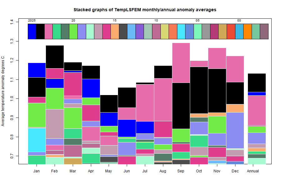
I do a lot of such averaging in assembling the monthly global average temperature anomaly (TempLS). I have written a general guide to that program here, and an article on the general principles here. The first link leads to many other articles.
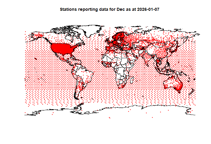
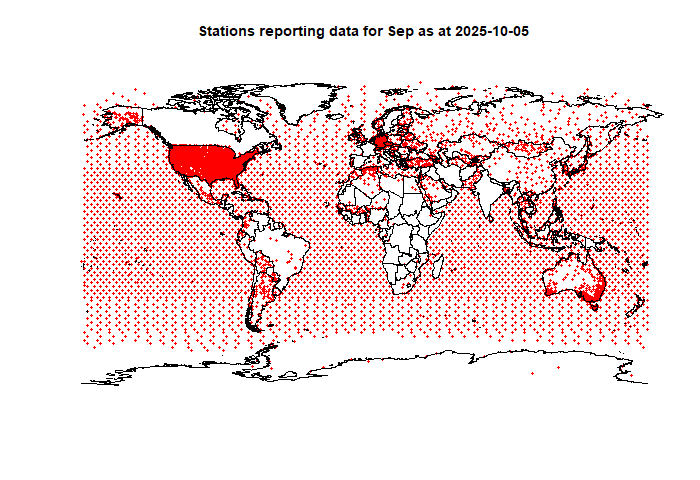
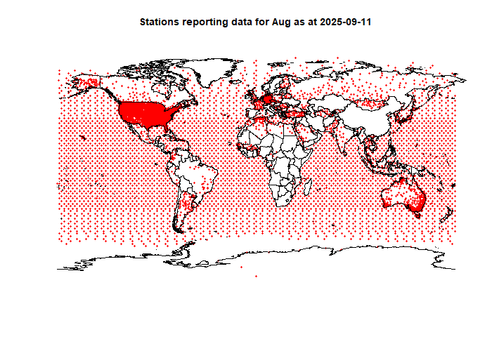
I have been looking at this again because of some articles written recently by Dr Roy Spencer, first on Max and Min temperatures for Canada, and then for UK. For Canada at first, he just averaged the temperatures as they came. But that ran into the homogeneity problem. Over time there were more northern stations in the sample (and hence colder). So that caused a spurious cooling trend, which countered the true warming trend. So he developed a pairwise comparison method similar to that of Hansen and Lebedeff (1987, and still used in Gistemp). This seems to work well enough, but is to my mind rather complicated, and hard to analyse. It also does not include area weighting, and it isn't easy to see how that could be done.
Least Squares
I use variants of a very direct method. I write down a statistical model for the observed temperatures for a given month of the year, say:
Tₛₜ=Lₛ+Gₜ+εₛₜ
Subscript s represents station, and t time. For monthly data, t would be years. The model says that if you represent T as the sum of a local climate Lₛ, independent of t, and a "global" change Gₜ, independent of s, then that should take out the major sources of inhomogeneity, and so the residuals εₛₜ should appear as random variation with the same distribution. The numbers L and G are then varies to minimise the sum of ε².
That sounds complicated, but L and G are loosely coupled, so simple iteration converges quickly. The algorithm is
Start with G=L=0. Then repeat:
Average T-G over t to update L.
Average T-L over s to update G
That converges after a few steps. Averaging over t, if steps in t are uniform, is just a simple average. But averaging over s should really be done with area weighting, and much of my work with TempLS is about how to do that. But you can do a simple average, and that is the result you will get.
I tried that with Roy's data for Alberta, Tmin and Tmax, and got essentially the same result. And I note that Roy's method gives the same result for the UK as does UKMO. So far, so good. So why suggest something else?
I don't think Roy's method would work globally, or even, say, for all of Canada. That is why GISS uses it within cells, but combines te cells with area weighting.
Another method
Here is another method which I have used, also fairly simple. I define a set of approximately orthogonal functions over the region, Fourier style. I use it globally and so use spherical harmonics. This can be fitted using least squares regression to determine coefficients. Then the residuals have had the spatial effects removed, and so their average should be near zero. The answer is then just to average mathematically the approximating function, which because of orthoganility, should be just the fitted zero order coefficient.
I hope to follow up with a more detailed exposition, particularly addressing area weighting.