Thursday, April 14, 2011

Quiet time

Why is June hotter seen with GHCN V4 than V3 - and lots of active graphics.

This post is a follow-up to one a few days ago on differences seen calculating monthly global averages using TempLS and version 4 of GHCNrather than V3. It followed a post of Clive Best, who has a similar program, and was finding differences. I too found that June 2019 rose about 0.07°C while using GHCN V3 did not show a rise. I think overall differences are small, but I wanted to look at the underlying arithmetic.

So, as foreshadowed, I adapted my program to use its LOESS based calculation and graphics, in which I could calculate differences. But there was mission creep, as I found that being able to put disparate data on the same equally spaced grid made a lot of other things possible. So I showed also the effects of homogenisation. It does answer the question of why V4 made a difference this month, but there is a lot more to learn.

First let me tell the many uses of the main graphic, which is shown below. It is the familiar WebGL trackball Earth. You can drag it about and zoom. Click on the little map to quickly center at a chosen point. But importantly for this inquiry, you can control the content. The checkboxes top right let you switch on/off the display of V3 and V4 or SST nodes, or the shading (called "loess"), or even the map. And the radio buttons on the right give the choice of five data sets for June 2019, which are
  • Un V4-V3 which is the difference of TempLS anomalies using unadjusted GHCN data from V4 and V3.
  • Adj V4-V3 the corresponding difference using adjusted GHCN data (QCF, pairwise homogenised)
  • V4 Un - Adj the difference between unadjusted and adjusted data, for a V4 calculation
  • V4 Un - Adj same for V3
  • V4 Unadjusted just the TempLS anomalies using V4. It is the LOESS version of my regularly updated mesh plot.
So I'll show the plot here, with below an expanded discussion of what can be learnt from it.


Improved coverage in GHCN V4

This is shown most clearly if you switch off loess, and toggle the boxes controlling V3 and V4. The improvement of coverage is greater than I had thought, and as I will show is the basis for V3/V4 discrepancies.

The V3/V4 difference for June, and reasons.

One thing that surprised me was the coherence of the difference plots. The LOESS does some smoothing - you can estimate the effect by looking at the smudging around coastlines. The SST is the same between versions, so color in the sea means either islands or smoothed land. It fades basically exponentially, so color difference tends to exaggerate the spread. It's surprising because you would expect that station differences between V3 and v3 would be fairly random.

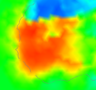
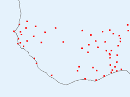
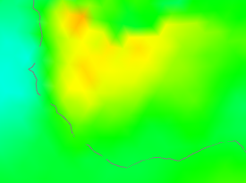
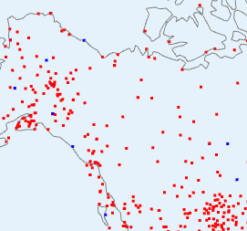
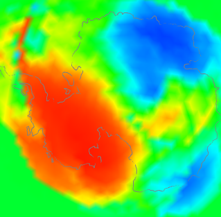
But only if both types are represented, and that is the key here. There is, for example, in Un V4-V3 a big warm patch around Senegal. I'll show also the station distribution and the anomalies:

V4-V3 differenceV4 stationsV4 anomaly

I haven't shown the V3 stations, because basically there aren't any (check the figure). So how did V3 cope? It used information from nearby, a lot of which was sea. V4 had much better coverage, so the region is predominantly represented by land. And as the third column choes, the land was warmer, by anomaly. Not a lot, but watch for the different color scales here. The apparent warmth in the first column is a much smaller temperature difference - the scales are about 4:1.

So here is where a discrepancy arises - an area which V4 covers much better, which happened to be warm that month. Here is an example going the other way in NW Canada:
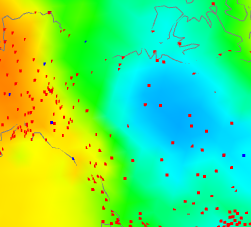
V4-V3 differenceV3 and V4 stationsV4 anomaly

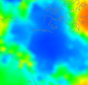
have shown the same tableau, but this time the centre plot shows V3 stations as well (in blue) since there are a few. But not many. Again what is happening is that the rather faint blue patch on the right, because it is picked up by V4 but hardly by V3, turns into a V4-V3 discrepancy on the left. One more case - Antarctica:
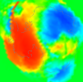
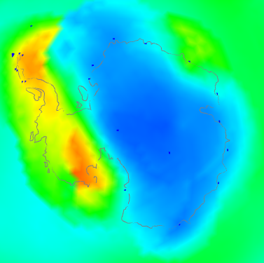
V4-V3 differenceV3 and V4 stationsV4 anomaly

This is a bit of both. It shows a discrepancy plot warm (ie high V4-V3) in the W, opposite in the East. The station plot shows a big increase in coverage in the interior, and also on the peninsula. And the right shows that the actual anomaly was also strongly divided between W and E. You might ask - why did the strong warmth in the East show a relatively small discrepancy? I think it is because although the V3 stations were sparser, they did give reasonable coverage around the coast of EA. So although the interior had to look far afield to infer temperatures, mostly it found land rather than sea.

So overall I think that is the cause. There are a few regions around the Earth where V4 has much better coverage. If these happen to align with anomaly patterns, those patterns will be reflected in the V4-V3 difference, and because there are only a few, from time to time they will align by chance.

I think this also explains the small persistent long term changes. As warming proceeds overall, it will more often happen that the anomaly patterns in V3-sparse areas with vary from SST on the warm side, producing a warm V4-V3 difference, which will accumulate.

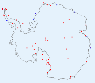
What about adjusted data, whch seems to show a little more warming? I think it just fixes some aberrant cases which would reduce the effect in unadjusted data. Here is another tableau from Antarctica

Unadjusted V4-V3Adjusted V4-V3


The unadjusted had a number of blue spots along the Antarctic peninsula. Homogenisation identified some of these as biases that could be corrected. Whether right or wrong, the arithmetic result is of a discrepancy that integrates to a higher value, because of reduced noise.

To summarise, I think the reason is not that V3 stations were reporting temperatures different to V4; it is that in some regions they weren't reporting temperatures at all, and the discrepancies are a resulting artefact. So where it happens (not much), V4 is better than V3. This may not affect methods like HADCRUT and NOAA in the same way, since they more rigidly separate land and sea. But I think Clive's method will respond in the same way as mine.

Coverage patterns

Again, to see this I'd recommend switching off loess, and then between V4nodes on and V3nodes on. I was actually surprised at how many areas in June were much better covered by V4. Large areas of Africa like the Senegal area above, are much better. There are, of course, still gaps. Antarctica is much better in the interior. Australia is better, and so is the Amazon region.

Adjustment patterns

I'm looking now at radio buttons 3 (V4 Adj - Un) and 4. If you look at the color keys, the adjustments are quite small. I was a bit surprised that there are any at all. So it probably isn't that useful to talk much about June, since it is in older times that adjustment has more effect. Still, June is what we have here - I may try and look at more data in a later post.

Again the patterns are mostly quite triking. The US is an exception, where there may be a residual effect of TOBS adjustment. Africa is an interesting case, where two large regions are warmed, and one is cooled. The Amazon is cooled, but further south is warmed. China and Thailand are warmed.

Button 4 (V3 Adj - Un) shows the corresponding pattern with V3. This time North America is mostly warmed. The Arctic ocean (from land stations) is cooled. Africa is more cooled than warmed. N China and west are warmed, but not the south. W Antarctica is cooled.

I don't want to go too much further into this, as I don't think the most recent month is the best place to look for adjustment effect. I'll hope to do more.

More plot details.

Usually I show the actual mesh being used for shading. That isn't so important here, but if you want to see it, and read more about the icosahedral mesh which underlies the Loess method, it is described here.

Being V3 (I will write up) of the WebGL facility, there is improved zooming, with buttons as well as right button motion.

The Match button enforces the same color scaling, but I don't think that is wise here. I haven't included station names, so clicking won't bring them up. The data file is already over 1 Mb, and it would be messy with the two station sets.


Saturday, April 9, 2011

TempLS Ver 2.1 release

This is the first release for a while. The structure is still much like ver 2, and the math basis is the same. The main differences are:
  • The code has been internally reorganized. Most variables have been gathered into R-style lists. And more code has been sequestered into functions, to clarify the underlying structure of the program.
  • The new work on area-based weighting has been incorporated.
  • Other work has been done with weighting. In particular, subsets of stations can be weighted differently relative to each other.
  • Hooks have been added so that the adaptions to the Antarctic studies can be included.


The preprocessor which merges and converts data files available on the web to a standard TempLS format is unchanged. Data and inventory files from Ver 2 will still work.

A reminder of how TempLS is used. In an R environment, a jobname is defined, and a .r file with that name is created which defines some variables relevant to the wanted problem. This may have several consecutive runs defined. The variables are variants of supplied defaults.

Then source("TempLSv2.1.r") solves and writes data and jpg files to a directory jobname.

The files you need are on a zip file TempLSv2.1.zip. This 16Mb file contains preprocessed data sets, so you won't need to use the preprocessor. I've had to separate GSOD data; GSOD.zip is another 7 Mb.

If you just want to look at the code and information (everything readable), there is a 170 Kb TempLS2.1_small.zip. A ReadMe.txt file is included. There is also a partly updated manual from V2.0, most of which is still applicable. More details below, and past files on TempLS can be found on the Moyhu index. I'll describe below the things that are new.


TempLS internal lists

Being R code, you can of course modify it as you wish. But it's better generally to work through the jobname.r file. To understand the code, you'll want to know about these global lists:
  • u - the one most encountered. It is defined in TempLSuserv2.1.r, and includes the variables that I think you're most likely to want to change. Some important ones:
    • u$inputstem - for selecting data. eg if ="GHCN", uses files GHCN.data, GHCN.inv
    • u$name - a string that gets attached to output and filenames - can be varied between runs
    • u$num_runs - your file can have several expressions {} and a run could be done with each - num_runs says how many are used
    • u$station_mask - select from the inventory which stations to include in the analysis. A logical expression based on the names of columns
    • u$model - what kind of analysis. 1 for time series, 2 for spatial trend, 3 for spatial period (currently year
    • u$yr0, u$yr1 analysis endpoints
    • u$postp() - an output function where you can add requests
  • v - list from the data read - loaddata()
    • v$d - the full data set from the .data file, v$nd = number rows
    • v$i - the inventory table from the .inv file, v$ni = number rows
  • s - things created following station selection by u$station_mask
    • s$o - logical vec (length v$ni) of stations selection
    • s$ns, s$nm, s$ny - numbers of stations selected, months and years
    • s$i - index vec (length s$ns) of stations selection
    • s$ib - reverse index vec (length v$ni) of stations selection
    • s$dm - various dimensions that can be assigned to the s$ns*s$nm data array
  • out - list for accumulating runs for compiling run report

    TempLS V2.1 output

    You'll generally get a map of the region with stations marked, and a plot of stations reporting in each year. The map will be a projection of a sphere on the surface. You can specify the lat/lon of the centre point (u$mapfocus). If the region is global (u$isglobe=T) you get a Mercator-like map as well.

    Model 1 will produce a time series of temperature anomaly, with a smooth and trends. You can ask for several different periods to be covered.

    Model 2 and 3 will produce shaded plots. If you have asked for a direct solver (oCG=F) you'll get a graph of eigenvalues. If the verif() function is called, you'll get R2 for the fit, and you can request plots of residuals at a list of stations (u$residual=c(,,,)).

    If you are requesting area weighting, you can ask for a map of the weights and mesh for a specified month (numbered from start)(u$showmeshmonth=..)

    Weighting (new)

    Before V2.1, the only weighting was by estimated density based on number of stations in lat/lon cells. Now 4 kinds of weighting are allowed:
    1. Uniform weighting
    2. Cell weighting (as before)
    3. Mesh-based (ie by area)
    4. Voronoi (also area)
    In V2.1 Voronoi is not fully implemented, and mesh-based is preferred. You specify by u$wt_type=1,2 or 3.

    You can have two classes of stations that you weight separately. This was created for AVHRR vs land, but would also be useful for SST vs land. You need a mask u$wt_mask to select one subgroup. It's value is a logical expression based on columns of the inventory. Then you need u$wt_type to be a vector, eg c(3,1). That gives the wt_type of the set you've chosen, then the rest. They cannot both be >2.

    Then you need to express how one class is weighted relative to the other. This is the wt factor u$wtf, which ranges from 0 to 1. They are scaled so that (sum wts of class 1)/( total sum of weights) = u$wtf.

    You can also control smoothing of the weights. The parameter is the characteristic length of smoothing, in km, say u$wt_len=100. The default is 0, which means no smoothing. Smoothing gives some benefit, but takes a little time.

    Zip file contents

    • ReadMe.txt - summary of the contents
    • DataInv.zip - contains the preprocessed data files (eg GHCN.data) and inventory files. With this you won't have to use the preprocessor until you want an update. This file is 16Mb; because complete data exceeds the 20Mb limit here, I've had to separate the GSOD data and inv, which is in GSOD.zip.
    • TempLSv2.1.r - the master routine
    • TempLSfnsv2.1.r - the collection of functions for the master routine
    • TempLSuserv2.1.r - defaults for the user file, defining list u
    • TempLSprepv2.1.r - preprocessor file
    • TempLSprepinputv2.1.r - some names etc for the preprocessor file
    • userfiles.zip - a zip file of user routines for example problems. Most were used in compiling recent Moyhu posts.
    • TempLSv2a.pdf - a users guide for v2 which has been updated with new variable names etc for v2.1. It does not have a description of new features yet.
    • testall.r - a master file for testing - uses all the supplied example files, creates their directories of results, and makes a file testall.htm in which you can see all the code and output. Handy to check if you have everything. Good to run with R CMD BATCH.
    • testall.mht - an output from testall.r that I made recently, stored as IE archive.
    • miscR.zip - files like ryan.r (some of Ryan O's graphics routines, called by the user file for Antarctic.r). Also update.r, used by testall.r.


Monday, April 4, 2011

Blogger's spam filter

In about September last year, Blogger, the Google outfit that host this site, introduced a new spam filter. Until that time I had been very happy with them. I still am, in most aspects. But the spam filter is making dialogue on the site impossible. It is supposed to learn from the liberations that I make, but it seems to be just getting worse. I have not yet been blest with a single item of real spam, but about one in three genuine comments go to the bin for no obvious reason at all.

The problem is compounded because, since I'm on Australian time, they can sit in the spam bin for hours before I can fix it.

I've done what I can to raise the problem with Blogger. They don't offer direct communication, but delegate feedback to a forum. The response is that, no, you don't get a choice here, your sacrifice is for the general good.  We seem to be conscripted into an experiment whereby Google uses our rescue activity to improve its spam database.

So I'm looking at Wordpress. Blogger has just announced a revamp, but from their aggressive attitude about the filter, I don't see much hope. I'll wait a few days longer, and listen to advice on whether Wordpress is likely to be better, but it's looking inevitable.