This replaces a post of three days ago, which had some errors in numbering. In a few cases data was filled with the wrong JMA stations, which created a few large errors. I now use a more conservative correspondence rule.
Last week I posted provisional results for August, noting that the number of stations reported by NOAA's GHCN was unusually low, and didn't seem to be improving. In particular, no results for China, Iran or Kazakhstan.
NASA GISS had a similar difficulty, reported here. They mention mainly problems in Africa, so maybe they have alternative China data. It is available; China has sent in their Climat forms. NOAA has posted an August average with, as far as I can see, no caveats. So I looked for other accessible data.
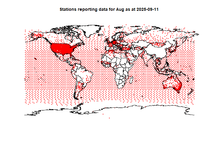
The best I found was JMA, which does have that Climat data. So I combined that with the GHCN data (details below)(. This gave me about 300 more stations outside US (ROW), and 100 within. The number of US stations is still a lot less than usual, but more than we need. I now have 2515 stations in ROW, which is less than the 3200 I would normally use as publishable, but does now at least have reasonable coverage of China and Kazakhstan. I'll show the map below.
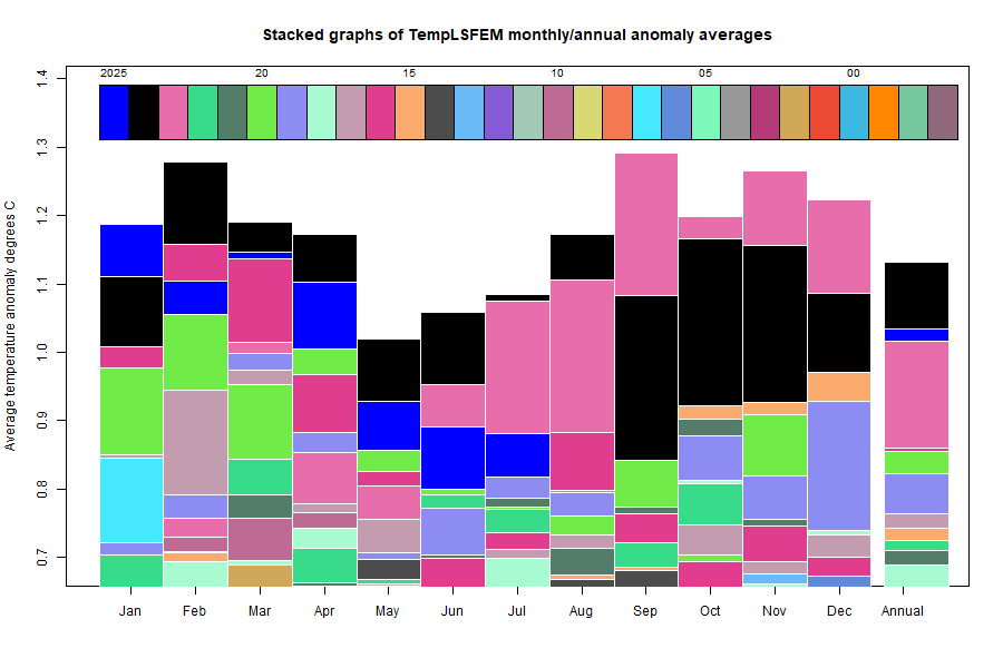
The change amplified the rise since July, from 0.881°C to 0.981°C (last post was 0.968°C). That is now a substantial rise of 0.1°C, but still with some missing data. GISS got a provisional rise of 0.13°C; NOAA of 0.07°C.
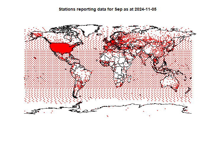
Here is the map of stations now included, with the map for September 2024 for comparison:
|
|
Here is the temperature map, using the FEM-based map of anomalies. Use the arrows to see different 2D projections.
Combination rule
The JMA gives the name of station and country, but these don't reliably match GHCN letter by letter. They give the WMO number. GHCN gives a code of 11 chars, often ending in the WMO number. My earlier problem was that sometimes it doesn't, and in fact there can be very different stations with the last 5 chars. But if it is a WMO number, usually it will be preceded with 3 zeroes, so I made that a requirement. I use JMA only where GHCN is missing.As always, the 3D globe map gives better detail. There are more graphs and a station map in the ongoing report which is updated daily.