The main pattern is a warm Arctic/central Siberia, with a surrounding ring of cool, from Norway through Iran to China. Most of N America was cold. Antarctica was relatively warm.
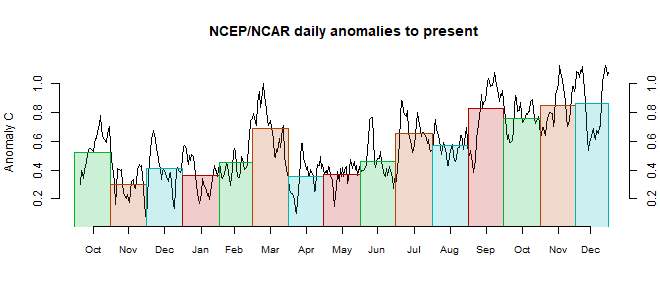
This post is part of a series that has now run for some years. The NCEP/NCAR integrated average is posted daily here, along with monthly averages, including current month, and graph. When the last day of the month has data (usually about the 3rd) I write this post.
The TempLS mesh data is reported here, and the recent history of monthly readings is here. Unadjusted GHCN is normally used, but if you click the TempLS button there, it will show data with adjusted, and also with different integration methods. There is an interactive graph using 1981-2010 base period here which you can use to show different periods, or compare with other indices. There is a general guide to TempLS here.
The reporting cycle starts with a report of the daily reanalysis index on about the 4th of the month. The next post is this, the TempLS report, usually about the 8th. Then when the GISS result comes out, usually about the 15th, I discuss it and compare with TempLS. The TempLS graph uses a spherical harmonics to the TempLS mesh residuals; the residuals are displayed more directly using a triangular grid in a better resolved WebGL plot here.
A list of earlier monthly reports of each series in date order is here:


Hi Nick,
ReplyDeletehave you noticed that NCEP reanalysis produces weird temperature anomaly pattern lately? Mainly Southern Eurasia/China, but increasingly Russia too, with tons of sketchy cold spots that simply cannot be right. NCEP used to produce very smooth patterns, which have suddenly turned into sth rather dodgy. Lack of airplane data since the start of Covid19? Also, NCEP much colder than my GFS anomalies or GISTEMP since March. Couldn't find anything online yet ...
KarSteN
Karsten,
DeleteI see the patterns you describe, but unfortunately my normal plots don't have enough resolution to tag it as abnormal. Do you see the same in any other reanalysis?
Good question. Plotted ERA5 for April 2020 real quick (well, took 12 minutes) on CE. Here's the comparison: drive.google.com
DeleteSeems to be alright. Nothing sketchy and their monthly bulletin showed the same: climate.copernicus.eu
April 2020 in ERA5 on par with 2016. NCEP reanalysis on the other hand, 0.35°C colder in April this year compared to 2016.
I had April down 0.235°C from 2016. But it was a little warmer than March 2020, a change which agreed with my TempLS surface change. GISS had April a little lower than March.
DeleteGuess the breakpoint is between Feb and March. Little change in GISTEMP, but huge drop in NCEP. And only in NCEP! Given that ERA5 is fine, it's gotta be an issue on their end as I've never seen these kinds of cold spots in NCEPs monthly mean.
DeleteLooking at the daily data for NCEP and ERA5 in KNMI climate explorer there is no sharp change. NCEP cooling relative to ERA5 appears to have started in December and continued into March. NCEP data to be viewed cautiously at present.
DeleteChubbs
Thanks Chubbs! The gap has indeed become increasingly large since 6 months or so. By now, the gap has widened to an extent that it's rather obvious sth isn't quite right anymore.
Delete