It was quite cold in W Canada and the US, although warm in Alaska and the SE USA. Warm in Europe, cold in the Sahara, and mostly warm in Antarctica, with the Arctic mixed.
The BoM ENSO Outlook was is still set to Watch.
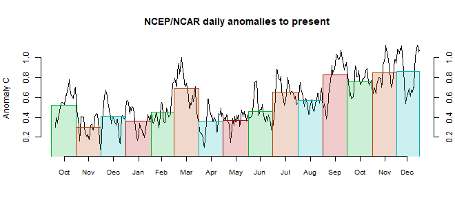
This post is part of a series that has now run for some years. The NCEP/NCAR integrated average is posted daily here, along with monthly averages, including current month, and graph. When the last day of the month has data (usually about the 3rd) I write this post.
The TempLS mesh data is reported here, and the recent history of monthly readings is here. Unadjusted GHCN is normally used, but if you click the TempLS button there, it will show data with adjusted, and also with different integration methods. There is an interactive graph using 1981-2010 base period here which you can use to show different periods, or compare with other indices. There is a general guide to TempLS here.
The reporting cycle starts with a report of the daily reanalysis index on about the 4th of the month. The next post is this, the TempLS report, usually about the 8th. Then when the GISS result comes out, usually about the 15th, I discuss it and compare with TempLS. The TempLS graph uses a spherical harmonics to the TempLS mesh residuals; the residuals are displayed more directly using a triangular grid in a better resolved WebGL plot here.
A list of earlier monthly reports of each series in date order is here:


Looks like the global average is back on the upswing now. The GFS forecast suggests March will cool down to about 0.3ºC over the next week, but my guess is that the monthly average anomaly will be at least as high as February. It seems you can never tell exactly, but I expect both months to turn out at around 1ºC in GISS.
ReplyDeleteMy prediction for the year is 0.95 +/-0.05, so probably 2nd warmest year. Plus a wild prediction that it will be the warmest global "Summer" on record (JJA, Northern Hemisphere bias and all).
Hi Nick,
ReplyDeleteHow do you get three-decimal precision from the starting data? What is the uncertainty on your final anomalies? I've looked over the TempLS.r program and I can't see where you calculate any kind of uncertainty. Could you explain a little about that aspect of the program?
Thanks!
James,
DeleteI have written a lot about uncertainty. There are several sources, of which the main one is coverage uncertainty. I argue that the proper quantification of uncertainty is the distribution of results you might get if you did the same analysis with different reasonable choices. Coverage uncertainty is the variation resulting from sampling in different places. Here is another post in a similar vein. Here
is a discussion explicitly on error in the annual average.
Here is an interesting study using Monte Carlo subsampling to get the order of spatial sampling error. It shows that the error remains quite reasonable even choosing a subset of 500 stations (about 0.05°C).
I also write quite a lot on autocorrelation and the uncertainty of temperature trends.
As to number of decimal places, I take the view that I am reporting the result of a calculation. I should give as many significant figures as the readers are likely to find a use for.
Nick,
DeleteI have to disagree with your statement "I am reporting the result of a calculation." You are reporting on scientific measurements: the temperature at a weather station on a given date. it's not the same as plugging two unitless numbers into a calculator. In the world of physics, of which climatology is certainly a part, units, uncertainty, and significant digits are of paramount importance, and can't be ignored in favor of what you think the reader would like.
There are hard and fast rules about significant digits in calculations with measurements, and the first is that a calculation result cannot be more precise than the least precise measurement. In your analogy of getting the average weight of 100 men, if you weigh them in pounds, you can't report the mean in tenths of a pound. If your temperatures are in tenths of a degree, the result can't be reported in hundredths of a degree.
I believe this is a serious problem in the reporting of global averages, and why the phrase "not statistically significant" has real meaning when reporting record high and low temperatures. In physical measurements, one must report only the level of precision in the least precise raw data.
James,
Delete"You are reporting on scientific measurements: the temperature at a weather station on a given date."
I am not reporting on the temperature at a weather station at a given date. I am reporting a calculated global average.
Yes, you are. But that average is an average of an average of an average. NOAA starts with measurements taken every 5 minutes to get the daily mean. Then the daily averages are averaged to get the monthly measurements. You use those to get your monthly global average. That's three averagings of temperatures taken at a weather station, which uncertainties have to be propagated and reported in line with the significant digits appropriate to the original data in tenths of a degree.
DeleteLet me ask you a question: if I took the same monthly data and calculated my own global average anomaly by the simple means of using the monthly data over a period of 1961-1990 (is that the period you're still using?) to get a baseline for each month at each station, using each station's baseline to calculate an anomaly for each month of 2018 (picking the year at random), and then averaging all of the stations' anomalies for each month into a global monthly anomaly for 2018, how close to your calculation do you think it would be?
Thanks for your time!
James,
Delete"how close to your calculation do you think it would be"
You have the main elements of the right method there. But there is one big issue - area weighting. If you just average stations wherever they are, the result is biased toward wherever has the most stations per unit area. So the US has a disproportionate effect, especially NE US. That matters when the US behaves differently to ROW, as in this winter. So the answer is that your average would be not bad on average (:)), but jumpy.
I've actually been looking lately at that very question. I'm working up a new post on integration (averaging) methods. Gridding is one kind of area weighting. You get an average for each grid cell, then add up each cell average, weighted by its area.
Nick,
DeleteYes, I'm looking at it as a first approximation. Getting my feet wet, as it were.
Is the version of TempLS3.r at this link:
https://moyhu.blogspot.com.au/2015/06/templs-new-v3.html
the most current? Also, why still use v3 of the data set? I noticed NOAA dropped the urban/rural/etc. attributes in V4, is that why?
James,
DeleteThe version of V3 at that link is not what I now use, but is mostly equivalent to it. I've reorganised it a bit, and some minor changes:
1. I now use only the cubed sphere grid instead of lat/lon. It's better, but lat/lon still works.
2. I've changed the implementation of the optional spherical harmonics integration; again the old way worked. I'll exp[lain these changes in more detail in introducing V4.
As to why I still use V3, well, this is the month of the transition. I'll post a comparison soon, and will probably still calculate V3 for a while, although posting mainly v4. In fact, the main block to a complete transition to GHCN V4 is a silly one. V3 gave stations numbers from which you could deduce the continent, and I use this in the breakdown plots. V4 doesn't, although it does do by country. So I have to make a list of countries by continent. Just time.
An issue with V3 vs V4 is just size - GHCN V4 is nearly four times larger, and that makes for big matrices. You can restructure so there is a separate calc for each month, which fixes that. TempLS V4 is done that way.
If this site is just a hobby and not a money-maker, you know you can get a free account at Oracle.com and download any of their s/w for your own private use. That includes the Enterprise edition of the Oracle database and all of the middleware and development tools.
DeleteThe link is https://otn.oracle.com. It'll redirect you to the new site, but that's the one I know off the top of my head. It's a free account, no strings attached, no credit card required. They figure it's a good model for potential real customers to get a good look at unadulterated, non-crippled database tools. The only caveat is that it has to be for personal use, prototyping, etc. Can't make money off it.
You should give it a try; I'm using it right now and it handles that V4 file like a baby. Oracle database s/w development is what I've been doing the past 35 years, BTW. If you have any questions, ask away.
James
James,
DeleteAs a caution in using area weighting, I trid just averaging the station anomalies for GHCnv4/ERSST5 in Feb 2019. There are just 3783 SST locations in this list, and 27361 land, which is already a sign of trouble. The various respectable methods give about 0.75 to 0.82°C. GISS got 0.92, but to aa slightly earlier base (1951-1980, all my figs are 1961-90). The unweighted average of that global set was 0.008°C. This just reflects the very cold month in N America.
Thanks for the advice about Oracle. I've got most of the data reading and sorting mechanised now. I use R for the analysis, which I'm pretty happy about. I would qualify for free use of Oracle, and I maybe should have when I started out. But I like R.
Nick,
DeleteInteresting that you got such low global figures using the station anomalies. My first cut with the data gave me anomalies from +6°C to -6°C over a period from 1900 to 2019.
I used 9367 stations that had at least 345 of the 360 records for a full 30-year, 12-month baseline from 1961-1990.. I have not checked them for location across the globe yet, as I just wanted to see that the numbers were like. I filtered for the -99.99 "missing" figure, and any value at all in the QFLAG field.
Here's my results for my very first pass, for the year 2018 using the 1961-1990 period. I haven't gone over the numbers in detail yet, this is just the first query that ran successfully. They seem reasonable, though, given the decades since then.
Month anomaly no. of records Std Dev Std err
1-Jan-18 1.18 4806 2.24 0.03
1-Feb-18 0.59 4820 3.12 0.04
1-Mar-18 0.29 4803 2.13 0.03
1-Apr-18 -0.20 4802 3.02 0.04
1-May-18 2.21 4785 1.66 0.02
1-Jun-18 1.21 4742 1.31 0.02
1-Jul-18 1.16 4717 1.42 0.02
1-Aug-18 1.00 4699 1.28 0.02
1-Sep-18 1.35 4679 1.38 0.02
1-Oct-18 0.43 4667 1.91 0.03
1-Nov-18 -0.54 4125 2.27 0.04
1-Dec-18 1.39 4527 1.66 0.02
I know what you mean about switching horses in mid-stream, but my experience with R and big data sets was slow, slow, SLOW. I'm crunching a 16 million row data set using Oracle on an 8GB RAM I7 haptop (the V4 data) in 22 seconds. That's a bit faster than R, I think. You can always take the Oracle output and put it in R for graphics, but I'm not one to tell the chef how to make his souffle. If you ever decide you want to try Oracle, I'd be glad go give you a hand.
James
Jeez, is there any way to get columns of figures to line up in these blogs?
DeleteLooking likely that NOAA will declare at the end of this month that El Nino conditions were reached this Winter, according to the ONI classification based on Nino3.4 SSTs, though I maintain that El Nino is really defined by an East-West temperature gradient and that just didn't happen.
ReplyDeleteHowever, there are now some early tentative indications of things heading that way: subsurface cooling in the West and warming in the East. Which would suggest we'll see the development of a genuine El Nino over 2019.
Looks like NCEP/NCAR was up by a lot in March, the warmest in nearly three years, if I'm reading correctly -- i.e., warmest since the 2016 El Nino.
ReplyDelete