The main cold region was N America, except W Coast, but extending right up through the Arctic Archipelago. There were warm patches over Alaska and far N Atlantic/Scandinavia. Cool over a lot of Russia, warm Africa. Antarctica mixed, but a lot of cold. A noticeable El Niño warm jet.
The BoM El Niño alert continues.

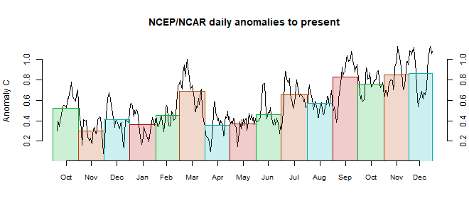
This post is part of a series that has now run for some years. The NCEP/NCAR integrated average is posted daily here, along with monthly averages, including current month, and graph. When the last day of the month has data (usually about the 3rd) I write this post.
The TempLS mesh data is reported here, and the recent history of monthly readings is here. Unadjusted GHCN is normally used, but if you click the TempLS button there, it will show data with adjusted, and also with different integration methods. There is an interactive graph using 1981-2010 base period here which you can use to show different periods, or compare with other indices. There is a general guide to TempLS here.
The reporting cycle starts with a report of the daily reanalysis index on about the 4th of the month. The next post is this, the TempLS report, usually about the 8th. Then when the GISS result comes out, usually about the 15th, I discuss it and compare with TempLS. The TempLS graph uses a spherical harmonics to the TempLS mesh residuals; the residuals are displayed more directly using a triangular grid in a better resolved WebGL plot here.
A list of earlier monthly reports of each series in date order is here:


The US NOAA Climate Data Assimilation System (CDAS) preliminary monthly average global mean surface air temperature (2 meters above ground) for November 2018 based on daily CDAS averages was 13.643°C, which is the lowest November average since November 2014 at 13.471°C. The November 2018 global mean surface temperature anomaly (unadjusted) referenced to 1981-2010 was +0.246°C compared to +0.328°C for October 2018, a decrease of -0.082°C.
ReplyDeleteThe CDAS global mean surface air temperature anomaly has been showing a seasonal pattern the last several years with a peak in the NH winter and a minimum in SH winter. So I expect to see an overall slight rise to a relative peak this NH winter, potentially enhanced a bit more by the weak El Niño. See the trend graphs of CDAS daily GMSTA since 2014 here (last three graphs):
https://oz4caster.wordpress.com/cfsr/
The fourth graph at the link above includes a running 91 day mean of the daily CDAS GMSTA which is indicative of seasonal patterns.
Thanks, Brian. I have the feeling most measures won't dip as much as the NCEP/NCAR.
ReplyDeleteThe Darwin-Tahiti SOI data is available on a daily basis back to 1992. I decided to evaluate the ENSO model against both the monthly data from 1880 and the 26 years worth of daily data. Can't say it was unexpected (otherwise I wouldn't have tried it) but the model fits the data across the time scales surprisingly well.
ReplyDeletehttps://forum.azimuthproject.org/discussion/comment/20971/#Comment_20971
Could be support for this recent Nature paper:
Jajcay, Nikola, et al. "Synchronization and causality across time scales in El Niño Southern Oscillation." npj Climate and Atmospheric Science 1.1 (2018): 33.
All the standing waves in the dispersion spectrum are phase synchronized, from the main Darwin-Tahiti dipole to the high-wavenumber Tropical Instability Waves that pop along the equator. Cool to find this out right before presenting at the AGU next week.