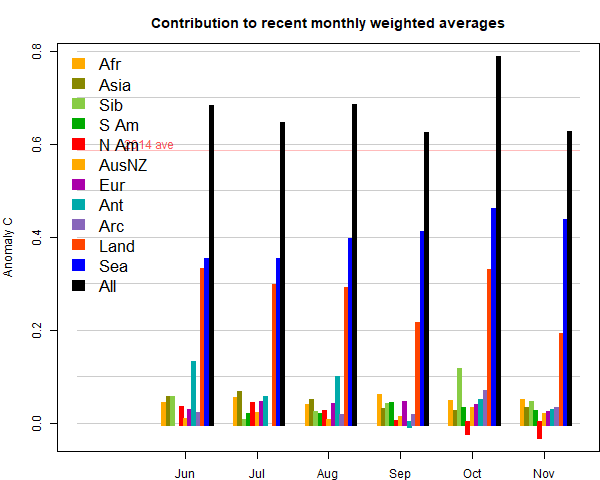
The marked feature for the last three months has been a big rise in SST, which continued. But this month land was also warm. The main hot spot was Siberia, whicle Canada/N US was cool. China was cool, Europe was warm. Here (from here) is the plot of relative contributions to the rise (ie components weighted by area):
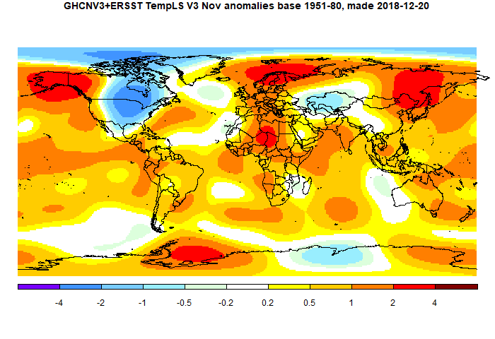
Here is the temperature map. As always, there is a more detailed active sphere map here.
This post is part of a series that has now run since 2011. The TempLS mesh data is reported here, and the recent history of monthly readings is here. Unadjusted GHCN is normally used, but if you click the TempLS button there, it will show data with adjusted, and also with different integration methods. There is an interactive graph using 1981-2010 base period here which you can use to show different periods, or compare with other indices. There is a general guide to TempLS here.
The reporting cycle starts with a report of the daily reanalysis index on about the 4th of the month. The next post is this, the TempLS report, usually about the 8th. Then when the GISS result comes out, usually about the 15th, I discuss it and compare with TempLS. The TempLS graph uses a spherical harmonics to the TempLS mesh residuals; the residuals are displayed more directly using a triangular grid in a better resolved WebGL plot here.
A list of earlier monthly reports of each series in date order is here:


RSS TLT in BIG disagreement with UAH again. Here is 2018 to date both set to 1981-2010 base:
ReplyDeleteRSS UAH
Jan 0.42 0.26
Feb 0.36 0.20
Mar 0.41 0.25
Apr 0.32 0.21
May 0.28 0.18
Jun 0.33 0.21
Jul 0.49 0.32
Aug 0.37 0.19
Sep 0.35 0.14
Oct 0.40 0.22
I understand both sets are acknowledged by the American Met. Society. How long can AMS maintain both sets before properly investigating this contradiction?
Yes, you can see that plotted here, to the same base, with surface measures as well. And of course, it is UAH that is the outlier.
DeleteAn example of how not to do it from the most over-confident would-be scientist on the blogs wonderin'Willis
ReplyDeletehttps://wattsupwiththat.com/2018/11/12/forest-fires-in-the-golden-state/
He estimates only ~0.2C of warming in California over the past 100 years because he has no clue how to calculate temperature anomalies from a baseline.
Yes. I see there is now a correction saying that it should be 1.2, not 0.2. It's still unclear to me where it comes from.
DeleteThanks. Yet still no scale on the new axis. If that is Celsius, Willis is claiming that the average temperature in California is 29C?
ReplyDeleteQuite a racket that he employs. Most blog readers don't stick around for the corrections. They see the initial post and assume that Willis found another problem with climate science.