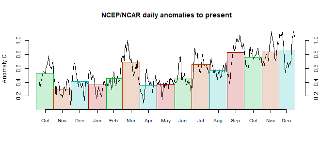
There were few prominent patterns in the month, and no big ups and downs. Cold in Antarctica and N Canada. Warm in Alaska and the Arctic above Siberia, extending weakly through Europe.
BoM is still on El Niño Watch, meaning about a 50% chance, they say, but nothing yet.

This post is part of a series that has now run for some years. The NCEP/NCAR integrated average is posted daily here, along with monthly averages, including current month, and graph. When the last day of the month has data (usually about the 3rd) I write this post.
The TempLS mesh data is reported here, and the recent history of monthly readings is here. Unadjusted GHCN is normally used, but if you click the TempLS button there, it will show data with adjusted, and also with different integration methods. There is an interactive graph using 1981-2010 base period here which you can use to show different periods, or compare with other indices. There is a general guide to TempLS here.
The reporting cycle starts with a report of the daily reanalysis index on about the 4th of the month. The next post is this, the TempLS report, usually about the 8th. Then when the GISS result comes out, usually about the 15th, I discuss it and compare with TempLS. The TempLS graph uses a spherical harmonics to the TempLS mesh residuals; the residuals are displayed more directly using a triangular grid in a better resolved WebGL plot here.
A list of earlier monthly reports of each series in date order is here:


The CDAS preliminary monthly average global mean surface temperature for September 2018 based on daily CDAS averages was 15.717C, which is the lowest September average since September 2012 at 15.644C. The September 2018 global mean surface temperature anomaly referenced to 1981-2010 was 0.151C compared to 0.147C for August 2018.
ReplyDeleteRegarding El Nino, found lots of evidence that all the major climate indices, including ENSO, QBO, AMO, PDO, and NAO (so far), can be readily modeled using essentially the same kernel forcing terms, with only a different LTE standing wave modulation applied. Our AGU abstract was accepted yesterday, so this will be presented in detail at this December's AGU meeting in D.C. The presentation will also be available on the ESSOAR repository.
ReplyDelete