The overall pattern was similar to that in TempLS. Warm almost everywhere, with a big band across mid-latitude Eurasia and N Africa. Cool in parts of the Arctic, which may save some ice.
I'll show the plot of recent months on the same 1981-2010 base, mainly because they are currently unusually unanimous. The group HADCRUT/NOAA/TempLS_grid tend to be less sensitive to the Antarctic variations that have dominated recent months, and I'd expect them to be not much changed in July also, which would leave them also in much the same place.

Recently, August reanalysis has been unusually warm. As usual here, I will compare the GISS and previous TempLS plots below the jump.
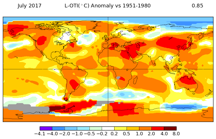
Here is GISS
And here is the TempLS spherical harmonics plot

This post is part of a series that has now run for six years. The TempLS mesh data is reported here, and the recent history of monthly readings is here. Unadjusted GHCN is normally used, but if you click the TempLS button there, it will show data with adjusted, and also with different integration methods. There is an interactive graph using 1981-2010 base period here which you can use to show different periods, or compare with other indices. There is a general guide to TempLS here.
The reporting cycle starts with a report of the daily reanalysis index on about the 4th of the month. The next post is this, the TempLS report, usually about the 8th. Then when the GISS result comes out, usually about the 15th, I discuss it and compare with TempLS. The TempLS graph uses a spherical harmonics to the TempLS mesh residuals; the residuals are displayed more directly using a triangular grid in a better resolved WebGL plot here.
The reporting cycle starts with a report of the daily reanalysis index on about the 4th of the month. The next post is this, the TempLS report, usually about the 8th. Then when the GISS result comes out, usually about the 15th, I discuss it and compare with TempLS. The TempLS graph uses a spherical harmonics to the TempLS mesh residuals; the residuals are displayed more directly using a triangular grid in a better resolved WebGL plot here.


ERSST5 has now been introduced in the dataset and it makes some difference according to the map version of gistemp
ReplyDeletehttps://data.giss.nasa.gov/gistemp/maps/
July 2017 is 0.85 C with ERSST5 and 0.81 with ERSST4.
Also, the warmest year 2016 is now up with 0.01 to 1.00 C. I am not sure that ERSST5 is the only cause of this rise since the Gistemp map give an identical temp for 2016 with ERSST4.
GHCN has also released nearly two years of data from "quarantine" for the russian met stations on Ostrov Vize and Franz Josef Land. These stations have been in the center of a strong arctic hotspot with anomalies close to +10 C the last two winters, which the PHA obviously distrusts now and then, and simply remove the data for a while. But now they are back again and it could make some of the +0.01 difference for 2016..
Olof,
DeleteI'm planning to use ERSST V5 in TempLS, but I actually used V4 here. I have to tweak the mechanism to make the change routine. It's possible that whether 2017 had the hottest July depends on which version of ERSST is used.
Hello Olof,
Deleteindeed it looks quite nice on the weasel island. I compared the stations time series for 1979-2017 with that of the UAH 2.5 degree grid cell encompassing that station:
1. GHCN V3 anomaly top 10:
2012 | 2 | 14.59
2016 | 1 | 14.48
2016 | 11 | 14.19
2011 | 12 | 14.14
2012 | 1 | 13.38
2017 | 1 | 12.58
2015 | 11 | 12.49
2012 | 3 | 12.07
2012 | 11 | 11.69
2005 | 2 | 11.49
2. UAH6.0 anomaly top 10:
2016 | 1 | 5.27
1995 | 4 | 4.66
2015 | 4 | 4.51
2016 | 2 | 4.40
2012 | 1 | 4.14
1993 | 11 | 4.11
2005 | 12 | 3.84
2016 | 9 | 3.81
2012 | 2 | 3.78
2016 | 10 | 3.76
Nearly all anomalies happened during winter months.
But the nicest temp chart I ever have seen comes from a comparison of absolute GHCN and UAH temperatures in and above Verhoyansk (coldest GHCN station in the Arctic):
http://fs5.directupload.net/images/170817/hgjzni5c.jpg
Not only is the incredible similarity of the two plots amazing. It is also strange to see that the surface there is colder than the troposphere during the winters. I never did notice that before.
The plots for TempLS and GISS differ more than usual. could it due to using different ERSST versions? GISS seams to use ERSSTv5 from now.
ReplyDeleteFor the year including Jul data for GISS but not yet for MEI my regression predicts 0.90+-0.05.
Uli,
DeleteNo, I think it is due to a change I made with spherical harmonics for display. I'm just writing a post to explain. I used to use up to N=12 order (169 functions). I have an improvement that I pushed to N=16 (289 fns). But I think it might not be working perfectly. I think the blue spot in Sudan is probably an artefact, due to lack of data. That is what happens when you try for too much resolution. I'll probably have to wind it back.
"289 fns"
DeleteBrave man.