A blogger and commenter there, sunshinehours1, said, no, that's misleading information. And he shows how the average of estimated final less rises faster than the average of non-estimated.
It has been reblogged by Paul Homewood, and looks like it is getting around. But it's the same bungled methodology that Steven Goddard used. The stations in that average, plotted over the years, change substantially from year to year. They could be just be an increasing number of warmer stations. Since climate differences are large, it doesn't need a big imbalance to show up.
So the same refutation will work here. Simply work out the difference using just the climatology of the stations. No use of estimation, or indeed annual data. And you get the same result. It isn't telling you anything about the effect of estimation. It is just telling you about the changing nature of the stations being estimated.
Sunshinehours (SH) prefers to work with Max data, and do individual months. He shows this plot:
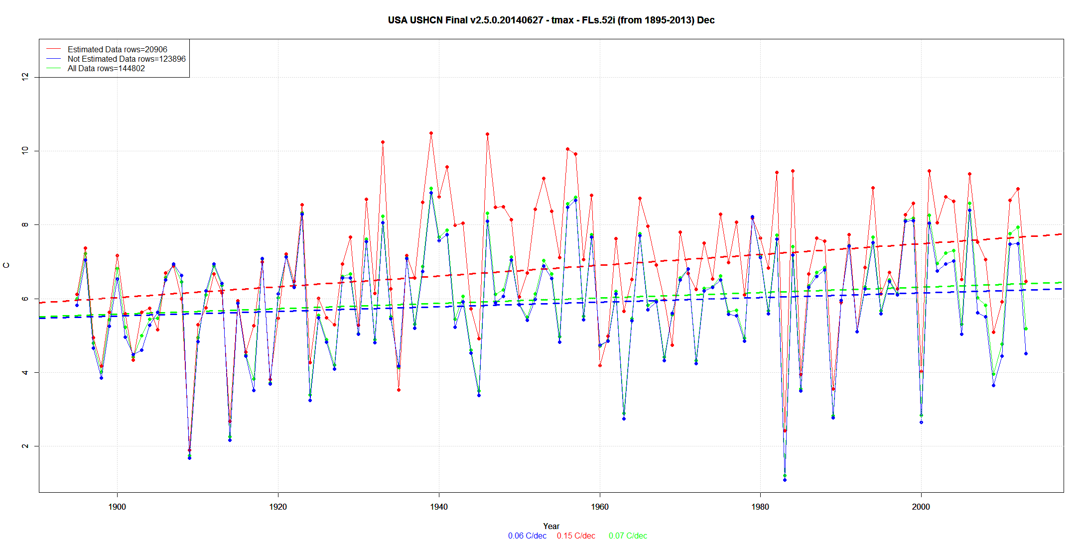
It's bigger at the source. Red is average estimated, Blue is not estimated, and green is combined. My equivalent plot is below - I've omitted combined, since it is very close to "not estimated":

It looks the same, and the estimated sure seems to have a higher slope. So I'll plot the difference between them:

Yes, rising and positive. That's his result. But now I'll plot the same difference calculated with just climatology. To get that, I just average each station, for December, over the whole range of years, and substitute this constant value for the year-by-year data. So there is no issue of estimation. If the composition of the estimated wasn't changing, the result would be absolutely flat. But it isn't:

Instead it tracks the data-based difference very closely, with similar trend.
The difference between average estimated and average non-estimated, doesn't reflect estimation. It just reflects changes in the kind of stations that were being estimated. For some reason, they were more likely to be warmer. I don't know why, but they were. It's just the wrong way to do it.
My R code is here.


That's a very elegant demonstration.
ReplyDeletegreat demonstration nick .how would you address this issue identified by dougmanxx .
ReplyDeleteI’ll just leave this here for whoever sees it to draw their own conclusions. This is Circleville, Ohio in 1934. I’ve added the dates to the beginning of each line for clarity’s sake, but everything else is a direct cut and paste from the daily “tavg” release for the USHCN.
06_26_2014 USH00331592 1934 114 -533 277 1030 1851 2441 2627 2259 2062e 1311 830 18 0
07_01_2014 USH00331592 1934 99 -547 262 1016 1837 2427 2613 2245 2048e 1297 816 4 0
07_07_2014 USH00331592 1934 118 -528 281 1035 1856 2446 2632 2270 2073e 1322 841 29 0
For those unfamiliar with the data format: the date is my addition, USH00331592 is the station number, 1934 the year, and the following numbers are each months “temperature” in Celsius. So. On June 26th this year Circleville Ohio had a January 1934 “average temperature” of 11.4C, on July 1, 2014 it had a January 1934 “average temperature” of 9.9C, and finally on July 7th, 2014 in 1934 the temperature in Circleville Ohio was 11.8C.
whilst i agree the changes made for tobs and instrument changes need to be addressed,issues like the station highlighted above give cause for concern that somewhere in the pha there is something amiss.
"Issues like the station highlighted above" apply to every USHCN station I've looked at so far. When you compare the "data" verses a different run date, its different. So the past is changing EVERY DAY when it comes to USHCN. I'd not call this good "data management".
DeleteDoug,
DeleteI suspect the reason is the requirement, unevenly enforced, that adjusted match the current data, which is changing. I say unevenly because it doesn't seem to always hold on an annual scale, but maybe it is set on some other time scale. If you shift the adjusted up and down to strictly enforce that, then yes, there will be small changes propagated right through the record.
As to whether it's good data management, I think you'd need to know who actually uses it, and how it affects them. Data is adjusted for a purpose, not to maintain the serenity of kibitzers.
"So. On June 26th this year Circleville Ohio had a January 1934 “average temperature” of 11.4C, on July 1, 2014 it had a January 1934 “average temperature” of 9.9C, and finally on July 7th, 2014 in 1934 the temperature in Circleville Ohio was 11.8C."
DeleteThere's an order of magnitude exaggeration here. The units are hundredths of a degree. It's 1.14C etc.
Gee, every one of those average lines goes uphill at an alarming rate - even the ones "skeptics" prefer.
ReplyDeleteThat reminds me of what really irritates me about the denialist crowd - in front of our eyes we are witnessing alarming warming, with today's weather reflecting the state of our global heat distribution engine about three decades ago - meaning we KNOW it's going to get much worse.
Yet, the Republican/Libertarian crowd continues to so easily disassociate themselves from down to Earth realities such as the facts of Accumulating Compounding Interest, instead preferring to check-out and crawl into their 'faith-based bubbles of awareness' and hide.
I mean, considering current trends in our cryosphere, the increasing tempo of very severe infrastructure/crop destroying hydrological events (both drought and deluge), documented disruptions of biological synchronization between plants and pollinators, the shifting of "planet hardiness zones", the frightening changes to our oceans, and more - and still they rather squander yet more precious time with disingenuous hand wringing about fractions of a trend in order to self-justify inaction - to me it all seems tragically infantile.
oops "plant hardiness zones"
ReplyDelete1) You didn't put in trends.
ReplyDelete2) You are using Estimated data in the climatology? Why?
3) Zeke uses 1900-1910 as a baseline in his graph. That decade has the most Estimated data. About 30%
4) " For some reason, they were more likely to be warmer. I don't know why, but they were." Very droll.
Bruce (I presume),
DeleteMy results were rebaselined to 1900-1910 for illustrative purposes. Anomalies are calculated relative to 1961-1990 as is standard for CAM methods.
Using Estimated and non-Estimated data?
DeleteNon-estimated data only for all calculations save the homogenized + infilled dataset. I discard infilled values prior to calculating anomalies.
DeleteNick,
ReplyDeleteDo Dec 1998 to 2013. Add a trend line for both. For Climatology use 1895 to 2013 values WITHOUT an E flag. (I haven't tried just blank ones)
Non Estimated trend is down. Estimated is less down by .15C per decade.
Bruce,
ReplyDeleteThese are December graphs. I chose that because it was your first. And it shows how the difference that you calculate is just an effect of the choice of station.
I'm not sure about your point on trendlines. They are there.
It makes very little difference how you calculate the climatology. This graph from your latest post seems to show the effects (July) of calculating the climatology in different ways. Green and Blue (using all and E excluded) seem almost identical. Red (E only) deviates, but that is not surprising. Many stations have very little data. I'm surprised that there were not some with none at all.
You described your latest post as a rebuttal, but I can't see it. The fact is that climatology alone explains your curve. It would be very surprising if such a close match turned out to be a result of including E in the climatology, or choosing particular years to average. And your exploration of alternatives doesn't seem to make any real difference.
"Many stations have very little data"
ReplyDeleteI meant very little infilled data.
About 10-15% of the data is infilled. And it cools the past and warms the present.
ReplyDeleteThere are no values for the trendlines.
Same dumb story. Goddard just can't stop doing it.
ReplyDeleteHe's shown the average of raw data, no anomalies. And the set of stations reporting ("raw") changes by the month. All he's doing is finding whether the places reporting are warmer places or colder places. And that is what is established here. The places that have been infilled are relatively warm, and becoming more so. Not because each individual place warms, but because of changes in the reporting sample. If the places that need infill are warmer than average places, those that don't are colder.
thanks again for the reply nick .my understanding now is that there may not actually be any argument at all,as one is a data set,and one is theoretical explanation of what the temperature would be if stations provided total uninterrupted coverage over time ? so comparing the adjusted data set to the raw data is meaningless.
ReplyDeleteGoddards argument is very simple. Around 40% of data stations are no longer showing an actual measurement. An estimate has been put in for these. If you look at the estimates, they show increases sufficient to explain all the warming. If you look at actual readings, they show cooling. I don't think anything you have written has countered that point. As far as I - a pure layman - can see, the GW/CC agenda is resting on 'adjustments' and has no basis in fact.
ReplyDelete"Goddards argument is very simple."
DeleteOK, let's break it down:
"Around 40% of data stations are no longer showing an actual measurement."
Exaggerated. I counted on May 9. Numbers reporting for Jan, Feb Mar were 891,883,883. That's 73%. Still a lot missing, but why don't the Goddard folk even try to get it right?
"If you look at the estimates, they show increases sufficient to explain all the warming."
That's the crummy math. It compares two different lots of stations. You can't tell how much of the increase is due to adjustment, and how much to including warmer places in the estimated set.
TOBS adjustment certainly has a warming effect. The reasons have been explained over and over. And if there is a bias, you can't let it stand uncompensated just because it's a cooling bias. But if Goddard wants to make that argument, he first has to calculate the effect right. This he just refuses to do.