This is a followup to my two previous posts (here, and here). In the last, it was shown that in comparing two different USHCN sets (raw and final) a spike in 2014 was due to the data coming from different periods. The spike was there even if the climatology was substituted; so it wasn't a result of actual 2014 readings, only when and where they happened.
Now I'd like to draw some lessons from that in terms of anomalies.
- How anomalies remove the spike.
- How they allow comparison of disparate multi-year data in global indices
- Why anomalies are expressed on fixed base intervals, and
- How this might be improved.
The USHCN adjustments spike
Averaging is linear, and you can think of it as applied to the sum of an expected value (climatology) and an anomaly (the information part). If the expected value is subtracted, the cause of the spike goes away. Put another way, if the expected value is near zero, it won't matter much if the station/months in the samples vary. Let's see how that works.For each station/month, I'll subtract the longterm annual raw average. That is, from a May reading, I'll subtract the May average. Here are the equivalents of R1, F1 and SG from the previous posts.
It corresponds to this plot from the previous post; 2014 has no spike and has not been omitted. You can see that it is broadly similar except for the offset. But now F2 (the average of unmatched final data) is far less out of line, and so the mauve SG (average of all final) is very close to F1 (average of matched final). SG's method, mine all give much the same.
Missing values - infilling
In this post I showed how for a fixed grid with empty cells, you could say that averaging with missing values and averaging with missings infilled with the average of what was there gave the same result.This is true for subset averaging. If you average first over latitude bands, it's equivalent to infilling with the subset average. That gives a criterion; the averaging should be done so that the infill is closest to your expected value. So latitude band averaging is better, because there is a systematic latitude effect on trend.
When comparing two different sets, with no natural set of slots for data, missing means unmatched. If there are station/months in one average but not the other, the latter can be treated as missing, and considered infilled by average.
You could try to improve with explicit infill. But if you have a time series plot, say, the missings between any pair are different. So explicit infill won't work. But you can offset so that each average is of points with as near as possible zero expected value. Then the default infill is near zero. That's the anomaly approach.
Global indices
These are compiled from a scatter of stations with very different reporting periods. These are conventionally assembled into grid cells, anomalised and the cell averages averaged. This compensates for variations in station density. But if the cells are small enough to give good resolution, then many will be empty.It is also possible to make station anomalies directly by subtracting long term month averages. Then some suitable spatial integration formula is needed.
The inter-set comparison logic is needed just to make the time series coherent - you can compare any pair of years and know they are on the same basis. You aren't seeing big differences because stations drop in or out. A famous example where this didn't work so well was the Marcott spike.
You can extend the concept of missing data to cover all points that aren't sampled. Again there is implicit infill. You can see this in two ways. The quadrature formula brings weights, so it's equivalent to infilling with a weighted average. Alternatively, the quadrature is based on forming and integrating a local interpolate. These two ways should be consistent.
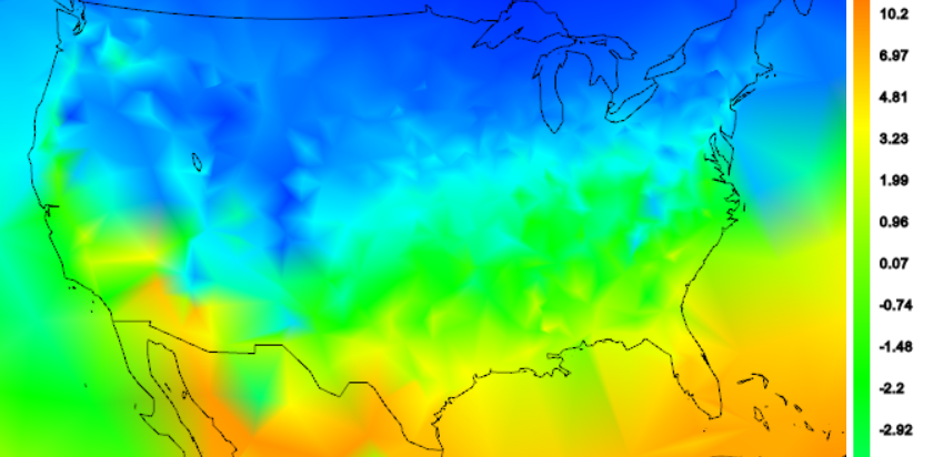
I'd like to show the effects of various anomaly methods. First here is a shaded plot of absolute temperatures for US April 2014. This is unadjusted min/max average for GHCN stations (QCU). There is a strong latitude variation, which dominates the local variability due to altitude. The color scale is actually a cut-off fragment, and is also non-linear. But you can see how the average might vary depending on how evenly the stations sample the latitude zones.

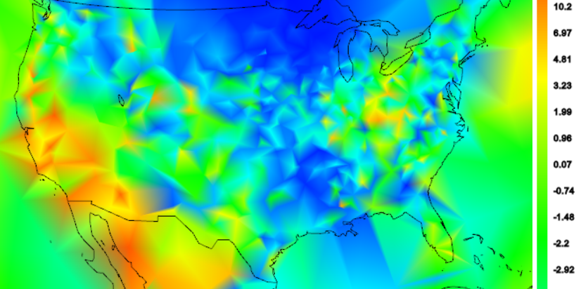
Now here is a shaded plot of individual US anomalies for April 2014, calculated just as differences from the long term mean of all April data. The latitude dependence is gone, but it is fairly blotchy, empohasised by the way the triangular mesh does shading. In these plots, the colors are correct for the actual stations, and linearly shaded in between. The blotchiness is partly due to the fact that some stations have long records, and so a fairly low average, because of the cooler past. Low average means high anomaly. Others have only recent data and a higher average.

Common basis years
There is a catch. Using long term averages which are typically all available data removes variation in station climatology and seasonal monthly. But there may be a secular variation over years - probably a trend. You'd like to know what that is.However, it also means that the flat mean is not the best estimate. There will again be a bias in that stations whose anomaly mean is formed with more recent data will have a lower expected anomaly that those who don't, so again it matters what stations are in the mix.
The standard remedy is to choose common base years, eg 1961-90, for each station/month base. But then there is the problem of stations lacking data in the period.
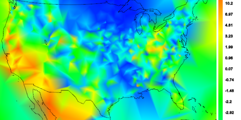
In the next plot, I've used a trick to overcome this. I've used an exponentially weighted linear trend fit. The weight is centred at 1975, and gives most weight to data in the range 1961-90, which is a common choice for anomaly base interval. I use the 1975 intercept. In that way I can get a reasonable estimate even if there is data missing in that interval. It won't work so well for stations that stopped long before, but they won't have 2014 values anyway. GHCN has few if any US stations that started post 1975.

You might agree that it is better than averages taken at whatever time there is data; it takes out that variability. But it still has variability due to variation in trend since 1975.
Another way is to detrend completely. That is the standard way of removing expected value. But the trend is wanted, so has to be recovered after averaging.
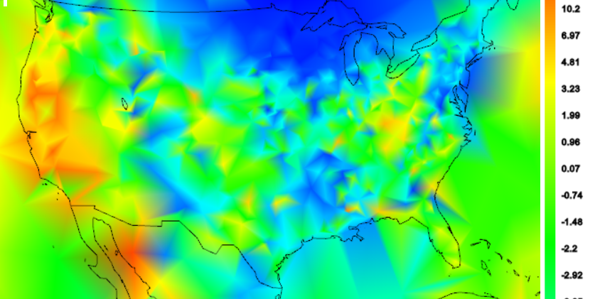
The next plot shows the April 2014 plot where each station has been locally detrended, again with exponential weighting. You can see that as each element of expected value is taken out, over the succession of plots the map gets (slightly) smoother.

Conclusion
Anomalies represent an attempt to romove as much as possible from a signal that is predictable, generally prior to averaging. Since the residuals have much reduced mean, there is less sensitivity to variation of stations/months in the sample.Since the part removed reflects non-climate variations like topography, latitude and seasonality, the remainders have a better chance of showing whatever coherence there is in the information part. Hence the improving smoothness. It gives a better chance that the samples will reflect the measurand in between locations.


0 comments:
Post a Comment