This is a belated post. I'm writing about a paper by Ludecke et al which was accepted in February by the EGU online journal "Climate of the Past". Eli wrote about several aspects, including data quality and how the paper made it to acceptance. Tamino gave a definitive mathematical takedown. Primaklima has a thread with some of the major local critics chiming in.
So what's left to say? And why now? Well, Ludecke had a guest post at WUWT a few days ago, promoting the paper. While joining in the thread, I re-read the online discussion, and was surprised at the lack of elementary understanding of Fourier analysis on display. Surprisingly, the guest post was not well received at WUWT, at least by those with math literacy.
I expect that notwithstanding this negativity, the paper's memes will continue to circulate. It comes from EIKE, a German contrarian website. And they have been pushing it for a while. Just pointing out its wrongness won't make it go away.
So here my plan is to redo a similar Fourier analysis, pointing out that the claimed periodicities are just the harmonics on which Fourier analysis is based, and not properties of the data. Then I'll do a similar analysis of a series which is just constant trend; no periodicities at all. Ludecke et al claim that their analysis shows that there is no AGW trend, but I'll show the contrary, that trend alone not only gives similar periodicities, but is reconstructed successfully in the same way.
Data
Ludecke et al use an average of six long time European temperature series, dating back to 1757. As Eli says, the reliability of the early years is doubtful. They also, to try to get more information on longer periodicities, used a single stalagmite series and some Antarctic ice core data. But the thermometer series is central, and the only one I'll consider here.At CotP, they were taken to task by Dr Mudelsee, then a reviewer, for not making the series available. It's components are not easy to access. However, Dr Mudelsee ceased to be a reviewer (story to come) and his requirement that they be available was not enforced. I will look at just one of the series, Hohenpeissenberg. L et al say the series are similar.
The analysis
To anyone who understands Fourier analysis, it was trivial. They took a DFT (Discrete Fourier Transform) of the series, truncated the spectrum to the first six terms, inverted, and showed that the result was similar to a smoothed version of the original series. They identified the peaks with claimed natural periodicities.There was a complication. They added zero padding to the original series. They never said how much; not even if it was a lot or a little. The result was the panel on the left, in the image below:
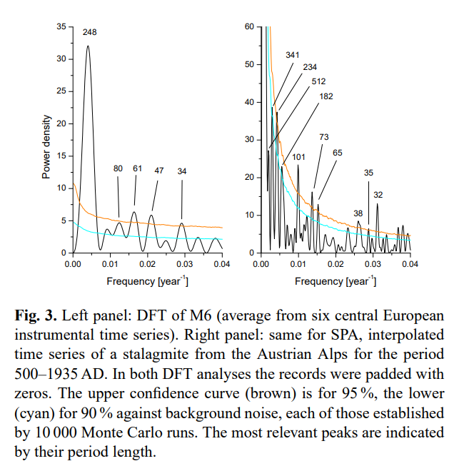
Note the annotated periods on the peaks. The panel on the right was the stalagmite series, not discussed here.
When it came to truncating and inverting, they read the amplitudes off this graph, but used the original harmonics as frequencies. That gave a still good comparison with a 15-year moving average of the temperature series.
The claims
These were stretched. They say of the peaks marked on their transform:"Four of our six selected frequencies in M6 have a confidence level over 95% and only one over 99 %. We find for SPA roughly the periods corresponding to 250, 80, 65, and 35 yr from M6."
They are comparing peaks from their padded DFT. They have compared them to a noise level derived from the signal. This involved Hurst components, DFA, Monte Carlo analysis etc. The referees complained that this was inadequately described. But it is nonsense. The peaks have little to do with the noise, or the data at all. I will show the trend case where the peaks are there and there is no noise at all.
The inverse of the truncated frequency series was indeed close, as it must be. They say in the abstract of the final version:
"The Pearson correlation between the mean, smoothed by a 15-yr running average (boxcar) and the reconstruction using the six significant frequencies, yields r = 0.961. This good agreement has a > 99.9% confidence level confirmed by Monte Carlo simulations. It shows that the climate dynamics is governed at present by periodic oscillations. We find indications that observed periodicities result from intrinsic dynamics."
So the fact that the transform/inversion gets back to the starting point is proof of "observed periodicities result from intrinsic dynamics".
In the original was the even more absurd claim
"The excellent agreement of the reconstruction of the temperature history, using only the 6 strongest frequency components of the spectrum, with M6 would leave, together with the agreement of temperatures in the Northern and Southern Hemisphere, no room for any influences of CO2 or other anthropogenic emissions or effects on the Earth’s climate."
They were prevailed on to take that out, but with this claim to follow:
"The agreement of the reconstruction of the temperature history using only the six strongest components of the spectrum, with M6, shows that the present climate dynamics is dominated by periodic processes."
Of course it shows nothing of the sort.
They then went on to predict. In the original it said:
"We note that the prediction of a rather substantial temperature drop of the Earth over the next decades (dashed blue line in Fig. 5) results essentially from the ~64 yr 10 periodicity, of which 4 cycles are clearly visible in Fig. 5; and which, consequently, can be expected to reliably repeat in the future.
They are, of course, just predicting on the basis that the fundamental periodicity of the Fourier analysis will repeat outside the range. There is no scientific basis for that. But worse, as a prediction, it just says you'll repeat from wherever you started the data. Start at a different point, and you get a different prediction.
The journal
The managing editor was Prof Zorita. He (presumably) chose the referees. One #1 clearly knows nothing of the maths involved. He began:"The authors appear to be statistical experts in this form of analysis, although not mainly publishing in climate science, and it is refreshing to see new approaches to an old problem."
They aren't experts, and elementary FA is not a new approach. He raised minor objections, and one which he said was major:
"I simply do not see how what the authors have done has any relevance
on excluding GHGs as a major factor on the climate."
Indeed, and that does seem to have led to some excesses being removed.
The second reviewer seems to have been Dr Muldelsee, who was quite critical, making the essential points, although not as clearly as I would have liked. He fell into the trap of making good suggestions (eg detrending) which would not have rescued the analysis if followed. However, they were anyway ignored, so he wrote a more critical response. This seems to have been enough to have him removed from the process. He subsequently asked to be removed from the journal's list of reviewers.
His replacement #2 was more upbeat ("This article is interesting and it deserves publication after some revisions.") His one major objection was to the periodic prediction, marked in blue on Fig 5, on the correct grounds that Fourier analysis will always make a periodic prediction. The blue line remains.
So what was Zorita's role? He wrote a curious, semi-critical editor comment, which didn't come to grips with the technical objections, but recommended some steps such as using part of the data to predict the remainder. None of this was done.
Then with no further public discussion the paper appeared, with just a few changes implemented.
My Fourier analysis of temperature
As mentioned, I'll do just the 231 years of Hohenpeissenberg, ending in 2011. The power spectrum of the DFT without zero padding looks like this: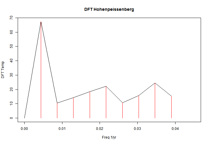
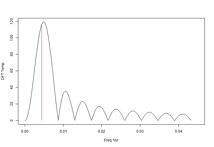
It is discrete, consisting of the red lines in this low frequency view. The effect of zero padding to total length 8192 years is to in effect convolve those lines with the sinc function associated with the 231-year data period:
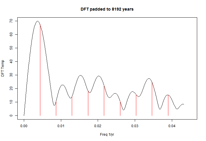
I've kept the original red lines; they are just the harmonics of freq 1/231. The padding has the effect of shifting the apparent peaks. The reason is that each convolution sinc function has a zero at the neighbouring harmonics but a non-zero slope, so it shifts the peak. I'll illustrate with a single frequency. It is of course artefact - there is no new information being discovered by zero padding.
So the logical thing to do is to reconstruct using the first six harmonics of the DFT. I've done that, with this result:
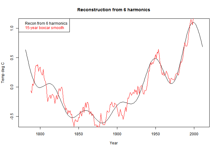
This is all similar to Ludecke et al.
Peak shift - a single frequency
If we take a single sinusoid (cos) of period 231 years (one period) then the power spectrum of course has a single spike: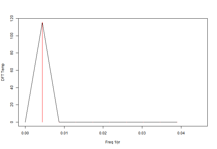
But if it is also zero-padded to 8192 years, the result is:
Note that all the side lobes of the sinc function appear, and the peak is shifted. In fact, the (non-power) spectrum has two spikes, one positive frequency and one negative, and each shifts the peak of the other - outwards in this case. But the displacement is artefact; the data was the sinusoid of the red line.
Pure trend data
Here is an example which will show what nonsense this all is. I take a series in which the temperature rises with absolute regularity, 0.01°C/year for 231 years. There is no periodicity or even noise. Here is the DFT with no padding: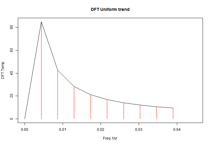
This is an undergraduate-level problem; the series is given here. The power coefficients are 231*2.31/(2π*n), n=1,2,3.
And here is the DFT with padding to 8192 years.
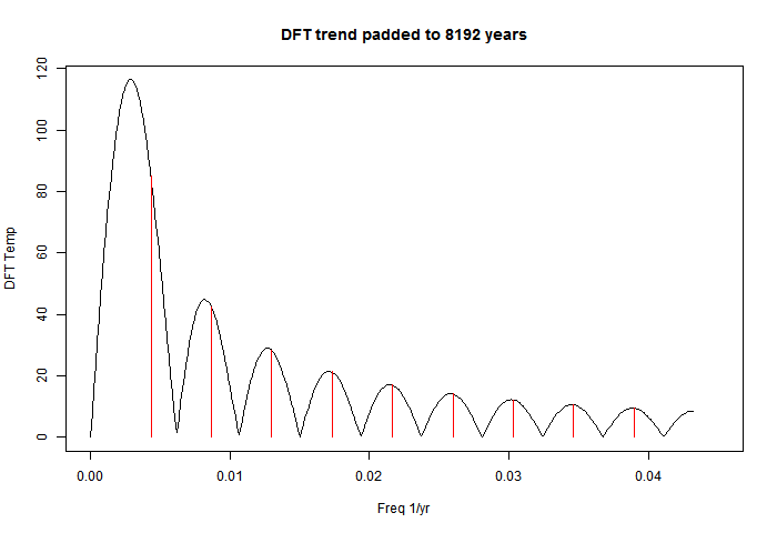
Just as with the temperature data, there are peaks, in about the same places. We can't do a "significance" test, because there is no noise. They are "infinitely significant". Note the prominence of the base frequency, which Ludecke et al were promoting as a discovery.
Reconstruction
Here is the 6-harmonic reconstruction: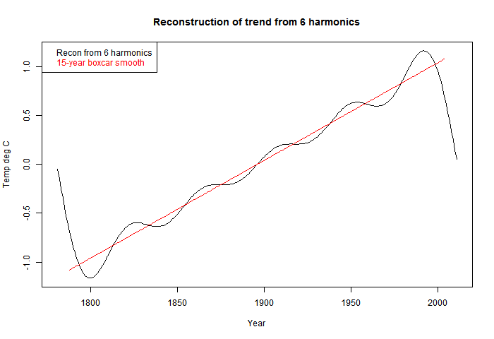
That is pure trend reappearing. But of course, the DFT makes it periodic, so there is oscillation at the ends so that it can go down sharply. This is very well known - called the Gibbs effect, after the 19th century physical chemist.
The boast in the abstract was:
"The Pearson correlation between the mean, smoothed by a 15-yr running average (boxcar) and the reconstruction using the six significant frequencies, yields r = 0.961. This good agreement has a > 99.9% confidence level confirmed by Monte Carlo simulations. It shows that the climate dynamics is governed at present by periodic oscillations."
My corresponding r-value for Hohenp was 0.9496. But for the pure trend case, it was 0.988. Much higher, and no periodicity at all.
Prediction
Ludecke et al used their reconstruction for prediction. They mark the continuation in blue, and find a reason based on the 4th harmonic:"The prediction of a temperature drop in the near future results essentially from the ~64-yr cycle, which to our knowledge is the Atlantic (Pacific) Multidecadal Oscillation (Mantua and Hare, 2002; Hurrel and van Loon, 1997)."
So, following their method, where is this uniformly rising trend data headed? Down! It rose 2.31°C by uniform steps; Ludecke-style foretelling is that it goes back to where it was, very quickly. And of course, there is absolutely no basis for that in the data.
And if the analyst had happened to FT 500 years of data, then the prediction is a 5°C drop.


Lovely. I must steal it.
ReplyDeleteI agree, its very bad that Zorita couldn't see it. But also bad that none of the other referees saw it clearly. Even Tamino missed the key point about the padding (and I'm just going with your flow; I did FFTs as an undergraduate and what you say *sounds* entirely plausible but I can't claim to have checked).
Nick,
ReplyDeleteOpen discussion comments shown on the CotP website can be posted by anyone on a voluntary basis, so it's not necessarily the case that Zorita chose them, or even knew who they were.
AIUI there is another round of reviews, after this initial open discussion phase, in which Zorita would select reviewers in his capacity as editor, but those reviews aren't posted.
The discussion has contributions from people labelled Anonymous referee #1 and #2. I can't imagine that they just wrote in with those names. Zorita refers to the referees frequently in his message.
DeleteAIUI the second round is basically where the editor and authors haggle, bringing in the referees as the editor wishes.
Ah, yes, I see now they make a distinction between referee comments (RC) and short comments (SC). The former presumably selected, the latter open to all. That does mean Mudelsee was never an appointed referee, he was just posting a short comment in the open discussion as anyone is able to do. Anonymous referee #2 wasn't a replacement - he was probably invited to comment before Mudelsee posted anything, and indeed the first comment from each appeared on the same date.
DeleteLooking at other dates, Zorita's comment was posted on 27 Nov 2012, the final paper says a revised paper was submitted on 20 Jan 2013 and was accepted 4 Feb 2013. That's not much time for a further round of reviews, particularly since the reviewers and Zorita himself seemed to be suggesting a complete do-over.
Nick, do you have any plans to make this into a comment to the paper? I think some people need to be embarrassed (Zorita claimed the reviewers were experts in time series analysis; surely they should have noted the problems?).
ReplyDeleteMarco
Marco,
DeleteIn their policy, the only mention of comments on papers is the interactive forum, which does seem to be the right place. But that's for a limited time. In their FAQ they explain why they don't have a category of "letters" or "short communications".
Nick, in case you haven't noticed it, Eduardo commented on the backgrounds of the review process. Georg, Manfred and I commented as well: Klimazwiebel
ReplyDeleteIn fact, Manfred wasn't official reviewer at any stage. In any case, thank you for this additional comment on the subject.
Thanks, I hadn't seen that. It is a very interesting thread. I had inferred from some of Mudelsee's comments that he had had some reviewer status, but I see from the editor's view that he had declined.
DeleteI think, though, that it was a very poor defence by Prof Zorita. He dismissed a chorus of objections because they had been previously expressed at a blog:
"There were a few more public comments on this manuscript, most of them critical. However, as editor, I could not consider all these comments as independent reviews, since all of them stemmed from commentators of Georg Hoffmann's blog. I have a strong opinion that reviews of a paper have to be independent."
I see that you remarked on this too.
So, the fairness of the process was maintained, and the truth died. It is the responsibility of the editor to find out whether the paper is actually right, not just to adjudicate a he siad/she said process.
Anyway, I see that he did invite a rebuttal.
James also had a bit of discussion on this article on his blog.
ReplyDeletehttp://julesandjames.blogspot.com/2013/03/peer-review-problems-at-egu-journals.html
Don't you think it's a bit of stretch though to suggest the truth "died"? Essentially everybody including the WUWT crowd is aware the paper is bad.
Anyway... to the more technical aspects of your post:
The result you go here is a special case where the frequency of the signal is exactly centered in a bin, and on the use of a rectangular window. For observational data, it's essentially never going to be centered on a window. You'll guaranteed to get just one peak, but in general you'll have nonzero values for the other bins.
I redid your little experiment, but I moved the period to 250 years, had an observational period of 1000 years, and a sampling interval of 1-year. (It makes it a bit easier to interpret if you move the signal out of the first non-zero frequency bin.)
Here's my version of the plot.
When you zero-pad the data, the true window-response function is revealed, which for a rectangular window is just a sinc function of course.
Since the location of the secondary maxima of the window response function depends on the window function chosen, one test for windowing artifacts is to use more than one window type...
I recommend using rectangular, Welch, triangular, Hann and Blackman windows.
Here's a figure. (I'm just showing rectangular, Welch and Hann windows.)
Carrick,
Delete"The truth died" - well, it's a play on "the operation was a success but the patient died". Focussing on process, while forgetting that the object of review is to find out whether the paper is sound.
With the sinusoid example, I was trying to show that when padding shifts the peak location, it's due to overlapping sinc's. With the sinc function, because of the regular spacing the value at the peak doesn't change, because sincs from neighbor peaks have a zero there. So the red lines continue to touch the envelope. But they don't have a zero slope, so the peak shifts.
Yes, I think padding with windowing might help a little, by reducing overlap. But the issue isn't really with the spread of the peaks; it's the peaks themselves and their misinterpretation.
Nick, do you agree the peaks are artifacts of windowing?
DeleteChanging the window function shifts the location of the secondary maxima in addition to changing the width of the primary maximum, so if the peaks are due to an artifact of windowing, going to Hann windowing would nail this.
Today is Mother's Day in the US and I'm trying not to draw wife aggro, so I have to stop here!
Do you have a link to the data that you actually used?
ReplyDeleteCarrick,
DeleteDo you mean for Hohenpreissenberg? I used the BEST data. I've been looking into it more, and I found all but Paris is in their set, with these ID's:
# HOH=14159; KRE=5226; MUN=14189; WIE=5238; PRA=13014; BER=14474
Carrick,
Deletehere is a csv file of the annual averages of the 6 stations # HOH=14159; KRE=5226; MUN=14189; WIE=5238; PRA=13014; BER=14474. It starts 1701.
Thanks Nick.
ReplyDeleteRegarding this statement:
To anyone who understands Fourier analysis, it was trivial. They took a DFT (Discrete Fourier Transform) of the series, truncated the spectrum to the first six terms, inverted, and showed that the result was similar to a smoothed version of the original series. They identified the peaks with claimed natural periodicities.
It appears from from their figure they also subtracted the mean of the series... correct?
I can't understand their rational for not detrending the data though.
Nick thanks again for the link to the data. When I compute the spectra for the Hohenpeissenberg data (231 years), I get a very similar figure to Ludecke's Figure 3, in terms of the apparent spectral peaks in the data.
ReplyDeleteI went back and did the test I suggested, namely compared rectangular to Welch and Hann windowing. It's very clear (to me anyway) that most of these other peaks are artifacts. I still get peaks for periods near 250 years and 35 years.
My suspicion is the 250 year peak is just a windowing artifact associated with the non-zero trend in the data (it disappears if you e.g. quadratically detrend the data).
The existence of a 35-year period seems plausible though. It's robust across different window function choices and
I think that the labeled peaks in Ludecke's figure 3 are just windowing artifacts.
Anyway here's the figure.
Definition of Welch window here.
There's a more formalized approach for testing the robustness of spectral peaks called the "multitaper method". There even seems to be an R-implementation. If you care to pursue this, you might get a publishable result from that.
DeleteCarrick,
That sounds right about the 35 yr; with >6 periods, there's a good chance something can be said. I think the difficulty of separating lower frequencies from artefacts just reflects that there are two few periods to tell.
In effect, the DFT bins low frequencies. They have to go somewhere. I think your filters more efficiently push them into the lowest bin.
I looked at the detrending used in Matlab - it's just OLS. I think this is not the right idea. If you think of sin(πx) from -1 to 1, it is very well handled by DFT. But it has an OLS trend, and if you subtract that, you get a mess.
The idea of subtracting a trend is to make the residue more plausibly periodic, which really means continuous. I think the line to be subtracted needs to be chosen on that criterion. It should be a line joining some estimate of endpoint values, rather than OLS.
"filters" I meant windows. I assume the red curve is Hann? Yes, agreement at 35 yr is good.
DeleteNick, regarding detrending... I don't think there's a lot more that you can do, unless you have a specific model for the origin of the secular component. it's pretty typical to detrend on a per-window basis (e.g. linear detrend) before computing the time series. Detrending the whole series with a polynomial is less optimal.
DeleteIn this case, you don't have a choice because there's so little data.
Regarding this: I think the difficulty of separating lower frequencies from artefacts just reflects that there are two few periods to tell.
That's why I suggested using the multitaper method... See this, particularly noting:
[The problems with conventional Fourier analysis ] are often overcome by averaging over many realizations of the same event. However, this method is unreliable with small data sets and undesirable when one does not wish to attenuate signal components that vary across trials. Instead of ensemble averaging, the multitaper method reduces estimation bias by obtaining multiple independent estimates from the same sample. Each data taper is multiplied element-wise by the signal to provide a windowed trial from which one estimates the power at each component frequency.
The technique I used above to vary the window (taper) function is similar in spirt, but Thomson went a step further by demonstrating that the discrete prolate spheroidal sequences of length "n" (window length) are independent of each other (as you know, by using orthogonal functions, the inversion of the OLS is both trivial and noiseless).
It's a very elegant method, but like the Welch periodogram, it provides a mechanism for estimating confidence intervals.
I really don't have any question that most of the spectral peaks in Ludecke's Figure 3 (left panel) are artifacts, but a formal method like this nails it.
Here is my attempt (I've normalized the PDF using Parseval's theorem and requiring that the integral of the PDF equal the mean-squared value of the original time-series.)
Figure
Blow-up here.
I've quartically detrended the data before computing the MTM PDF. Note that the spectral peak I surmised was real survives here.. it shifts to a bit longer period though --- 41 years versus 35.
Regarding normalization... I should have stipulated that Matlab uses the same normalization. However, I checked to verify this.
DeleteThe code is very simple here:
[x yp count] = readdata('hohen.nick.detrend.n4.txt');
[pxx0p,pxxcp,f] = pmtm(yp,4,16*length(yp),1.0, 0.95);
semilogx(f,pxx0p,f,pxxcp)
readdata is just my code to read in a two column ascii data file, nothing special there.
(source here)
The data file is here.
Documentation for PMTM can be found here.
Carrick,
DeleteYes, the code is very simple. I'd worry a little about quartic detrending. The argument for lunear detrending is that it probably doesn't take out periodic signals (though in the sin example above, it does take out some). But by quartic, there is substantial opportunity to remove a periodic signal. Or put an other way, anbiguity about what is periodic and what secular.
I've been trying different detrending. Now it's simpler; I just use weighted regression, emphasising the ends. cosh(yr/10) currently. The idea is that the residuals are close to zero near the ends; with quadratic. the gradient of residuals is near zero too. That makes a periodic fit more reasonable, and it's fairly continuous with zero padding. It works fairly well, and makes tapering less attractive. I'll post results later today (14th).
Nick: Or put an other way, anbiguity about what is periodic and what secular.
DeleteYes I think this is always the case for very low frequency signals, but the ambiguity is intrinsic here.
If the data really have a linear/quadratic/etc trend in it, the only "right way" to model it is as a linear/quadratic/etc tend + oscillatory terms.
Higher order trends can mimic spectral peaks, via their window response function, as you showed here.
It's harder (not impossible, but unlikely) for spectral peaks to mimic a trend, but it does require a special phase relationship among them to produce a trend from them. You can address the effect of detrending on estimation of spectral peaks, through a Monte Carlo, where you randomize the phase of the components and see how much effect the detrending has on them.
Anyway, it'll be interesting to see what you come up with.
Here's the results of a sensitivity test, where I've applied linear, quadratic, cubic and quartic detrending to Hohenpeissenberg:
<a href="http://dl.dropboxusercontent.com/u/4520911/SignalProcessing/hohen.nick.detrend-effect.pdf'>Figure.</a>
Here's my interpretation:
Linear detrending still leaves what appears to be a large window response function from an apparent secular component in the original data. Quadratic detrending actually suppresses the measured response for frequencies below 0.015 yr^-1. Cubic and quartic give very similar results.
This suggests that the multitaper result for cubic and quartic gives the spectral peaks that are <i>unambiguously</i> associated with actual oscillatory components present in the actual signal over the measurement period.
Fixed link:
DeleteFigure.
Carrick,
DeleteI am getting quite good results with weighted regression (cos((yr-meanyr)/10)) detrending. It leads to near continuity at the edges, and a non-zero mean. So there is a big zero peak which extends beyond the first harmonic, but other peaks are not very high. The 35 yr isn't robust.
I've tried adding tapering, but it's a mixed blessing. It widens the central peak, and while I'm sure it is suppressing side lobes, they weren't so bad anyway.
With weighted detrending, going to quadratic doesn't seem to help much.
It's late here, so I won't try posting pictures, but probably in about eight hours I'll show something.
cosh((yr../, not cos((
DeleteCarrick,
DeleteResults here. I've done each of 7 syations and their mean, for
1. Ordinary detrend (OLS)
2. wtd detrend
3. OLS + Welch taper
4. wtd + Welch
Nothing is perfect, but there's no great pattern visible.
Carrick,
DeleteI expanded the results file to cover weighted quadratic fit. I've lost faith in my weighting idea, though. It creates a big central value, being non-zero mean, and there's no real improvement to compensate.
So reading through our various comments, here's my summary...
DeleteI think the 35-year peak is probably real, but has a fairly low signal-to-noise. I wouldn't write a paper featuring it though.
The side-lobes are a bit of an issue in this case because Luedecke et al erroneously try to assign meaning to them.
Changing the taper or detrending helps to demonstrate that these peaks are associated with the window response to the secular component.
The benefits of the width of the central peak and the tail of the response function strongly depends on the the class of measurements you're taking. It's pretty rare where rectangular windows beat out other tapers, especially when you've detrended the data.
Very low frequency signals and secular drifts are difficult to sort out. I would personally never write a paper that featured the first non-zero frequency bin of an FFT for this reason, unless I had a physical model that allowed me to "sort things out". Cases where you're measuring the response of an amplifier to an external signal might be such a case (the model is well understood mathematically, here, you're just trying to characterize it's behavior.)
MTM formalizes a method for separating out window-response artifacts from spectral features that are actually present in the signal. Because of the ambiguity problem between low-frequency oscillations versus secular terms, interpretation of the results in terms of origin (e.g. oscillatory versus drift) still remains.
The conservative approach would be to "allow" as much of the low frequency structure be "eaten" by detrending as is reasonable, and assign the rest as plausibly associated with oscillatory behavior.
Trying to construct a statistical forecast model using the low-frequency structure where an ambiguity of this sort exists is completely insane.
Got distracted.... to clarify this, other than the 35-year peak, I think the other, longer period, peaks in Figure 3 are not real.
ReplyDeleteNo idea what you peeps are going on about but thought it might be interesting to note that 35 years is the average recurrence time for large volcanic eruptions in the Gao 2008 stratospheric aerosol series. There's fairly substantial variance (+/-28 years, 1 sd) so it could be coincidence.
ReplyDeletePaul S,
DeleteHere's my summary of what we've been on about. I've criticised a flawed attempt to extract information about low freq periodicities where there are only a few periods observed. Artefacts were not being separated from meaningful analysis. The question was, can this be done better.
The problem shows clearest with the simple DFT. The low freq information is binned, one bin per harmonic. That limits resolution. But there's junk in the bins too. A big source is from the DFT trying to fit secular processes into a periodic frame. So the common suggestion is, de-trend. I played with a non-standard method, but on balance, it was not better. But de-trending is good.
Then there's zero padding, which lets you try many more frequencies, and has some potential to show a sharp peak. But not much, because each peak is convolved with a sinc function associated with the data length. This broadens the peak, and also produces side lobes, which push adjacent peaks off centre.
Carrick suggests tapering. This suppresses side lobes, but broadens the centre. He also suggests multi-tapering, which gives varied views, which helps to decide what is real and what not.
I've done a lot of playing, though not yet with systematic multi-tapering. I haven't found any low frequency that I think is robust, including 35 yr.
IEHO the problem was the reviewers were a) polite and b) not really appropriate. Now some (hi Steve), not Eli to be sure, would say that the fix was in given Zorita's connections to the Alpine climate groups. He had to know better.
ReplyDeleteHi, where did you find the numerical data for the stations in BEST? esp the ones that are corrected.
ReplyDeletehttp://berkeleyearth.lbl.gov/stations/155038
Eli,
DeleteI downloaded from BEST in December - metadata:
File Generated: 30-Jan-2012 22:25:12
Dataset Collection: Berkeley Earth Merged Dataset - version 2
Type: TAVG - Monthly
Version: LATEST - Non-seasonal / Quality Controlled
Number of Records: 36853
I've put here an R binary file of the annual averaged data in a GHCNv2 type structure (6.8Mb), with an inventory file here.