I don't know what makes these things recur - but it can be amplified by a gullible journalist, like Graham Lloyd, of the Australian. The classic of these was Willis Eschenbach on Darwin, about which I wrote my first blog post. The issue then was about GHCN V2 adjustments. As I showed there (following Giorgio Gilestro), you could plot distributions of effects of adjustments on trend. There was a fair spread, but the mean effect was 0.17°C/century. A little short of half had a cooling effect. I noted Coonabarrabran as one that was cooled as much as Darwin was warmed.
I did an update here for GHCN V3, and a further breakdown here between US and ROW. US has higher adjustments, mainly because of TOBS.
The first link included a gadget using a Google Maps interface that could selectively show stations that were warmed or cooled by adjustment, and by how much. I'll describe it more below the jump, but the original had more complete information. It works for anywhere in the world, but here is an image of Australian GHCN stations with more than 50 years of data. Pink are cooled by GHCN V3 adjustment, cyan warmed, and yellow have no adjustment (strictly, zero trend change):
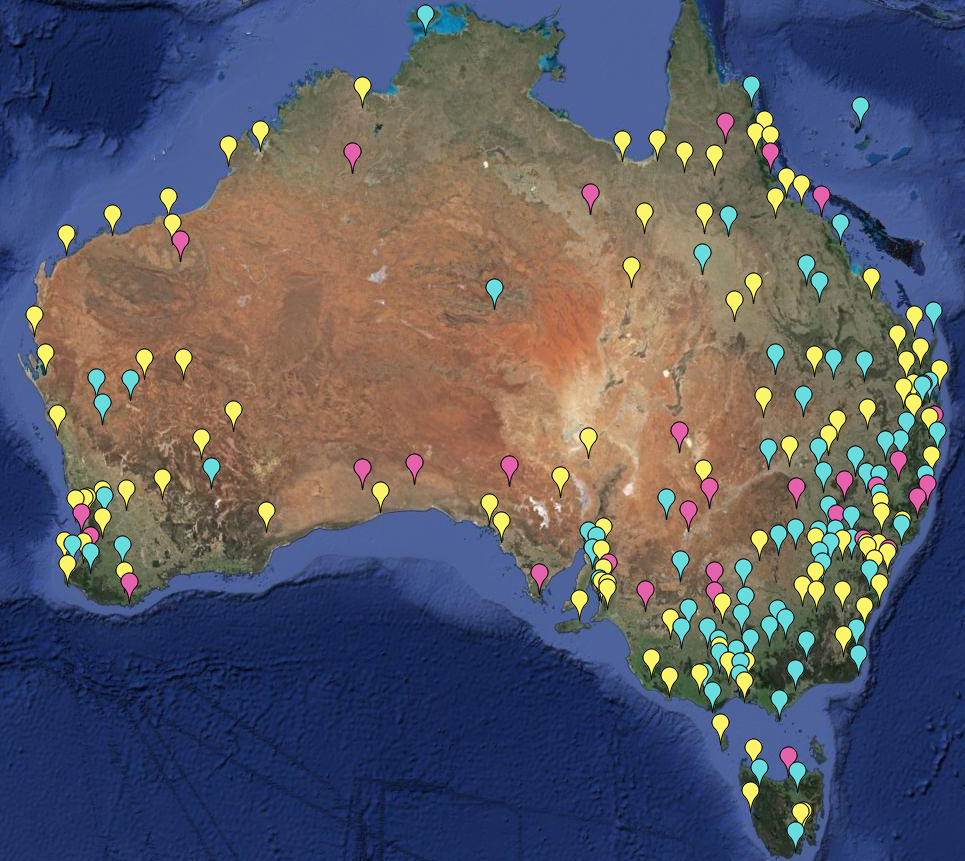
Update: Here is a further plot of the more extreme trend adjustments, magnitude >1 °C/cen. Note that it is for mean temp, not minimum. Amberley still qualifies (1.36°C/cen), but not Rutherglen. Yellow warming; cyan cooling.
The gadget works by "or" logic, which can be tricky. It's better to change than add. To make the pic, I first pressed the Invisible button to start with blank screen. Then I unset the All button, and:
- entered trend change < 0.0001, pressed the radio button for that, and clicked yellow. All stations with zero or cooling are shown.
- Then I change 0.0001 to -0.0001 and click pink. Actual cooling trends turn pink.
- Now I change to > 0.0001 and click cyan. That produces warming trends.
- Finally I limit to 50+ years. I unset the radio button for trend, set it for duration, and set that to <50. Then I press invisible.


Hi Nick,
ReplyDeleteYou said the overall influence of adjustments was 0.17C per century. How does that influence from adjustments compare to the overall trend per century without any adjustments? If the overall trend is positive without adjustments, then that would seem to place a lower bound on the extent of actual warming, acceptable to all.
Is there any reason (a priori) to expect the net of adjustments over all of Australia to be on average in one direction rather than the other? (eg. conscious re-siting to locations with reduced UHI effects, or replacement of older instrumentation with newer, or routine re-siting of stations to airports, etc.) Unless there is an identifiable underlying cause (or causes), someone might reasonably expect the adjustments to average very close to zero.
Steve Fitzpatrick
Steve
Delete"Is there any reason (a priori) to expect the net of adjustments over all of Australia to be on average in one direction rather than the other?"
What is normally cited is the tendency of locations to move out of mid-town, often to airports. There is also change to MMTS. ROW doesn't have an explicit TOBS adjustment, because it isn't documented, and probably didn't happen nearly as much. But to the extent it did, it will show up in homogenisation. I look at some of that here.
Steve Fitzpatrick, yes there are many sources that may make the trend smaller. You do not hear much about them on the blogs and also scientists did not study them much, because they were mostly interested in detection of climate change and thus in the lower limit.
DeleteA better explanation of these cooling biases is high on my list of upcoming posts, but here are some as key words: Old quicksilver thermometers could not measure below -39°C (freeze) modern alcohol ones can (not the biggest problem in Australia I guess :-) ), relocations of urban stations to (irrigated) suburban areas or (irrigated) rural areas or airports largely outside of the UHI (this causes a bias as many stations started within the UHI), more in general in Austria (not Australia) a deurbanisation of the network was found by Reinhard Böhm (possibly because with the interest in climate change, accurate measurements became more important; the interest in climate change may also have improved painting & cleaning schedules), irrigation may also lead to cooling biases for rural stations, there have been changes in the shelters that protect the instrument from the sun and heat radiation from the soil (generally this protection has improved (measurements in the 19th century were warm biased) and the error may also been decrease due to the introduction of mechanically ventilated automatic weather stations). The time of observation bias (TOBS) is a bias of 0.2°C in the USA; it is expected not to be a bias world wide.
For exposure improvements due to transition to Stevenson screens, relocations to suburbs there is good evidence, even if too little to quantify. For relocations to airports and deurbanisation there is some evidence. Most of the above possible sources of bias have unfortunately not been investigated and should thus be considered speculative, we cannot quantify their importance. I think it's a travesty we can't because we only had eye for the warming biases.
Steve---one mechanism is the moving of stations from urban to more rural locations. This produces a "saw-tooth" like modulation in the otherwise smooth temperature trend. Obviously the point you raise is a good one, because we should verify with meta-data, when available, that we understand the origin of the particular corrections that are being made.
ReplyDeleteNick,as you know, I've become interested in the question of spatial smearing associated with the homogenization process. This is in relationship to some issues that Brandon Shollenberger originally uncovered with respect the Berkeley Earth project.
It's not completely obvious to me that this spatial smearing associated with homogenization would not also lead to a net bias in the trend too. The worry that comes to my mind is costal stations—which typically are influenced by the marine-costal boundary layer and should have lower trends than inland stations—might end up getting artificial warming. Because the area being sampled by coastal stations is very small, this might not be relevant to estimates of global mean temperature (though the specter of the smearing of Antarctic Peninsula temperatures into the Antarctic mainland comes to mind). But it certainly is something that needs to be considered, since there is an increasing focus on regional scale climate change .
Carrick,
Delete"It's not completely obvious to me that this spatial smearing associated with homogenization would not also lead to a net bias in the trend too."
For this type of operation, it's not obvious what the smearing is. A jump is corrected for. You could say that neighbors contributed to the estiamte of the jump size, though that's not really the case here.
If a location is downweighted, that does in effect diffuse neighbor data.
But homogenisation is usually associated with loss of resolution anyway. Most typically regional averaging. So "smearing" just re-weights. That wouldn't necessaarily bias coastal. It probably would if you are averaging a land mass, say. I actually don't think one should overly seriously do that.
One thing that always bothered me about Antarctica is that coastal is a rubbery concept there.
Nick: But homogenisation is usually associated with loss of resolution anyway.
DeleteThat's exactly what I'm describing as "smearing".
Most typically regional averaging. So "smearing" just re-weights. That wouldn't necessaarily bias coastal.
I agree: That won't necessarily produce a bias, but it can . I'd expect that appropriately designed algorithms should be able to avoid the problem:
The problem is that coast line represents a boundary between regions with different trends, typically the trend is higher on land than in ocean, are larger as you approach the poles, and coastal sites tend to have trends that are closer to ocean measurements than inland stations.
If you think about it from area weighting perspective, in the case where ocean temperatures aren't being used in the homogenization, the area influenced by coastal stations in the homogenization process would be approximately 1/2 (not exact because coast line is curvy) of that of inland stations. So it's easy to see how bias might creep in.
(It is a standard mantra in software engineering, see e.g., Kernighan's book, that boundaries should be examined separately when you are validating an algorithm.)
It's my understanding that none of the standard temperature products use ocean temperature in the homogenization process. So when you correct a coastal location with an inland one, I'd expect that a positive bias in trend, and a smaller trend when you correct an inland station with a coastal one. In the case where ocean temperatures are being used across the coastal boundary and you have a sparse inland network, I'd expect a bias towards lower trends.
As I mentioned in my previous comment, he overall effect should be very small on averages over large ares, unless you have a very under sampled region. My argument about the adjustments is that they were designed to reduce the bias in the global mean temperature series, not to faithfully reduce the trend in all stations. This is why I tend to focus on land-only gridded data, if I want to discuss the possible bias associated with homogenization.
One thing that always bothered me about Antarctica is that coastal is a rubbery concept there.
It's a rubbery concept anywhere I think, actually, because some coastlines have a diurnal cycle in the direction of the wind. Some coastlines are dominated by off-shore winds, others are dominated from flow from the interior. The extent that this happens depends on meteorology, so it can get complex.
Here's the last month's wind patterns for Sydney:
Sydney
Notice the winds for this period typically oscillate from southerly to northerly over a day, but there are periods of days where the direction is northerly. (But the pattern changes if you go back to previous months from there.)
Because the raw data includes wind speed and directions, I suppose in principle, you could incorporate this information into your reconstruction. In practice, I think it's better (for now) just to focus on regional averages, rather than fret, as some people do, whether the adjustments of individual stations are "getting it right" on a station-by-station basis.
(Of course Kernighan was referring to conceptual boundaries for an algorithm, but this happens to also literally be a boundary here!)
DeleteI'm probably completely wrong. But is it possible that if there is an overall warming trend, then homogenisation of stations (particularly if there are others in the region) will tend to lead to more stations being corrected up than down?
ReplyDeleteI can't say it's impossible, but I can't see why it would.
DeleteSee my comments above about stations near boundaries (such as oceans). I don't necessarily claim that homogenization algorithms must produce biases, but it is the case that it could happen, and probably does. But I can't prove that for an algorithm that is making adjustments to noisy dat with spatially varying trends, that the nonlinear processing of that homogenization algorithm won't introduce some residual bias in trend. In that case, I expect the bias to depend on the sign of the trend.
DeleteMy guess is because the algorithms are nonlinear and because there is a trend in the data and the data are noisy, you'll see some residual bias. I would expect it to be small (including the coastline effect, if that really exits, because the area affected is so tiny).
There is certainly spatially smoothing in the data, and some reconstructions do worse than others, see for example GISTEMP versus BEST
These are the trends between 1924 and 2008.
Anonymous, with few exceptions relative homogenization methods are used in climatology. "Relative" here means that one station is compared to its neighbors. We search for non-climatic changes in the difference signal. This takes out the climate change signal, the "overall warming trend". Thus you would not expect this warming trend to have an influence.
DeleteThis is also what we found in a numerical validation of the algorithms as the are actually implemented and used in practice. You can see this in the top row of Figure 5 for 3 example methods in this publication by me and colleagues. And in Table 8 for all methods. The right trend is on the x-axis (some trends were negative others positive). The vertical lines run from the trend of the data with artificial inhomogeneities (non-climatic changes) to the trend of the homogenized data; the end with the homogenized data has a symbol (head). These heads (homogenized) of the lines are on average closer to the diagonal, close to the right answer, than the tails (raw data with non-climatic changes).
The trends of the homogenized data do not vary as much spatially as the trends in the raw data. This is a feature, not a bug. On global average, the non-climatic changes only produce a small bias of about 0.2°C per century (trend in raw data is about 0.6°C per century since 1880, trend in homogenized data 0.8°C per century). However, locally the error in the trends can be very large. A typical non-climatic change is about 0.8°C in size. Thus two stations that are very near to each other and should measure almost the same climate can have very different trend in the raw data, before the non-climatic changes have been removed.
Victor: If a typical non-climatic change is about 0.8 degC in size, this is something that gets incorporated into the uncertainty of the global or regional trend - it isn't something that you get rid of by "homogenation". If you knew the cause of the breakpoints in the data, it would be appropriate to correct those breakpoint that weren't the result of restoration of original observing conditions (ie maintenance). So it is appropriate to correct breakpoints associated with documented station moves, changes in time of observation, equipment change, etc. Unfortunately, you have NO IDEA whether most breakpoints were caused by some sort of maintenance that RESTORED earlier observing conditions or a sudden change to NEW observing conditions. When you correct breakpoints that were caused by maintenance, you BIAS the resulting trend. With as many as one breakpoint per decade now being identified at the average station, it no longer makes sense to assume that at of these artifacts can be attributed to station moves, rather than maintenance.
DeleteJust because two stations are relatively close to each other doesn't mean they should show the same trend. Each exists in its own microclimate, which can respond differently to climate change. See: http://journals.ametsoc.org/doi/pdf/10.1175/JCLI3358.1 The existence of a correlation with distance doesn't mean the "right answer" is that all nearby stations WILL show the same trend. It would be interesting to see how the well the three USCRN stations in this paper less than 10 km apart agree since they became operational.
You are working with data that was not acquired with the goal of being able to accurately detect surface temperature trend of 0.1 degC/decade. The 0.17(?) degC that homogenization algorithms have added to the record by correcting undocumented breakpoints is based on the unproven hypothesis that one gets a more accurate trend by correcting all of them. Processing artificial data with known errors of the type you expect to encounter is useful, but it can't tell you how to handle unknown artifacts.
The best you can say is that land surface stations have warmed X degC (after correcting documented breakpoints) and X+0.17? degC (after correcting all breakpoints).
Frank
Victor, I think Frank's point about spatial variation in trend is a valid one. So "The trends of the homogenized data do not vary as much spatially as the trends in the raw data" sounds like spatial smoothing to me. (Which is neither good nor bad without specifying the application.)
DeleteIn your benchmark, did you guys include a spatial variation in trend?
Carrick,
DeleteThere is a whole-earth gadget here where you can look at shade plots of trends over various time periods. You can choose adjusted or unadjusted. Yes, adjusted is smoother.
Raw is the sum of a fairly smooth anomaly field and a whole lot of uncorrelated inhomogeneities. When you remove the latter, it smoothes, but not diffusively.
You can see how wrinkly US is without TOBS adjustment.
Nick: You probably remember the comparison of BEST to GISTEMP temperature trends I generated using that widget.
DeleteRaw is the sum of a fairly smooth anomaly field and a whole lot of uncorrelated inhomogeneities. When you remove the latter, it smoothes, but not diffusively.
I think that's an interesting claim, but it needs something further to back it up. It's not unexpected that as you decrease the size that you're averaging over, you will see more structure.
One can distinguish structure from uncorrelated noise using e.g. a spatial Fourier transform. If you end up with a (nearly) flat noise floor, that would be credible evidence that this is "uncorrelated inhomogeneties". If on the other hand, you find a $latex 1/k^\nu$-type spectrum, that's evidence that this structure is not an artifact of the measurement process, but intrinsic to the processes that produce a land amplification of the AGW signal.
Nick,
ReplyDeleteThanks for your reply. Do you know how much of the total warming in Australia that 0.17c per century adjustment effect represents?
Steve Fitzpatrick
Steve,
DeleteNo, I don't. I don't actually think of the total warming in Australia as a particularly significant number. And again, it isn't really attached to a time period. It's in the range of 10-20% of recent global warming. But remember - 0.17 was V2 global. V3 is a bit higher.
Interestingly, I think Darwin was one of the few examples where an actual error was identified: the old NCDC algorithm had a small probability of inducing a random walk in the data. (I think Tom Peterson wrote a letter to Willis that was featured in WUWT regarding this). Of course, as you note, the Darwin adjustment was insignificant at the global scale: also, it wasn't used in either the HadCRUT or GISTEMP records. Still, it was worth fixing, and I understand that the new NCDC algorithm removes the potential for such errors.
ReplyDelete-MMM
History was found, but no error that I'm aware of. I couldn't find the Peterson post at WUWT. I'd be surprised if he got involved - Blair Trewin of BoM had a bit to say.
DeleteMMM, thanks for the link! Very interesting.
DeleteMMM,
DeleteYes, that is very interesting. Nothing specific about Darwin, though - he just refers to a possible fault mode in the old algorithm. Here was Willis' old Darwin; here is the new. It skips the last jump at about 1980, but is otherwise very similar.