"Just another in an endless series of why you should never average absolute temperatures. They are too inhomogeneous, and you are at the mercy of however your sample worked out. Just don’t do it. Take anomalies first. They are much more homogeneous, and all the stuff about masks and missing grids won’t matter. That is what every sensible scientist does.
..."
The trend was toward HADSST and a claim that SST had been rather substantially declining this century (based on that flaky averaging of absolute temperatures). It was noted that ERSST does not show the same thing. The reason is that HADSST has missing data, while ERSST interpolates. The problem is mainly due to that interaction of missing cells with the inhomogeneity of T.
Here is one of Andy's graphs:

In these circumstances I usually repeat the calculation that was done replacing the time varying data with some fixed average for each location to show that you get the same claimed pattern. It seems to me obvious that if unchanging data can produce that trend, then the trend is not due to any climate change (there is none) but to the range of locations included in each average, which is the only thing that varies. However at WUWT one meets an avalanche of irrelevancies - maybe the base period had some special property, or maybe it isn't well enough known, the data is manipulated etc etc. I think this is silly, because they key fact is that some set of unchanging temperatures did produce that pattern. So you certainly can't claim that it must have been due to climate change. I set out that in a comment here, with this graph:
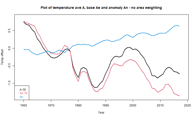
Here A is Andy's average, An is the anomaly average, and Ae is the average made from the fixed base (1961-90) values. Although no individual location in Ae is changing, it descends even faster than A.
So I tried another tack. Using base values is the simplest way to see it, but one can just do a partition of the original arithmetic, and along the way find a useful way of showing the components of the average that Andy is calculating. I set out a first rendition of that here. I'll expand on that here, with a more systematic notation and some tables. For simplicity, I will omit area weighting of cells, as Andy did for the early posts.
I haven't given values for the sums S, but you can work them out from the A and N. The point is that they are additive, and this can be used to form Andy's A2-A1 as a weighted sum of the other averages. From additive S:
S1=S1a+S1b and S2=S2a+S2c
or
A1*(Na+Nb)=A1a*Na+A1b*Nb, or
A1*N=A1a*Na+A1b*Nb+A1*Nc
and similarly
A2*N=A2a*Na+A2c*Nc+A2*Nb
Differencing
(A2-A1)*N=(A2a-A1a)*Na-(A1b-A2)*Nb+(A2c-A1)*Nc
or, dividing by N
A2-A1=(A2a-A1a)*Wa-(A1b-A2)*Wb+(A2c-A1)*Wc
That expresses A2-A1 as the weighted sum of three terms relating to Ra, Rb and Rc respectively. Looking at these individually
A2-A1 = 0.210 + 0.431 -1.455 = -0.813
So the first term representing actual changes is overwhelmed by the other two, which are biases caused by the changing cell population. This turns a small increase into a large decrease.
The main thing to note is that the numbers are all much smaller. That is both because the range of anomalies is much smaller than absolute temperatures, but also, they are more homogeneous, and so more likely to cancel in a sum. The corresponding terms in the weighted sum making up A2-A1 are
A2-A1 = 0.210 + 0.012 + 0.029 = 0.251
The first term is exactly the same as without anomalies. Because it is the difference of T at the same cemo, subtracting the same base from each makes no change to the difference. And it is the term we want.
The second and third spurious terms are still spurious, but very much smaller. And this would be true for any reasonably choice of anomaly base.
However, you can do better with infilling. Naive anomalies, as used un HADCRUT 4 say, effectively assign to missing cells the average anomaly of the remainder. It is much better to infill with an estimate from local information. This was in effect the Cowtan and Way improvement to HADCRUT. The uses of infilling are described here (with links).
The trend was toward HADSST and a claim that SST had been rather substantially declining this century (based on that flaky averaging of absolute temperatures). It was noted that ERSST does not show the same thing. The reason is that HADSST has missing data, while ERSST interpolates. The problem is mainly due to that interaction of missing cells with the inhomogeneity of T.
Here is one of Andy's graphs:
In these circumstances I usually repeat the calculation that was done replacing the time varying data with some fixed average for each location to show that you get the same claimed pattern. It seems to me obvious that if unchanging data can produce that trend, then the trend is not due to any climate change (there is none) but to the range of locations included in each average, which is the only thing that varies. However at WUWT one meets an avalanche of irrelevancies - maybe the base period had some special property, or maybe it isn't well enough known, the data is manipulated etc etc. I think this is silly, because they key fact is that some set of unchanging temperatures did produce that pattern. So you certainly can't claim that it must have been due to climate change. I set out that in a comment here, with this graph:
Here A is Andy's average, An is the anomaly average, and Ae is the average made from the fixed base (1961-90) values. Although no individual location in Ae is changing, it descends even faster than A.
So I tried another tack. Using base values is the simplest way to see it, but one can just do a partition of the original arithmetic, and along the way find a useful way of showing the components of the average that Andy is calculating. I set out a first rendition of that here. I'll expand on that here, with a more systematic notation and some tables. For simplicity, I will omit area weighting of cells, as Andy did for the early posts.
Breakdown of the anomaly difference between 2001 and 2018
Consider three subsets of the cell/month entries (cemos):- Ra is the set with data in both 2001 and 2018 (Na cemos)
- Rb is the set with data in 2001 but not in 2018 (Nb cemos)
- Rc is the set with data in 2018 but not in 2001 (Nc cemos)
| Set data | N | Weights | 2001 | 2018 |
| 2001 or 2018 | N=18229 | S1, A1=S1/(Na+Nb)=19.029 | S2,A2=S2/(Na+Nc)=18.216 | |
| Ra 2001 and 2018 | Na=15026 | Wa=Na/N=0.824 | S1a, A1a=S1a/Na=19.61 | S2a, A2a=S2a/Na=19.863 |
| Rb 2001 but not 2018 | Nb=1023 | Wb=Nb/N=0.056 | S1b, A1b=S1b/Nb=10.52 | S2b=0 |
| Rc 2018 but not 2001 | Nc=2010 | Wc=Nc/N=0.120 | S1c=0 | S2b, A2b=S2b/Nb=6.865 |
I haven't given values for the sums S, but you can work them out from the A and N. The point is that they are additive, and this can be used to form Andy's A2-A1 as a weighted sum of the other averages. From additive S:
S1=S1a+S1b and S2=S2a+S2c
or
A1*(Na+Nb)=A1a*Na+A1b*Nb, or
A1*N=A1a*Na+A1b*Nb+A1*Nc
and similarly
A2*N=A2a*Na+A2c*Nc+A2*Nb
Differencing
(A2-A1)*N=(A2a-A1a)*Na-(A1b-A2)*Nb+(A2c-A1)*Nc
or, dividing by N
A2-A1=(A2a-A1a)*Wa-(A1b-A2)*Wb+(A2c-A1)*Wc
That expresses A2-A1 as the weighted sum of three terms relating to Ra, Rb and Rc respectively. Looking at these individually
- (A2a-A1a)=0.253 are the differences between the data points known for both years. They are the meaningful change measures, and give a positive result
- (A1b-A2)=-7.696. The 2001 readings in Rb have no counterpart in 2018, and so no information about increment. Instead they appear as the difference with the 2018 average A2. This isn't a climate change difference, but just reflects whether the points in R2 were from warm or cool places/seasons.
- (A2b-A1)=12.164. Likewise these Rc readings in 2018 have no balance in 2001, and just appear relative to overall A1.
A2-A1 = 0.210 + 0.431 -1.455 = -0.813
So the first term representing actual changes is overwhelmed by the other two, which are biases caused by the changing cell population. This turns a small increase into a large decrease.
So why do anomalies help
I'll form anomalies by subtracting from each cemo the 2001-2018 mean for that cemo (chosen to ensure all N cemo's have data there). The resulting table has the same form, but very different numbers:| Set data | N | Weights | 2001 | 2018 |
| 2001 or 2018 | N=18229 | S1, A1=S1/(Na+Nb)=-.116 | S2,A2=S2/(Na+Nc)=0.136 | |
| Ra 2001 and 2018 | Na=15026 | Wa=Na/N=0.824 | S1a, A1a=S1a/Na=-0.118 | S2a, A2a=S2a/Na=0.137 |
| Rb 2001 but not 2018 | Nb=1023 | Wb=Nb/N=0.056 | S1b, A1b=S1b/Nb=-0.084 | S2b=0 |
| Rc 2018 but not 2001 | Nc=2010 | Wc=Nc/N=0.120 | S1c=0 | S2b, A2b=S2b/Nb=0.130 |
The main thing to note is that the numbers are all much smaller. That is both because the range of anomalies is much smaller than absolute temperatures, but also, they are more homogeneous, and so more likely to cancel in a sum. The corresponding terms in the weighted sum making up A2-A1 are
A2-A1 = 0.210 + 0.012 + 0.029 = 0.251
The first term is exactly the same as without anomalies. Because it is the difference of T at the same cemo, subtracting the same base from each makes no change to the difference. And it is the term we want.
The second and third spurious terms are still spurious, but very much smaller. And this would be true for any reasonably choice of anomaly base.
So why not just restrict to Ra?
where both 2001 and 2018 have values? For a pairwise comparison, you can do this. But to draw a time series, that would restrict to cemos that have no missing values, which would be excessive. Anomalies avoid this with a small error.However, you can do better with infilling. Naive anomalies, as used un HADCRUT 4 say, effectively assign to missing cells the average anomaly of the remainder. It is much better to infill with an estimate from local information. This was in effect the Cowtan and Way improvement to HADCRUT. The uses of infilling are described here (with links).


Nick,
ReplyDeleteThanks for all your efforts here and over there. As always.
Hear! hear!
DeleteYou are of course right, but there is a second order effect. Anomalies need a normalisation period which is usually 30 years for individual land stations and for SST (lat, lon) grid averages. The basic problem is that measurements become rapidly sparser as you go back in time. So past temperatures become increasingly uncertain.
ReplyDeleteClive,
Delete"Anomalies need a normalisation period which is usually 30 years..."
I think that need is exaggerated. It's true that a long period helps reduce month to month bumpiness which might result if it just happens that the Junes in the period were unusually warm, Julys not. But otherwise it really doesn't matter much. One reason why I did this breakdown was to show how anomaly choice affected the difference. In this case the arithmetic came down to
A2-A1 = 0.210 + 0.012 + 0.029 = 0.251
The first component is the genuine climate change term, and is the same for any anomaly base. The second and third are spurious (wrt climate) but are rendered small. Many other choices of base would make them about as small. That is all you need here.
Are you getting 14C for ERSSTv5? Using Climate Explorer global averaging I get 18.5C. 14C seems way too low given a typical global land+ocean absolute estimate of 15C.
ReplyDeleteHi Paul,
DeleteNo, that is Andy's graph, and he is not area weighting, so it boosts the Arctic contribution.
Ah, that makes sense (or not).
DeleteThanks Nick.
Averaging of temperature anomalies can also go wrong. I prefer temperatures not anomalies. Many gridded datasets of monthly surface temperature are published: NOAA ERSSTv5, NOAA GHCNv4, NOAA NCEP Reanalysis Dataset, CERES Data products and so on.
ReplyDeleteTo go wrong, you need both biased sampling and inhomogeneity, which translates it into temperature error. Anomalies are much more homogeneous.
DeleteJust a short comment. Averaging absolute surface temperatures is physically meaningless, but you can find a Teff as the fourth root of the total thermal energy emission from the surface divided by the SB constant (in the IR all surfaces are effectively black). The Teff for TOA is simply uninteresting as the total is set by the solar input less the albedo reflectivity and is pretty much locked at 255K with very small excursions due to imbalance which contributes to the net anomalies.
ReplyDeleteOTOH, averaging T^4 does horrible things noise wise as Eli noted when he was young http://rabett.blogspot.com/2007/03/once-more-dear-prof.html
Eli is banned at that place fwiw
Anyone know what happened to Tamino? No posts since July.
ReplyDeleteI don't know. A little discussion in comments here
Deletehttp://www.realclimate.org/index.php/archives/2020/12/2020-vision/