I've been adding bits, as foreshadowed, to the latest data page, with another rearrangement. I have added the maintained monthly plotter, and I have used it as a framework for updated back trend plots - ie plots of trend from x-axis date to present, that I've used for the recessional of the Pause. It's here, with more detail at the original posts. There is a button to switch between modes - they use the same updated data. There is also a data button so you can see the original numerical data.
I did a calc of the new ERSSTv4 global average for Bob Tisdale's post, and I'll add that to the maintained set.
I have also included the WebGL maps (updated daily) of daily surface data, currently for days of this year, but I may extend. For recent days, it also shows the global average. I see that for the last week or so, these have been exceptionally warm, which balances cold earlier in the month.
So that's probably it for 2014. A Merry Christmas and Happy New Year to all readers.
Wednesday, December 24, 2014
Tuesday, December 16, 2014
December update on 2014 warmth.
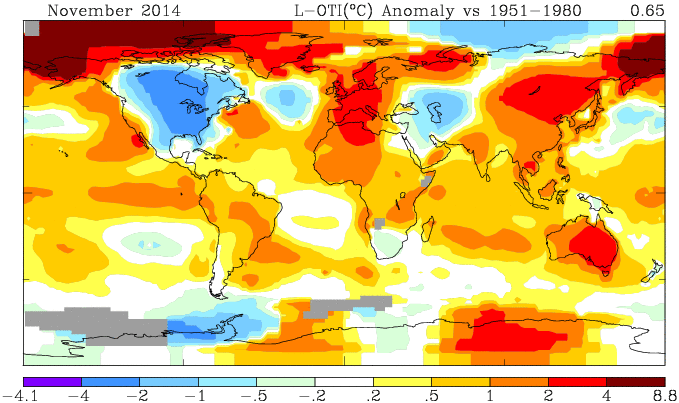
NOAA has posted their report on November 2014 (h/t DK). It shows a global anomaly relative to 1901-2000 of 0.65°C. This is down from October's 0.74°C. TempLS grid was down 0.11°C, which looks like very good agreement, but is something of a break with the recent eerily close tracking.
They may take a few days to update the detailed MLOST file that I normally use (base 1961-90), so, with Christmas coming, I'll use a synthetic value by dropping the Oct value by 0.09°C too, so as to produce the last of the anticipatory posts about record prospects.
I'm following the format of an earlier post, with sequel here. You can click buttons to rotate through datasets (HAD 4, GISS, NOAA, TempLS mesh and grid, and HADSST3). I haven't shown the satellite troposphere indices, because these are nowhere near a record. The plot is cumulative sums of monthly ave relative to 2010, the next highest. I see that NOAA has a similar plot, but with average to date rather than total. This is just a scale difference, becoming small near end year.
Highlights are, first HADSST3, which is way ahead of 2010. In fact, for that, 1998 was higher, at 0.43°C, but that level too should be exceeded. This emphasises that high SST was the driver for 2014.
GISS is less clear; Nov 2014 was cooler while Nov 2010 was warm, so it's prospects receded slightly. Meanwhile, my NCEP/NCAR daily index showed the first week or so in December very cool, but then warmer. So GISS is no certainty. However, Dec 2010 was quite cool. NOAA is well ahead, and while there is no November data for HADCRUT 4, it is also well placed.
The plot is below the jump:
The index will be a record if it ends the year above the axis. Months warmer than the 2010 average make the line head upwards.
Use the buttons to click through.
![]()
They may take a few days to update the detailed MLOST file that I normally use (base 1961-90), so, with Christmas coming, I'll use a synthetic value by dropping the Oct value by 0.09°C too, so as to produce the last of the anticipatory posts about record prospects.
I'm following the format of an earlier post, with sequel here. You can click buttons to rotate through datasets (HAD 4, GISS, NOAA, TempLS mesh and grid, and HADSST3). I haven't shown the satellite troposphere indices, because these are nowhere near a record. The plot is cumulative sums of monthly ave relative to 2010, the next highest. I see that NOAA has a similar plot, but with average to date rather than total. This is just a scale difference, becoming small near end year.
Highlights are, first HADSST3, which is way ahead of 2010. In fact, for that, 1998 was higher, at 0.43°C, but that level too should be exceeded. This emphasises that high SST was the driver for 2014.
GISS is less clear; Nov 2014 was cooler while Nov 2010 was warm, so it's prospects receded slightly. Meanwhile, my NCEP/NCAR daily index showed the first week or so in December very cool, but then warmer. So GISS is no certainty. However, Dec 2010 was quite cool. NOAA is well ahead, and while there is no November data for HADCRUT 4, it is also well placed.
The plot is below the jump:
The index will be a record if it ends the year above the axis. Months warmer than the 2010 average make the line head upwards.
Use the buttons to click through.
Sunday, December 14, 2014
November was cooler - GISS down 0.11°C
GISS has reported for November 2014, down from 0.76°C to 0.65°C. The title alludes to my post of 4 Dec, which reported a similar drop by TempLS Mesh. That drop has reduced somewhat as more data arrived. I have been following these monthly events with added interest, because it is the first real test of early TempLS mesh predictions (described here), and was foretold by another index I have been calculating (reanalysis NCEP/NCAR). This reports daily, and indicated a considerable cooling in November.
As usual, I have also done a TempLS Grid calc. As explained here, I expect the mesh calc to more closely emulate GISS, while the grid calc should be closer to the NOAA and HADCRUT indices. TempLS grid did show a greater reduction, from 0.631°C to 0.519°C.
When NOAA comes out, I'll post on the likelihood of a record this year. The NCEP/NCAR index has been quite cool in December as well, so a GISS record is in the balance. NOAA and HADCRUT are currently ahead by a greater margin, but TempLS suggests may see a greater reduction.
Details of the GISS map for the month, and comparison with TempLS, are below the jump.
And here, with the same scale and color scheme, is the earlier mesh weighted TempLS map:
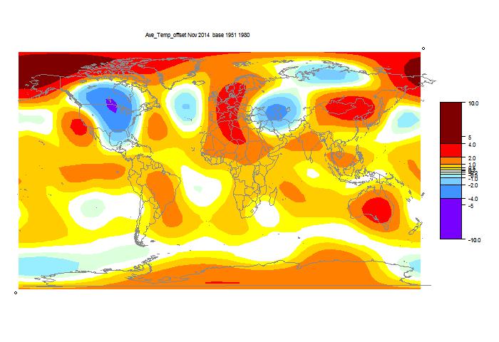
And finally, here is the TempLS grid weighting map:
As usual, I have also done a TempLS Grid calc. As explained here, I expect the mesh calc to more closely emulate GISS, while the grid calc should be closer to the NOAA and HADCRUT indices. TempLS grid did show a greater reduction, from 0.631°C to 0.519°C.
When NOAA comes out, I'll post on the likelihood of a record this year. The NCEP/NCAR index has been quite cool in December as well, so a GISS record is in the balance. NOAA and HADCRUT are currently ahead by a greater margin, but TempLS suggests may see a greater reduction.
Details of the GISS map for the month, and comparison with TempLS, are below the jump.
And here, with the same scale and color scheme, is the earlier mesh weighted TempLS map:
And finally, here is the TempLS grid weighting map:
Thursday, December 4, 2014
November was cooler - latest TempLS
Since I wrote in October about a new scheme for early mesh-based TempLS reporting, I've been looking forward to producing such an early result. Last month didn't work, because GHCN was late. But this month everything is on time. For me, there is added interest, because I developed the daily NCEP/NCAR based index, and it has been suggesting a perhaps unexpected drop in November temperature.
The early TempLS mesh report is now out, and it does show a corresponding drop, from 0.647°C (Oct) to 0.557°C (Nov, base 1961-1990). The Oct value also came back a little, which reduced the difference slightly.
It is indeed a very early report, and will change. 3108 stations, probably about 70% of final. There is essentially no data from Canada, China, Australia, and most of S America and Africa. So it's too early to have much faith in the regional map, but the cold in the US certainly showed up.
Both satellite indices showed small reductions, with RSS going from 0.274°C to 0.246°C, and UAH similar. In terms of a record warm 2014, I think the likelihood is essentially unchanged.
Update 8/12 With most GHCN data now in, TempLS has risen a bit, to 0.579°C. But the NCEP/NCAR measure went the other way. It stayed cold in November, with the average down to 0.106°C, and December (to 4th) has been cold too.
Wednesday, December 3, 2014
Reanalysis revisited
I have been working with climate reanalysis. I found some more resources, mainly through the Univ Maine Climate Change Institute. They have a collection of reanalysis offerings, some of which are just remappings of flat plots on the globe. But they have useful information collections, and also guides. A comprehensive guide page is here. They have a collection of GHCN daily data here, convenient, although not up to date. They have globe maps of daily temperature, as I do here, but again with a considerable lag. And they have a section on monthly reanalysis time series here, which is the focus of this post.
They let you draw graphs of annual data, and plots of each month over years, but frustratingly, not a monthly plot. This may be to avoid including seasonal variation; they are not anomalies. However, they do give tables of the monthly average temperature for various reanalysis methods, to only 1 decimal precision :(. Despite that limitation, it is useful for me, because I had wondered whether the convenience and currentness of the NCEP/NCAR data was undermined by its status as a first generation product. I now think not; the integrated global temperature anomaly is quite similar to more advanced products (MERRA is something of an outlier). More below the fold.
The first thing I wanted to check, since they give NCEP/NCAR v1, is whether they get the same answers as I did by integrating the grids. Again, CCI data only goes to 2012. Here is the plot for the most recent 8 years, set to 1994-2013 anpmaly base (actually to 2012 for the CCI version).
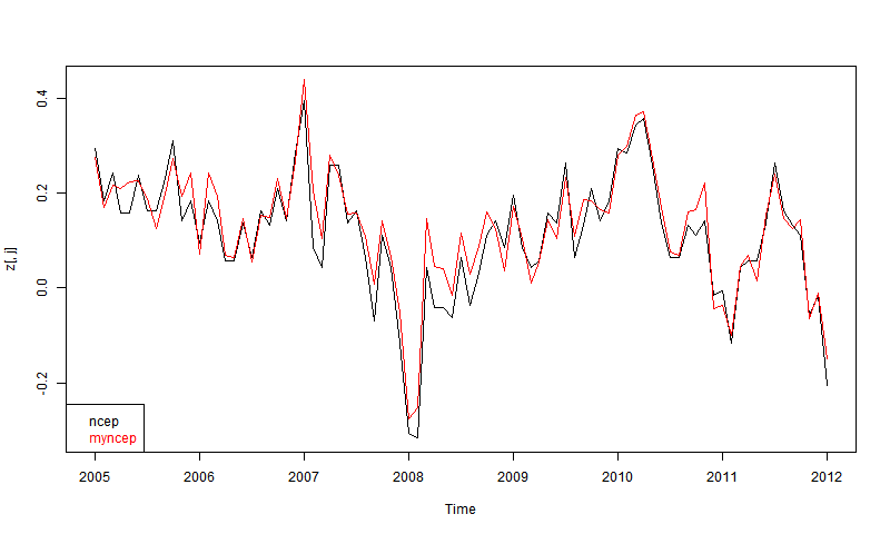
At first I was disappointed that they didn't overlay more closely. Then I remembered their 1 decimal accuracy, and then it seemed quite good agreement. You don't see 0.1 steps, because I've subtracted each month's mean. There may also be discrepancies because my numbers are likely more recent.
So then I plotted 5 reanalyses as shown by CCI. These are the main ones that go to near present (usually some time in 2012). You can read about them in the CCI guide. ERA is ERA-Interim. Ncepdoe is NCEP/DOE.
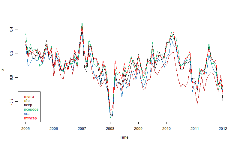
Again. quite good agreement if you allow for the limited precision. Surprising that MERRA, supposed to be one of the best, seems most deviant, even though others like CFSR are also well-regarded. It may of course be that MERRA is right. But anyway. there is nothing in the plot to disqualify NCEP/NCAR.
So I'll stick with it. It seems to be the most current, and I appreciate the 8 Mb download (for daily update). CFSR, for example, seems to come in multi-Tb chunks, which for me would be a multi-year task just to download. Resolution is not an issue for a global average.
They let you draw graphs of annual data, and plots of each month over years, but frustratingly, not a monthly plot. This may be to avoid including seasonal variation; they are not anomalies. However, they do give tables of the monthly average temperature for various reanalysis methods, to only 1 decimal precision :(. Despite that limitation, it is useful for me, because I had wondered whether the convenience and currentness of the NCEP/NCAR data was undermined by its status as a first generation product. I now think not; the integrated global temperature anomaly is quite similar to more advanced products (MERRA is something of an outlier). More below the fold.
The first thing I wanted to check, since they give NCEP/NCAR v1, is whether they get the same answers as I did by integrating the grids. Again, CCI data only goes to 2012. Here is the plot for the most recent 8 years, set to 1994-2013 anpmaly base (actually to 2012 for the CCI version).
At first I was disappointed that they didn't overlay more closely. Then I remembered their 1 decimal accuracy, and then it seemed quite good agreement. You don't see 0.1 steps, because I've subtracted each month's mean. There may also be discrepancies because my numbers are likely more recent.
So then I plotted 5 reanalyses as shown by CCI. These are the main ones that go to near present (usually some time in 2012). You can read about them in the CCI guide. ERA is ERA-Interim. Ncepdoe is NCEP/DOE.
Again. quite good agreement if you allow for the limited precision. Surprising that MERRA, supposed to be one of the best, seems most deviant, even though others like CFSR are also well-regarded. It may of course be that MERRA is right. But anyway. there is nothing in the plot to disqualify NCEP/NCAR.
So I'll stick with it. It seems to be the most current, and I appreciate the 8 Mb download (for daily update). CFSR, for example, seems to come in multi-Tb chunks, which for me would be a multi-year task just to download. Resolution is not an issue for a global average.
Monday, December 1, 2014
Maintained monthly active temperature plotter
This post follows on from a thought by commenter JCH. On the latest data page, I maintain an active graph of six recent temperature indices, set to a common anomaly base 1981-2010. But I actually maintain a file of about fifteen. JCH mentioned a difficulty of now getting recent data for HADCRUT, for example. So I thought I should add some user facilities to that active graph to make use of this data.
I tried dynamic plotting once previously with annual data - it is the climate plotter page. It hasn't been much used, and I think I may have tried to cram too much into a small space. So I've been experimenting with different systems. I've learnt more about Javascript since then.
So the first addition is a panel for choosing which datasets to show. It has a floating legend, with buttons for changing color, asking for regression (OLS), or smoothing (12-month boxcar). If you ask for regression, a similar panel pops up with again color, and start and end time text boxes. Initially it sets these to the visible screen, but you can type in other times. If you press on any color button, another panel pops up with color choices. The OLS trend in °C/Century for the stated interval, is in the red-lined box.
The original plot worked by mouse dragging. If you drag in the main space, the plot follows. But if you drag below or left of the axes, it stretches/shrinks along that axis. I've kept that, but added an alternative.
There is a faint line at about 45° from the origin. If you move the mouse in that region, you'll see faint numbers at each end of the x-axis. These are tentative years. If you click with Shift pressed, the plot adapts so that those become the endpoints. The scheme is similar to the triangle of the trend viewer, but backwards. Near the origin, you get short intervals in recent time; the scale of mouse move gives better resolution here. Move along the x-axis makes the start recede; along the diagonal, both recede keeping the interval short. In the upper triangle, it's similar with the y-limits. It's easier to try than to read.
The Redraw button is hardly needed, because there is much automatic redraw. The Regress button forces a recalc when you've manually edited the text boxes for intervals. Each pop-up window has an exit button; the Legend button is the way to bring it back (it toggles). Each pop-up is draggable (gently).
More on regression - you can at any stage amend the textboxes with dates, and then click either the regress button (main table) or the red-bordered cell containing the regression trend in C/Cen to get a new plot with the specified period. By default the period will be set to the visible screen, which may include months in the future (but trend will be calculated over actual data). Trend lines will be shown.
So here it is below the fold. It's still experimental, and feedback welcomed. When stable, I'll embed it in the page.
Subscribe to:
Comments (Atom)


