I see again a fuss at WUWT from Lord Monckton about "no significant warming for seventeen years and four months". I note wryly that the recent Keenan kerfuffle was about the Met Office answering a question about significant rise by citing the exact same statistic - whether with a AR(1) model the linear trend could be distinguished from zero. People wanted Dr Slingo sacked etc. But here we're back as usual - WUWT is citing that very same statistic.
But it is indeed a fairly pointless statistic (the Met Office produced it on the insistence of a contrarian Lord). Statistical significance is important when you are trying to deduce some proposition from data. You need to know if your deduction could have arisen by chance.
But that's not the case here. We believe temperatures will rise because we've burnt a huge amount of carbon and boosted air CO2 by over 40%. And we look to temperatures and see a rise. Whether noise could have caused it is not the point; if you have a theory that predicts a rise and you see a rise, that's the best you can expect from the theory.
"Significant rise" relates to the wrong null hypothesis. You can only disprove a null, and a failure to disprove that trend is zero is not a very interesting result. It could just mean a not very powerful test. The logical question is - OK we expected a rise and we see a rise - is it the right amount? That is, can we reject the null that there is a trend of the expected magnitude?
That's the proposition that Lucia keeps testing, and though I argue there about whether what she tests is the actual AGW prediction, it is a test that makes sense.
Anyway. I'm sure that we'll hear more about no significant warming for x years, so I thought I would try to say something about the future course of x. It doesn't have a lot of degrees of freedom. And of course, it's as much affected by the ups and downs of temperatures in the '90s as those of today.
I'm basing this on the comprehensive trend plots I started a year or so ago.
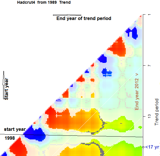
Here is a plot of Hadcrut 4 over the last 20 years. A snapshot of the relevant part is here:

The x axis is the recent end of the trend period, the y-axis is the past end (years). The right edge is Dec 2012. Fading represents trend that is not significantly different from zero using a AR(1) noise model at 95% (two-tail).
On the original plot, you can click anywhere to get information, and this helps in understanding the plot. Each color point represents a trend from year y to year x, and when you click, the red and blue dots on the time series plot at right show the interval, and the relevant statistical information is also shown. You can also move hte red and blue to change the interval and see the new trend and statistics.
The "17 years and four months" is the point on the right y axis where the color fades (near the bottom in the snapshot). The color of course, in the future, will respond to how warm it becomes. So I'm discussing what might happen to that color pattern as more data emerges on the right.
The first thing to note is the horizontal banding. This reflects the hot/cold pattern of years on the y-axis - ie in the '90s. The band near 14 on the axis is the cool years of 1999-2001. Trends that start there are likely to be positive and significant. The faded horizontal below is the warm year 1998. Trends that include that are smaller, and likely to not be significant. So a year or so ago, there was a jump from "13 years ago" to "17 years ago".
Except, of course, it was 16 years ago then. What has happened since is a result of the horizontal banding. The start year stays at about 1996 - it's in a sort of well. It can't go back much because trhe previous years are relatively cold, and including them will boost the significance strongly. And coming forward loses the warmup of 1997, which also boosts significance.
So unless it escapes from the well, we can expect "18 years and four months" next year. Will that happen?
Well, the gradual increase in time period improves significance even if the trend doesn't increase. So that helps get out of the well. What is likely, even without much warmong, is a reversal of the jump of a year ago. A switch to the 1999-2001 well, even though there would remain a band including 1998 which would be insignificant.
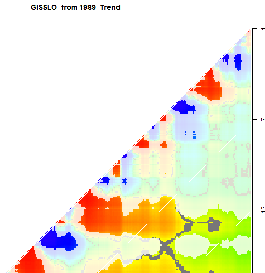
You can see this by looking instead at GISS. Here is the snapshot:

GISS did not make that transition, and so the significance period remains at a bit over 13 years. You can check other datasets on the trend gadget linked. You'll see the same horizontal banding.
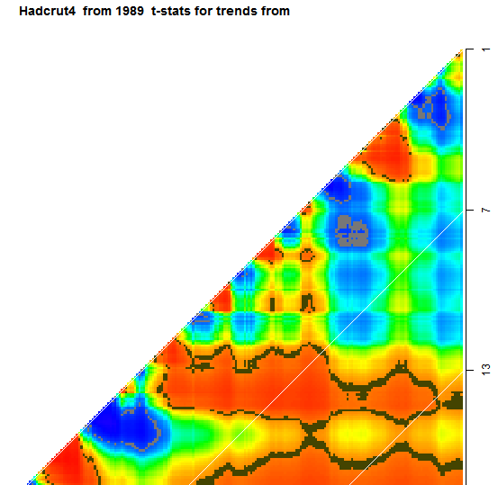
To get another view of what may be in store, you can look at the t-statistic. The critical 95% level is shown in brown. Here is a Had 4 snapshot:

Again you can see how constrained it is. It is close to significance near 14 years, and quite likely to go back there. There is a strong gradient at 17 years, so it can't start much before 1996. And earlier than 13 years, there are no new bands likely to emerge.


I'm not even sure Monckton's claim succeeds on it's own terms. He appears to employ injudicious use of the eyecromometer when asserting that the 2 õ are "approximately +/-0.15°C". The Skeptical Science trend calculator puts it at +/-0.118°C which, if correct and employing Monckton's test of simply superimposing this over a least squares regression fit, would mean significance was achieved towards the end of 2009.
ReplyDeleteKevin,
DeleteYes, his justification for the number is bizarre, and I don't think he knows how significance is calculated. But I think someone there does, because the figures bandied about are usually correct, with AR(1) correction and all. They just don't mean much.