Monday, May 20, 2013
Draggable graphs
In the climate plotter a large amount of climate data could be plotted on an adjustable scale. There were bars on which you could click to move and expand the graph vertically and horizontally. Curves with different units could be moved independently. This is all based on the HTML5 canvas.
The bars were a bit clunky. I've been experimenting with mouse dragging. I had thought it would be slow, but it isn't. I'm planning to use it routinely in plotting, and for the climate plotter, and to post the code that enables it. Entering different data is easy.
Here's an example which I'll include in the monthly data tracking. It looks like just the last three years of monthly index data, similar to a graph that is currently shown. But it's backed by data back to 1850, which you can see by dragging back, and shrinking the scale if you want.
You can drag with the left button within the plot area. Dragging within the axis mark areas, parallel to the axis, changes the scale of that dimension. Away from the origin expands. If you want to get back to where you started, click the restore button.
Friday, May 17, 2013
Jaxa Arctic Sea Ice - active polar plot
It's the time of year for tracking ice. I have kept current plots and tables of Jaxa daily reports. This year, there will also be daily updated movies of high resolution Arctic SST, both last 50 days and full year.
But I wanted to update the plotting methods using some of Javascript active features. I've made a polar plot, where the ice extent is represented as distance from the centre, and time progresses by angle, just as with a clock. Various parts can be magnified. When it has settled, I'll include it in the current page.
Here is the plot. The current point is circled, and the centre picture is a magnification of that region. The years from 2002 to 2012 are shown in rainbow colors (legend bottom left), and 2013 in black. Things you can do are:
- Click on each of the month sectors; the central picture will show a magnification of the history of that month
- Click repeatedly on the current point circle; the picture will alternate magnifications of the current region
- Click on the legend; the history of that year will show in a dark color
- Click on the picture to make it go away.
Tuesday, May 14, 2013
April GISS Temp down by 0.08°C
GISS LOTI went from 0.58°C in March to 0.50°C in April (back to February level). TempLS was fairly steady, satellites mixed.
Here is the GISS map for April 2013:

And here, with the same scale and color scheme, is the earlier TempLS map:

Previous Months
MarchFebruary
January
December 2012
November
October
September
August
July
June
May
April
March
February
January
December 2011
November
October
September
August 2011
More data and plots
Friday, May 10, 2013
Climate of the Past fails Fourier test
This is a belated post. I'm writing about a paper by Ludecke et al which was accepted in February by the EGU online journal "Climate of the Past". Eli wrote about several aspects, including data quality and how the paper made it to acceptance. Tamino gave a definitive mathematical takedown. Primaklima has a thread with some of the major local critics chiming in.
So what's left to say? And why now? Well, Ludecke had a guest post at WUWT a few days ago, promoting the paper. While joining in the thread, I re-read the online discussion, and was surprised at the lack of elementary understanding of Fourier analysis on display. Surprisingly, the guest post was not well received at WUWT, at least by those with math literacy.
I expect that notwithstanding this negativity, the paper's memes will continue to circulate. It comes from EIKE, a German contrarian website. And they have been pushing it for a while. Just pointing out its wrongness won't make it go away.
So here my plan is to redo a similar Fourier analysis, pointing out that the claimed periodicities are just the harmonics on which Fourier analysis is based, and not properties of the data. Then I'll do a similar analysis of a series which is just constant trend; no periodicities at all. Ludecke et al claim that their analysis shows that there is no AGW trend, but I'll show the contrary, that trend alone not only gives similar periodicities, but is reconstructed successfully in the same way.
Data
Ludecke et al use an average of six long time European temperature series, dating back to 1757. As Eli says, the reliability of the early years is doubtful. They also, to try to get more information on longer periodicities, used a single stalagmite series and some Antarctic ice core data. But the thermometer series is central, and the only one I'll consider here.At CotP, they were taken to task by Dr Mudelsee, then a reviewer, for not making the series available. It's components are not easy to access. However, Dr Mudelsee ceased to be a reviewer (story to come) and his requirement that they be available was not enforced. I will look at just one of the series, Hohenpeissenberg. L et al say the series are similar.
The analysis
To anyone who understands Fourier analysis, it was trivial. They took a DFT (Discrete Fourier Transform) of the series, truncated the spectrum to the first six terms, inverted, and showed that the result was similar to a smoothed version of the original series. They identified the peaks with claimed natural periodicities.There was a complication. They added zero padding to the original series. They never said how much; not even if it was a lot or a little. The result was the panel on the left, in the image below:
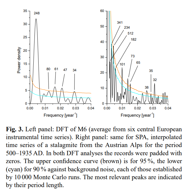
Note the annotated periods on the peaks. The panel on the right was the stalagmite series, not discussed here.
When it came to truncating and inverting, they read the amplitudes off this graph, but used the original harmonics as frequencies. That gave a still good comparison with a 15-year moving average of the temperature series.
The claims
These were stretched. They say of the peaks marked on their transform:"Four of our six selected frequencies in M6 have a confidence level over 95% and only one over 99 %. We find for SPA roughly the periods corresponding to 250, 80, 65, and 35 yr from M6."
They are comparing peaks from their padded DFT. They have compared them to a noise level derived from the signal. This involved Hurst components, DFA, Monte Carlo analysis etc. The referees complained that this was inadequately described. But it is nonsense. The peaks have little to do with the noise, or the data at all. I will show the trend case where the peaks are there and there is no noise at all.
The inverse of the truncated frequency series was indeed close, as it must be. They say in the abstract of the final version:
"The Pearson correlation between the mean, smoothed by a 15-yr running average (boxcar) and the reconstruction using the six significant frequencies, yields r = 0.961. This good agreement has a > 99.9% confidence level confirmed by Monte Carlo simulations. It shows that the climate dynamics is governed at present by periodic oscillations. We find indications that observed periodicities result from intrinsic dynamics."
So the fact that the transform/inversion gets back to the starting point is proof of "observed periodicities result from intrinsic dynamics".
In the original was the even more absurd claim
"The excellent agreement of the reconstruction of the temperature history, using only the 6 strongest frequency components of the spectrum, with M6 would leave, together with the agreement of temperatures in the Northern and Southern Hemisphere, no room for any influences of CO2 or other anthropogenic emissions or effects on the Earth’s climate."
They were prevailed on to take that out, but with this claim to follow:
"The agreement of the reconstruction of the temperature history using only the six strongest components of the spectrum, with M6, shows that the present climate dynamics is dominated by periodic processes."
Of course it shows nothing of the sort.
They then went on to predict. In the original it said:
"We note that the prediction of a rather substantial temperature drop of the Earth over the next decades (dashed blue line in Fig. 5) results essentially from the ~64 yr 10 periodicity, of which 4 cycles are clearly visible in Fig. 5; and which, consequently, can be expected to reliably repeat in the future.
They are, of course, just predicting on the basis that the fundamental periodicity of the Fourier analysis will repeat outside the range. There is no scientific basis for that. But worse, as a prediction, it just says you'll repeat from wherever you started the data. Start at a different point, and you get a different prediction.
The journal
The managing editor was Prof Zorita. He (presumably) chose the referees. One #1 clearly knows nothing of the maths involved. He began:"The authors appear to be statistical experts in this form of analysis, although not mainly publishing in climate science, and it is refreshing to see new approaches to an old problem."
They aren't experts, and elementary FA is not a new approach. He raised minor objections, and one which he said was major:
"I simply do not see how what the authors have done has any relevance
on excluding GHGs as a major factor on the climate."
Indeed, and that does seem to have led to some excesses being removed.
The second reviewer seems to have been Dr Muldelsee, who was quite critical, making the essential points, although not as clearly as I would have liked. He fell into the trap of making good suggestions (eg detrending) which would not have rescued the analysis if followed. However, they were anyway ignored, so he wrote a more critical response. This seems to have been enough to have him removed from the process. He subsequently asked to be removed from the journal's list of reviewers.
His replacement #2 was more upbeat ("This article is interesting and it deserves publication after some revisions.") His one major objection was to the periodic prediction, marked in blue on Fig 5, on the correct grounds that Fourier analysis will always make a periodic prediction. The blue line remains.
So what was Zorita's role? He wrote a curious, semi-critical editor comment, which didn't come to grips with the technical objections, but recommended some steps such as using part of the data to predict the remainder. None of this was done.
Then with no further public discussion the paper appeared, with just a few changes implemented.
My Fourier analysis of temperature
As mentioned, I'll do just the 231 years of Hohenpeissenberg, ending in 2011. The power spectrum of the DFT without zero padding looks like this: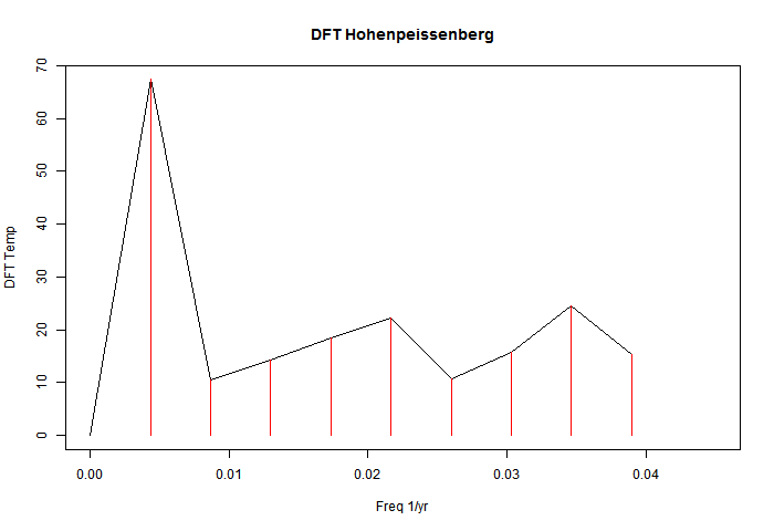
It is discrete, consisting of the red lines in this low frequency view. The effect of zero padding to total length 8192 years is to in effect convolve those lines with the sinc function associated with the 231-year data period:
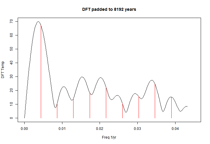
I've kept the original red lines; they are just the harmonics of freq 1/231. The padding has the effect of shifting the apparent peaks. The reason is that each convolution sinc function has a zero at the neighbouring harmonics but a non-zero slope, so it shifts the peak. I'll illustrate with a single frequency. It is of course artefact - there is no new information being discovered by zero padding.
So the logical thing to do is to reconstruct using the first six harmonics of the DFT. I've done that, with this result:
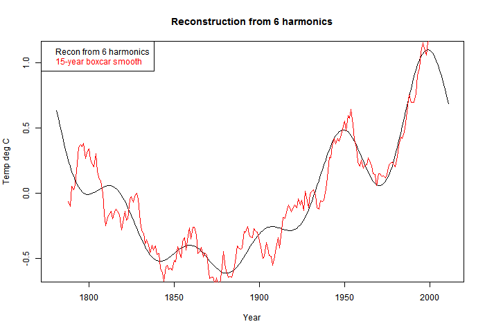
This is all similar to Ludecke et al.
Peak shift - a single frequency
If we take a single sinusoid (cos) of period 231 years (one period) then the power spectrum of course has a single spike: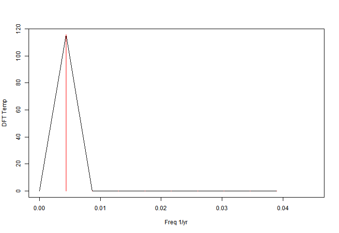
But if it is also zero-padded to 8192 years, the result is:
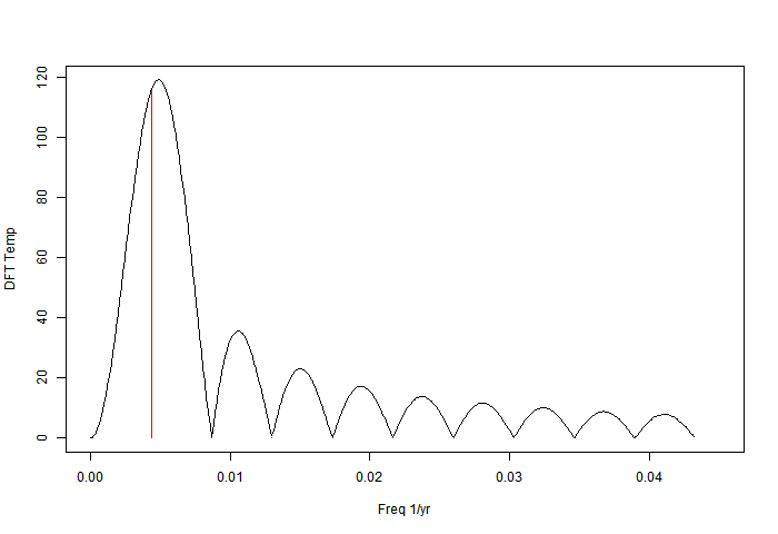
Note that all the side lobes of the sinc function appear, and the peak is shifted. In fact, the (non-power) spectrum has two spikes, one positive frequency and one negative, and each shifts the peak of the other - outwards in this case. But the displacement is artefact; the data was the sinusoid of the red line.
Pure trend data
Here is an example which will show what nonsense this all is. I take a series in which the temperature rises with absolute regularity, 0.01°C/year for 231 years. There is no periodicity or even noise. Here is the DFT with no padding: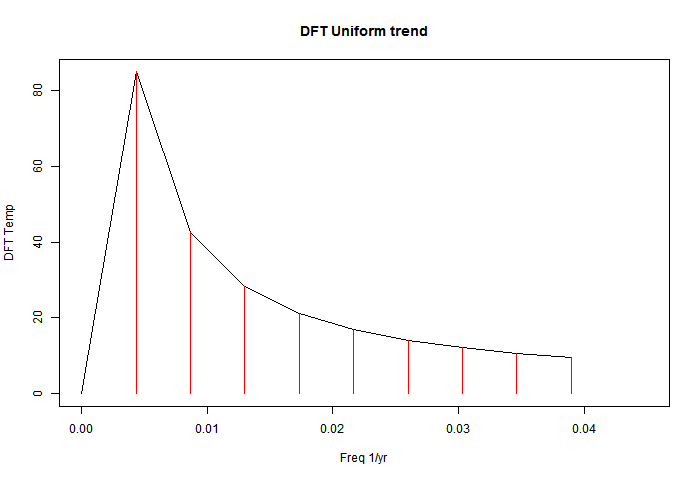
This is an undergraduate-level problem; the series is given here. The power coefficients are 231*2.31/(2π*n), n=1,2,3.
And here is the DFT with padding to 8192 years.
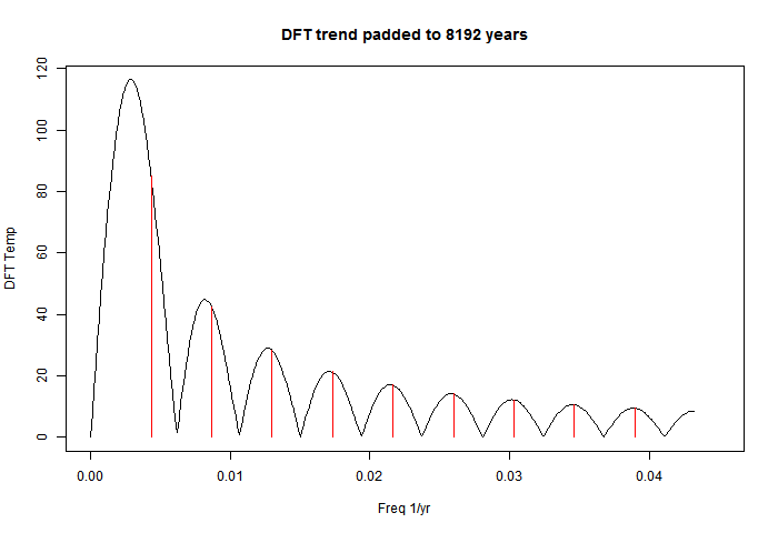
Just as with the temperature data, there are peaks, in about the same places. We can't do a "significance" test, because there is no noise. They are "infinitely significant". Note the prominence of the base frequency, which Ludecke et al were promoting as a discovery.
Reconstruction
Here is the 6-harmonic reconstruction: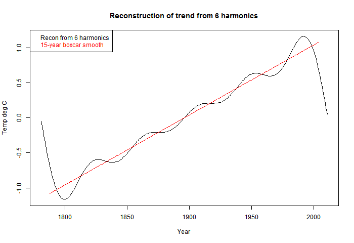
That is pure trend reappearing. But of course, the DFT makes it periodic, so there is oscillation at the ends so that it can go down sharply. This is very well known - called the Gibbs effect, after the 19th century physical chemist.
The boast in the abstract was:
"The Pearson correlation between the mean, smoothed by a 15-yr running average (boxcar) and the reconstruction using the six significant frequencies, yields r = 0.961. This good agreement has a > 99.9% confidence level confirmed by Monte Carlo simulations. It shows that the climate dynamics is governed at present by periodic oscillations."
My corresponding r-value for Hohenp was 0.9496. But for the pure trend case, it was 0.988. Much higher, and no periodicity at all.
Prediction
Ludecke et al used their reconstruction for prediction. They mark the continuation in blue, and find a reason based on the 4th harmonic:"The prediction of a temperature drop in the near future results essentially from the ~64-yr cycle, which to our knowledge is the Atlantic (Pacific) Multidecadal Oscillation (Mantua and Hare, 2002; Hurrel and van Loon, 1997)."
So, following their method, where is this uniformly rising trend data headed? Down! It rose 2.31°C by uniform steps; Ludecke-style foretelling is that it goes back to where it was, very quickly. And of course, there is absolutely no basis for that in the data.
And if the analyst had happened to FT 500 years of data, then the prediction is a 5°C drop.
