Sunday, April 27, 2014

A weekend paradox

There's a post by Willis Eschenbach at WUWT, titled Extreme Times. It notes that with an autocorrelated signal, for any fixed observation period, the max for the period is more likely to be at the ends than in the middle. That's not easily intuitive.

They go on to argue that statements like "the millenium ended with its warmest decade" do not reinforce global warming. That's what millenia do.

The argument he's countering says that there's only about a 1 in 100 chance of that happening by chance. No, says Willis, it's more like 1 in 50. True, but that's still only 1 in 50. It doesn't change much.

Anyway, I thought of a more homely version of the paradox. Counting weeks as starting on Sundays, on what day are weekly temperature maxima most likely to occur?

My argument went thus. It's like with TOBS. Warm days often come in spells. A warm spell midweek will probably yield a max for one week. But a warm spell at the weekend may well make a weekly max on both Sat and Sun. So over a year, say, Sundays will show up more in the statistics. In fact, up to twice as often as mid-week.

Anyway, the argument at WUWT went on, so I checked. I have a file of daily max for Melbourne from this post. It's from May 1855 to Nov 2013. I counted. Results below, with an error corrected:

Update I had made a mistake in transposing matrices, which had the result of somewhat exaggerating the effect. It is still there though. I have posted the Melbourne max data as a 7 col array here. It starts Sun 7 May 1855.

Day of MaxNumber
Sunday1273
Monday1138
Tuesday1100
Wednesday1071
Thursday1101
Friday1057
Saturday1534

This doesn't mean, alas, than Nature gives us specially warm weekends in Melbourne. You'd get the same result for minima. Or, if you start the week on Wednesday:

Day of MaxNumber
Wednesday1306
Thursday1102
Friday1067
Saturday1126
Sunday1038
Monday1150
Tuesday1485

TOBS

This logic lies behind the TOBS adjustment for change of resetting times for min/max thermometers. There you divide into 24 hour periods. The difference is that Nature does make a difference between hours of the day. So if you make a split at 5pm, while it does increase both the occurrences of maxima and minima there, at that time maxima are far more likely to occur and be more counted. That's a warm bias. If you shift to 9am, minima will be favored. In the USHCN, there was a trend to move from 5pm reading to 9am reading of min/max thermometers (which sets start of "day"). That needs to be corrected. And yes, since the bias moved from warm to cold, correcting it increases trends.


Monday, April 14, 2014

March GISS Temp up by 0.25°C


GISS has posted its March estimate for global temperature anomaly, and it has risen from 0.45°C in February to 0,70°C in March. That balances the drop from January to February.

The TempLS comparison is murky this month, because of GHCN errors that I described here, here and here. My original estimate was a rise of 0.27°C, but after correcting a sign reversal at Sarh in Chad, that rose to 0.31°C. Then I found that NORD ADB in Greenland had September data instead of march; removing that brought the estimate back to 0.23°C. Then I found that other Greenland stations were also affected, and removing them all made the final estimate also a rise of 0.25°C. But I had little faith in it.

The comparison maps are below the jump.

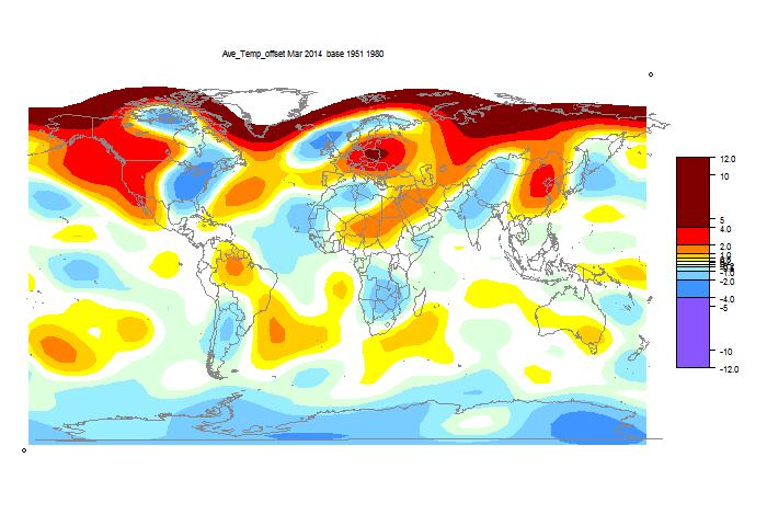
Here is the GISS map. It shows no sign of the Chad problem, which they must have fixed. But it does show high values in Greenland.


And here, with the same scale and color scheme, is the earlier TempLS map:


GISS was gererally warmer, more so especially in Asia, but less in W N America. I think TempLS was cool because of an adjustment I made because my new scheme for simple harmonics wasn't getting the anomaly base right. I think I have a proper fix for this now. The TempLS map also had the artificially high Greenland data.

Previous Months

February
January 2014
December
November
October
September
August
July
June
May
April
March
February
January
December 2012
November
October
September
August
July
June
May
April
March
February
January
December 2011
November
October
September
August 2011

More data and plots

Saturday, April 12, 2014

More GHCN QC errors

My previous post was on some specific problems in the March GHCN data (monthly TAVG QCU). At this stage that data is newly posted, and while the errors should not have passed QC, they will probably be corrected. I imagine that Greenland, for example, will be sorted once the CLIMAT form comes in.

But I'm finding data points going back, which should have been eliminated by QC. It seems there may be a general failure.

For example, in February, Kwajalein, in the Marshall Islands, had an average of -2.3°C. Historically, it's a pretty steady 28°C at that time. That one was in the CLIMAT form, but should have been picked up. Not so far away, in Truk December 2011, it was 0°C. Again in the CLIMAT form.

Port Hardy, on Vancouver Island, BC, is a very strange case. It seems to have an equable climate. But in February, GHCN gives it -27.5°C. -25.3 in January, -26.4 in December 2013. And other icy spells, like -24.1 in December 2011. This time it isn't the CLIMAT reports, which seem OK. Instead, Port Hardy has been getting the data for Clyde River, in Nunavat, Lat 70°N. This seems to have happened at least 13 times since 2009.

But even more spectacularly, La Paz, in Bolivia, reached 86°C in June 2010, and 83°C in June 2011. The latter seems to have been a reinterpretation of the 53°C in the CLIMAT form. La Paz is normally around 7°C in June. That's not the record, though - Oruro in Bolivia in September 2011 reached 90°C. This and the 2010 La Paz rading were not in the CLIMAT forms. They may have been removed. The issue seems to be decimal points.

The problems are not common, and often relate to errors in the data submitted. But I can't see why they aren't being picked up.


Significant GHCN errors in March 2014


Every month I run my least squares program TempLS on the data from GHCN V3 TAVG QCU and ERSST, when enough stations have reported, to estimate the month's temperature. A few days ago I posted for March. I found a substantial rise of 0.27°C.

As luck would have it, I had recently upgraded my program for showing the spatial pattern using spherical harmonics. So when the picture looked a bit strange, I checked and rechecked my revisions.

But in trying to analyse a spurious-looking cool spot in central Africa, I discovered that FORT-ARCHAMBAULT (now Sarh) in Chad had reported a very surprising -31.6°C. That was clearly a sign error, and fixing it removed the cool spot and raised the global average to 0.31°C. I traced the sign error to the CLIMAT form submitted by Chad.

The reason it had such a large effect is that it is an oasis in a data desert, and is weighted to represent a large area.

There was also an oddity with the map which was a very hot spot over N Greenland. When I looked into that, I found the March average at NORD ADB (81°N) was 4.3°C. It's usually about -30. This time I found that OGIMET says that no forms for March had been submitted.

So I looked further, and it appears that the data from September 2013 has been re-entered in the GHCN V3 QCU file for March 2014. Naturally this has a huge effect. Just omitting NORD ADB brought the global back to 0.23°C. But there were 5 Greenland stations, all with March averages of more than 4°C.

So I don't now have a reliable March estimate. I may calculate one without Greenland, but I think I'll wait for the errors to be fixed.

FWIW, with Greenland removed, the March average anomaly is 0.559°C, a rise of about 0.25°C. Almost back to where I started. But Greenland is important here.
Denmark has the same problem. 19.3°C in Copenhagen, March 2014! This time the March data is from July 2013.


Thursday, April 10, 2014

TempLS global temp unknown (yet) in March

Update  12/4. I have discovered another big error in GHCN for March, which makes all my estimates unreliable. See next post.


TempLS showed a large rise from February to March, more than balancing the large drop to February. The global average anomaly rose from 0.305°C to
0.616°C. The satellite indices showed little movement.

Update 11/4. As you'll see below the jump, there has been a little excitement this month, caused by what seems to be an error in GHCN. I originally posted a rise of 0.27°C and showed a plot with a huge cool spot in Central Africa. It turns out that FORT-ARCHAMBAULT Lat 9.10 Lon 18.40 is in GHCN as having a -31.6°C average in March. This station reports infrequently, but March 1998 and 1999 were both 31.5°C. Looks like a sign error. Assuming that, the global mean rises by 0.04°C, and the cold spot in the map goes away. This place is influential because there's not much other data in the region.
Update;  Here is the CLIMAT form submitted by Chad for Sarh (formerly FORT-ARCHAMBAULT). It shows -31.6°C.


Here is the spherical harmonics plot of the temperature distribution. I've made some changes this month. I used a different and I think better scheme for truncating to a finite basis set. That seems to let me get better resolution, so I have resumed showing the polar regions as well. I have also improved the color matching with GISS.
Update 11/4: As mentioned originally below, there is a big cold spot over central Africa, which looks like an artefact. I have reverted to the old scheme, and in the revised plot below, lowered the resolution. It doesn't go away. A commenter pointed to a reanalysis which showed nothing much in central Africa, but some cool in the Sahara; maybe that, combined with the lack of stations in the area, is causing the problem. None of this affects the calculated monthly averages - it is a spherical harmonics (used for graphics) issue. See next. 
Update: Problem solved, I think. It's a GHCN error. I now have the March 2014 station-based HTML5 plot showing, and there are just a few cool stations in central Africa. But you can display the anomalies, and one of them, FORT-ARCHAMBAULT Lat 9.10 Lon 18.40, has an anomaly of -37.84°C! That caused the spherical harmonics to go haywire.

In the original data, this equatorial place had a March average of -31.6°C. Probably a sign error.
It will also have reduced the global average by a small amount.


It was again cold in N America, but the spectacular cold spot was in central Africa. This may be an artefact (Update - error in GHCN, see above). Below is the map of the 4255 stations reporting to date. That is a fair total, but as the map shows, reports from central Africa are sparse. The natural suspicion is that I've pushed the resolution too far, but the cold spot shows at lower resolution. And I've used the revised method to recalculate previous months, with good results. We'll see what GISS says.

It was very warm in Europe and northern Asia.
Update 12 Apr: I've had to modify the plot (slightly) because the new SH routine wasn't setting the anomaly base correctly. Again, the global average is unaffected.


Update: Another apparent GHCN error. The station of NORD ADS, 81°N in Greenland, is shown with a monthly mean of 4.3°C. It's normally about -30 in March. I checked the CLIMAT forms, but OGIMET says Greenland hasn't submitted any in March.

Friday, April 4, 2014

Active viewer for Neukom et al proxies

A current paper in Nature from a long list of authors, including Neukom, Gergis and Karoly, on Southern Hemisphere proxies, is attracting attention. It's emphasis is on inter-hemispheric comparisons. The paper is here, the extensive SI here, and the data here. A press release is here.

There are critical posts at WUWT (here and here) and at Climate Audit.

So far I don't have an opinion on the study itself. But as with previous studies by Marcott et al and Pages2K, I have posted an active viewer, which gives easy access to plots and metadata. It's below the jump.

Update: I've added a choice of range. You can click on 2000 years to see the full range, or 400 years to see post-1600 on an expanded scale.


The methods are as for the Marcott viewer. The spaghetti curves are colored as their labels; since the proxies are ordered longest first, this creates a rainbow pattern. The annual data (2000 years) is very noisy, so I smoothed with a 10-year boxcar filter.

One of the tedious tasks here was getting a formatted table from the pdf Table 5 in the SI. I have put up a csv file of that table here.

At some stage I'll do a composite viewer for Marcott, Pages2K and Neukom.

There was a slight discrepancy between the order of proxies in Table 5 and the order of columns in the data. I've reset the Table 5 order to mtch.


Wednesday, April 2, 2014

WebGL code: shaded grids and maps

In a previous post, I described a generic specification for a WebGL representation of continuum data on a spherical Earth that you can rotate like Google Earth. Examples were cited. The idea was to separate out the task of geometry specification from the nuts and bolts of WebGL (which were hidden). But you still had to specify the geometry.

In this post, I want to simplify three common tasks:
  • Drawing a shaded plot of gridded data.
  • Specifying a palette (there's a default for grid shading).
  • Adding a world map (just coast outlines)

It's reduced to the extent where you have to simply supply the gridded data as a comma separated list. In the example below, you can enter it by pasting into a text box, and press the "Plot New" button.

To enter a world coast outline map, just define an object with new type MAP. Nothing else required. I have also added a "title" attribute of an object. If supplied, the title will appear top left. It can be any HTML (including plain text).

So here is the new plot, showing GISS LOTI temperatures for January 2014. You can rotate to see the pattern of the Polar vortex. (Currently replaced with BEST trends). Below, I'll show the user code, and how you can add your own data.


The user JS file that I supply is:
function PxDat(p){
var C,M,p;
C=p[1];  //The grid
M=p[2]; M.type=MAP;
C.links=1; 
C.title="GISS LOTIJanuary 2014"
C.nodes=[1.42,1.42,...];
}
Easiest is object 2, the map. Just give the type.

For object 1, C (the grid), instead of node coordinates, in "nodes" I put the grid values, starting at (or near) the corner (90S,180W), and then in latitude bands. In "links" I give a single integer. This can be the number of horizontal cells, but if the cells are square, as usual, the digit 1 will do. Such grids usually are 2n x n, or maybe 2n x (n+1); the program will work out which. If it is neither of these, you should set .links to the number of grids in a latitude band.
You can still define a palette, as described previously. But for a grid, if you do not, the default is a rainbow palette with 256 colors, seen here.
You'll see that a color key is provided. This is centred at the mean of your data (as is the palette), and color spacing is finest there, dropping rather exponentially as you go away, so coarse for outlying values.

User data entry

You don't even have to do this much programming. If you have grid data as a comma separated list (from 90S, 180W), just paste it into the text box top right. There seems to be a limit of about 16000 characters. You can put a title in the box below. Then click "Plot New".
Here are some trivial examples, which still give some idea of how the shading is done. Try pasting in:
1,1,1,1,2,2,2,2
This is a 4x2 grid; you'll see uniform shading from bottom to top, Vary the numbers if you like. If the number of latitudes is even, it is treated as nodes at cell centres. So thete is a gap at each pole. It looks huge here, but of course is small in real grids. Now try:
-9,-9,-9,-9,3,-3,3,-3,9,9,9,9
This is a 4x3 array, and so the nodes are assumed at the corners of cells. So there's a row of nodes at each pole, and the cells show here as faces of an octahedron. The colors are mixed up a bit. Note how the color key adapts.

Where next?

Usually, providers such as GISS and HADCRUT supply gridded data on NCDF files. I use the R package "ncdf" to unravel there. Unfortunately, they usually pack a huge lot of data into these files; typically a century or so of months, for monthly data. Often there are several variables. Files can be tens, hundreds or thousands of megabytes. You'll need to extract a single grid, and even those can be big. JS input has to be text. Make sure to use rounding.
I have found good data rather hard to come by. Coarse grids like the GISS one above don't make good use of the much better WebGL resolution. Much better is something like the 1/4° SST data here. But there there is extra work to keep the land/sea boundary sharp. HYCOM has 1/12° data, but I'm finding the files just too big. I'd be glad of any suggestions.
If I can find interesting and regularly updated data, I'll rig up a scheme for updating and install a page like that for SST.

Code

I've updated the zip file from the previous post, here. The main JS is now in grid.js; the example here is grid0.js. But the HTML file is still Moygl.html. I think everything is backward compatible.