Tuesday, May 21, 2024

High resolution SST and movies of critical regions

About twelve years ago I did quite a lot of work with NOAA's AVHRR data on sea surface temperature anomaly. I wrote about it here and maintained an updated page here, with an active trackball globe. I then extracted certain regions of interest and posted movies of specific periods. This required projection from the sphere onto a flat surface.

All this was prepared in R and implemented in Javascript/WebGL. It worked, but was then at the limit of my skills and computing infrastructure, and some things stopped working after a while, and were difficult to fix. So I have done a complete re-write. I think the interface is more usable, and updating will be better.

The page is here. The standard movie controls are below the image, also shown below. The regions are:
  • E for tropical Pacific, intended to show ENSO effects
  • A for Arctic, centered on Pole
  • E for Antarctic, centered on Pole
  • N for Notrh Atlantic
  • P for North Pacific

You can choose one of the time intervals stated, click a radio button, and use the movie control to start and pause. Below the selection buttons is a slider to vary the frame speed. Default is 5 Hz, but the log scale goes from 1 to 25. The last row of buttons has about 800 frames at 4 day intervals, so you may want to speed up.


Sunday, May 12, 2024

GISS April global temperature down by 0.07°C from March.

The GISS V4 land/ocean temperature anomaly was 1.32°C in April, down from 1.39°C in March. This fall is larger than the virtual tie reported here for TempLS.

As with TempLS, April was the warmest April in the record - next was 1.13°C in 2020.

As usual here, I will compare the GISS and earlier TempLS plots below the jump.

Thursday, May 9, 2024

April global surface TempLS down 0.004°C from March, but still warmest April in record.

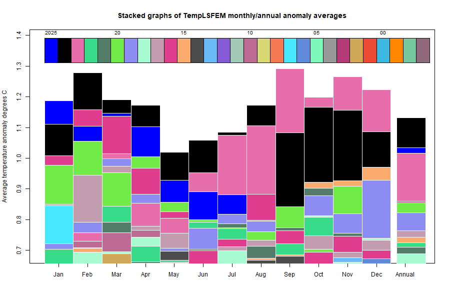
The TempLS FEM anomaly (1961-90 base) was 1.178°C in April, very slightly down from 1.182°C in March. It was still the warmest April in the record, ahead of 1.009°C in 2020. The NCEP/NCAR reanalysis base index fell by 0.077°C.


Here is the corresponding stacked graph, showing how much hotter recent months have been:


Here is the temperature map, using the FEM-based map of anomalies. Use the arrows to see different 2D projections.


As always, the 3D globe map gives better detail. There are more graphs and a station map in the ongoing report which is updated daily.