Karsten Haustein commented that NCEP/NCAR had been showing some strange effects in March/April not seen in ERA5, say, and this could be part of a spurious cooling. There has been some disparity also with TempLS and other surface measures. I think the primary value of this NCEP/NCAR index has been to show changes over short time periods. I don't compare over long periods or calculate long term records. The reason is that I don't think reanalysis offers long term homogeneity; there is a changing mix of instrumentation, for example. This oddity may be a case in point that means one should not make too much of a one-time shift.
The map shows most of N America very cool, and also Northern Europe and a band from Iran to China. Warm patches in Arctic and N central Siberia. Australia cool, Antarctica mostly warm. We'll see if that is borne out by other indices. The BoM agrees Australia was cool.
Update: The UAH satellite temperatures are out; they showed a rise of 0.16°C. The map is here. It is a similar pattern, but cold places are not nearly as cold as the reanalysis, and the warm places warmer.
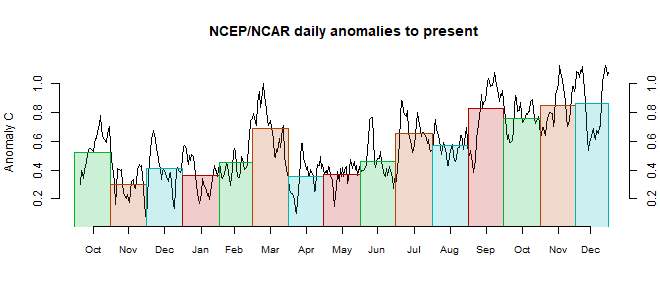
This post is part of a series that has now run for some years. The NCEP/NCAR integrated average is posted daily here, along with monthly averages, including current month, and graph. When the last day of the month has data (usually about the 3rd) I write this post.
The TempLS mesh data is reported here, and the recent history of monthly readings is here. Unadjusted GHCN is normally used, but if you click the TempLS button there, it will show data with adjusted, and also with different integration methods. There is an interactive graph using 1981-2010 base period here which you can use to show different periods, or compare with other indices. There is a general guide to TempLS here.
The reporting cycle starts with a report of the daily reanalysis index on about the 4th of the month. The next post is this, the TempLS report, usually about the 8th. Then when the GISS result comes out, usually about the 15th, I discuss it and compare with TempLS. The TempLS graph uses a spherical harmonics to the TempLS mesh residuals; the residuals are displayed more directly using a triangular grid in a better resolved WebGL plot here.
A list of earlier monthly reports of each series in date order is here:
Using KNMI climate explorer which has daily data, looks like NCEP cooled by 0.2 to 0.3C relative to ERA5 between December and March and then stabilized. Reminds me of the spurious cooling in CFS over a several month period in 2011 around the time CFS was updated to v2. Wonder if there were any changes in the NCEP methods?
ReplyDeleteChubbs
I understand that NCEP/NCAR V1 which I use is pretty much legacy now, and unlikely to use new methods. But yes, that does seem to be the period of change. Oddly, it seems more apparent wrt other reanalysis than wrt thermometer indices.
DeleteThe CDAS/CFSR global mean surface 10-meter air temperature anomaly referenced to 1981-2020 dropped from 0.475C for April to 0.393C for May. The May CDAS global mean surface 10-meter air temperature was 15.723C which was the third highest May since 1979. The May NCEP/NCAR R1 global mean surface 0.995% pressure level (roughly 40 meters above ground level) air temperature was 15.301C and the May anomaly referenced to 1981-2010 was 0.462C compared to 0.543C for April.
ReplyDelete