However, the match is not exact. The CO2 did start to rise while our emissions were small. I remarked that this is likely due to land clearance, which transfers C from the plant biomass to air. A commenter suggested that I include that in the plot.
So I do that here. I am using the land use data of Houghton, from the CDIAC site. It goes from 1850 to 2005. I have assumed for plotting that annual increments since 2005 are unchanged (they were fairly stable pre-2005). It is an estimate of nett carbon emitted due to land use changes in general, including reforestation etc.
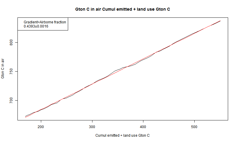
This allows me to do a separate calculation of the airborne fraction (AF) - the fraction of emission that stays in the air. I find that the added CO2 rises very linearly with total anthropogenic addition, and the AF is 44%, with very little sign of change.
So here is the revised plot of mass of atmospheric C and the anthropogenic additions (see previous post for scale factors). As before, the light red curve shadowing observed C is the anthro added C, scaled by AF of 0.44.

There is a slight dip in ice core CO2 1600-1800, which could be due to the LIA,
Below the jump I'll show a plot for more recent years, and the airborne fraction plots.
Here is the recent version, post 1800:

And here you see, for the Mauna Loa period (1959-), the mass of C in the air plotted against all anthro addition (fossil + land use). It is very linear, and the regression slope is 0.439.

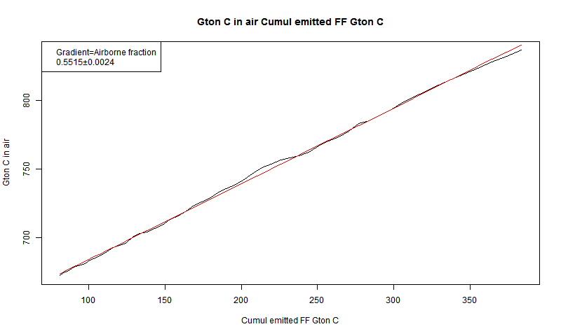
Airborne fraction is described in AR4 Ch 7. It is often described in terms of AF of emissions, rather than total anthro. Here is my corresponding plot of air C vs fossil fuel emissions.

The AF is of course larger, at 55%, and is quite close to what Scripps quotes.
A point is that my values seem much stabler with lower errors than the AR4 values. I think the method they describe, showing the ratio of annual changes in isolation. loses a lot of information - the fact that the changes are consecutive and cumulative. In effect, they treat AF as something that could be different with no correlation from year to year, and they describe population statistics of the implied values. My analysis assumes that the AF is a physical thing, likely to be sustained from year to year.
Hi Nick,
ReplyDeleteI think you have the x and y axis swapped on your graphs. The linearity is quite remarkable. Might be good to put the R^2 value on the graphics. The future emissions will be almost certainly driven by FF use rather than land clearing; the 44% in air from your graph is probably better for estimating future atmospheric concentrations from FF use projections than is the higher AR4 value.
Steve,
DeleteFerdinand Engelbeen has posted a similar plot here. He goes back to 1900, and gets a slightly different slope.
For my land use+FF regression, R^2=0.9993.
Nick,
DeleteYour fit is better and doesn't have the odd divergence near the end like in the AR4 plot. I would trust the 44% figure you get more than the 53% figure Ferdinand gets.
Nick,
ReplyDeleteSorry, I misread your axis labels; they are right.
The effect occurs at all times, but other things happen too.
ReplyDeleteBut for the moment, I think it's useful to focus on why the CO2 in the air is increasing. There's plenty of discussion on whether that then causes warming.
Anon:
ReplyDeleteAre you implicitly assuming that temps will respond tightly and mechanically to CO2? It seems that the climate system is way noisier than that, doesn't it?
Garhighway
No. I haven't said anything about temperature response.
ReplyDeleteAirborne fraction has never been my favorite measure. It seems to me that its relative constancy has been a matter of historical coincidence, in some part: after all, if we were to, in a single year, drop emissions by an order of magnitude, the ongoing carbon uptake would lead to a negative airborne fraction!
ReplyDeleteYour "cumulative" airborne fraction is perhaps a less variable measure, though even there, we would expect it to drop over time if we were to reduce emissions to near zero, or increase if we were to vastly accelerate emissions...
-MMM
ps. It is really ridiculous how often the Salby/Ernst Beck/Essenhigh/etc. arguments get picked up by the contrarian community. Watts and Nova aren't scientists, I'm maybe not so surprised by them, but Curry and Spencer have both fallen for the argument at different points in their pasts, which is just embarrassing for them.
MMM,
Delete"Airborne fraction has never been my favorite measure."
I agree. I think its attraction is superficially based on Henry's Law phase partitioning, but that is an equilibrium notion that doesn't apply here. So its apparent constancy is rather by good fortune. I was surprised by so much good fortune here.
Yeah, Henry's Law plus the Revelle factor... I think the general long-run percentage of CO2 that stays in the atmosphere after ocean equilibration* is estimated to be 20-30%. _That_, I think, is a useful constant to know.
Delete-MMM
*But before sedimentation. So long-run here being thousands of years, not hundreds of thousands. Archer et al. 2009 was what I used to cite for this, but I should probably update to a more recent carbon cycle paper, or probably this was addressed in AR5 somewhere.
The airborne fraction being remarkably constant may be mainly coincidence, but I would not discount that major sinks (accelerated plant growth, thermohaline circulation) ought to be linearly proportional to atmospheric level of CO2.
DeleteThe sinks should be somewhat proportional to how far away the system is from equilibrium (with some complexity because the different reservoirs all have different equilibration timescales - e.g., surface ocean and annual plants pretty fast, deep ocean and soil-carbon reserves rather slow). Any given year's emissions might matter for the very fastest reservoir exchange, but the rest of the reservoirs should still be far out of equilibrium and so their contribution to uptake should be fairly constant regardless of what the current year emissions are.
Delete-MMM
MMM,
DeleteI suspect plants are unaware of how far the ocean may be from equilibrium . They are quite aware of atmospheric CO2 levels
a tele-disconnect?
Delete"Stephen Fitzpatrick August 8, 2014 at 7:39 AM
ReplyDeleteI suspect plants are unaware of how far the ocean may be from equilibrium . They are quite aware of atmospheric CO2 levels
"
What a dumb thing to say. Plants aren't "aware" of atmospheric CO2 levels. They have evolved to the point that they fit within ecological niches for the levels that have existed over centuries. This will only change through evolutionary steps or competitive advantages from one species over another.
WHT,
ReplyDeleteIt appears your ability to appreciate humor closely parallels your ability to understand basic science. Too bad.
Steve Fitzpatrick
Fitz, It looks like the joke is on you.
ReplyDeleteI see, you have done the work to add the emissions from land use. This fits observations of the co2 concentration better.
ReplyDeleteThe cumulative land use emissions starts in 1850, but there was probably additional land use emissions before. Are there such data?
Yes, there would have been some, and I don't know of any data.
DeleteIn the IPCC AR5 WG1 technical summary there is figure TS.4 (page 51). They seem to have data from 1750 on. Probably Houghton from 1850 on and some model estimates from 1750-1850. Maybe better than assuming zero.
DeleteThey say in Chap 6, Table 6.2,
Delete"Estimated from the cumulative net land use change emissions of Houghton et al. (2012) during 1850–2011 and the average of four publications (Pongratz at al., 2009; van Minnen et al., 2009;
Shevliakova et al., 2009; Zaehle et al., 2011) during 1750–1850.
"
They give cumulative since 1750 180 +-80 Gtons from land use. Judging from my graph, total land is about 170. So I guess it would make a slight difference.
I would say the land use emissions from 1750-1850 are about half the 1850 value on average in the graph, about 250Mtons per year. Using the 2013 Budget v2.4 from the Global Carbon Project
ReplyDeletehttp://cdiac.ornl.gov/GCP/
I get 154 Gtons for 1850-2011.
This is what I get when I integrate the BERN model (Joos et al. 2013) from 1750 to 2013 using CDIAC emissions and R.J. Houghton 'land-use' emissions to derive CO2 ppm. This is compared to cumulative emissions (blue curve) and to the same BERN model excluding land-use emissions.
ReplyDeletehttp://clivebest.com/blog/wp-content/uploads/2017/01/BERN-ML-DM-LU.png
The match to ML data is not good after 1950. BERN hugely over-estimates the actual measured CO2 levels. If post 1950 the land-use emissions were damped to essentially zero by 2000 (perhaps from the CO2 fertilisation effect) then it might work.
AR5 essentially ignores the greening effect, but which now NOAA claims to offset emissions by 25% .
This paper also found a similar problem http://www.atmos-chem-phys-discuss.net/acp-2016-405/ It seems to have been hidden while under review but here is the direct comparison.
ReplyDeletehttp://clivebest.com/blog/wp-content/uploads/2017/01/Joos-result.png