I've been intermittently commenting on a
thread on the long-quiet Climate Audit site. Nic Lewis was showing some interesting analysis on the effect of interpolation length in GISS, using the Python version of GISS code that he has running. So the talk turned to numerical integration, with the usual grumblers saying that it is all too complicated to be done by any but a trusted few (who actually don't seem to know how it is done). Never enough data etc.
So Olof chipped in with an interesting observation that with the published UAH 2.5x2.5° grid data (lower troposphere), an 18 point subset was sufficient to give quite good results. I must say that I was surprised at so few, but he gave this convincing plot:

He made it last year, so it runs to 2015. There was much scepticism there, and some aspersions, so I set out to emulate it, and of course, it was right. My plots and code are
here, and the graph alone is
here.
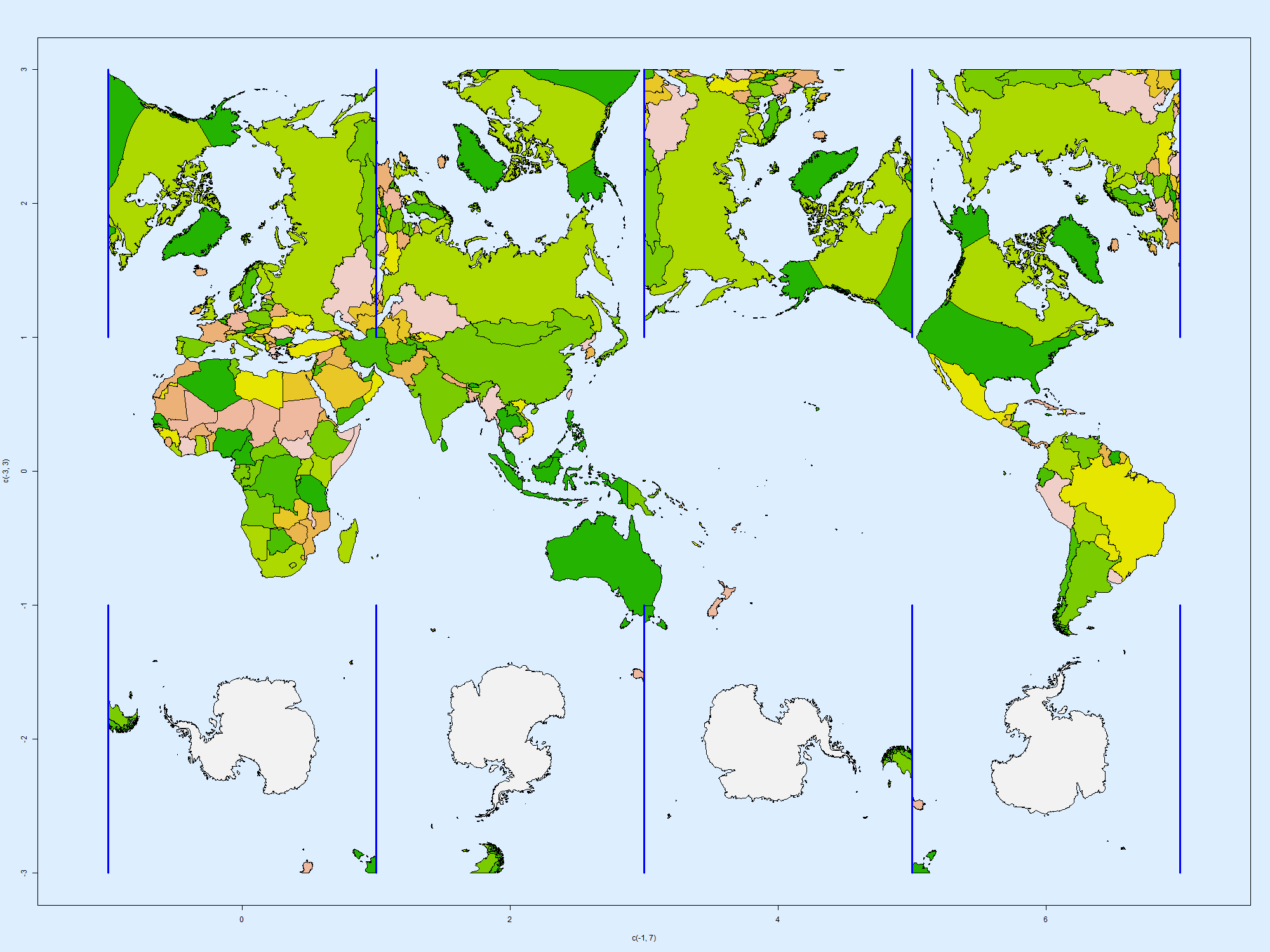
So I wondered how this would work with GISS. It isn't as smooth as UAH, and the 250 km less smooth than 1200km interpolation. So while 18 nodes (6x3) isn't quite enough, 108 nodes (12x9) is pretty good. Here are the plots:


I should add that this is the very simplest grid integration, with no use of enlightened infilling, which would help considerably. The code is
here.
Of course, when you look at a statistic over a longer period, even this small noise fades. Here are the GISS trends over 50 years:
| 1967-2016 trend C/Cen | | Full mesh | 108 points | 18 points
|
| 250km | | 1.658 | 1.703 | 1.754
|
| 1200km | | 1.754 | 1.743 | 1.768
|
This is a somewhat different problem from my intermittent search for a 60-station subset. There has already been smoothing in gridding. But it shows that the spatial and temporal fluctuations that we focus on in individual maps are much diminished when aggregated over time or space.


